Park / Rabunhod
-
 08-January 21
- Views 1,667
- Downloads 353
- Fans 0
- Comments 8
-
 47.50%(required: 65%)
 Design Submission

In:Cities 55% Jappy 55% Xtreme97 55% bigshootergill 50% CoasterCreator9 50% Cocoa 50% Liampie 50% RWE 50% chorkiel 40% Scoop 40% ][ntamin22 35% posix 30% 47.50% -
 Description
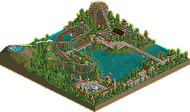
This RMC coaster is surrounded by its own themed area. This is not a whole park in itself, but only a particular area of an imaginary theme park.
-
 No fans of this park
-
 Download Park
353
-
 Objects
193
-
 Tags
Tags
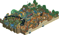
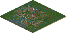
Not bad, of course this also shows room for improvement, like the screens youve showed us of this, but i also see some promising elements to point out. I think for example that the bridge with the coaster barrel roll behind it was a nice little thing composition-wise i liked while viewing this.
For future improvement i think i would recommend to look more into detail when choosing your objects and put some more thought and height variation into your foliage. Realistic foliage consists of more than sparely placed trees and green grass.
I can surely see tho, that you have already improved a bit from your previous releases. Keep it up.
Pleasant map, as usual from you. I'm glad you added some more foliage from the screens, it helps to make it feel a bit more completed. The part with the three bridges is beautiful! With some small adjustments to your game it can be even prettier I think. My biggest point of criticism would be that the lake on a hill is pretty awful, you should've left that out. It has no relation to the park itself, it doesn't make sense, and the waterfall is not very well done. And then there's that sunken boat... Who would even put a boat up there? But as I said, ignoring that bit, very nice. Great atmosphere. Looking forward to seeing your next work, do share screens!
Nice work! Really enjoyed how simple and quaint this felt. The surroundings were overall very well done.. minus the hill with the pond at the top.. agree with everything Liampie said in that regard.
The coaster layout was nice, but felt a bit short maybe?
Would've liked to have seen more manicured gardens and some larger buildings to really sell the setting and theme. Look forward to whats next from you!
Very charming and pleasant atmosphere; though I agree that the coaster could probably have used some further development to be more interesting and less relegated to half the map. I think you're holding back a little on the scale/size of your buildings. They've got a particular style too them, but they're all a little too small to really make effective use of that. I actually think your foliage use is tasteful, it just needs a little bit of refinement.
As far as atmosphere, you're on the right track. Refining the rest of your abilities will bring your work to a superb level!
This was pretty neat, somewhat lacking in big structures or focal points besides the coaster but that sort of works in its favour to dominate the map. The layout had some great individual elements such as the trick-track over the water, but I thought it was a little tame for an RMC and quite short, could have used the turnaround a bit better too (such as with a dive loop or something more RMC-esque). The buildings were pretty nice for what they were but could have been a bit more ambitious, I liked their style and I think the one by the lake next to the gardens was quite cute and has a quaint atmosphere.
I actually thought about it while building it, but weirdly enough I also wanted it to give a Gravity Group feel, just like The Voyage. Too bad we can't make 90 degrees turns in RCT2, otherwise I would have used that element!
Thank you all for the reviews, I'm really happy to see that this map was quite well received even though it only took me a few days to finish it. I guess I should have worked on it a bit more, but I just felt like I was done with it. If that lockdown will still be in for a few months I will probably find time to work on another project!
I will keep your opinions in mind in order to progress even more in the future. :-)
I liked the fog effects in the tunnels and the little plank walk across the waterfall.
The coaster is really good at a couple of RMC-style features; first drop is a classic, the double bridge with the inverted camelback is great, the late roll and trick track before the brakes, the overall sense of speed. I think it could be better in a couple of places; the return bridge with the ?wave turn? is taken waaaay fast and looks like it should be ejecting the peeps- another single larger airtime hill might have been a better fit. There could probably have been another element or two before the turnaround at the far side of the river as well.
The foliage work here is a nice start to using trees and plants in a "realistic" way or using them as visual background elements to help frame your park. I like the lilypads by the bridges and shoreline and the way the trees transition from pine to leafy as you move up the mountain to the crater lake.
I echo Liam with this. You could've left the little pond on the top of the mountain out. My main criticism is to clump your foliage together more instead of spreading it out like this.
Still charming though, hope to see you more active again!