Park / Joker - An S&S Freespin Clone
-
 08-January 21
- Views 3,478
- Downloads 616
- Fans 2
- Comments 15
-

-
 65.00%(required: 65%)
 Design

bigshootergill 70% CedarPoint6 70% In:Cities 70% Xtreme97 70% inthemanual 65% robbie92 65% RWE 65% Scoop 65% chorkiel 60% CoasterCreator9 60% Cocoa 60% posix 60% 65.00% -
 Description
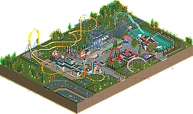
A peepable and "realistic" RCT version of an S&S freespin clone, which is usually always themed to the Joker. At some Six Flags park probably somewhere near you!
Mainly inspired by: Six Flags Great America, Shogo's Batman, and Worlds of Discovery. -
2 fans
 Fans of this park
-
 Full-Size Map
-
 Download Park
616
-
 Objects
346
-
 Tags
Tags


RaunchyRussell Offline
Just a quick footnote: I know I had one of these in my last park, but after I made the static version I really wanted to make one work in game without it being too obnoxiously large. Enjoy!
There is no Six Flags park near me.
Some promising stuff tho. Ironically the freespin was the thing i probably spent the least time looking on when viewing this park. Batman's Revenge is a very well done coaster with some nice Gotham architecture.
I also really enjoyed the water ride with the smart entrance up front and the freezing station. This is having the sort of character i wanna see from all realism park these days, although it also made some little mistakes i dont like to see in these american realism releases like the cutting of the map, i thought the lonely coaster curve on map edge trend is long gone.
All in all this shows off some great ability tho. Youre probably one of the most promising members on this site at the moment. Keep it up!
RaunchyRussell Offline
There's no six flags near me either..
Thanks for the comment! I had originally made the Joker and the splash boats, but the map was too sparse. I really didn't expect the batman ride to turn out as good as it did! I really steals the show from the Joker..
I was wondering if that coaster curve trend was frowned upon and I guess I was right!
This is incredibly well done and nails that Six Flags feel. Great work.
RaunchyRussell Offline
I appreciate it!
First of all, well done - you've displayed a lot of technique here and that's something to be proud of. The free spin is exceptionally well done, but also the super looper and your theming overall - it definitely feels like (cleaner) Six Flags. The entrance to Batman and the whole of Mr. Freeze really stand out as particularly nice. I'd love to see you tackle a full size Six Flags park.
I think a case can be made for or against Design. You've accomplished a lovely Six Flags-esque scene packed with interesting details and good ride design. One thing that holds it back a little for me is the lack of a clear focus on a major attraction. You've got two excellent smaller coasters, but neither of them are massively impactful alone. I think this will be a close one with regards to Design, but it makes me excited to see this take on Six Flags. Really do hope to see you expand on this style.
Great to see a release this hot off of your Quarry park, and one that shows a great deal of growth already at that. It's a little confusing to see it submitted for Design, since judging by the name I assume that the S&S is supposed to be the "design" part but the launched coaster takes the spotlight here. The S&S itself is quite impressive, the mix of track isn't too noticeable and the support structure is lovely. Would have liked to see more than one train however, and the theming was a little bare. Batman's Revenge was a lot more exciting to me, and the theming was more pronounced with the rows of facades showing some solid skill. The rest of the map was great too - loved the Mr Freeze splash boats (really superb station) and the super looper, though it does feel like it's treading old ground. Your style is certainly taking after a few of the modern realism builders and I think with a bolder theme and idea you could really excel.
RaunchyRussell Offline
Thank alot man! I guess the map was supposed to be kind of a cut out of a realistic SF gotham area rather than just focusing on the joker being the star. I do think my next park project will be a midwestern six flags park actually! Cheers!
I appreciate it! I was thinking that it was confusing as a design stand point after a while of thinking about it. A design should be focused on a main attraction rather than a small themed section. Thank you though, I am definitely working on some more original ideas at the moment so I am excited to start sharing some screens regarding that!
this is awesome man. You're definitely one of my favorite newer builders right now. You wouldn't happen to be interested in H2H would you?
RaunchyRussell Offline
Thanks a lot! I would be super down for H2H!
Very fun little small map. You executed the freespin coaster very well, not so much fun of the colors though. I think complete green track with purple supports or vice versa works better.
Batman the ride was the most interesting coaster in this map Very fun pacey coaster, a bit on the faster side. Would have loved to see it with proper Mack/Intamin/Gerst track.
Youre facade game is pretty strong, really topnotch work on that! Also very clean and interesting path work. You do look a young and more colorful version of G Force.
Congratulations on winning design!!!
Congrats on design!
I Did not expect much from this before opening, consider my mind totally changed. There's so many nice pieces of architecture here that fit nicely with the six flags style, I love the gotham architecture and the mr. freeze station. All the theming around the path was impressive too. Lovely little stretch of park
Congrats on Design.
I thought this was nice, but on first viewing felt like you cut it out of your recent solo. You're clearly one of the greatest ride design talents we've seen in recent times, and I'm excited where you'll take your RCT.
Fun design, and lots of skill shown in detail and activity.
he drawbacks here to me are that the batman coaster isn't very visible from the paths--blocked by buildings almost everywhere--and that the two main coasters kinda compete for the highlight as a result. An S&S freespin would be a tiny coaster for a design on its own, so I understand the idea to include another, but to have the other cut off so much from peep-level sightlines ends up confusing the focus a bit.
Regardless, it seems you've got a strong knack for recreationalism, an affinity for six-flags type parks, and some serious skills in ride design. I look forward to what you'll produce next.