Park / Sea World: Vancouver
-
 01-January 21
- Views 3,523
- Downloads 460
- Fans 0
- Comments 11
-
 63.50%(required: 60%)
 Silver

Xtreme97 75% In:Cities 70% bigshootergill 65% chorkiel 65% CoasterCreator9 65% Scoop 65% ][ntamin22 65% Jappy 60% nin 60% posix 60% RWE 60% inthemanual 55% 63.50% -
 Description
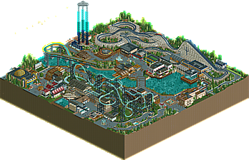
Park Entry for Deurklink's NCSO RCC Multi Dimension contest.
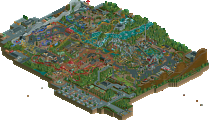
Sea World: Vancouver is the newest edition to the Sea World theme park line up. Orca, the Multi-Dimension coaster is inspired by the naturally occurring orca population in the north Pacific. Experience the magnificence of an apex predator and see if you can survive the "Flukes" inversions that are uniquely built to mimic a real life whale tail. -
 No fans of this park
-
 Download Park
460
-
 Objects
281
-
 Tags
Tags
![park_4800 [NEFC] Ghost TowNE](https://www.nedesigns.com/uploads/parks/4800/aerialt5001.png)
A nice little release, one can definitely see the SWAGTITTIes style here. Also great to see a new builder submitting something. I think the 4D coaster is definitely one of the best we've seen lately on this site. The wooden coaster also had a nice aesthetic to it.
Architecture was all round solid, maybe a bit too much trackitecture in places for my taste. Also the foliage work in this was quite well done. I liked how you guys managed to use flower coloring to elevate the theming.
Thanks! Iretont work tirelessly to make both coasters as awesome as they are. I just supported his greatness.
This looks awesome guys!
Doesn't give me a SeaWorld vibe at all, but thats no big deal. The colors were lovely. Great little details throughout the park. Coasters were top notch.
Always love seeing what you guys do!
RaunchyRussell Offline
Man this is super underrated. Really top notch NCSO park here! The 4D coaster was really well executed and the supports were good as you can get without custom scenery. Neptune's layout and trident detail was simple, but very nicely done. Cool idea on the footers too!
I could go on about the other rides, they're done really well, but the little details really make this thing come to life.
My favorite moments:
The Orca and Great white shark encounter building. Wow.
The lemonade stand out of the mine car and the salesman is pure gold. Storm Surge's sign is a really cool along with the crashed vehicle smoke to make the "mist". Pretty genius there. The sea world water trailer next to the reverse freefall water tanks are both great and look really clean. Last one is the sea turtle tank on the queue of Neptune. That's a cool touch.
Overall really strong entry. There is a lot to like here.
All of those were Iretont's details! But, I can't blame you for liking them haha!
Quite unique 4D coaster; always a plus. My feelings are a little mixed on the layout itself, but it's certainly a cool concept. The supporting rides are very well done, I almost thought that the wooden coaster was supposed to be the focus of the map. I like the exhibits; it's not particularly Sea World, but more of an identity of its own. The architecture is a bit of the usual "modern-NCSO" style, but the Tsunami station and Neptune's Descent's station stood out to me as a cut above the rest!
Really solid park guys, great job. There's a lot to like about this and I think it shows some of the more competent and refined work in this style of NCSO. I'll start with the main focus of the map, the 4D coaster Orca. Definitely feels like a cool take on the ride type, with a launch and sort of out and back layout, and the support work is impressive but I think it gets a bit overcrowded at times. Neptune's Descent is a very charming family coaster and I loved how you used the trident motif on the lift and the expansion objects in the queue. There were a lot of great ideas and object usage throughout the map in fact, especially the wave signage for the shot towers and the mist effect you used there, and I loved the lemonade cart too. I think architecture wise it was a bit reliant on track-roof and didn't have much of its own identity as a result, but I did like things such as the layered 2x2 towers. The water and tank details were excellent, loved the main lake/pond with all the fish swimming about and the big tank that the woodie queue wraps around is a brilliant piece of guest interaction.
Really lovely little park you got there. The palette is quite fun, I love the off white in thiS; It is a bit cluttered in some places though, like in the backstage area behind the 4d coaster. The rest is pretty solid, I especially like the theatre and the classic dodgems
Overall nice little park.
The DKMP meta style is such an interesting one. I think at this point it's clear that the map size and the obligation to do cool hacks and include the checklist of latest NCSO tricks is holding the community back from making really impressive parks that stand by themselves without being geared to win points in a game of trumps.
There's so much really positive here - both on a tiny detail scale, but also on a general park scale. I think the placement of the splashdown ride is really impressive and engaging. Great way to turn a ride that really benefits from path visibility into a centerpiece. The hedge maze and photo booth for Neptune are super cool. Love the colors. The thematic oomph put into all the rides is really impressive as well - fish tank and fountain effects, big custom signage, really selling the over-the-top theme park elements. Loved the backstage elements under the Neptune drop. Love the 3d sign detail for Trader Jo's.
Orca's supports are outstanding, very well done. I like the choice to leave some bare grass underneath it. Overall the foliage is a little underdeveloped, sort of like it was just applied with a blob brush or clone stamp in open spaces. I would have liked to see more attention paid to making it naturalistic vs. an even covering of the salad mix.
The coasters themselves were... meh. I really wish Orca hadn't been so difficult to follow; with 4Ds I always have to watch the trains particularly carefully to try and get a sense of whether the layout would flow nicely as a rider. The S-bend before the .. pull-up? half-Immelmann? was unfortunate. Neptune is also a little strange and doesn't quite fit a layout mold I'd expect. It's sort of a family coaster and sort of not. Still, low-lying and fast turns with a bunch of airtime sounds like a lot of fun, so I'm a fan in theory.
For being a Sea World, there was not a lot of focus on the sea life. The whale hoist is cool. The turtles and such in the water are cool. I get that it's a contest map and the real-estate is limited, but maybe it would have been better to scope the park to just one area of a SeaWorld park vs. trying to squeeze in an entire SeaWorld roster.
I'd love to see a full park in this style, something that doesn't have to meet restrictions.
I get the feeling looking at this park that the label of Sea World doesn't really add anything. Spare for the lake in the middle you don't have any true animal exhibits or shows the way a seaworld park would. Such a small map size is limiting for sure, but I would've liked to see such Seaworld traits be prioritized a lot more, or just have the brand dropped in general. Using brands doesn't add anything unless their style is followed in my opinion.
The architecture is good but looks like pretty standard NCSO. What did wow me was the Great White building, it was a lot more daring than your other buildings and I think it paid off.
I had mixed feelings about the aesthetics of this park. On the one hand you make lovely choices such as the off-white wooden coaster and the colour of the buildings, water, and foliage creates a lovely warm atmosphere. On the other hand there's also parts that feel cold and unatmospheric, such as the backstage area for Orca, all the grey and tan gets very overwhelming. Looking at this area I also noticed how the only aquariums/exhibits in your park are only visible through a queueline. I really liked the rest of the park in terms of atmosphere.
Overall its a nice park, looking forward to seeing more!
Intamin22 - Thank you for the feedback. I understand the feeling of map limits and packing the park a little too full. You are right, it is built for the contest. Filled to the brim parks do very well because lack of energy or excitement lead to lower ratings.
Lotte - We basically made it Sea World themed after the coaster was designed, because of the whale tail element, outside of that we didn't go out of our way to mimic a Sea World park. It was sort of what can we do to add to the main ride attractions, not what we can do to emphasize its a Sea World park. I understand its the title of the park, but typically in these contests we just randomly name the parks without much though behind it, so people don't lower our votes because out park title was "Swag Bench 2020" lol. Thanks for the feedback!