Park / Scarecrow
-
 19-February 09
- Views 4,770
- Downloads 792
- Fans 0
- Comments 16
-

-
 78.46%(required: 65%)
 Design

chapelz 95% RCTFAN 90% CedarPoint6 85% FullMetal 85% Xcoaster 85% 5dave 80% Milo 80% zodiac 80% Evil WME 75% posix 75% Steve 75% Fr3ak 70% geewhzz 70% Magnus 70% nin 55% 78.46% -
 No fans of this park
-
 Full-Size Map
-
 Download Park
792
-
 Tags
Tags
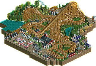
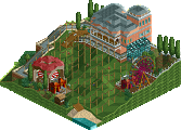
The advertising district has become a lot more interesting place since robbie92 showed up. It’s pretty much expected that there will be something interesting and well-crafted whenever he posts a screenshot. He was certainly never at a loss for ideas as displayed through the number of projects he advertised. However, the one thing everyone was waiting for was a complete project. Around Christmas, he released his first large park project unfinished. While it was a shame to see the park go uncompleted, there were numerous spots of very well done architecture as well as strong coaster layouts and plenty of detailing. It was only a matter of time before a project would be released as small screens of a new design started popping up in the advertising forum. Now we have Scarecrow, robbie92’s first NE award. Read On...
As for the design itself, well, the layout was great! Nice landscaping, coaster, everything like that was great. The archy and surrounding 'park' area didn't do much for me, however, it just seemed rushed. Though, you've already said you could've slowed down a bit, ah well. It's a great little design anyways.
it wasn't bad, it just wasn't my cup of tea (but then again, most realism isn't).
We can see a pretty good layout, but the theming wasn't so good:
small houses with no great architecture, except of the stations.
Beside that, congrats for winning accolade.
One thing id suggest you do however is re-visit and make this thing peep friendly! I think that when ever building in such a small 'realistic' scale peeps are a necessity.They help reinforce the idea of imagining in a peep eye view and help to create a park atmosphere and in turn help stop people from slating your architecture because its 'small'
Overall, I enjoyed the layout. It had some great interactions and as CP stated, the flow from area to are really worked.
The one thing that irks me about some of these designs and was present in this one as well. If your going to use block brake mode, you need to increase the minimum wait time so that the second coaster is not sitting at the top of the lift hill. It takes time to make the adjustment so that the first train clears the next block brake just befor the train hits the top of the lift hill however it really adds to the realism.
Overall though, great job and I look forward to seeing more from you in the future.
James
Xcoaster Offline
Now, I don't suppose someone would like to make some of those support objects in a MT format?
I really liked this. The layout was awesome - I didn't notice it getting significantly slower towards the end, I thought the pacing was about right.
The surroundings were good too. I liked how it's meant to be part of a bigger park. Talking of which, the backstory and explanation of the park was really interesting and showed you'd planned this out well. The architecture was generally nice, I particularly liked the chairlift station. And I also liked the bit of railway going past the coaster - that would provide an amazing view.
Pretty much the only thing I didn't like was the catwalk on the lift hill which was wasn't really necessary. But that's such a minor point it didn't detract from this at all.
So yeah, well done on this one and I look forward to seeing what else you come up with in the future. Your recent screens in the dump place have been stunning.
Great job on this, and good luck with future projects.
I'd say it's a solid design overall - definitely worthy of the accolade, as the layout is one of the strongest for a while. It really does feel like a GCII coaster - lots of twists, turns and crossovers, with only a few small airtime hops. It does slow slightly towards the end - but not too detrimentally - but what I didn't like was, as RRP said, it's almost like you run out of ideas and are just finding a way to connect the final segment back to the station. I think a ride should always have a strong ending, but this one just sort of... peters out.
And it takes the unbanked turns at speeds which mean they should be banked turns. This all adds up to a feeling that the final segment was rather rushed or unplanned. But that's the only negative on the layout really; otherwise it was great, providing an aggressive (but not excessive!) ride experience. Good ratings too.
The support work throughout was really strong and convincing. There were a couple of other ride-related details which would have made me enjoy it more. Firstly - RCTNW mentioned this- blocking. Take an extra 5mins just to ensure that the dispatch time is set such that a train never stops on the lift-hill. It's one of my pet-peeves (along with people putting 9cars on an inverted coaster!).
Secondly, (this is a minor point) I noticed that guests board and leave the train on the same side of the station. A lot of the attraction of a station fly-thru is that guests can leave the train and walk under a fly-thru segment... That, and capacity is improved if you have separate load and unload platforms. Minor detail, but still one worth mentioning I think - compare it with the GCII coaster in 'Snowdrift', which really tries to put the peeps right in the thick of the action - check out its queue-line bridge.
Other than that, the station as a whole was really good. Like CP6 has said, it very simply and realistically conveys the theme you're going for. The station is the best example of this, but I felt the other architecture also did enough to simply convey the theme you were going for. You used a few custom objects which in terms of looks were not what I'd call 'classic RCT'... but I actually felt they all worked well together, which is usually pretty hard to do. I think the ride's entrance plaza was a little clustered and forced - it was almost like you were trying to crowd in a few smaller attractions and midway stalls, just for the hell of it... I think the ride would have benefitted from a more 'open' and obvious, big entrance!
Finally, to pick up on another couple of points people have made - Xophe said how the railway would provide a great view. I'd have to agree 100% - the railway offers an imposing but picturesque and idyllic view of the coaster; I could just imagine sitting on the train and trying to take the perfect photo as a coaster train full of people screams down the first drop. So, whilst perhaps you neglected it in other areas, you did a great job here of really thinking about the park from the peep's point of view.
And on that note (again, RRP mentions it) - this park would be SO much better if it was peepable. It would hold the viewer's attention more, and would bring a buzzing atmosphere to the Design. Perhaps the 'clustered' ride entrance plaza would work better... Perhaps the whole Design would have had more impact if you actually did have a steam-train on the railway tracks, travelling past the coaster as a train-load of peeps screams down the first drop.
So that sums up my thoughts... a solid design which I really liked. If you'd altered a few things and taken a little more time to attend to the 'small things'(such as the train dispatch times), as well as maybe making the whole thing peepable, this would have been a design which I not only really liked, but actually really loved. Congrats anyhow!
EDIT: I really REALLY need to try and cut down on my 'reviews' - they're taking too long to write and too long for everyone else to read
You definitely made a great effort to ensure the structural stability of the ride and in many places it was pulled off very well and accurately too. There are some places that you either missed or the solution wasn't the best (example of this would be the track leading out of the station-flyby). The footers were a nice touch but there were areas were their use was a little inconsistent.
The smaller trees and paths made the coaster seem bigger, which I thought was cool. General path and building layout worked nice with the ride. Only thing I really dislike in this category is the extra catwalk added to the lift hill. I was a little confused as to why the foliage was so different on the other side of the train tracks by the coaster's first drop, is there a swamp there or something? Also any GCI coaster will probably command a line much longer than that which you built for this one.
nin: I'm glad to see that the design grew on you. It's certainly not my best anymore, as you can tell...
kumba: I'm sorry that you didn't find it design quality... Good thing I submitted it under this stage of NE...
Gwazi: Totally understandable. There's some styles that I just can't grasp as well as others, so I can relate to not being accustomed to a certain style, or not enjoying a certain style.
Yannik: I'm sorry you didn't like it. Hopefully you will like my future releases, hopefully, more.
RRP: Thanks for the comment! I agree with you that the ending isn't that great, but maybe I can go back and make this thing peepable. It would definately work with the atmosphere.
CP6: Thank you! The attitude of the comments changed after yours, and its nice to see that someone realized that the focus of this park was the coaster, and I'm happy that you liked the archy.
Todd Lee: Thank you for the great comment. I'm glad you enjoyed the park.
RCTNW: Yeah, I didn't realize how to fix the problem before now, so thanks for the help. It bothers me too, and had I figured out how to fix it, I probably would've gone back and fixed it before submitting it.
Xcoaster: Thanks! And yes, those supports in MT format would be awesome.
Chapelz: I'm glad you really liked it. Thank you for the great vote.
Steve: Thanks. I'm honestly looking forward to finishing something else to submit! Haha...
Xophe: Thanks. I honestly don't really know why I put the catwalk on, but I'm glad you liked the railway... It's one of those smaller things I enjoyed...
Jusmith: Thanks!
Eyeamthu1: These long reviews are good. They're really helpful. Thank you for the critique, and I understand the reasoning behind every one of your criticisms, which I can totally realize now.
Phatage: It's great to get a comment from you.
Overall, I'll try to address some common criticisms. Yes, I lost inspiration at the end of the layout. It's definately not great, and since then, I've been trying to work on layouts even more. The archy is more simple than what I'd been doing in other projects, just because the park is basically a generic themed park, and not an elaborate one at that. I like realism, so the archy is close to that. As for the wierd foliage beside the railroad, it's kind of like a wheatfield, to connect it to a farm theme. I myself am not a huge fan of the treeing within the coaster, but I like it on the hill. I'm glad everyone enjoyed the layout. My goal was to create a good GCI layout, and diagonals were the way to go.
To reiterate, thanks everyone for commenting on my little design. It's especially nice to see such great comments from people whose work I've admired, and parkmakers who have inspired me to get to where I am in the game.
Keep your eyes on the front page. Maybe there will be something soon...
Edited by robbie92, 25 February 2009 - 06:09 PM.