Park / The Wild Frontier West
-
 25-December 20
- Views 2,096
- Downloads 541
- Fans 0
- Comments 5
-
 Description
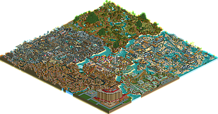
Welcome to The Wild Frontier West!
(My first mostly completed park after 10 years of not playing)
Enjoy the ride, because it has just begun! -
 No fans of this park
-
 Download Park
541
-
 Objects
1
-
 Tags
Tags
hey, nice to see this so quickly!
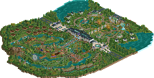
I think that a lot of the construction here, while a bit amateur-ish, works surprisingly well. like a lot of the coasters, buildings, and park layout are on first glance not fantastic, but somehow the areas combine into something greater than the sum of their parts with some great atmosphere and vibes. I especially like the wood/swampland area, which comes together quite magically. great work on a very fun release after ten years, and I can't wait to see where you take your next work now you've loosened the rust and learned some parkmaking lessons!
It's quite good for a first released park. The theming is good overall though it could use a few more variations from the overall color scheme on individual structures. The coasters were a so so element for me. I don't want to shift you away from how you've used them for defining a theme instead of doing more traditional layouts but I think that there's room for improvement. When you've got so many makeshift lift hills it really cheapens the ride so if you could, try to come up with a better pattern like having a couple normal sized lift hills. This isn't as much of a big deal for the suspended swinging coaster but for traditional tracked rides it's quite important. The hotel was one of the weaker points of the map architecturally but you've been given better critiques on that than I can offer.
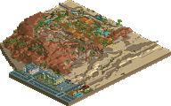
The disaster area needed some more finesse that comes from observation so maybe if you do something like that, look at some real life footage or a movie just to get a more of a sense of how to do that within a park. I think that it really could have benefitted from some more negative space. You could have done some bolder things like have a black remains of a building just using building blocks or have some oil spills or something.
The parts I like most were the center with the bright architecture and gokarts and the forest area with the suspended swinging coaster. The first is just well made and the other has some great atmosphere.
I'm not a pro so you may get some better critique from more aesthetically talented people but I think that this is pretty good. It deserves in my mind, a bronze and if you improved the coasters a silver. Keep at it and I think you could make something quite good.
There are traces of macro brilliance which I would love to see more of in the future. Also the aesthetic choices are bold and interesting.
RaunchyRussell Offline
I really enjoyed this park. The theming is very fun, especially the jungle and the apocalypse area. I thought those two were the most successful. This gives me some heavy old school vibes, while still being original.
Some downsides are that this park is very densely packed. It needs more negative space. Another thing to work on is ride design. The rides are awkwardly fast (the Expedition Treetops ride and the fast paced sky ride) and flung around their corners really quickly.
Regardless, this is pretty awesome especially considering this is your first release. Keep it up! This gets a 55% from me.
This has some lovely old school vibes to it with some awesome moments like the burning down bridges in the industrial area. Definitely some great macro.
You have room for improvement in the micro aspects though, try to care more about every single object you place while building and dont be afraid to get into some more details, especially with foliage and peep details. Keep it up and im sure you will have a great park making career in front of you!