Park / Magic World - Indoor Paradise
-
 04-September 07
- Views 4,015
- Downloads 761
- Fans 1
- Comments 9
-

-
 52.50%(required: 50%)
 Bronze

Jaguar 65% CoasterCreator9 60% Cocoa 60% posix 60% Recurious 55% RWE 55% chorkiel 50% Terry Inferno 50% ottersalad 45% Scoop 45% wheres_walto 45% bigshootergill 40% 52.50% -
1 fan
 Fans of this park
-
 Download Park
761
-
 Objects
247
-
 Tags
Tags
![park_4134 [H2H8 R5] Romon U Park](https://www.nedesigns.com/uploads/parks/4134/aerialt3926.png)
![park_3324 [H2H7 R1] Circus Circus & Adventuredome Atlantic City](https://www.nedesigns.com/uploads/parks/3324/aerialt2970.png)
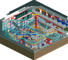
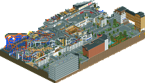
Some people say RCT is dying out and NE won't be around much longer. Well its hard to deny that not that many parks are coming in, but it seems everyday someone new shows up with some promising work. This time it's this guy called Fr3ak who brings us a strong concept creation with Magic World Indoor Paradise.
Please post comments below.
disneylhand Offline
Sorry if this sounds harsh, your work is promising, and I'm looking forward to seeing you improve with any future projects of yours.
-disneylhand
i have never seen anyone use this kind of project concept.
looking forward to seeing your next release.
4000th post. god ...
really, i love ne. i truly do.
I told you already what I think about it, while there are still some major flaws (like the launch out of the station at Paradise Loop) or the very spread out paths, there's no denying you have a bright future.
Well done, and I look forward to your next endeavour!
Wicksteed Offline
example: you had those emergency exits with signs above the, but most of the just displayed the name of the nearest attraction. and there were more things like that, where you showed a good idea and then seemed to forget about it.
but don't get me wrong that park definately shows that you're talented.
i'd say, just take more time before you release something.
My biggest complaint would be the low fences that seem to be pointless.
Really though, I loved the idea, execution, and especially loved the junior coaster, it was done very well.
To me, it seemed like there was way too much path. I've only ever been to one indoor park, but from pictures of others it seems like there wouldn't be that much. Especially with the size of the park that you're looking at, I think you could've afforded to have a much smaller path layout and therefore some more rides.
I like that you included all the mechanic areas and stuff, although the front of the building wouldn't be my first choice for a place to locate the outdoor maintenance area. Still, that looked really nice.
You did have the nice little canopy at the entrance area, but I was hoping you might have a larger facade so as to disguise the huge gray building. From the perspective of the peep, I think that could be a really cool addition.
Finally, I really like the supports on the water ride. That was pretty excellent. Those looked really nice and added to the appeal of that type of ride, which are otherwise kind of boring.
Overall, nice job... would love to see you do another one, maybe on the scale of Toverland or something with some bigger outdoor rides and indoor/outdoor interaction.
But thanks for the comment.
-Posix, Thanks a lot.
-Peee, thank you, too!
-Wicksteed, what? Really? .. shit .. I've seen this a while ago and sended another, newer version to Kumba, but it seems, that he had put up the 'older' one.
I will send it again ..
-Comet, thank you, but which fences are you talking about?
-CedarPoint6, yep, I agree .. there is much path, maybe too much.
Yes, I've tried soemthing completly new with those supports, but they're insipred by Atlantica, the super splash in Europe Park (Germany).
You would like to see another indoor park? Hmm .. nice idea .. maybe, but atm I've started a new solo (this time it's outdoor
-lucas92, thanks =)
Nice work Freak!
Good to see a new german talent!
I liked the park. It was pretty unique and good looking.
The amount of path was a bit of a let down. The whole park was a bit too 'wide' for an indoor park. Mostly those parks are crammed with attractions and such.
Keep improving!
"MFG"