Park / Balthali Terrace
-
 15-November 20
- Views 11,190
- Downloads 454
- Fans 0
- Comments 19
-
-
 63.00%(required: 60%)
 Silver

RWE 75% Camcorder22 70% CoasterCreator9 65% Cocoa 65% In:Cities 65% Scoop 65% inthemanual 60% Liampie 60% posix 60% WhosLeon 60% Xtreme97 60% chorkiel 55% 63.00% -
 Description
“Welcome to Balthali, Nepal. Just outside of Kathmandu lays this idyllic place, perfect for a quick escape from the fast-paced city life. Known for its beautiful hiking routes throughout the wonders of Nepal’s finest nature.
Take the well-known pilgrim’s route to “Namobuddha” which takes you straight through the colorful environments of rice-fields and tea cliffs before going in the deep vast rainforest.”
This nice piece of commercial text would be a great way to lure tourists to this area if the main attraction would still be in its original form.
Legends say that, after a villager committed a rather disturbing sacrilege, the angry gods decided they were not worthy of this beautiful temple and so tried to destroy it!
Years later the locals have decided to use this place for entertainment and fun, rather than hold on to the past.
This year they even build some new rides including a huge chairlift to attract new tourists!
Feel free to explore this land and all its glory!
Please, don’t mention either “angry gods” or “natural landslide” when talking to locals!
Enjoy!
*special thanks to Liampie to guide me through this awesome project! -
 No fans of this park
-
 Full-Size Map
-
 Download Park
454
-
 Objects
319
-
 Tags
Tags

He who travels has stories to tell!
Round 5 - Nepal
It's Nepal, pals. Like in Round 4, we received five entries, which again doesn't mean this round isn't competitive. Who will peak like Mount Everest and proceed to the final? Let's find out.
For reference, these were this round's criteria that all entries will be judged on:
1. Your park must be themed to or set in Nepal
2. Include at least one water ride
3. Must include or refer to spirituality
How to vote
Before you vote, you have to make sure you've viewed all parks with thought and care. Voting happens through the polls above. The submissions will be judged on two criteria. First, you are asked to vote for the parks that you think completed the three objectives for this round the best. Second, you are asked to judge the parks on their overall quality - separate from the round objectives. After 72 hours, the polls will close and we will add up the votes from each poll. The submission with the most votes in total will earn the creator(s) a ticket to the final round!
Entries
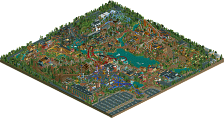
My entry focuses on the ancient Hindu temple of Changu Narayan. A majority of the project is directly influenced by the temple and buildings in the surrounding villages (all visible thanks to Google Street View). This area was hit by an earthquake in 2015, so many of the buildings are in disrepair, partially reconstructed, or new construction. I hope you enjoy exploring the village and are able to fully experience Li?ga ?ar?ra
“Welcome to Balthali, Nepal. Just outside of Kathmandu lays this idyllic place, perfect for a quick escape from the fast-paced city life. Known for its beautiful hiking routes throughout the wonders of Nepal’s finest nature.Take the well-known pilgrim’s route to “Namobuddha” which takes you straight through the colorful environments of rice-fields and tea cliffs before going in the deep vast rainforest.”
This nice piece of commercial text would be a great way to lure tourists to this area if the main attraction would still be in its original form.
Legends say that, after a villager committed a rather disturbing sacrilege, the angry gods decided they were not worthy of this beautiful temple and so tried to destroy it!
Years later the locals have decided to use this place for entertainment and fun, rather than hold on to the past.This year they even build some new rides including a huge chairlift to attract new tourists!
Feel free to explore this land and all its glory!
Please, don’t mention either “angry gods” or “natural landslide” when talking to locals!
Enjoy!
*special thanks to Liampie to guide me through this awesome project!
FK's gets better the longer I look at it. Wasn't convinced this was as good as the highest quality parks from earlier rounds, but I'm changing my mind. It's 100% up there.
Some of the GT entries feel like I'm looking thru H2H level creativity. That journey for the flume! You guys build so fast too...congrats to all fellow entrants, I will comment more after I find details!!!
1. that they try to fit in too much stuff at the same time, which makes it hard to focus for me, there isn't a clear concept imo. Example is kenos that added a river that isn't even in Nepal
2. The overuse of a palette bothers me a lot of times, but in these entries it was even more obvious. Why is the water almost purple again? And FK's entry looks like one beige smudge, without any clear focal points because of the saturation of the colours.
Julburi Bazaar (roygbiv and shogo):
I'm a big fan of the crustyness and level of detail in all the structures and pathing, but I think when you have this level of texture in the micro scale, you really need a strong sense of organisation in the macro to make it readable. There were some really beautiful elements in here, especially the flume, but as a whole it was quite messy.
Linga Sarira (FK):
This is crazy good, FK, I'm a bit mindblown actually. The texture and detailing in the architecture is probably the best I've ever seen in RCT - especially all the subtle imperfections. After a while looking at the map I was intrigued as to why it was built on such high land, and then I figured there was probably a cutaway - which I had very low expectations for, because to be honest I usually find them annoying gimmicks. But I was proven wrong! You made perfect use of the black background, and the fact this abstract layer was literally inside felt like an apt metaphor for how in eastern religions the spiritual world is within (oneself), rather than a celestial 'above' (as you did in Sistini). My only minor critiques are that I also found the palette flattened things a bit, aaand I wish the flume station was up top so you didn't have this harsh angular line of peeps killing the vibe, but otherwise this is a clear winner - by both criteria.
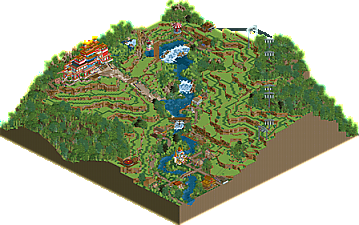
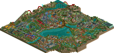
Bathali Terrace (Coaster GEOFF):
Great entry - I love the clarity and readability, and the landscape shapes you've created with the terraces look very authentic. This is my second favourite.
Chandra Surya (KaiBueno and Liampie):
The map shape was such a tacky move that it both annoyed me and amused me in equal measure, so well done there. Otherwise, nice architecture and fun rides but felt a little unambitious.
Nepal, the Roof of the World (kenos):
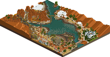
Nice how much you packed into a small map - the result is that it has a bit of a miniature diaroma feeling, which I quite like. The architecture is quite mixed, some is great - the cliffside temple and the building with steps by the river - but the town is a bit unrefined. I notice you're falling into the trap of painting each building its own colour scheme (one buiding is entirely shades of yellow, another shades of red, another green, etc) - a tip I would give is: go for more uniformity and neutrality in the wall colouring, and then add different colours through the details like trims, balconies, windows, awnings etc. Cool that you included a little amusement park btw!
Julburi Bazaar (roygbiv and shogo)
I liked the Wirering Chaos the buildings looks great. I found the clouds destroys your plot a bit and Shiva was nice but it fits not so really in the map but we need a Water ride i remembered. All in all a very solid work.
Chandra Surya (KaiBueno and Liampie): A cool Plot with nice Details. I found it was not really finished, think same prob like me with the runing time. The Exit False from Moksha was a little mistake but it can happen.
Linga Sarira at Changu Narayan Temple (FK+Coastermind): This was a nice big Temple with tons of details. First i don't found the water Ride but than this logflume was so nice integrated in the landscape and the foliage was next Level. Every Detail was nice maybe a bit to mutch red and brown but this was my favorite plot.
Balthali Terrace (Coaster-GEOFF): A really successful plot, the rice terraces look great, everything looks right. From the concept, I give Faas right everything fits so far.
The sand slide is also beautifully embedded in the landslide. Very nice work
and than my plot:
I agree with you Faas that I wanted too much (like mostly xD) you can see it clearly. I lost sight of my concept a little. The time to build something like this on the quality of the rice terraces or the huge temple alone, without really knowing how to find the right components, is difficult. It was my first CSO attempt but I thought it was pretty good. The city building details have unfortunately been lost. The river or water exists in Kathmandu but not in the scale. I'll try to make it better in Chile: D
PS: the runway on Everrest is really so inclined, but it couldn't be reproduced in RCT2 and it takes courage to land there anyway. = P
So the big Temple or the Rice field???? ......for me the winner is the Balthali Terrace (Coaster-GEOFF)
maybe the Water can be a bit bluer =P
Can't open Julburi Bazaar, game crashes while trying to open it (on both release and develop)..
All others look great, especially like the landscaping in Geoff's and Kenos' entry.
Congrats to everyone who entered, another really high quality round!
Julburi Bazaar: This park felt like a breath of fresh air. It had an incredible amount of unique and interesting ideas and in general just felt very unique in its style and execution. It almost feels like an artistic exploration of Nepal, where the different styles and elements of that culture are being integrated and reinterpreted in rct. I love the main drop of the splash boat, the composition there is excellent. I really like the landscaping and how you put together the different climates overall, but it does feel like the placement of buildings is a bit chaotic. The architecture and execution is often gorgeous, but it has that sketch-like feel that can sometimes come across a bit messy. I love the ideas of the clouds, but I think a bit more variety in the pieces you used to shape them would have helped. Overall, a really high quality entry and probably something I’ll come back to for inspiration in the future. Congrats!
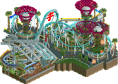
Chandra Surya: First and foremost, I think this is a huge step up for Kai from your Namibia entry. Not that the latter was bad, but I think Chandra shows a big improvement. Highlights for me were the palace around the water coaster, the Holi festival, and the map shape overall. Some are gonna say gimmick, and I say gimmicks are great. The architecture was mixed in a few places, but I think often had a nice balance of good forms with smart details. I also think this entry did the best job of integrating Hindu/Indian influences. I wasn’t a fan of either rides layouts, the giga in particular felt awkward, and a few parts of the map felt a little blocky by today’s standards.
Balthali Terrace: I’ll start by saying, the palette doesn’t bother me at all. I like the high contrast, it gives this an almost graphic feel with the different greens, dark blue water, vibrant reds. Zoomed out in particular, the rice paddies with the bits of taller foliage and the temple all look so good. Composition is a huge plus here. The landslide is super cool and really well done, and I think this is one of the most unique and fun uses of the carpet ride we’ve seen. Also, the chairlift is really well done. You managed to make that into a feature of the map when those are often more background. While I think the ride paddies are composed incredibly, I think another brick texture and some greater variation amongst the rice plants themselves would have helped. Also, while I understand why you added the rides, I don’t think they’re really needed and you could have kept the peeps entertained with some invisible rides here and there (I cheated and did that a ton in my entry).
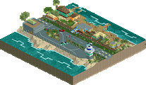
Nepal, the Roof of the World: I think this entry shows a ton of potential. While the execution isn’t perfect, it shows an understanding of how buildings are put together and areas are composed that I think spells out better things for you moving forward. This gave me a real Road Rally throwback vibe with all the different parts of Nepal you included. That was more common in Road Rally, particularly Emergo used to do diorama-like parks with bits of architecture and landmarks from throughout a country. In particular, I love the airport with the shortened runway, that brough a lot of run movement to the park. I’m surprised we only got one Everest, but the hikers going up and taking pictures was a great detail. Probably my biggest gripe here was the foliage, which felt a little too similar throughout and had a lot of grass spam. Moving forward, I’d recommend clumping things a bit more and adding more variation and layers to build things up.
Linga Sarira: For those interested (Kai probably?) I put together a document showing some of the buildings I recreated in my entry (attached). I definitely relied more heavily on reference material and directly recreating real buildings for this project than I usually do, so thought that’d be fun to share.
Attached Files
downloads: 282
recorded my viewings, will edit and upload tomorrow probably
Amazing
Julburi Bazaar
You guys have a lot of great ideas, but you forgot to separate them from the bad ideas. This map is just a bunch of ideas and it could've done with less.
The good: steps into the water (always a hit), some great archy (like the pagodas in the main village), chair lift station (some Turtle vibes, intentional?), waterfall with wheel, diagonal bridge in the same area, the snow area (amazing), the buses, Shiva Dive (station)
The bad: Shiva Dive (name), Magic Bus (name), deli meat landscaping, foliage, grass trim objects in river, the 'clouds'
To end it positively, I liked how the park was kind of a cross-section of Nepal, but focusing on the country's rural qualities, not the chaos and density of Kathmandu. The map is messy, but full of atmospheric and charming scenes, as well as some object ingenuity. Well done.
Nepal, the Roof of the World
Well done, you've been ambitious with this and I think it pays off, as this is clearly the best work you've shown us over the years, and I've enjoyed it quite a bit. Like someone else mentioned this is very reminiscent of the old Road Rally parks, parks from the contest from 10-15 years ago The Grand Tour was modeled after. Just a showcase of cool shit from Nepal. The little theme park is nice and well done, but not even that necessary, as it's all the semi-recreated buildings and scenes that steal the show. None of them are as refined and perfect as in many of the other entries we've seen throughout the Grand Tour, but they work together nicely. I like that you included inspiration pictures, I enjoyed puzzling together which pictures are where on the map, it even helped to find some small places and details I might've missed otherwise. Some of my favourite bits: the alpinist camp, the ridiculously short runway (it's funny), the corner with all the bridges, and the waterfront in the city. As I said there's plenty to improve but it's a complete and enjoyable park that shows a lot of promise. I think all the stuff that can use improvement can be addressed at a different time, if you want.
Chandra Surya
I'm a little biased because I have a 25% share on this map, but at the same time, I can also judge this objectively for I only got involved during the last 48 hours and this is almost entirely Kai's vision. The flag shape and some other aspects about this is silly, yes. And I think Kai and myself are both people who enjoy silly things very much, so no complaint from me there. I appreciate these silly ideas by Kai because at the same time, no one else is doing them. The coaster layouts need some work and I think the landscape looked a bit too much like mountain tool spam, but Kai has done a good with the theming here again. I think the village has some really nice moments like the gold building in the center and the steps into the water, and what could've been a basic plopped down flatride in the swinger has become an actual theming setpiece. I did the water coaster station area (Kai's ride and path setup, I just adorned them) and 50/50 of the Intamin station and surroundings and I'm very happy with them. I hope I get to collaborate with Kai again, as I think I inspire Kai to build more modern and Kai inspires me to build more classical in an authentic way; when we meet in the middle I think we can produce something great. Not enough true collaboration here yet. Maybe in the future!
Balthali Terrace
I'm really glad I chose to 'coach' you because this is easily your best work yet and it's all yours - I gave you some early pointers and you ran with it. All the best bits are things you came up with, like the landslide, the shoddy bridges, the variation and little places of interest on the terraces, and the stepped waterfalls. It's easy to imagine yourself walking there and I wish I could actually walk there, I would have a blast. The chairlift is pretty nutty but I'm glad you added it. The overall landforms are beautiful. The temple complex on top of the hill also came together well. Overall there's room for improvement as always, but that's for the next park. This is a well made finished product that many people should be jealous of. Lovely work!
Linga Sarira
At first I hated the palette - the brown you used around the temple complex reminds me of the way ghost objects look in RCT, except it's brown instead of white. With the lower contrast, it looks like it doesn't belong. The pale colour scheme throughout the map also is a bit hard on the eyes at first. Once my eyes adjusted, I started to get immersed. And on a micro scale, this park is more immersive than maybe anything we've seen in RCT; the level of detail is astounding and blows garbage like Ombezin Basin and Rovinj out of the water. I think the best way to show my appreciation for what you've built is to highlight some details with screens:
[coming soon, need to switch laptops]
So after you've nearly maximised your potential at the surface with this detail masterclass, LOTR rocks and less than perfect palette aside, the underground shit pushes it over the top. It makes sense conceptually and the execution is so FK, but also so fresh, and fun! The drops and jumps on the flume are great, as well as the seemingly normal bits on the surface like the waterfal shower. Great flume ride. The deconstructed temple blows my mind.
Clearly and by far the winner of this round in both categories. The best RCT, and the best execution of all three criteria. You made me feel like I'm in Nepal, while not doing anything cliche. Excellent flume, like I said. And you got the spiritual angle more right than anyone else. Great work FK, and by now you've made a great case for a parkmaker of the year nomination in my eyes.
He who travels has stories to tell!
Round 5 - Nepal: Results
In round 5, the results are pretty clear cut, with the vote distribution being nearly identical in both polls. With his third submission this contest, FK+Coastermind has finally reached Nirvana, as his highly detailed and multi layered temple complex garnered almost twice as many votes as the runner-up - roygbiv and shogo's Julburi Bazaar, with Coaster-GEOFF trailing not too far behind. Congratulations to FK!
Find a table with all entries and their respective ranking and scores below. The total score has been calculated using the following formula:
Total score = objectives score + quality score
Last chance to qualify for the final: Chile!
Congrats to all parks, they are all fantastic.
I think kenos is super underated, even more when I look at his/her profile and seeing the improvement he/she did, but the competition was hard and the other parks deserve recognition too.
Edit : This scene was probably my favorite from the competition, so beautiful. Too bad the rest of the park is very messy and very difficult to read.
Here is my experience with the parks: https://www.youtube....h?v=syNo5vGbxfs
Thanks for the comments and putting that together Sammy, was a true joy to watch you find the cutaway in real time. I will note, the maze doesn't have an exit on purpose, with the idea that those who complete the 'maze of the mind' then fall into the map itself. If you watch someone finish it, you can see them fall through the exploding building and land at the bottom.
Congrats again to everyone who entered! Another high quality round and very excited to book my ticket to the final!
@Julow for my first cso it was not bad for me. I know that i can't get the level of the rest of the builders because they worked with most object years over years but it was fun to build this. Thanks for your reaktion i try to focus it on Chile better.
i must learn how i use the cso objects and getting better the best method is try and error.
so for me this is just a game and i enjoyed that contest new round new chance
ps i don't see this brilliant artwork from fk and costermind on the black ground holy fuck this was next level
and please he not she
My apologies for a lack of a review. I am almost done writing them up in word so i can paste over. Thx again Sammy for the toothbrush review, congrats on FK for the win and everyone else for the parks. All were fun to look at and you should be proud of what you built. I know I'm grateful for the late assist to get me across the finish line.
OK, so I keep failing at this, so here's a quick version:
Julbari (roy/shogo) - So many good ideas but I guess it feels a bit messy to me. The feathering feels a cousin to Seasons but not needed here, perhaps a bit distracting. The rounded terrace levels work well but are leaned a bit heavily on as well. Highlights for me were the falls on the bottom left, that design in the river just above them, and the water ride was well placed. The waterfall with the white bldg/wheel was nice too.
Balthali (Geoff) - I love how you are entering each round, whether paired or solo and show such determination and improvement. The terrace effect here is lovely, and I love the bold colors on your temples and prayer flags, The skyride/chairlift is very ski like (good stuff) and the water ride subtle but fun looking from the hillside start. Good job again! My 2nd favorite of the round of you 4.
Roof (Kenos) Excellent take on the whole area! I love the downtown especially and feel like I researched some of the same structures. I appreciate your boldness in attempting the white/golden temple and the airplanes overhead are a nice touch too. As for everyone's comments about it being neat you included a amusement park in the middle of the area, I love it! I almost did similar, but I do want to inform everyone that Kenos got this right, cos technically in the middle of town there is an actual amusement park, complete with kid sized coaster and flats. Nice to see you noticed too!
Linga (FK) - Hands down class, put away your digital pencils. This is the winner for me and not just cos it actually did. Epic detail up top, surreal ride and theming below ground. You're the fantasy designer I wish I could think on that level on. Outstanding vision here on multiple levels. Between this and Sistini and Seasons consider me an obsessed fan. Love them all. Congrats on this, I'm still looking here and there with cutaway to see what else I can find. What a year for you!
CS (me/Liam) - Thanks for the map shape comments. Love it or hate it, that was my sole initial drive... Can I make something on the flag's unique shaped map, the map be just big enough, and then can I make some temples to practice architecture? If not I'd have shut it down, and in the end I got a bit bogged down and thankfully Liam helped fill in just in time. It was a blur of the last 36 hrs or less but thanks. Love how it turned out how I envisioned, even if I didn't build it all. I learned some tricks for buildings going forward I hope.
Bazaar:
This was a great technical showcase, but on a macro level it felt like a bunch of disjointed ideas and didn't really come together for me. Like most of the entries, I didn't really pick up any sense of spirituality from the entry either. I do think it's strong work, but it could benefit from a greater sense of identity.
Linga:
You already know what I think. The above ground stuff is fantastically detailed and definitively among your best work. Your architecture is good normally, but when you've got clear reference material or a grounded idea to base it around like this, it really stands out as something incredible. The underground stuff was a pleasant surprise, but I found myself wanting more to it.
Roof:
This shows some skill and was fun to explore for a bit. Parts of it did feel a little disconnected from each other, and I didn't pick up a spirituality vibe at all. Your growth in this contest, and reaction to feedback has been a joy to watch, and I suspect you'll keep improving.
Balthali
Palette was too bright for this, but I liked it quite a bit. You're showcasing a huge growth in technical skill and making a great case for your value in upcoming contests (*cough* H2H *cough*). The landscaping and placemaking here was great.
Kai's Flag:
Fun map shape for sure, gave me a smile. I wish there was a little more on it though, as it felt rather empty and lifeless. I think this was the most grounded thing I've seen you do, and I think you did a good job of giving purpose and thought to the buildings and layout of everything.