Park / Serpiente
-
 12-November 20
- Views 2,930
- Downloads 437
- Fans 0
- Comments 16
-

-
 68.50%(required: 65%)
 Design

Jaguar 75% RWE 75% Cocoa 70% In:Cities 70% Scoop 70% SSSammy 70% WhosLeon 70% bigshootergill 65% chorkiel 65% CoasterCreator9 65% posix 65% Xtreme97 60% 68.50% -
 Description
newest project!
-
 No fans of this park
-
 Full-Size Map
-
 Download Park
437
-
 Objects
356
-
 Tags
Tags
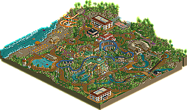
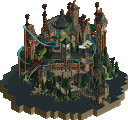
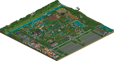
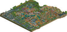
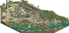
So glad you are still building. I was a little worried after your hiatus. This is definitely your best work thus far, and I think it shows how far you've come in composition. Keep up the great work!
This is a very cool little water park! There is a lot of atmosphere there and your use of colors helped a lot in that. I also really like the foliage and landscaping here, smart use of that steep building block as cliff!
Kudos for making the waterpark & beach feel very much alive. The rides are cool, but I'm a bit disappointed that the launch part of the water coaster is almost completely hidden away. For me as rct viewer but also for the POV of the rct peep. I think that should've been more of an eye catcher.
The rapids seems fun too and has a very nice station. Bit weird that the big drop is so close to the station, the splash part is even a bit too short because the boat still rages into the station. I'd be more aware of that when making future water rides
Overall very nice and cute park.
I loved this. Reminds me a lot of older tropical styles we used to see on NE, and I'm glad someone's bringing that back. I also love your foliage and am a bit confused why you were interested in tutorials on that? You don't need it.
Nice job. I especially liked the queue line of the main water coaster.
What I am not a fan of however, is your unnecessary stacking of track types. Imo it makes it looks a bit messy. Don't you think the second screen looks a lot cleaner than the first one, for example?
Attached Thumbnails
-Scoop: Thank you, much appreciaited
-Fred: Thanks for the feedback, The coaster I based it off had a launch inside the mountain so I didn't really think twice about it. You are right though, in retrospect I wish the launch would have been more prominent. Also good point on the river rapids, I didn't even realize the speed until you pointed it out haha
-Posix: Thanks for the comment and thanks for looking over the park before i submitted it.
-Faas: Thanks for the comment, at the start of the project I took a look at how the coaster looked stacked and how it looked unstacked and I decided the I liked the stacked better although its a little glitchy
really cool and a testament to your personal style! only thing I'd say is when building water rides, be mindful of the run outs after the drops, i think pretty much all of them where too short if you're looking for a realistic approach
-BG: thanks for the comment! you're right, I should pay more attention to realism in my rides. Thats something ive always struggled with
defs some of your best work yet. nice tropical atmosphere and I really dig the central structure that the water coaster interacts with, although I do wish you'd back off a bit on the tan/green color scheme for everything. My favorite bit may actually be the rapids station, but the park composition on the whole is lovely.
Congrats on the release!
As always, really wish I could tell if you submitted this as a park or a design. Based on the name I'm guessing design for the main water coaster, but not 100% sure.
Overall, I think you've shown great skill in execution of your ideas and composing the individual components of different rides and areas. The landscaping throughout is really top notch, I love the use of the steep roof piece and the way you've incorporated that with rides like the main coaster. Foliage is excellent and uses open space really well. I often get carried away with my underbrush and leave nothing flat, heh.
I definitely get the throw-back vibes that posix mentioned. It feels very much like late 2000s realism where the focus was still on marco composition, but some detailed realistic elements were starting to seep in, often in less-than-realistic ways. For example, some of the park infrastructure like 'staff only' areas feel a bit odd.
I also got the impression, seeing some of the screens you posted here and there, that this was more of a build-as-you-go project that developed naturally? I don't see that as an issue at all, as it affords an opportunity to grow and experiment with different things. But, I think it shows a bit in the final product, like the odd juxtaposition between the heavily thematic main ride and the more simple 'resort' buildings around it. While I don't think it's a major issue for this park, I think a natural next step for you as a builder would be to more carefully consider the overall context of your park in planning it.
I hope that makes sense and doesn't just confuse you, heh. Overall, the quality of execution here is great and makes me excited to see what you do next! Congrats!
-Cocoa: Thanks for the comment, ill keep that in mind for the next project.
-FK: Thanks for the review, there is quite a bit of useful info in there and I appreciate that. This project was a design submission, I probably should have stated that clearly haha. And yes it was a build as I go park, it was more about having fun with the game as a way to get back into it then anything else. I have just started a newer project in which I've completely laid out positioning for all of rides and buildings prior to placing any scenery so hopefully my macro will improve a bit with that.
This was a joy to look at. You're definitely improving rapidly and I feel like everything you release will just get better and better as you develop your style. I do agree with cocoa's comment about the color use in some places but overall it didn't bother me that much. I think my favorite part is the pool area near the beach, feels very spacious and clean but that didn't stop the atmosphere at all, and the area still feels warm and cozy like the rest of the park.
As I said on discord I think this shows a lot of promise, and I encourage you to keep going and develop your style further!
-Leon: Thanks for the comment, I appreciate the nice words
Still have to check this out in-game but it looks pretty nice. Congrats on design.
Although I have to say, the absolute worst RCT thing in 2020 has got to be those 4:1 diagonal slope blocks. I've yet to see an instance where they look good.
-csw: thanks! I'm not entirely sure what piece your talking about? the ones I used for the cliffs?
Love this! You're getting so friggin good....
Architecture is great, especially the castle around La Serpiente, dang that's good. Loving the shapes and colour mix here a lot. The other buildings on the map, while good, feel a little boxy perhaps.
Bothe rides are pretty cool, but like said here aboth, the splash zones are waaaaay too short. Especially on the rapids, you come crashing into the station. Not healthy methinks!
Kudos for this great little slice of park though, keen to see you do more. You have a distinct style that I really like.
-Jappy: Thanks for the comment, great feedback too. I'll keep it in mind during my current project