Park / Domovina
-
 19-October 20
- Views 27,128
- Downloads 594
- Fans 4
- Comments 33
-

-
 77.50%(required: 70%)
 Gold
Gold

Jappy 85% Scoop 85% SSSammy 85% CoasterCreator9 80% posix 80% Xtreme97 80% chorkiel 75% csw 75% RWE 75% Liampie 70% nin 70% WhosLeon 70% 77.50% -
 Description
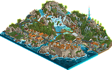
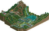
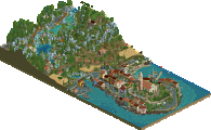
"Croatia - my homeland - Moja Domovina. From the falls of Krka to the vistas of Mount Srd over the Fortress Lovrijenac, a land as beautiful as any in all time..."
Get just a glimpse of these many incredible sites:
- Blaca hermitage
- Igralište Batarija (Trogir soccer stadium)
- The incredible Krka falls and lagoon
- The boardwalks of Croatia's beautiful Plitvice and Papuk nature parks
- The seaside towns of the Istrian peninsula
- The Fortress of Dubrovnik and the cablecar to Mount Srd above -
4 fans
 Fans of this park
-
 Full-Size Map
-
 Download Park
594
-
 Objects
465
-
 Tags
Tags
![park_3122 [MM2014 R1] Weise Stadium](https://www.nedesigns.com/uploads/parks/3122/aerialt2773.png)
Summerstorm:
Nice entry. The main tower was maybe a bit too bulky, but I liked the final element of the coaster.
Sjleme Mountain Park:
Not bad, nice swimming pool, but the tower/monument aspect could have been a lot better imo.
Pula i Hrvatska:
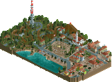
I've been to Pula and you did a nice job recreating the atmosphere. Also nice that you've fit a coaster in this park. Architecture in the city feels very Liamesque. Great TV tower.
Domovina:
I didn't like this as much as others seem to. The main culprit is the palette, which makes it looks like everything is made of plastic. This is especially true for the cathedral. It's like the whole park is wrapped in cling film in the bright sun.
Rovinj i Plitvice:
Lovely entry, but apart from the cathedral it didn't remind me of Rovinj much (having been there as well). Great landscaping and the new waterfall objects are awesome! Also bonus points for the diagonal buildings.
Ended up voting for Rovinj and Pula.
Well I'm not gonna review or vote for my own park, so here goes for the other three.
Sjleme Mountain Park:
Pretty cool entry! Love the size of the mountains, and the swimming pool as well. What a fun idea. I didn't like the foliage though, that could've been improved.
Pula i Hrvatska:
Croatian Budapleasure without the park? In all seriousness, really like this entry. The archy feels real, like you could walk around in it. It reminds me of my holidays in Southern Europe. The coaster side of the park looks a tad on the dark side for me though.
Domovina:
I love the amount of stuff you managed to include in here. The town is great, all very nice and compact. Lots of little nooks and crannies to explore. I didn't like the water though, especially around the swimming lagoon. Too much textures, patchwork and even glitches for my liking.
Rovinj i Plitvice:
Fantastic entry. Really well done town and landscaping. Those waterfalls are now my favorite. Love the object creation going on here Tols, looking forward to more! It could have used a little bit more movement though imo.
Awesome round and great competition for Leon and me!
Summerstorm:
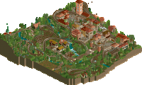
Really nice idea with the historic take on the theme, also with going more into the rural direction, not doing something with the coast. That said, I like the rural half of the map more that the town half. The town is lacking a little the small grain details to kick it off into being lifeful. I'm speaking of lamps, hanging cloths, maybe peeps/frozen staff, goods at the open stalls. What I'm saying it feels too clean for a medieval city. I think trying to work with additional ground texturing/decals might help already. The archy is good, feels mediterrean, also the path work going up that hill is convincingly done. The tower is good, but it's standing on a little thin basement. The houses on the backside of the lifthill are my favourites from the town I would say. Another thing I have to criticise on the archy: not every piece of wall needs a window. Think of where windows make sense, what walls might be bearing walls. What I think you did great was the texture/tiling work on the roofs. Best one of the whole round. The patches of different color feel totally real and nothing random, like actual repairs. Well done!
Coming to the rural side, as I said, I thought this was the better part of the map. I'm liking the roman ruins peeking through here and there, also the orthodox chapel is really nice. I think you just created a convincing landscaping also with the path winding its way through. I have to agree with others that the bumper cars don't work in 2020 anymore.
This is my favourite part of the map, albeit being on the map edge. That building is very simple but I mean, that's what rural houses are. Feels very natural, also the stream shining through the trees in the background works really good.
Sjleme Mountain Park:
Nice entry, but I think it could be a little more refined. I think the main problem with this entry is, that it doesn't really bring a lot of Croatia with it aside from the fort on the hilltop maybe where I think you have some real life inspiration for. There is a lot of generic stuff on the map, the centerpiece being a huge green box. This doesn't help a lot to bring a theme across. I liked the interior of the swimming pool, mainly because this is the most detailed part of the map, sadly covered by the roof. I'm not convinced by the green glass color, seemed like moss. The hilltop fort could be a little more detailed and also have more focus, I think that would have gone also more in favour of its landmark purpose. Make it a little bigger, also some refining details on the walls like roofs and crennelations would have elevated this already.
Regarding the RMC, I don't care much about it, I think others have already stated that it's going way to fast through the inversions. I liked the side with the alpine coaster, it looked well done, also the foliage on this side was a little more convincing apposed to the tree and high grass spam on the mountain. I suggest for forestes to take a look on real forests again, shrubs and bushes should go to the outlines and in the inside I would go with trees only. Also not every tile needs a tree, make some open areas (where is place for bushes again). As said, this is better on the other side of the map. The only negative of the alpine coaster was the almost non existing station, it looked a little halfhearted. My favourite part was the waterfall/stream going down the mountain.
One last thing I want to say is about the car traffic, it's nice that you include it, adds nice movement. But why do the cars make those unnecessary s-bends on straight streets? That was a little disturbing and put away from the added realism.
Good effort in total!
Pula i Hrvatska:
Unsurprisingly this is my favourite entry of the round. The townscape is almost perfect. Spacing, buildings, texture work, details. All done very good. The stacked combination of the window with the frame and the closed shutters is great. The ground levels of the houses are nice, my favourite being the ATM in one of those walls I think (although it would be better to have it on the very side of the building I think. Also the Bistro Alighieri is a highlight. Awesome use of awnings.
I think the only thing not working are the satellite dishes, they are way too clumsy imo. I'm also a fan of the waterfront with the colisseum in the back. That obelisk/pillar is placed perfectly. Also that ugly pizza stall feels exaclty like what you would find in a touristic spot like that. And wtf, that map sign, gorgeous. I feel set back to holidays, which especially this year is even more welcome.
The second half of the map felt like a 'we are running out of time' half. Lots of tree spam (I'm a fan of that new tree though). The brutalist sculpture is cool though. The TV-tower by itself is cool looking but I don't feel like it adds much to the theme. Here the satellite dishes are not so bad working, mainly because of the change in relative scale I think.
Domovina:
I'm with Faas here, sadly. I'm not a big fan of this. To me large parts of this entry are kind of messy. In most parts it's induced by the palette which has very strange contrast behaviour. I don't think the orange for the roofs works. It's so dark and also goes more into a dirty direction. Looking at reference pictures of Dubrovnik I don't get the same tone impression from it. This looks like the situation on a rainy winterday maybe. The brown you used for the archy also has some contrast problems but that's not as grave as the roofs. Also, on the rocks it works really well. Another point on the messiness is the water, especially at the waterfall. I appreciate your effort to try to get the different colors of the water with the two new objects, but the result are sharp edges everywhere. Also, this object water causes some kind of grain that you don't get with normal water.
Ok apart from that, there is of course lots of stuff to like in the park. The church/cathedrale is architecturally stunning. Well done, but maybe a tad small. The whole fortress archy has a good form, and especially the fortress walls itself. The archy on the other side of the river is a bit weaker and heavy texture mashup (on individual buildings even). The bike rental station is cool, though. I like the futsal field, even though it seems a little unconventional. Going up from there to the national park area it's a bit sad to see no peeps (or only exhausted ones there). On the other side of the map I'm a fan of these water front buildings
Especially that metal rooftop bar (I guess?) put on top of the house is cool. I thinks that's the strongest part of the map. Only the street is a but lacking here, I would have wished for more curves here.
I think I'm going to write on our entry after the voting something maybe.
He who travels has stories to tell!
Round 4 - Croatia: Results
With only five entries, it was still a close race between a clear top three! Fourty-one votes were cast, and the majority of these went to Tolsimir and WhosLeon*! In second place, ][ntamin22 and In:Cities narrowly beat Liampie and Sulakke. Congratulations to the winners, and congratulations to all for submitting.
Find a table with all entries and their respective ranking and scores below. The total score has been calculated using the following formula:
Total score = objectives score + quality score
Ready for Nepal?
* Since WhosLeon already qualified for the final in R3, together with AvanineCommuter, he now holds two tickets. This means that WhosLeon can play in the final with either AvanineCommuter or Tolsimir; whoever gets left out is allowed to pick a new partner for the final.
awwww snaaap leonardo
congrats boys
Grats to tolsimir to getting in to the finals. Congrats to all the participants of the round for making some sweet maps as well.
ugh that means we have to face both an AVC park AND a Tolsimir park in the finals haha
Great stuff!
Sjleme Mountain Park (Coaster-Geoff and RobDedede) The main focus of the map is obviously the RMC and I while I do like how it winds its way down the mountain with smooth, flowing motions, the speed of the train as it gets into the second half is absurdly fast. The castle at the top certainly fits the monument objective and looks like a pretty solid recreation so well done on that. My main issue would be the foliage looking a little off, mainly with the use of the custom dark brown colour which really doesn't fit the tree trunks in my opinion, and also you could have tightened up the number of colours used in the grasses and flowers to give a more cohesive look. Overall a solid entry - it shows a good deal of growth, and I think it met all the objectives very well.
This was a really creative entry and not at all what I was expecting from a Croatia round, and going inland was a good choice to distinguish your entry from the others I think. The spa building is pretty neat, though the entrance seems somewhat out of sync with the rest to me, and I would have loved to see those town style buildings at the edge of the map continued across. The inside of the spa is pretty nicely decorated too, and while normally that saturated green foliage doesn't work I think here it sort of adds to the artificiality which fits in a sense. The billowing smoke object is horrid though
Pula i Hrvatska (Liam and Sulakke)
Been waiting for a more serious Liam entry and even though you admit that you were guys were short on time it still turned out pretty great, and feels like a nice continuation of the style you've been developing with Budapleasure and DKS, with a bit of Forum's influence in there too. I think the way you structured the map was genious, with the colusseum at the center flanked by the dense cityscape on one side and the forested area with the coaster on the other side to balance it. The architecture is stellar of course, and you've managed to capture a number of the Croation influences quite nicely. A favourite of mine has to be that little yellow tinted building on the map edge with its green accent poking through, and the bistro is another. The woody feels very classic and is certainy well laid out but perhaps not as exciting or interactive as your previous efforts. I'm also loving the use of the spiky tree selection around here too, gives it a more unique and purposeful look than you'd normally see for a forest. I also appreciate some of the nods to the more recent history, particularly the brutalist monument on the hill there, and the TV tower is the best one of the round I'd say. Excellent work.
Summerstorm (MK and Jappy)
This is a cool change of pace for this round, another that's perhaps a less expected route to take with the rural period setting, and makes for a neat park. The woody has some very strong moments in the layout such as the fly-by through the town building, but also a couple of awkward spots at the mid-point, in particular that double dip over the river. I found the town area of the map really enjoyable, some of the best architecture either of you have shown and a lot of the medieval influence present. I also liked how well it worked with the landscape and somewhat conceals the height of the coaster in doing so. The rural half of the park is obviously quieter but I think that works in its favour as the coaster is given the full attention of the map here. The farm buildings are very cozy and the aqueduct and church punctuate the landscape nicely. Not too keen on the top spin ride which doesn't really work with the theme well, though it does maintain the more classic RCT feeling. Unfortunately I also don't get what the monument you were recreating was meant to be, so this didn't meet the objectives in my mind. Nevertheless a pleasant entry.
Rovinj i Plitvice (Leon and Tolsimir)
So it looks like the Leon/AVC/Tolsimir triangle is complete, and you guys did a stunning job. I was a bit surprised by the big church organ sound upon opening this park, but it sets the scene with the gorgeous church front and center. The peninsula town provides a really picturesque setting too and I think typifies the mediterranean atmosphere with its architecture and the little details throughout. The use of the 2x1 off-diagonal walls is really impressive as well, they fit in perfectly with the harbour wall and help the park break the grid a bit more, though they do take some getting used to. The other half of the map is perhaps a little loosely connected to the town but the waterfall scenery is equally beautiful. The new objects you made feel a lot more realistic, and should definitely open up the field more in terms of water effects. Not a huge fan of the grey rockwork since the textures can often blend in a bit much and create issues with their depth. The bridges are really wonderful however and I like the more serene approach to this area and the atmosphere it gives. In the end this ranked among my top 2 with Domovina so congrats on the win, looking forward to seeing what you guys cook up for the finals!
Domovina (][ntamin and Josh)
So glad somebody decided to tackle the Dubrovnik style, and it seems you guys have combined a number of other Croatian landmarks for this map, in much the same way as Rovinj did. The fortress is fantastic, I love the use of the steep sloped roof pieces for the base and also how it's continued among other buildings on the map to tie them together visually. The rockwork is superb as well with the use of layered colours to achieve that weathered effect, and the little hidden beach next to the road is a great smaller detail. The futsal pitch nestled amongst the rocks and fortress elements is another highlight of the map, and the neighbouring town is lovely as well. The waterfalls make for a great scene with the footbridges and the visitor center across from it, but I find the landscaping work for them a bit too messy especially with the little corners of the waterfall objects sticking out poorly. One thing I really love about this area though is the placement of the bobsled and the way it passes over the aqueduct. I think the main thing holding the park back for me was some of the landscaping looking a bit undercooked in spots but the rest is really strong work and definitely ties with Rovinj for the best of the round in my eyes.
Things I enjoyed on each entry:
Pula i Hrvatska
Liam/Sulakke
- Coliseum looks great. Love how clean the surrounding path/roads are as well.
- Shoreline looks natural. Great blending.
- Orange flowers are great
- Hillside Bunker is a nice touch. Love the pathway winding through the woods.
- Bistro Alighieri is great. Curved windows and bright green work well.
- The form of the white church is very nice.
- The Roman Ruins "ride" was very cleverly done.
Summerstorm
MK/Jappy
- Harvesting ride was a fun idea. Love the yellow flowers in the field.
- The little red-roof buildings /ruins in the field are so believable. Great work.
- Cascading aquaduct is one of my favorite things on the map. Absolutely love how it connects the streams and interacts with the coaster. Very believable.
- The stream is just so well done. Great use of rocks and foliage on the shores to hide the hard edges and make it look more natural.
- Really love how the peeps are queuing to attend Mass. Very clever little corner.
- That one green building with the red roof and open doors that the coaster passes through is just so great.
- Statue with the light blue flowers around it is awesome.
- Excellent elevation changes and staircases in the town.
Honestly a very underrated entry. Tons of great little details in this map that are executed just so well. Great work.
Rovinj i Plitvice
Leon/Tolsimir
- The church bells at the start are just awesome.
- Purple flowers balance really nicely with the purple building nearby.
- Hanging road signage is top notch.
- The elevation changes of the roads/paths of the main church hill is just so well done.
- I'm a fan of the water color.
- Multicolored toilets on the beach with the peeps swimming. Honestly all the little details of the buildings/rocks/peeps along the shoreline are great.
- The random knight standing guard on the shore.
- The plaza with seating and the little fountain. Also enjoy how the power lines are connecting some of the buildings. Very believable.
- That building with the curved balconies and green awnings. So cool.
- Obviously the waterfall objects are a standout.
- Grey rocks may have been a little overdone, but I like the overall aesthetic they create.
- Little cave/tunnel at the top of the waterfall.
- The paths in general are just excellent.
Sjleme Mountain Park
Geoff/Rob
- The awnings for this building are just great. Love how wild you went with the designs! Fantastic.
- Man this RMC flies through the layout haha. It looks awesome the way its positioned next to the river, but i think it might kill someone in real life. The launched lift is so cool though. Love the little archway above the main path.
- Station for the Alpine Coaster is just great. Such a nice little scene with the open grass and flowers/tree, and the small bit of water along the building.
- That great little yellow geometric design on the side of the building next to the red/white slide is so cool. Always a sucker for this sort of stuff.
- The roof for the indoor waterpark is just so good. Awesome job there.
- Additionally, the pool floor is really interesting. So cool.
Glad that we got to see some incredible entries this round. Congrats again to Leonardo and Tolsimiranda for taking first place. Well deserved!
Pula:
Cool entry that felt very slice of life. The architecture felt spot on and was really the best part of this entry in my opinion, even if it felt a little under-detailed in the current meta. The calmer wooded area was nice, but felt a bit off having what looked to be an otherwise rather peaceful place interrupted by a rumbling wooden coaster. The dish spam on the tower was also a bit off-putting to me, regardless of it matching the reference.
Summerstorm:
Nice little design. I appreciate the distinct areas between the serene grassy hills and the town. The way the statue in the plaza was framed from the back angle was rather nice as well. I didn't like however, how the coaster fits into everything. It felt like it kind of awkwardly wraps the town and frames it off oddly.
Sjleme:
Individual parts of this are great. The waterpark was well done, I love the take on the alpine coaster, and adding butterflies to the meadows to add some life was a great addition. I wasn't a huge fan of the colors, however, and I felt like a lot of this was rather blocky and unrefined compared to other entries. It's still a strong entry, and I look forward to what you guys will continue to build as you develop your skills.
Rovinj:
Loved the town. I think the new diagonals and low slopes helped breath some extra atmosphere into this. The water colors were also gorgeous. I'm a big fan of the wooden walkways over the falls and wanted to do something like that myself. The gripe I have with this is that the LOTR landscaping felt unrefined and overdone. Maybe it was a bit rushed? More thoughtful landscaping and this would have been a parfect non-park in my opinion.
Domovina:
GORGEOUS water. love the objects you made to get that texturing right and keep the animation. This is definitely the most picturesque of the entries. The alpine coaster above the dam felt a bit tacky and the gondola doesn't work (where's the return cable???) but it's definitely a great park. I would have liked some more attention to the peeps/pathing around where they enter the map, as it's very crowded and single file which harms the atmosphere there a bit.
Congratulations on every park in this round. It's not often when we get an entire round of parks that get an accolade and that's something special even if there were only five submissions.