Park / Domovina
-
 19-October 20
- Views 27,128
- Downloads 595
- Fans 4
- Comments 33
-

-
 77.50%(required: 70%)
 Gold
Gold

Jappy 85% Scoop 85% SSSammy 85% CoasterCreator9 80% posix 80% Xtreme97 80% chorkiel 75% csw 75% RWE 75% Liampie 70% nin 70% WhosLeon 70% 77.50% -
 Description
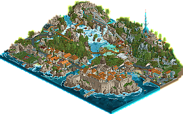
"Croatia - my homeland - Moja Domovina. From the falls of Krka to the vistas of Mount Srd over the Fortress Lovrijenac, a land as beautiful as any in all time..."
Get just a glimpse of these many incredible sites:
- Blaca hermitage
- Igralište Batarija (Trogir soccer stadium)
- The incredible Krka falls and lagoon
- The boardwalks of Croatia's beautiful Plitvice and Papuk nature parks
- The seaside towns of the Istrian peninsula
- The Fortress of Dubrovnik and the cablecar to Mount Srd above -
4 fans
 Fans of this park
-
 Full-Size Map
-
 Download Park
595
-
 Objects
465
-
 Tags
Tags
![park_3122 [MM2014 R1] Weise Stadium](https://www.nedesigns.com/uploads/parks/3122/aerialt2773.png)
He who travels has stories to tell!
Round 4 - Croatia
After the carnage of round 3, with 18 submissions, our journey has taken on a more relaxed, gentle nature. We received five submissions, and as always, only one will win. But which one?
For reference, these were this round's criteria that all entries will be judged on:
1. Your park must be themed to or set in Croatia
2. Include a tall structure; ride or building
3. Recreate a monument or landmark
How to vote
Before you vote, you have to make sure you've viewed all parks with thought and care. Voting happens through the polls above. The submissions will be judged on two criteria. First, you are asked to vote for the parks that you think completed the three objectives for this round the best. Second, you are asked to judge the parks on their overall quality - separate from the round objectives. After 72 hours, the polls will close and we will add up the votes from each poll. The submission with the most votes in total will earn the creator(s) a ticket to the final round!
Entries
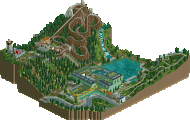
Nestled atop beautiful Medvednica Mountain, just outside of Zagreb, lies Sjleme Mountain Park. Come visit the numerous attractions at the finest mountain resort in southern Europe. These include an in-house built mountain coaster, a chair lift, and two new attractions for the 2020 season.
First, a large indoor water park that features a retractable sliding-glass roof (weather permitting). The whole family will have fun on the new bowl slide! For the thrill seekers, a Rocky Mountain Construction conversion of our old wooden coaster, Snow Monster! This coaster is the tallest and fastest terrain coaster in Europe, and only the second RMC coaster to feature a launched lift hill.
If you are just looking for a hike, the park features two trails. One up the hill to the historic Medvedgrad Castle, with tours now open for booking. The chairlift also leads to this area. You might also choose to stroll around the pristine Lake Petnja.
We hope you enjoy your stay!
Croatia is a popular destination for tourists from Europe and all around the world. It hosts rocky beaches along the adriatic coast with cities and villages originating in Roman times und the Middle Ages under the reign of the Venitian Republic. The town of Rovinj located in Istria is one of these. The curch of Santa Eufemia is its landmark site. The church's tower, visible from afar the coastline, was inspired by the famous St Mark's Campanile in Venice. The small cafés, restaturants and souvenir shops around the old town invite you for a quaint walk on the town square and the rocky promenade.
The geology of Croatia is dominated by a dry karst landscape. But in some places, rivers carved in millions of years spectacular scenes into the limestone. At the lakes of Plitvice you can witness this natural phenomenon in all its beauty. Several lakes on different levels are connected by one of Europe's biggest system of waterfalls with each other. Different mineral constituents of the individual lakes cause an astoning range of colors between the lakes -- from strong teal to deep blue.
Come and discover the great country of Croatia!
"Croatia - my homeland - Moja Domovina. From the falls of Krka to the vistas of Mount Srd over the Fortress Lovrijenac, a land as beautiful as any in all time..."
Get just a glimpse of these many incredible sites:- Blaca hermitage- Igralište Batarija (Trogir soccer stadium)- The incredible Krka falls and lagoon- The boardwalks of Croatia's beautiful Plitvice and Papuk nature parks- The seaside towns of the Istrian peninsula- The Fortress of Dubrovnik and the cablecar to Mount Srd above
Amazing round! I was suspecting this round would have fewer entries but that they'd be of incredible quality and that turned out to be true. Having been to Croatia I feel they all are uncanny and I immediately want to go back there...
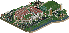
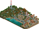
Pula i Hrvatska - this is a really beautiful entry. First off, the macro is great, I'd say easily the best of the round. It is just really well balanced and has great flow. That said, it also has some neat details and a sweet atmosphere. The coliseum-like structure is executed perfectly, looks fantastic. Also, the woodie is incorporated really well and is perhaps the best ride of the round.
Just a pretty snippet which I think backs up my points.
80/100
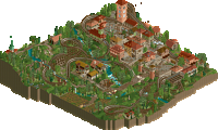
Summerstorm - Also very pretty, good mix of town/countryside here. The archy is very convincing, and I dig the Forum Caeleste kinda aesthetic, it is adapted enough to look firmly Croatian.
This square was probably the best portion of the map. Good colors and it is really neatly framed by that diagonal stretch of the woodie.
Love this little church, best tiny building of the round!
70/100
Sjleme Mountain Park - Perhaps the least refined entry of the round, but with the overall quality being so high, that does not mean I don't think it's good. On the contrary, I appreciate this more original take on Croatia, skipping the beach and heading up into the mountains, even including some snow. The coaster is really cool with a nice verticality to it, and is a contender for best ride of the round, although it is perhaps a tad fast in the inversions.
The archy for the water area feels a little on the bulky and hollow side, but the inside of it is very well done.
65/100
Rovinj i Plitvice - Another incredible submission. I love that Tolsimir (mainly, I assume) brought in his diagonal skills that he has been honing with his city park, it really literally gives this entry another dimension, and it just looks great here I think. I do feel the transition into the natural part on the other side of the road is a bit abrupt from the fairly dense town built out on the water, there could perhaps have been a few more proper city-like buildings there. But that landscape though... damn. Is that waterfall object new?? It looks AMAZING. Organic in a way that just is not possible with the various water blocks. For a multi-tiered waterfall like this, it works perfectly, and it pairs with the LOTR rocks in a great way. The one thing that will be bringing the vote down a bit for me is that there are no rides - which means I can't consider it as a design, and as a spotlight park, it'd be difficult to give it too high of a score considering it is not very large, nor does it contain any mind-blowing concepts. But what is there is of incredible quality, so I've got to reflect that in my score:
The use of a semi-diagonal shape for this harbor takes it to the next level. Together with the archy and the rest of the details in this screen, this just oozes atmosphere.
70/100
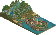
Domovina - How can you crank out so much great stuff in such a short period Josh? What a great submission together with ][. The centerpiece castle island is magical, beautiful from all angles and very, very distinctly Croatian. Nice mix of focus on the proper Croatian feel and rides here. Being European I also appreciate (and completely buy) the soccer field. Together with Ombezi, this is really showing the way in terms of complex color and texture layering for landscaping. Here it is done to an incredible level, there's almost every shade of blue imaginable but it is done so consistently it looks really good and convincing. The only issue I have is the same as for Rovinj i Plitvice - it is a little lacking both as a design (the mountain coaster is good but not outstanding and not very thrilling) and as a spotlight contender. But it'd be crazy not to give a high rating here, so I'll have to think a little outside of the conventional categories here.
This was a favorite spot - I love the strong yellow tint of the beach here!
Another great spot. I can really imagine sitting right there at one of the tables under the archway overlooking the busy marina.
75/100
So for me, I think Liam and Sulakke win overall. Even if incorporating a ride was not part of the objectives, it is normally very important for park scores (that or incorporating some very, very novel concepts), so it is hard to not take into account. I liked the balance of it, pulling off both the Croatian atmosphere perfectly while also making it a proper design. Plus, I guess they fulfilled the "tall building" objective really well with that massive tower, although I do feel that objective turned out to be a little off for this round - not very easily incorporated into classic Croatian archy, so 3 out of 5 entries have tall radio towers... they're all pretty cool though. I was also a bit surprised no-one included pictures of the building/landmark that was supposed to be recreated. It's easy enough to google the names, but it'd be really easy to throw in a reference pic as well. Anyway, great round, after seeing these great entries I feel inspired to try a Nepal entry.
Summerstorm:
Nice take on the theme. Would have enjoyed more takes on rural Croatia - or more parks that show rural Eastern Europe. But for now this will do. You had what I would call for lack of a better term the most authentic RCT. That is a pro, for me, given the amount of gimmicks this contest has seen.
Sjleme:
The green building was really cool. That section was my favorite of the map. My least favorite was the coaster. I am aware that that RMC track is the new hot stuff in town, but I personally find it quite hideous. I'll gladly await the park that will change my opinion on this.
Rovinj:
That church is really cool, as was the architecture overall. Also a good showcase of the diversity of Croatia. If I have to pick one con on this map, it would be the palette. Not a fan of the water color in particular.
Domovina:
Similar to Rovinj, I did not like the palette. For this park that issue was even worse though. Both the foliage and water stood out in a bad way because of it. Which is a shame because otherwise the map looked fantastic. The architecture in particular.
Pula i Hrvatska:
This ended up being my favorite for the round. It may have been the least risky entry for the two of you, but that does not mean it wasn't really good. Your tv-tower was the best of the round. The collisseum also looked great. To me Croatia is best-known for being a diverse country, both in terms of nature but also culturally. This map adresses that last part quite good.
Had a nice look thru 4 of the files, will comment more later. Great job for those that entered!
Can't open Sjleme Mountain at all despite about 4-5 tries. Am I the only one? It crash dumps my session on 3.1
You have to open it in develop mode. The rmc track can't load in release... Sorry for the inconvinience..
You probably need to update your game. It uses the RMC track which was merged very recently (10th October). Any version older than that will crash. If you use the OpenRCT2 launcher it can keep your game up to date automatically.
I knew this round was going to be low quantity and high quality. All of these parks have something to love and that's a great thing. Now I wish I had built
Pula i Hrvatska:
This was a nice little map. The coaster layout is very liam and screams dks. In fact this whole map screams dks. I think that "rocket ship" is a bit too bulky but it get's the job done. I like how simple the architecture is in comparison to what we normally see. It's a bit of fresh air. Solid release. I think I'm gonna give it a 65% right now but it could change before panelist voting.
Summerstorm:
I really like this entry a lot. I know I said Pula felt like dks but this might be even more so. Maybe even a love child from dks and Forum Caeleste. There are so many cool buildings on that right side of the map. I think the coaster layout is the weakest part of the map, however. the second half is better than the first imo, but I do like the interaction that the coaster has as a whole. I see a tall structure but I'm a little confused as to what the monument is. unless the tall structure doubles as both. 70%
Sjleme Mountain Park:
This is the most "parky" map of the bunch, which I'm glad to see. There are some hints of great landscaping and ideas throughout, such as the waterfall next to the rmc, and enclosed waterpark. I like the layering on the mountain coaster, but I think both coaster layouts could be improved a bit. I'm not a fan how the mountain coaster is jutted up against the map edge and doesn't have more room to maneuver. That rmc is fast... maybe too fast, but it's a blast to watch. like the previous entry I'm a little confused as to what is the tall structure vs monument, or maybe they are both. I think both of you are improving a lot throughout this contest and I'm glad we keep getting newcomers to this game and community that are willing to learn and get better. I'm somewhere between 50% and 55%.
Rovinj i Plitvice:
THOSE ANGLES!! This is an amazing diorama of fantastic architecture and landscaping. I loved the little sound detail right as you open the map with the organ playing from the church and I think that the object usage is extremely clever. All that being said I wish there was more movement, because it's kind of dead. Just more guests and moving parts in general would have helped especially since this wasn't in a "park" setting. I did vote this as the park that completed the objectives the best so great job on that. Right now I'm at least 80% but a second viewing may change that. Also even if it wasn't intended, that bell shape in the window is so cool.
Domovina:
WOOOOOW is all I have to say........ but seriously this is soooooo good. I was really surprised to see that
][ntamin22 made the majority of this too since we don't normally see rct2 work from him. That area with the church is just unreal, and the colorable water objects are just bonkers. I can see some unfinishedness in this park, but it's not nearly as bad as the Cuba entry from In:cities. In this case it's almost un-noticeable. There are so many amazing buildings that I would be here all day trying to pick out the best ones. The only criticism I could even find really is that the antennae looks more like a rocket ship than any of the other ones from this round and that the gondola is kind of floating from station to station. I also don't like the green water in both instances that it's used, but it get's the point across. The water fall is also a bit messy but it still works alright. This one takes the cake with quality hands down. 85% for sure but I might go 90% in the end.
Great job everyone on another successful round even if there aren't as many entries.
Summerstorm: This was a lovely park and had a lot of great details. Generally the forms were really strong, though I did feel like a few places could've used another critical eye. The woodie was nice, a few unusual elements but in a good way, gave it character. Some of the choices reminded me a lot of MK's Cuba entry, which is interesting given the differences in source material. Overall, I think this was a really high level entry, but it missed that wow factor that winning entries in GT have had thus far.
Sjleme Mountain Park: This park was filled with an absolute ton of ideas, which was both a positive and negative for the entry. In places, the ideas worked so well, like the idea of a waterpark steaming in a winter setting, the treatment on the bottom of the pool to give it a tiled appearance, and some of the foliage around the main lake. At the same time, it felt a little scattered and in some places, the ideas lacked a bit in execution. The coasters, for example, both are really fun for this setting, but the layouts didn't feel very balanced. The waterpark is cool, but the construction of it really clashes with the moments of more traditional architecture. If I'm correct, you're both still new to CSO and I think this is definitely heading in the right direction, but just needed a bit of concept editing to bring it all together.
Rovinj i Plitvice: It goes without saying that the angles on the pier are orgasmic. Overall, this entry has a lot of those winning moments of realistic execution that I've come to expect from this contest. The architecture along the coast is gorgeous, well composed to give that dense European style and brimming with rich details like electric boxes and cars parked along the slope and wet rock gradients. The mountains and landscaping at the back in incredible, though a few of the tree choices felt a bit off. The drama though of the water rushing over the rocks and the pathways and tunnels for peeps to explore is inspired. Perhaps my only larger criticism is the macro composition. It felt a bit like two ideas for Croatia slammed together, even if that isn't the truth. Something as simple as bringing the road that connects the town to the nature preserve (?) into the frame instead of being an 'unseen' connection would have tied it together in my opinion.
Pula i Hrvatska: This immediately feels very classically Liam but at the same time more fresh. Easy, well composed moments of architecture but it feels like a bit more crunch and detail have seeped in, maybe from Sulakke, in a way that adds a lot of energy and life to this. The woodie was nice, the radio tower was interesting in a 'ugly on purpose' kinda way. The bits of roman architecture integrated looks great and you know I love me some artsy sculptures! I feel like this has that realistic charm of the best entries we've seen in GT, but is slightly outweighed in execution by Rovinj. But I must say, some of the micro-composition in the architecture is gorgeous rct.
Domovina: I really love this entry, and I think it is probably because it seems to be trying something the others aren't. It has a more artsy and interesting approach that feels like a breath of fresh air. Perhaps missing in a few places on the execution, it has a great balance of composition, artistic liberty, and just outright gorgeous visuals. That is all the stuff that most appeals to me in a park. It also reminds me a lot of old-style Road Rally entries where people didn't try to capture one part of a country but instead craft a new location with a bunch of different parts of that country. Emergo always did that and she was the Queen of Road Rally. I'm sure others may complain about the color choices for the water, but I love it. It just looks so cool and unique. The castle is inspired and so well composed, the coaster was great and realistic without being boring. Some of the architecture felt a little rushed or simple in places, but the composition is on point and the landscaping is really gorgeous. I found this to be the most inspiring of the entries, primarily because it felt the most unexpected.
Another great round and the quality of this contest continues to astound. Congrats to everyone who entered. I ended up voting for Domovina and Rovinj in the first category and those plus Summerstorm and Pula in the second.
Sljeme Mountain Park
Oh no... another RMC in a ski resort haha... I like the idea of a resort with an indoor pool. The moveable roof of it is a neat detail and I also like the lazy river going outside, touching the lake. Must give a great view to the peeps. The alpine coaster looks fun but a bit short, the lift is longer than the actual ride. The RMC is ok-ish, the biggest problem for me is the placing of the first heartline roll. After coming down, that seems really painful to take! I do like the entrance gate to that little area with the outbanked hill there, that's great. Archy is a bit simple but the biggest downside of this map is the foilage imo. Seems just spammed without much of a thought behind. I think this is a point you can improve on. Also... I do miss a tall structure and monument?! Or am I missing something here?
Summerstorm
A real surprise to see this work from you both! Only the simple topspin placement gives it away that Jappy has built on this park. The park feels really authentic. I think you guys catched the feeling of a rural Croation village really well. Almost makes me feel like a Liam park (but the Aldi version, sorry). A lot to like, I would really want to see more work like this from you Jappy! And also from you MK
Rovinj
Wow... What an entrance it is, seeing that church and then the organ hitting off. It really sets an amazing entrance for us, the viewer. I don't really know what to say here... it's close to perfection. The atmosphere and feeling you guys realised is amazing. It all looks very believeable and real, I can see myself walking around there. Everyone who only rates a park at technical execution and doesn't really bother too much about atmosphere should watch this park! It's in the small things like the road towards the church... it's so recognazible from southern European countries. Almost real... I love how you guys managed to integrate an urban setting and a natur setting together fitting perfectly. That waterfall object is great and it helps so much creating a believeable and atmospheric setting!... Wow... Hats of to you both!
Domovina
Oh there is the Dubrovnik entry Great work guys, archy is looking great and the color choices as well. Interesting to have another alpine coaster, I think this one is the better one of those two. Great 5g covid spreading tower there guys, but where are the tinfoil hats trying to burn it?! Would be a great detail
  Also, great naming lol... I have to say the waterfalls came across a bit messy. Those object are naturally keen to glitch and together with the LOTR rocks it feels a bit too much. Also wanna point out that the guys on the football pitch are not playing futsal (that's the indoor version of football) but just regular football
  Great thing to include however and I love the Hrvatska logo thing on the pitch.
Pula i Hrvatstva
Another "Liam pulls something off quick but in fact it looks amazing" entry. A lot to like here, great archy setting a good and fitting atmosphere. Combined with some good landscaping and foliage, it's a really strong entry. Love the weird soviet statue you guys put in. The woodie is cool. I also like the Roman theatre but the carroussel in it is a bit weird to me. Lovely entry.
A really high quality round here, though for me the entry of Tolsimir & Leon is the clear winner here.
Here's a link to a video review I did: https://www.youtube....eature=youtu.be
Lovely video Sam, insightful, entertaining, and nicely bite-sized. Hope we'll see more videos like this in the future.

Usually I'd wait with commenting on my own park until the match is done, but after KaiBueno's plea in the general thread I decided to go ahead with some references and background info.
Initially I was talking with another potential partner about doing Pula, and exchanging reference pictures I was drawn towards this one:
This TV tower is near Zagreb, a different landscape than the coastal region around Pula. Snow occurs in Pula though, and in the Grand Tour it's not unheard of to sample random bits and pieces from a country and pretend they're close together. I figured we could do Pula in the snow with this tv tower in the hills in the background. My partner and I didn't start for a week, and when I did my partner dropped. I recruited Sulakke and the snow just never happened, too ambitious with just a week to actually build it.
I like it when a park's theme just spontaneously reveals itself during the process. With more time we could've emphasized what was the map's theme in my opinion. Croatia hasn't been an independent state for long or very often, usually a part of other states, like the description says. Pula like most of Croatia is a patchwork of influences from Rome, the italosphere, and Yugoslavia among other things. On this map, each era is represented by a number of structures. The coaster kind of represents the quest for the Croatian identity, as Croatians are reclaiming their land from a mess of a history. Again, if we had more than a week, these aspects would've been more apparant on the map.
Anyway, some Roman influences...
Note how the Amphitheatre sits on a slope.
The temple:
The gate:
Influences from the Venetian era:
City hall next to the temple:
Influences from Yugoslavia: (this is the least developed era on this map)
There are a lot of cool concrete monuments in former Yugoslavia, Croatia has several of them. Decided to reference this one:
Sulakke came up with the bunker:
Though Croatia is by no means a shithole, it has rough edges. To Sulakke I described my impression of Croatian public space as 'Belgian'. This horrible parking spot Sulakke found is referenced on the map:
Obviously there's the TV-tower as well.
As a general closing argument I'd like to respond to Sammy's point in his video that the city part lacked negative space. I don't think it does, the density is what makes it urban. And the low density around the wooden coaster is what makes that part not urban. Around the amphitheatre there is more green, and that is because it is situated at the edge of the old city - I think this makes for a nice gradient from natural to urban, although the contrast still exists - and I think the contrast is absolutely essential, and a good transition is there to sell it.
Compare:
I'm talking about this map as if it's a solo park, and obviously it isn't. This is my view on it, Sulakke is very welcome to add to this or contradict me.
Hope to review the other entries soon.
^ Absolutely loved seeing your references.
After digging deep the past month or so with ][ (he dug deeper haha) regarding refrences, we definitely came across some similar images. Ultimately we ended up going for southern Croatia of course - but still fun to do the research.
I'm glad that basically every entry tried a different area of the country!
loved it! really feels like you know your stuff and liked your comments.. I hope we can see more of this in de future!
This was our one and only photo reference
don't give away our secrets
jk here's the locations
Domovina is absolutely a "smash together landmarks" road-rally type map. It is mostly Dubrovnik, but he boardwalks are a common theme in several Croatian nature parks (including both the major waterfall-y ones, Krka and Plitvice) and curiously enough Croatia has multiple waterfront football stadiums, so much of the map is a croatia smoothie.
http://www.rangaadve...l-park-croatia/
This cafe outside Plitvice Lakes park was the inspiration for the nature park entry building
The windmill next to the futsal field is this one from the istrian peninsula
Direct inspiration for the futsal field, which is a futsal field because it was too small for football and I knew somebody would complain
The buildings at the top of the coaster lift are inspired by the Blaca Hermitage
The cablecar station is a direct interpretation of the actual Dubrovnik cable car station
The "Domovina" radio tower is the Dubrovnik one and genuinely does look like that. I think I got it reasonably close with the convenient perfect blue in the palette.

and here's a fun streetview image we used for early inspo that explains why all the windows are green.
here we go...
Domovina
this is to much! my brain can't handle all that goodness!
That transition from the Cliffside to the large structure Into that lagoon is just stunning! Taking your mouse and just going from the lower corner straight up to the upper corner is an rct experience I have not yet came across...
archi is magnificent and I'm just in love with this palate! I can't wait to use it myself in the near future!
if anything, on some spots it feels a bit to much though. there quite some paths and details vanishing between the buildings which is such a shame...
awesome dudes!
Pula Hrvatska
yes please!
Liam delivered once again! I'm not that familiar with sulakke's work but this map feels really coherent for a 60/40 so these 2 styles really work well together.
I like the twisty coaster a lot. has a nice flow to it and bleds great within those trees. which I think could have used some more love tbh.. foliage feels like I can expect more from you? I don't know...
the archi and path layout are really the strong stuff here. a shame that the screenshot spoiler is the best part of the map though, lol... at least for me it is..
only "complain" is the mat hing color of the Colosseum and paths... I think the structure could have popped out a bit more in an ever so slightly different color...
Thanks you!
Rovinj I plitvice
Jezus! some gamechanging stuff in here! those shoreline buildings that are darker at the bottom are amazing! just like the impressive diagonals!
Really love how that palette make the water look! how?!
Really trying hard to nót mention those waterfalls as I'm. sure they have had a fair amount of attention already, haha.
only thing missing here is some sort of attraction or coaster. I know, I know, it's not necessarily needed to make something nice of course but.. you know, it's still rct and no Sim city.
but that yacht harbor makes up for it though.. that's just the nicest piece of Harbour I've seen in this game!
Great stuff!
(oh, in name of this wholo community, thanks you for the waterfall object! ?)
Summerstorm (thank you for this easy typable English name!)
yet another amazing entry!
it's a bit pinkish but that archi is stunning! although I did not expect anything less with such a duo!
really like the foliage and that aquaduct combined with the small river.
Coaster is pretty nice to. I like how it interacts with the water features.
trying hard to find some sort of constructive criticism but it's kind hard... those sheep maybe.. not sure if this is part of a joke or something, but I'm not convinced it works, lol.
either way, brilliant job!
Damn Peeps! this overall quality just keeps rising thru the roof!
please hit the brakes a bit. don't leef us weaklings behind to much!
bit honestly, yet again some great shizzle and I love how this round again, gave us players lots of new stuff to play with in the future, like those waterfalls and brilliant new palettes!
thank you so. much for this great piece of rct y'all!
Ooh, this is what I'm talking about. Time to look at these references side by side with the game. Thx Liam, Josh, ][
I was hoping that radio tower was legit recreation, good job. Will go hunting for the niche things at lunch break. When does voting close?