Park / Timber Valley Theme park
-
 31-October 20
- Views 5,299
- Downloads 677
- Fans 10
- Comments 16
-
-
 83.50%(required: 70%)
 Gold
Gold

CedarPoint6 90% yes robbie92 90% yes SSSammy 90% yes bigshootergill 85% yes posix 85% no RWE 85% yes Xtreme97 85% yes G Force 80% no inthemanual 80% yes WhosLeon 80% no Liampie 75% no nin 70% no 83.50% 58.33% -
10 fans
 Fans of this park
-
 Full-Size Map
-
 Download Park
677
-
 Objects
591
-
 Tags
Tags
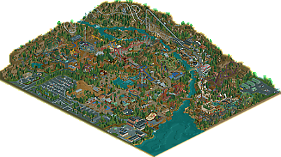
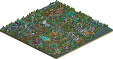
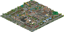
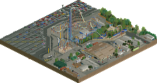
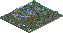
Entrance: Great intro to the park, seems well-mad, thoughtful of amenities, and sets the theme for the park cleanly and immediately.
Grizzly: Nice little GCI, but it feels a little small. The empty queue felt like an oversight? The entrance area to the ride is really well made. Love the sign, the photo building, and how sledgehammer settles in and supports it nicely.
Lumber Yard: Nice area full of flats, scultpures and nice things to look at. great path details throughout the area, but I felt like a more obvious path to get here would have been nice. The little vekoma family coaster and B&M dive machine anchor the area well, although the family coaster does feel slightly out of place amongst the higher thrill rides. I'm not really sure where this area stops, but the way you've incorporated machinery into the rides throughout is clever and adds some nice themeing and visual interest to rides that aren't always as exciting otherwise.
Denali: A good layout. Love the tunnels. Wish it had an extra helix or another interesting element in addition to all the airtime. The rest of alaska is also great. I've made my own attempt at the theme and this is miles better. Only some parts do feel a little small compared to the rest of the park.
Native America: This feels like the most dense area of the park. Dreamcatcher is a great RMC, and even though it spends most of it's time out interacting with the landscape, it doesn't feel disconnected from the park and path. Timberwolf and the Log Flume layered over each other is dense and chaotic and I love it. It's incredible how much is packed into a tight space there, but it looks great. Sequoia spire looks like a great tower complex as well.
Great release. I'm excited to see this get scored!
The amount of content in this park is crazy. Honestly feels almost like you wanted _too_ much. I love all the theming details you've realised, especially on flat rides. Tomahawk looks like one of the best custom rides ever. I'm no coaster expert, but your layouts all seem perfectly high-level realistic. I just wish you had taken a few more liberties with them sometimes maybe, and added your own twist to them, literally. Since there are so many coasters, even the bigger ones don't really work as highlights so to speak, and the composition of the park suffers. There's a certain factor of "amassment" here that takes away from the experience. Everything's fully fleshed out, but I miss more artistic character. I also think the palette hurt this as it makes the park look washed out brown-orange. Thus the atmosphere is a weird one, and holding the park back for me. I'm still inclined to vote this quite highly, for the sheer effort and skill shown.
Love seeing this top level builds from a fellow Belgian!
Tried to view it but my version of Open RCT2 is out of whack.
Absoulutely fantastic park
Positives:
+ Love the entrance
+ Very good composition of the entrance square, especially the water tower, disco coaster and game stalls
+ Grizzly is great
+ I like the restaurant next to the frisbee
+ The "Plopsa" Mack Splash/Swinging Ship combo works very well
+ Very cool building for the chairlift
+ Everything around Cougar Strike is great
+ Fan of the logging area
+ WidowMaker might not have a great name but it does have great theming.
+ Very healthy amount of family coasters
+ Treehouse Swing
+ Alaska area is very cool and feels really unique
+ Dreamcatcher is awesome
Neutrals:
+/- Torn on the Timberwolf area. Super interaction, great layouts but it feels a bit busy. Also, the fence for the flume queue is kind of an eyesore.
Negatives:
- Not a fan of the architecture of the "mainstreet"
- Timber Theatre area feels out of place
- Landscaping a biut too bary and blocky for me
My score: 85% / yes
One of the best releases all year. The attention to detailed storytelling with each ride is what elevates this for me. The theming, the queue details, the interactions, the sheer amount of research and creativity.
Just fantastic
Strange park, in that some areas are eaily your best work and would look fine in a spotlight calibre park, whereas other areas look horribly rushed. The landscaping in the Widowmaker corner of the map is pretty abysmal, and the general look in the Theatre corner of the map is Silver quality at best. But then there's also the area around Timberwolf, and all the great cranes, trucks and excavators all over the map. It looks like you threw a lot of stuff at the wall, without seeing what sticks and what doesn't. A lot of it sticks, but I wish you redid the stuff that didn't instead of rushing this park - your last park had similar issues. This one is better as a whole for sure, though. I opened the map expecting to be underwhelmed, and I ended up not feeling totally estranged by the spotlights shouts.
Going with 75 most likely, but closer to 80 than to 70. Going to sleep on it.
I took a long look at this and I was really impressed. I'm guessing this park is supposed to be set in northern Ontario based on the foliage and Josh's Tim Horton's. I go up north usually once a year and I have to say you captured the setting wonderfully. I saw some complaints about the pallet washing out the color of the park but in my opinion it adds a lot to it. I don't actually know if you were trying to capture the Canadian shield with this park but you did a hell of a job if you were.
With that being said I do with the rock work was more detailed throughout. I wish you had added rocks along the river/lake and had done more detailed cliff work. In areas like muskoka the beaches are almost completely make of rocks and it would have been incredible if you had captured that. Although I know you may have been constrained by the object limit.
That is really my only complaint with this park though, the archy is all excellent and the layouts all seem great (even though i dont really know anything about layouts). The outskirts of the park felt so ridiculously accurate and it was honestly just really exciting to see.
Really great job this is one of my favorite parks of the year, I hope this get spotlight.
I gotta say right off the bat, I'm so glad you didn't stop building. I know Terra Fantasia didn't receive the community response you were hoping for and kind of killed your will to play rct. It seemed like you were on the verge of retirement.
You determination to start on a fresh canvas paid off with this masterpiece of rct! I absolutely love everything about this park. I'm not usually a fan of realism, but you struck gold with every aspect of Timber Valley, from the ride design, coaster layouts, park flow, building construction, etc. And it oozes with atmosphere, which is usually at the top of my list to hold my interest in a park. Exploring this park makes me feel like I'm really there, I can hear in the distance screams from excited peeps, the rattle of the coasters racing through the track, the smell of the popcorn and pizza stands filling the air. I'll definitely revisit this park time and again to gain inspiration for my own parks (and to be sure, I still open Terra Fantasia, Imaginaerum and Jaguar when I need a creativity boost). Always a BG fan!
85% Yes from me. Hope you earn spotlight recognition for this beautiful project!
Solid park, BG. I enjoyed it a lot. I think there's still some refinement needed from you in regards to things like landscaping, foliage and more naturalistic elements, but in terms of parkmaking and ride design you've been killing it.
It's a good improvement over much of your previous work, and a solid entry in this trend of more North American-esque 'parks in the woods' so to speak.
Happy day to see you get +80%... sad day to see you miss spotlight by 2 votes. Killer park nonetheless. With the increase from 10 voters to 12 voters on the panel, needing 9 votes for spotlight rather than 7, makes it a tougher accomplishment to achieve. It's a spotlight among many members in the community, that in itself is a remarkable accomplishment. Great park again BG!
Congrats with the park BG! I now you hoped for spotlight and to me the park is spot quality, but the score isn't far from that. Just on the fence... the next curse Belgians have to break?! But now with 2 Belgian parkmakers recieving a 80+ score for their park gives me hope for myself
It was really cool to follow the building process of this park, which many will know, went super fast! I mean, it could've submitted a few months earlier if the RMC was merged before, that's how fast you've built (with the new lockdown I expect a new park from you released in december ). I think you really made clear improvements with this park compared to Terra Fantasia. We all knew you are pretty good with designing coasters and theming. But where Terra Fantasia felt a bit uncohesive, this park doesn't. Everything looks good and right, it all looks like it belongs together.
The park has some really strong atmospheric spots, I think the Alaska zone is the best zone in that regard. Feels so cosy and I think it would be so nice to walk around there. On that regard I also like the native American zone a lot, also really strong on atmosphere. The implementation of Widowmaker is also really good and one of the best thing's you've ever built.
The coasters are awesome. Cougar Strike and Timber Wolf are my favorites but the RMC is also dope (and it looks so good with X7123M3-256's custom made rails). Timber Wolf is really awesome with all the times it crosses itself and the all black color looks really great, gives also huge Taron vibes. The interaction with the flume is also a nice touch to it.
A lot of cool custom rides and ideas too in this park. The totem head on the drop tower, the execution of the topspin, the exevator ferris wheel,... all pretty good thought of ideas and executions. Dare I say maybe the best custom rides we've seen in the game so far?! I also the cranes and trucks around the park, all really done so well and it gives the park a nice and unique character.
It's def one of the highligh releases of this year for me, and that says a lot when 2020 is one of the best years in rct history when it comes to releases (lockdown was a pretty good measure for rct productivity and creativity). I think you should be proud of this, you def had your fun, it shows, and I'm looking forward to upcoming projects! One thing I'd like to see in a next full solo park is maybe less emphasis on the coasters, which seems weird since you're a great coaster designer, but have more focus on the park itself and other rides as well, which is also weird to say because this park has a lot of custom rides that aren't coasters. I'd love to see a park from you that has 5 or 6 coasters maximum. I think that would be an interesting challenge for you!
Congrats on this release BG. This is one of my favorite parks of the year. It is absolutely full to the brim with coasters and rides and unique sculptures and fun ideas. When you first shared it with me, I found myself coming back to it a few times to get another look.
While this is clearly a very modern execution, the style of parkmaking felt a bit nostalgic. Rather than trying to recreate something from the real world or capture a specific concept, this felt more like riffs on various coaster types with your own flair. Reminds me of old school rct where the focus was on crafting your own take on whatever rides you wanted.
My favorite parts of the park were Alaska and Native America. I think those had the best combination of architecture, landscaping, and placemaking. The interaction of Timberwolf, the log flume, and Dream Catcher is an inspired moment of rct. Also, the crammed feel to the area doesn't bother me at all, we've seen a lot of real parks make this overstuffed areas in an attempt to add new rides without taking up much space.
The sculptures throughout the park are incredible and never feel underdetailed or out of proportion. I particularly love the trucks near the diver and the custom truck sign for the family coaster in that area. The park also has a lot of great architecture that balances form and texture in a great way. The Cougar Strick station comes to mind, and the architecture in the area just behind the entrance.
For me, this is definitely a spotlight park. It held my attention, it's filled with high quality content, it has a great balance of macro composition with micro-details, and the world-building is fantastic. While I do agree a few spots are not perfect, I don't believe a spotlight has to be perfect. The panelist scoring system reflects this, with anything above 80% getting a secondary 'spotlight' vote. If the intent for spotlight was to identify only perfect parks, then it should function like another accolade and be assigned to parks above a certain percent. With things the way they are, I have no problem parks that have minor flaws getting a spotlight for the overall quality of the work. Personally, I believe Timber Valley has more than enough spotlight-level content to justify that accolade.
That all being said, I do understand what may have seemed lacking for some. I agree that the landscaping had a few problem areas where another level of detail would have been helpful (primarily near Cougar Strike and the back of the park. I also agree that the harbor/theater area could have used a refresh on some of the buildings that felt awkward or boxy. For me, these don't strip the park of being spotlight-worthy, but they kept the park from being above 90%
Congrats again on this momentous release BG. It remains a favorite of the year for me and I think will have a bigger impact on the community than the score would indicate.
Just trying to bump this a bit, because this park is seriously fantastic
you just want to flex your 1%, admit it