Park / Canary Mines
-
 22-October 20
-
 Canary Mines
- Views 6,123
- Downloads 787
- Fans 8
- Comments 23
-
-
 81.00%(required: 70%)
 Gold
Gold

bigshootergill 85% no chorkiel 85% yes In:Cities 85% no robbie92 85% no saxman1089 85% yes CoasterCreator9 80% no posix 80% no RWE 80% no SSSammy 80% no Xtreme97 80% no Scoop 70% no nin 65% no 81.00% 16.67% -
 Description
"This abandoned mine already has the makings of a tourist attraction with its minature railway and a pair of vertical drop roller coasters"
-
8 fans
 Fans of this park
-
 Full-Size Map
-
 Download Park
787
-
 Objects
483
-
 Tags
Tags
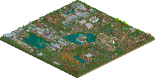
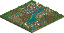
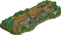
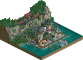
ok this is a breath of fresh air, and all the copied controversy aside this is your most inspired work to date I think. great stuff and i genuinely think this'll give you that green border
I love these recreations. Very well done !!
congratulations on the release! I'll leave a full review later, but from first impression it's got a great atmosphere and my favourite part so far is the mine train and surroundings.
Congrats on a great release! What I think is so successful about this park is the sense of fun and excitement that lays over everything. Reimagining rct scenarios is such a joy because it has the nostalgia of the original game with the improvements in objects, layout, and design that we as a community have made in the past 20 years. This park is no exception, and manages to be very referential but also clever in how you've expanded and reimagined some of the ideas. Having recently played through some CF scenarios, it's funny to see the similarities in how I built the park and how you've designed it here.
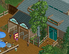
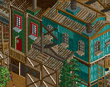
Overall, I think the coasters, macro layout, and unique ideas are the best part of this park. I love the safari-type ride, the woodie and mine train are spectacular, and you've even managed to spice up the original dive machines that were inherently pretty boring in vanilla. There are a few places that I felt your architecture lacked polish, but overall it was pretty stellar. In particular I loved the mine train station, the entrance area, and some of the smaller shops and buildings throughout.
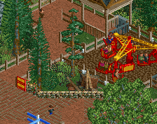
Part of what makes this park is a lot of smaller clever ideas and details. I love the throw-back squirrel topiaries, the sidewalk signs, the custom entrance signs, and the swinging doors at the exits for rides.
The only real criticism I have would be some of the surrounding 'rugged' landscape being a little too sporadic. Some of the rocks and pushes and how those all got integrated felt like a good idea but a little too random. I think there is a lot of organization in chaos and rct requires a really careful hand to capture that. As I told you before, I'm also not a huge fan of the default cabins thrown in, but that is minor.
Overall, I think this park demonstrates great execution, great macro ability to put together and expand upon ideas, and some really clever and smart ideas.
I'm old fashioned in preferring the idea that parkmaker should identify someone with a consistent quality across a body of work, not just one great release. But, by either standard, I think this is deserving of parkmaker, in the realm of an 80%+ gold. Congrats again on the release!
Congrats on another release Jappy!
Lovely work, Jappy.
I absolutely love the atmosphere around the river rapids, absolute highlight of the park for me - feels super vibrant and fun.
Overall, I think this park maintains your macro style but in a bit more of a cohesive manner. The ride design is absolutely fantastic, and I think your architecture really suits this style of park nicely. Feels like a very believable and fun park to be at.
Great work; everything is just really solid here but still in your style.
Awesome stuff Jappy! Really like the overall atmosphere and that woodie is just sweet!
Congrats on finishing your second big solo park of 2020. You really have phenomenal pace! I'm not into scenarios at all (I know you included it but I don't really care, sorry) but the park itself doesn't need that flashback to that scenario to be enjoyed. It is really a strong atmospherical park. And with every release you are also getting better at technical execution, CM really has some of your best archy (and it seems like your new project will even surpass that).
I could say I like the coasters, but if I'm correct they were made by others. I think it would be nice if you noted that down in your readme or in-game. Timber Wolf isn't my favorite woodie, it has too much parralels. The mine train and divers are the highlists on coasters. The mine train is fantastically themed and the duelling aspect of the divers is awesome. Also great interaction there.
The flume and rapids are also 2 highlights that deserve to be mentioned, they are so well composed that it's enjoyable to view as me as for the rct peep. I also like you finally started to do some custom rides but please... bright blue and yellow don't match I said it before and I'll keep saying it until you stop that!
I still think the shoot-the-ducks game is genius. The wildlife tour is also a great addition and the walkway in between is also pretty neat. Really a park to be proud of. You wanted to create a park heavy on atmosphere, and it pays off. The park clearly has a lot of heart in it. Ironically not building panel based and doing what you really want might give you that green name
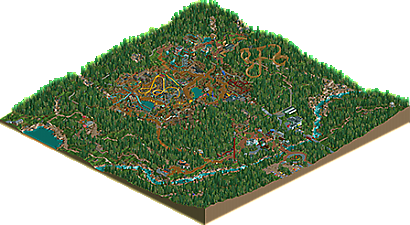
Congrats on the release. This is a very unique type of park that tells its own story, which was fun to see and something I want more of. The winding path around the mountain into the park is just such a cool experience, a great piece of parkmaking, and a beautiful sightline, as mentioned on Discord.

However, this park also had a really strong emphasis and reliance on its landscaping and environment, which I did not find particularly well done. There's a lot of messy, mixed textures in places where path supports, wooden land edges, stone retaining wall, and wooden fence are all mish mashed together without rhyme or reason. Some unity and thoughtfulness about textures would have gone a long way. Additionally, the floor of the mine was haphazardly strewn with random rocks and shrubs, which felt like an attempt to fill the space rather than to craft the space. Organized piles of rubble, foliage coming up along drainage lines or natural wells, and more care in general to the objects that are being put down would help elevate that aspect immensely. There's also a lack of drama to the landscape. Both the mine and the mountain felt really shallow and not too impressive in scale. For that matter, the mine didn't feel too much like a mine either, rather just a dry depression in the landscape. Doubling the height changes, and intentionally sculpting out tiers into the mine--as well as putting more planning into how a park would fit into a space like that--would have been the one last thing I think that would have been a major improvement to this park.
I know I put a lot of critique into this, but that doesn't mean this park isn't great. There's tons to admire here. The genius idea of the animated duck hunt game. The excellent woody layout. The entire area around the woody and the rapids. The unusual and funky rapids ride itself. The mine train. The dive coasters and the way they rest over the teacups/twister ride and gracefully interact with the landscape. Machinery sculptures. The architecture fits the theme really well and is very believable. Good job with this park, seriously.
This is great! Love the facades and use of color. Awesome!
Pros:
+ Cozy entrance area.
+ Cool safari/wilderness area.
+ Good macro landscaping.
+ Runaway Railroad is good.
+ Cool double diver layouts.
+ Very good atmosphere.
Cons:
- Somewhat awkward footpath to the park from the entrance.
- Screwbatt and Red Devil being placed so far outside the main loop isn't ideal.
- Brown path coupled with brown earth in the centre of the park makes it seem hard to read.
- Not sure I like the contrast of the very white and bright buildings in the rafting/woodie area to the more muted mine buildings.
My Score: 75%
Loved this park! Initially I thought it was an odd setting, but the more I looked around and explored, I actually really came to love the creativity in building a park in these surroundings. You nailed the ride design, fantastic work.
It has a unique atmosphere and a new style of parking making, you've really elevated your skills and this park showcases it. This is probably your first park that if I didn't know advance that you built it, I wouldn't have guessed you were the creator. The main reason is you've stepped away from your Jappy-style buildings, it's a new type of building construction that you've employed, and it's welcomed change. Love your style either way, don't get me wrong, but something different is always appreciated.
Mad skills Jappy! Keep the parks coming!
I loved this and I think it is your best work to date.
I loved the station area of the wooden coaster. Simple and effective, and I would advise anyone to follow the train around.
Well done, 80%.
Awesome job with this Jappy! I don't think there's any part of this I didn't like. As I said on Discord, viewing this park was probably the first time I've opened the game in a month, and it makes me want to play again. Congrats on finally getting parkmaker, a well-deserved reward for one of the best people and builders on this site.
Congrats on the gold and the parkmaker Jappy!
Congratulations on the score and parkmaker status. Easily one of my favorite parks of the year.
Brilliant work. While not necessarily being a step into a completely new themeing direction, it's definitely a breath of fresh air and still feels very inventive.
This park reminds me of some of the brilliant details of Dig Site mixed with the atmosphere of Dimi's old work and just that general charming Jappy style that is so full of live and quirkiness. Great job, the overall park layout is so fun and different, and this is definitely a memorable release imo. I would've voted this 80% myself.
Congrats on becoming a parkmaker finally, Jappy. Really well deserved for all these brilliant projects you've been pumping out!! I'm happy for you.
First off Congratulations on the gold and parkmaker, even with all of my discord flak. I do owe you a proper review on why I scored this way.
I do actually like the park and 70% is still a gold. The glaring issue for me is exactly what itm said about the foliage and landscaping in general. You have these opportunities for some amazing picturesque moments, but most of it is a repetitive mess of trees. I'm also not a fan of how only half of the map is the park and you have to walk half the distance of the property before you get to any main attractions. This is poor park planning in my opinion. While I can't get behind the idea of a safari in this setting I do respect it. I think it was fairly well done all things considered. The wooden coaster and Divers were pretty cool and I liked the idea of being able to see the whole park from the top of the quarry. Very unique in that aspect. There were a few clever moments like the game hut with the bicycles as well. Great job regardless of my score.