Park / Vampire
-
 28-May 07
- Views 4,618
- Downloads 572
- Fans 0
- Comments 29
-
 No fans of this park
-
 Full-Size Map
-
 Download Park
572
-
 Objects
157
-
 Tags
Tags
downloads: 256
Richie Offline
No promises, but if i was to remake this could i enter it for design?
Permission granted.
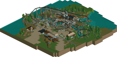
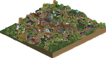
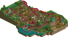
This is an interesting example of the style of the times. The buildings are still chunky like they're PT2 bench and the landscape treatment is delightfully old-school, but the microdetail is starting to creep in. I think the back half of the layout is a little unconventional, but overall it's a very nice compact small-inversion invert.
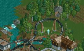
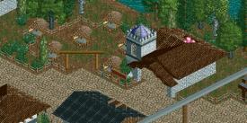
Richie uses classic time-tested foliage ideas here. Pick a selection of similar color and textured trees, then blob them up to form backgrounds that nicely frame the rides, path, and buildings.
There's some surprisingly evocative architecture here despite it being unfinished and unrefined. I'd love to see Richie return with current levels of architecture polish.