Park / Oregon's Palisade
-
 29-September 20
- Views 3,410
- Downloads 654
- Fans 2
- Comments 9
-
 70.00%(required: 65%)
 Design

CedarPoint6 75% CoasterCreator9 75% In:Cities 75% Xtreme97 75% bigshootergill 70% chorkiel 70% Liampie 70% RWE 70% Scoop 70% geewhzz 65% csw 60% posix 60% 70.00% -
 Description
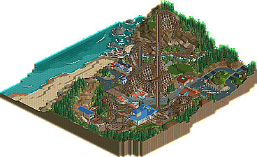
Welcome to the coast, where the air is salty, the water is ice cold, and wooden roller coasters plunge down cliffs and weave through the landscape.
-
2 fans
 Fans of this park
-
 Full-Size Map
-
 Download Park
654
-
 Objects
360
-
 Tags
Tags


Great to see this released!
Overall, I think this is of great quality. The coaster is fantastic, imposing and fast with many exciting elements and moments, while being elegantly embedded in the landscape and overall very aesthetically pleasing. Another very strong aspect here is the landscaping. I especially love everything that has to do with water - the stream is beautiful, and I don't know whether it has been done before, but that water splash object as waves crashing against the rocky shoreline works incredibly well! As for the archy, I think it looks good and credible without any obvious flaws. The coaster station fittingly stands out as a bit more adventurous than the other buildings.
The only thing I feel is lacking here is other rides than the coaster, even if this is a design submission. There could have been a nice little flat tucked in somewhere, perhaps the map could even have been expanded a bit to accomodate that if you felt there was no room. "Seniors with Metal Detectors" is rad though, haha! Great idea.
Awesome submission which I hope will result in a good score for you - from me it's 75%, with another flat or small tracked ride in there it would probably have jumped to 80.
Great macro here. Really enjoy the setting, and the beach and rockwork are pretty good throughout the area. The coaster really hauls through the first part of the layout and carries a lot of speed which I enjoy. After the MCBR, the swoopy and twisty layout is a nice contrast to the first half. The station flyover and the couple of turns before the final brake run look so fun. Architecture definitely feels very coastal. Really enjoyable design.
Congrats on a great design! This was a lovely little slice of park making and really showed a very confident approach to putting together a design.
The macro is gorgeous, with the coaster swooping through the landscape, a great balance of dense landscaping, rockwork, open space, and the coastline. Really, I think the composition is the most striking element of this, it feels very mature and well planned.
Personally, I don't think this needed any more rides. This setting was clearly not a park, and I got enough joy out of seeing the coaster and the landscape around it that throwing in a flat ride wouldn't change that.
Overall, I really liked the coaster, particularly the pacing and the interaction with the landscape, which I think can make or break a great coaster. A few of the elements felt a bit awkward, and personally I wasn't a fan of the train type, but those are minor.
The architecture was good, simple and clean but well suited to this kind of locale. I love the flyover in the station and the glasswork. Also, the foliage (and again, how you've composed it) felt so great. I love the gradient from really thick bunches of pine to sparser and lighter-toned underbrush.
Perhaps my only criticism would be that a few places felt a bit out of focus, as if they didn't get the same attention to detail as others. For example, the textural elements you used on the parking lot were gorgeous. Super subtle, but very carefully done. But the beach didn't seem to have that same approach to texture. Or the rockwork where the stream meets the coast is incredible, but in other places it felt a bit blocky or missing some quarter details.
I think the care put into the composition more than makes up for this, but it seemed kind of odd for a design of this size to have some areas that felt a bit overlooked. At the same time, I fully understand and support the idea of giving the work the room to breathe and only detailing what you feel is important to pronounce, so I'm a bit torn on that.
Easily a design win for me, and I'm very excited to see what you do next. If you can make a larger park with this level of care for the composition, It'd be magical.
Stellar design, Terry. The coaster is a mammoth structure with probably one of my favourite moments of layout in a while being that curvey knot of track hidden behind the lift. The latter half has a couple of awkward points but overall it's one of the better woodie layouts I've seen.
The setting shows off some great landscaping work too, love the little pockets of empty grass amongst the more dense thickets of trees and bushes. The architecture is pretty tastefully done also, and you've given it a fairly unique look with the red and blue colours alongside the glass. The beachside buildings felt more rugged in way which I think I prefer, and make for a bit more of a natural fit for the setting but both work in their own way.
Overall it does seem to be lacking in a supporting ride perhaps, though I worry that it might have been shoehorned in whereas the coaster feels more naturally sculpted to the landscape. The little details on the beach are a nice rounding out touch, and adds that bit more to keep it interesting. You're showing a good deal of growth in the cso department, excited to see more. (but don't ditch ncso altogether )
)
Congrats on the design. I like the super clean aesthetic and the layout is pretty top notch as well. I would've liked to see more park elements though, just because it's not to believable that a coaster of this magnitude would be all by itself.
Sorry for the late review - im really bad timewiese at doing these at the moment -, but this design from you was really great. When watching this i couldnt get out comparing this with thundering sierra. I think in that aspect i would say that this design has a similar overall feeling to it, but your style seems to be more 'mature' than with your previous work.
You've showed some clean and nice minimalistic realism on this, i agree with other reviewers tho: I would have loved to see more rides, some little details, stuff to smile at... don't forget the fun!
Overall this is definitely an enjoyable release tho and it shows some promising talent. I would really love to see your cso to be put into a park submission. Keep it up, dude!
I really like this Terry. One highlight for me was the foliage - particularly the way you framed things and created gradients:
Also just a really nice mix of textures.
Another strength was the composition - I like how the coaster and landscape hide the view of the beach from the entrance, but as you follow the path down the vista opens up, with the coaster framing the view. (also in the screen above)
This design had a strong vision and executed on it exceedingly well. The coaster is great, the placemaking is spot on, and most of the foliage and landscaping is perfect as well. The one place I can gripe about is wishing there was a bit more detail along the cliffsides, as they felt bare and untouched relative to the rest of the work's great balance of detail and space.
Congrats with design Terry! Well deserved. The lay-out of the woodie is really great, I like it a lot. Great composition and also a great foliage and landscaping. It all comes together pretty good. I also think where the cliffs were a bit underdetailed. Really nice design entry.