Park / Otterdale Gardens @ Lockdown Lake
-
 29-September 20
- Views 1,942
- Downloads 447
- Fans 1
- Comments 5
-
 55.50%(required: 50%)
 Bronze

Jappy 65% bigshootergill 60% In:Cities 60% CoasterCreator9 55% Jaguar 55% Liampie 55% posix 55% RWE 55% Scoop 55% Xtreme97 55% CedarPoint6 50% geewhzz 50% 55.50% -
 Description
First off, thanks so much to everyone for their feedback. I'm really stoked to come back years later and see this place is still thriving, and even MORE stoked to finally submit a park. I started on this mainly just to get back into the game. I messed with OpenRCT's terrain generator until I got a landscape that looked interesting to use and then just went after it.
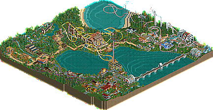
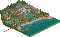
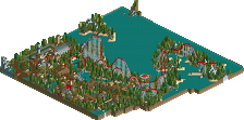
The glamorous Otterdale Gardens were constructed around Lockdown Lake and contain three distinctly themed sub-gardens: The Folk Garden, Tropic Garden, and Pastel Garden, each with their own offerings of thrills and cuisine. The park is built in an easy to navigate loop around the lake. A monorail shuttle can transport guests straight across the lake from the Folk section to Pastel section, should they perhaps desire to head straight to Overdrive!, the park's sprawling giga coaster. -
1 fan
 Fans of this park
-
 Full-Size Map
-
 Download Park
447
-
 Objects
365
-
 Tags
Tags

Looking forward to checking this out in game! Been looking forward to this one
Congrats on the submission!
As expected I'm really enjoying this park and the old school style! Curious to hear who and what you're inspired by. The entrance area is definitely of the nicest bits, but the colours in the tropical area are also praiseworthy. My favourite area is the pastel area - of course it is. Some really nice archy in here too, like the tea house (invitation only).
There's room for improvement too, of course... Firstly, the coasters aren't too great. Overdrive is especially mediocre, and that name seems totally irrelevant within the area. In general, the paths seem too narrow - this I probably mentioned in screenshot comments too. And lastly, I wish you didn't go with a generated landscape, it totally doesn't match the rhythm of your rides and buildings. I think the generated landscapes never look good to be honest.
Criticism paragraph is as long as the praise, but all because I think you got a solid solid base to work from and improve. Very excited to see your next park.
Thanks so much guys! To answer your question Liampie, I guess I'd have to say my influences would be the park makers I "grew up" on - players like Six Frags, X250, and especially Emergo. I was a huge fan of hers, shame to see she doesn't appear to be around anymore.
I appreciate the feedback, definitely things I'll keep in mind as I move forward!
I love the old school feeling of this. Some really nice colors and architecture, one really can see the fun you probably had making this.
On the other hand some stuff also felt a bit weird composition-wise and as Liam pointed out, the coasters and landscaping could be improved. I also think you could have elevated more with doing more with the foliage.
Definitely a great release tho and i hope to see more from you, your style is fresh and i see some promising things.
Very pleasant park, cool to see a new release that uses more old school objects and I think it gave this a really nice vibe. The entrance while perhaps being a bit heavy on the browns still felt lively and colourful, helped by some of the open grass patches I think. The structure on the lake for the launch tower is very nice, though feels somewhat out of place with the style around it.
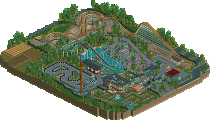
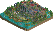
Moving around the lake, I like how you've done the forest theme and the purple and pink colours of the coaster look great. The tropical area is solidly my favourite of the park, love the light tan path and the little stone pillars dotted around the border are lovely. I also loved the little bridge segment on the splash boats, which I wish would have been continued for the large drop. The lift supports on Quake are a great incorporation of the theme, and there were some unique moments such as the double loop and twisting bit after the immelmann but it was a bit awkward in places too.
I adore the little tea house sitting on the hill there, cool addition to the park. The pastel area is certainly very pretty and I love the little overhanging gardens as you enter. While I like the pillars for the coaster going over the path I can't help but feel that it just doesn't fit the area.
Overall a great park held back by stylistic mismatches and I think mid bronze is a good fit. Hope to see you build more in future.