Park / Eye of Namibia
-
 14-September 20
- Views 28,111
- Downloads 564
- Fans 1
- Comments 26
-
 82.00%(required: 70%)
 Gold
Gold

G Force 90% no In:Cities 85% no Jappy 85% no nin 85% no Xtreme97 85% no chorkiel 80% no CoasterCreator9 80% no geewhzz 80% no RWE 80% no Scoop 80% no WhosLeon 80% no csw 70% no 82.00% 0.00% -
 Description
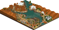
Right where the fertile soils of the Namibian plateau with its diverse nature meet the hostile flats of the vast salt deserts lies the Eye of Namibia. A striking centerpoint of culture and commerce on the high grounds and of death and drought at the bottom.
-
1 fan
 Fans of this park
-
 Full-Size Map
-
 Download Park
564
-
 Objects
364
-
 Tags
Tags

I get your point, but every comment is novel length, so in fact these parks still got way more than most parks on the site get. I think it's great!
However what's missing is some reactions by the makers. I'd like to see them respond to some of the things that have been said, although maybe there isn't anything to say.
sorry for missing voting.... busy boy. I'm sure they reflect at least roughly my thoughts!
fish canyon - really lovely. the bare, brown landscaping sets a really interesting and novel atmosphere. I wouldn't have minded seeing the coaster and paths interact more explicitly in the landscape though, or perhaps a bit more structures and storytelling. regardless, very cool.
ongongo - although there is perhaps not much novel about the particular aesthetic/theme, I think its a solid and nice entry. the coasters interaction with the park is my favorite bit for sure. lovely atmosphere, especially in the lusher parts around the waterfall.
tywfelfontein - I certainly appreciate the atmosphere you evoke by sticking heavily to a really rustic, ground-colored color palette for the entire park. the layout is also very interesting and has good flow- kudos to that. the landscaping and architecture is a bit blocky and simplistic, which brings it down a notch, but overall a solid showing.
otjikoto - i really vibe this, it has a lot of charm and really appeals to me. the crazy reverser coaster choice really works for me and almost somehow feels more realistic. its a cool piece of environment to rebuild in this. the bonus palette does not work well at all, but I'd love to see a more freshwater-green scheme developed.
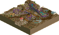
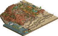
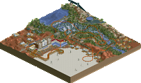
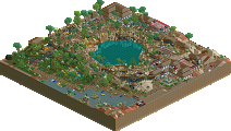
eye of namibia- this is really great, more of what I'd expect from the builders. sweet park layout and cool atmosphere. the landscaping _almost_ works- just needs a bit more finesse I think, but theres still a lot to love. especially that giant elephant skeleton for the coaster station. I also loved the weird pottery underground stuff. I don't totally get the whole picture as a park, it doesn't quite flow or mesh, but still awesome work. Probably more like a 75 from me especially on content-size but if you're late you're late hey
efundja- not the most beautiful coaster layout in the world, but something here works nicely. I think the simplicity of the bright sand as dried riverbeds in the overwhelming pink is quite interesting. and the small touches of archy and trees actually really sell an interesting african vibe to me I hadn't seen before. nice.
also, very very cool effect. almost missed it!! If anyone sympathizes with how annoying this shit is to do, its me... and you had to animate it! well... IDK how water images work actually...
inda- this is way better than it looks in the overview. very cool to see a sort of classy hotel infrastructure in this round, when most people went rustic. the landscaping is pretty novel and interesting especially the colors. its hard to imagine this coaster ever being built in real life but it would be pretty epic if so. the tents/cabins and waterside infrastucture is all neat.
ombezi- ah, this is what I was waiting for from those powerful teasers. the most impressive landscaping (of all time??) both of you guys have really come out of the last couple years as trendmakers and leaders in this community. can't believe strangelove was so OP. this is fantastic, and if this becomes the meta for landscaping, I give up. I can't be bothered. the tire lines in the mud, little water rivulets, the backsides being colored, just beautiful foliage and sand variety etc. too good. the buildings are also fantastic, obviously. big kudos.
karivo- also really fantastic. great landscaping flow and a cool park/city combo. love the atmopshere, the lushness, and even the orange rooves which I would usually never do. lots of details to love. in particular, the area with the telephone lines over the path to the park is awesome.
amazing round two!
Well Liam, I could call FredD out for being an ass, but he did that himself. No worries FredD, we all have our own preferences, though 1/4 block preferences aside, I'm not sure how I didn't execute recreating the environment. In fact, I actually replicated something vs the others which awesomely created something new that still felt like/referenced Namibia. Also chorkiel, apparently you loved the coaster but hated everything else for a 45? I know I'm nowhere near parkmaker level, a bronze aspiring for a silver type, but your score vs comment confuses.
I guess from any involved (and Josh has given me examples to an extent) I'd like to learn about the foliage comments as well as the architecture. Both are still works in progress apparently, and well, landscaping comment you made. If I knew where the glaring aspects were, I could improve my score past 59? Do I need to learn scale for buildings?
Also, is "So Bueno" some sort of parkmaking style attributed me cos I theme with color, even if more subtly here? I thought this park file felt like a stretch for me and yet many of you still see my work in it. Curious how...
Anyway, no hard feelings in this post, just wanting to understand different viewpoints, of which this site is full of understandably. Had fun, still think it's my best work since Glasshouse or KLAP and MP, and looking to either be interested in a new round or create something on the side from scratch. Thanks again...
Congrats to In:Cities and CC9 for the win. I think it was well deserved. When I saw the first screen of the entry I was immediatly blown away by how superior it was to ours. I second everyone who says that it feels like a totally new game, good job really.
Thanks to all the nice comments on AVC's and my entry. In the beginning I struggled a little with the theme due to the heavy focus on landscape. But AVC gave good guidance and the general idea with the 'eye' shape was a nice coproduction of us, him giving the vision and me trying the png landscape import of ORCT... In the end I am very happy with the result though, and I can see how we didn't that many votes in the objectives category as we ended in some quite generic theme.
Catching up! Here's my review of entries 9-5.
https://youtu.be/jyrmwK8Yy64
Sure thing-- great work on it!
Here's the remaining entries-- 4-1. The landscaping on Ombezi still blows me away.
https://youtu.be/ZmfbiSwv62E