Park / Castle Howard
-
 25-December 08
- Views 6,169
- Downloads 1,119
- Fans 6
- Comments 17
-

-
 80.00%(required: 65%)
 Design

5dave 90% geewhzz 90% posix 90% Xcoaster 90% CedarPoint6 85% Evil WME 85% nin 85% RCTFAN 85% Milo 75% zodiac 75% Fr3ak 70% FullMetal 70% Magnus 70% Steve 70% chapelz 55% 80.00% -
6 fans
 Fans of this park
-
 Full-Size Map
-
 Download Park
1,119
-
 Tags
Tags
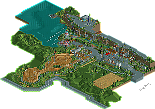
![park_3410 [H2H7 Finals] Asteroid Fields](https://www.nedesigns.com/uploads/parks/3410/aerialt3040.png)
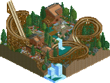
If you haven’t heard of RRP by now, then you’ve obviously been living under a rock. After his long hiatus from giving us map after map of fantastic LL work, he recently won design with valhalla, a hacked water coaster was fantastic atmosphere. But RRP didn’t stop there, and now we have yet another design, bringing his total up to a record six designs. Joining Slyvol, Son of Beast, Great American Screamer, Vesuvius Stampede, and valhalla is Castle Howard, an RCT2 wooden coaster. Read on
Rhynos Offline
Oh, and the MacD's was pulled off better than any other RCTLL/2 version that I've either seen in-game or in a pic.
Overall, I'd say this design was pulled off flawlessly. Please make more, please!
Woodie supports are perfect, foliage is gorgeous (large trees!), and woodie layout = killer!
2 things detracted, but they're very minor. 3 white custom scenery boxes in woodie station, what are those, they look aweful. Ride entrance/exit buildings don't look great, but again, that's minor.
Congrats, I love this one!
Concerning the woodie, I first liked the placement of it relative to the map. Definitely a more realistic design, obviously more along the lines of a Dinn/CCI/GG woodie with the slower pacing on the turnarounds. I thought supporting was pretty good but a little messy and over-convoluted in some places. It would have been cool to try some other paths with the coaster while keeping the same layout; what I mean by this is with the first turnaround, for example, it would have been cool and more GG like to have the train ascend up the other way (with the flat diagonal turns and the 180 degree banked incline curve) and then descend the straight path that was used for the ascension in your release. This is pretty much like the first turnaround on Ravine Flyer II, and what it does is let the train navigate the turns faster and when it gets to slow down towards the top, you get another big drop out of the element (and the ride lacked scarier drops towards the end compared to some GG rides). I feel this would just add some spice to a seemingly standard woodie and I often just try reversing entrances and exits in turnarounds to see what fits better because especially with woodies, they are asymmetrical and as a group this site (including myself) we tend to have a straight big ascension with a curved, gradual drop exit.
I didn't like the last large turn over the first drop and rest of the ride as much as if it were smaller to produce more laterals, especially considering that the turn was close to the end of the ride. The turn itself is reminiscent of the Cyclone's last turn, which has surprising laterals at the entrance and exit of the turn due to it being inclined. The extended period of banking out of the 2nd turnaround after it aligns itself to be parallel and adjacent to the first drop was really cool, reminded me of a Bill Cobb woodie like Rolling Thunder or SFNE's Cyclone.
While the general placement of the fishook was cool, I don't think it makes full use of the cliff in terms of scaring the riders. Maybe if the hook and the tower were switched it would be better. The only real thrill to those rides would be their height, and while it doesn't have to be 750 feet tall adding the cliff definitely enhances the illusion. Maybe even having the ride start up on the cliff, go up the tower off the cliff, then switch tracks to drop all the way to the bottom ground before going up the fishook part, switching tracks again and entering the station through the other way would have been a better version as well.
Can't wait to see more in this vein, or better.
The 3 boxes are lockers although they are a bit oversized.
This was built in rctmodified so entrances/exit dont show up in that
cheers for all of the kind comments guys,ill get back to the rest of the quotes later on
As well as this landscaping, the foliage is really really top notch, but also seems unique and original. There's a great use of often under-used shrubbery in this design. However, there's not an over-kill on the foliage - it seems to grow naturally in clusters, and you've left some blank spaces, which is good. Loved the crop-field.
Archy was just how I like it - simple, but realistic and conveyed a theme. The ride itself I thought was excellent, and I would have hardly changed anything, despite some of Phatage's alternative suggestions. I thought that a nice design feature was the four bits of parallel track at the bottom of the first drop, and then the crossover piece of track which goes over them toward the end of the ride. The tunnel was nice. There were also a few 'surprise' segments, which would tease the rider. Support work was very nice too. Can't really fault it.
What really made the map for me though were a couple of supporting attractions. I do have a couple of gripes with the fish-hook coaster, 'Bungee', but it was such a cool idea and was so fun to look at regardless. I think a shorter train would have worked better on it - if you're at the front of the train, you get the near-inversion, but don't get brought up very high on the spike. If you're sat at the rear of the train, you get the height on the spike, but don't get close to being turned upside down on the fish-hook element. A shorter train would ensure a better ride for all riders. The cliff-diving ride though was such a novel and great idea and was amazing fun to look at - and that's really what made this design so good; it was just really fun to look at.
EDIT: Never mind I found it.
Great job on this RRP. The whole atmosphere was really well done. One of my favorite designs to date.
Edited by Maverix, 28 December 2008 - 09:05 AM.
The coaster was awesome, not just the layout, the supports really worked out too.
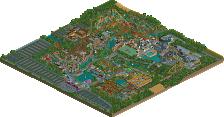
The rest of the park was good, but it felt extremely barren. I don't know if that's a good thing or a bad thing here, I know the setting is barren, but it was almost too barren to look good. A few more big trees could have changed that.
Congrats on your Design RRP, I'm really liking it and I'm looking forward too even bigger releases!
Phatage, I appreciate this paragraph!. I've never thought of this approach to building a layout. This will greatly influence my building from here on out. Thanks for posting!
Todd
Edit: I just noticed 2 more things, 1 that I like, and 1 that I don't. I like the switch/turnaround that you built at the end of the trolley line.. to direct the train onto different tracks. Very creative and a great idea!
There's something that I definately don't like, and I don't know how I missed this earlier. The coaster trains are stopping at the top of the lift hill. This is a HUGE pet peeve of mine. imo, it can ruin all positive aspects about a coaster. Unfortunately, the game can get tricky when you try to add block brakes.
Edited by Todd Lee, 30 December 2008 - 10:53 PM.
Theres something ive just noticed aswell,check out the chairlift ride stats,why do they keep increasing?