Park / Parque de la Habana
-
 16-August 20
- Views 42,637
- Downloads 502
- Fans 1
- Comments 62
-
 70.00%(required: 70%)
 Gold
Gold

CoasterCreator9 75% Cocoa 75% RWE 75% chorkiel 70% csw 70% geewhzz 70% nin 70% WhosLeon 70% Xtreme97 70% Liampie 65% posix 65% Scoop 65% 70.00% -
 Description
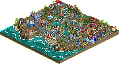
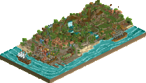
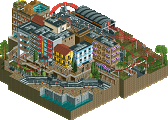
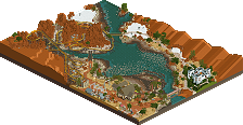
Originally a large city park west of Old Havana, Parque de La Habana was converted into an amusement park after the Cuban Revolution. The park featured El Columpio de Mar, a swing ride which commissioned several Cuban artists to decorate its structure, and El Caballo Mecedor, an original ride designed by the Ministry of Public Works; both of which stand today. In anticipation of increased tourism with the lifting of the trade embargo, the park built two modern rides: La Estrella del Sol, an imitation of Arrow’s corkscrew model, and Río de la Nación, a river adventure ride designed by Cuban-American Engineers and constructed by Hopkins Rides. The park is known for its historic rides and picnic grounds, as well as its proximity to the Memorial de Guerra de Independencia Cubana and Castle Estridor.
-
1 fan
 Fans of this park
-
 Full-Size Map
-
 Download Park
502
-
 Objects
420
-
 Tags
Tags
That was mainly to keep with the authenticity of the town, which has long runs of what is seemingly one building painted into different sections to mark the different shops etc., but definitely could have been made more interesting for sure. Thanks for the constructive feedback all!
I was not able to vote before the deadline, but overall the quality of these entries is exciting. Great job overall to all participants in Round 1!
Reviews below for all entries:
Carnaval Cubano by Gustav Goblin
Some promising work here, some of the best from you yet. Overall the atmosphere is pleasant but the architecture is lacking some details that make them really come to life. Very good effort and enjoyable little entry. Adding a nice centerpiece coaster would have helped, as well as having more peeps in the park before opening to give it some more life. Sidewalk details like benches and trashbins and small custom details like market stalls would have added to the atmosphere, as well as roof detailing. Nice work on the custom ferris wheel and I really liked the Cuban-flag themed entry to the park pier. I hope you continue to build in this contest and continue your good progress!
Carnaval de Maravillas Playa de San Arnaldo by 6crazy6king6 and hydroportal
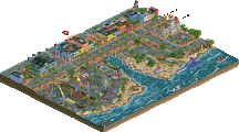
Such a wonderful lively entry. The water is busy and full of life, swimming peeps and underwater details with swimming fish and foliage really highlight the attention to detail here. The giant floating slide is one of my favorite things on the map, and is perfectly executed. Wonderful architecture throughout, some unique color combinations and really nice detailing. Love the little lighthouse at the end of the beach as well, and some of the custom boats are really creatively executed. The execution of the park is wonderful too, a lot of custom rides and details that really sell the cheap-tarmac aesthetic. A nice touch with some of the billboards and grafitti and even the powerlines across the entire road to sell the Cuban setting. Again, this is one of the reasons I picked Hydroportal in R2 of the mockdraft, and I'm doubly impressed by Henkert's work here as well. Amazing job overall, my #1 choice for the round!
Cuba Libre Gardens by Coaster-Geoff and Scoop
Very nicely done compact coaster, lovely layout. Oya is also beautifully integrated with the surroundings in the fairway, I love the atmosphere you crafted throughout. The architecture is really well done, but does seem too clean for the setting and lacks the bit of crunchiness that is typically associated with Cuba. The landscaping is my favorite part of the park. The combination of LOTR rocks and foliage is perfectly blended, and looks great overall. Very nice work!
Cuba Antigua by RWE and MK98
I'm not fully sure if I appreciate the theme with the scenes of slaves on the plantation... but I'm not going to fault the quality of the work. The atmosphere is fully immersive overall, with the architecture standing out for me. Impressed by the architecture being chock full of details while maintaining a very clean look. My favorite buildings are by the docks and by the plantation. The ride itself is my favorite of all the rides this round, a really cool layout and really fits perfectly with the landscape and theme.
Cuba by Vegas Coaster
The architecture is very simplistic and doesn't have compositionally is very rigid. Not really detailed enough to sell the Cuban theme, and it's a shame there are no peeps in the park. The foliage is very evenly scattered, which can be improved if you clump trees together to form bands or patches, then infill with lower foliage and grasses. The little coaster hop through the flag is a cute touch!
Cuba-a by Jaguar
Of course you would. I actually like the entry with the spiked land in sand / dirt / martian rocks... sculptural Ivo teas. Cute!
Dreamland Havana 1951 by Colby
The pastel colors are wonderful here! Very pleasant atmosphere and beautiful centerpiece with the Shoot the Chutes ride. The architecture in the center is really cute and well done, but the surroundings did have a few blank walls that could have used some details to bring it to life, especially around the road; lamps, benches, and peeps would add a lot to what's already there.
Guantanamo Bay Bolero by Liampie
I really don't understand the thinking behind this... idea. But at least Cabardi run's layout and station is cute.
Parque de la Habana by Camcorder22 and Dr. Dirt
Very nice take on Cuba with some unique ideas and aesthetics. I love the fusteria garden and the rundown look of the entire backside of the park. The curved queue for the corkscrew ride is really nice, and the ride fits perfectly with the theme for custom coaster. The horse swing ride is really cool, haven't seen something like that before! But I'm not a fan of the river rapids. Great work with the landscaping around the water as well, the cliffs work really nicely and the splashes of water to simulate crashing waves along with the brown water on the dirt are both perfect details.
Parque Santiago by Mamarillas
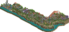
What a nice take on the fishing village. You really sold the rundown atmosphere of the shanties and the piers with the broken poles and wooden parts throughout. Lovely use of the pastel color palette with white trims, it's a nice combo and sells the atmosphere really nicely. I enjoyed the rides in the park; both El Tobogán Azul and Corredera del Trunco are perfectly suited for the theme and Montaña al Revés is such a cool little reverser coaster with a unique layout (and custom supports!). Really great work here. Simple but beautiful and unique.
Puerta Vieja by Shotguns? and In:Cities
That ship! So perfectly detailed and beautiful to look at to boot. Love the integration of so many rides and attractions on there, from the waterslide to the surfing ride, and the rock climbing wall and basketball court. The white diagonal atennae is my favorite part of the boat. The architecture is stunning here, really realistic and interesting to look at. I love the combination of more modern architecture with the older traditional buildings, it's a fully believable setting. Coches Salvajes bumper cars is really beautifully detailed and fresh, but I'm not a fan of the main coaster's layout. Very meandering and formless, and doesn't do much for me aesthetically. Looks like there were quite a few unfinished bits towards the back, which is a shame. The castle by the end of the map is a nice highlight for me, really beautiful forms and composition. Love the large retaining wall as well.
Puerto Habana by FredD
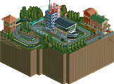
What a nice entry! Atmosphere is on point, architecture is really well done, perhaps some of your best work. This is my second favorite layout of the round, La Estrella Habana is really well done and pops so nicely with the bright yellow and purple. I especially like the turnaround right after the MCBR in the concrete trough. I think the waterside is a bit underdetailed and lacks life; some watersports or rides with peeps would have helped a lot to bring more action to this area. Great Che mural too. I think this would have been a great Design submission as it's the perfect size and composition. Nice work!
Really looking forward to the rest of the contest based on this! Congratulations to Hydroportal and Henkert as well, you both are really the ones to beat ATM!
It is submitted for design and I hope to beat Arevik with it Thanks for the kind words!
First of all, thank you for all the nice comments. This entry was a blast to make. After seeing almost 1k worth of photos, 10 hours of Cuban videos about city life on youtube and spending the same amount of time on Google Maps, we created (in my opinion) a nice little map of all the good things about Cuba. We wanted to create a fictional city that at first glance looked rich, but if you look at it longer it becomes increasingly poor (rubbish, bad road surface, rubbish in the ocean).
After much thought, we named the city after Arnaldo Tamayo Méndez. He is the first person from a country in the Western Hemisphere other than the United States to travel into Earth orbit and a hero in Cuba. Those who search can also find a reference to him.
We've also put a lot of little jokes and references on the map, such as the drone seeing the peeps having fun on the roof, the seafood stall on the bottom of the ocean and the car that crashed off the bridge.Throughout the map we have also placed various billboards that can also be found in Cuba itself.
Hope to see you all in R2!
And stay hydrated.
Henkert is Max Verstappen confirmed.
Carnaval de Maravillas is seriously fantastic. I finally got to check it out yesterday and it's awesome. You pulled off the "deliberately shitty" vibe well but also kept it really vibrant and fun. Great architecture too!
I can't lie, quite bummed with my score... I really don't see it as a borderline design. I hear from some people (it are always the same who say it) that the voting is inflated but to me it feels like every time when I release something, it's deflating! Imagine being told by several people that it's your best work yet, that it's a step-up... but the scores reflect something completely else.
I don't know what to think about it... and please don't hit me what "that's already a high score" or "just play for fun, not for NE". First one is easy to say when it comes from someone who gets 80+ scores with ease. Second, I have a lot of fun with every piece of rct I finish. If I don't have fun working on a project, I just don't finish it at all and move it aside. I'm ambitious too, I too want to break that 80 mark and gain parkmaker status and by that I do not mean Puerto Habana should score 80+.
All I want to say is that I feel the voting process at NE atm doesn't really function properly. Some releases get voted to an accolade within an hour, others have to wait days/weeks, depending from the name of the maker. I believe the name of the maker is influencing the way of voting too much. It's a FredD release?! Don't bother me, a 65-70 fits his rep. And it goes both ways... Remember SFWoD where Kumba took into account who the builders were?! I don't think that shouldn't be a factor at all, a park should just be voted on its quality whoever built it. It's remarkable how much the opinion of the first elite names are followed later on. When your park is just released and a parkmaker states he likes or doesn't like your park seems to influence the public opinion on it.
I like the new panelists that were appointed yesterday but I think there's more work to do. Can't deny I'm a bit mad right now so maybe my emotions are writing here too and I'll regret this post tomorrow or so... but fuck it. I'm quite done with all the prejudices. "It's a FredD layout so it must be bad" - I released 2 wacky layouts in TerraVentura and showed a crazy suicide layout on discord and that is all people seem to remember. I know I am not the best lay-outer here and I am not claiming that. But I have solid and good layouts too. But that is not meme-able I guess?!
I know this post will come across pretty pathetic and whiny. But I'm just not happy with how things are going here atm and it felt good saying that out loud. I do heard the same kind of complaints from others too and at the moment, I'm not the only one thinking about sending my parks non-competitively from now on...
I feel you. Thankfully it looks like things will start to change a bit regarding the panel. I personally really enjoyed your submission and thought it deserved design without a doubt. You're an exceptional creator and I always look forward to your consistently great work. Bias does exist to an extent, and its the responsibility of the panelists to score things objectively as possible. Quality > the builder name.
I agree with Fred as well, it really seems like parks are being rated much more harshly now than they would even a few months ago, 66% seems rather low, and there's been multiple parks that have scored worse than they would've last year.
Are you guys just grumpy from the quarantine, or is there this huge reactionary pushback against high scoring to somehow raise the bar? If you complain about accolade inflation, setting the minimum standard to gold isn't going to raise the quality. It's going to turn people away from the community.
Also it certainly seems like scores are in part based on who built the park... whether or not someone gets parkmaker seems almost entirely arbitrary and based on following the meta rather than being truly a skill-based merit, and this site has created this weird hierarchy based on it. This is especially irritating when these 'RCT greats,' many of whom haven't been active, are the ultimate decider in a park's score.
Parks #12 - #6 reviewed here:
https://youtu.be/vF-q5N0-f3c
1:13: Carnaval Cubano by Gustav Goblin
4:40: Cuba by VegasCoaster
6:49: Cub-a by Jaguar
8:14: Dreamland Havana 1951 by colby
13:25: Cuba Libre Gardens by Coaster-Geoff and Scoop
18:47: Puerto Habana by FredD
23:32: Parque Santiago by mamarillas
Some really great work throughout. I especially liked the historical approach by colby-- there were some really well researched details in there. Mamarillas also had an excellent aesthetic inside and outside the park with one of the only entries not set on the seaside. Well done to all!
And I feel ya Fred. I don’t think “Fred layouts” are inherently bad. I think taking ownership of it and making what you want and find fun is what’s important. Make Fred layouts like Luketh makes his Oompa Loompa rides! Keep doing your thing man. You have a definitive style that is a staple in our community.
I judged all of the Round 1 parks against each other - it is a contest, so I wanted to sort of separate the submissions into tiers so that I could pick a clear winner or two. Fred's coaster fell squarely into the second tier. I don't think there's any question that it is design worthy. I'm pretty surprised that there is a host of votes below 65%, actually. I had no problems with the coaster layout (I tend to like quirky layouts), the colors were great, and it fit the contest criteria well. The rest of the map was also solid - but nothing groundbreaking in my view. I think adding in a few flat rides would've helped tie things together. The dock/boats and the landscape by the immelman were a bit underbaked, though. I think if I voted again I might bump it up to a 70, but not much higher. I thought the best two parks from the round were worth a 75, so yours fell squarely into the 65-70 range for me.
I do think panelists take the builder into account, whether they mean to or not - there's an element of that you can't really get rid of. I don't think there's anyone that sees Fred's name on the park and decides they want to sabotage it based on his name alone. That being said, I think Fred does get a bad rap on the site and on discord in general - people making fun of his layouts, making 77% jokes, making memes out of his photo. If I was Fred, all of that would piss me off. The man is kind and is doing his best to improve his parkmaking. What did he ever do to deserve that treatment?
Keep your head up, Fred. That may not mean much to you, but as someone who tries to break from the NE meta when I can, I think you should be proud of what you've built and just keep trying.
I'm still a little confused at the Fred layout thing. The premise here is funny and interesting with the parts and pieces from other rides but honestly the layout itself fits a pretty realistic B&M. Like there's nothing weird about this layout. At all. I feel like some people just want to make a meme when there is none. It's very strange.
Regards to memes of his photos - him and Jappy are good friends irl. And I definitely wouldn't joke with him if he told me he felt uncomfortable or thought it was mean spirited - we've spoke about it and its coming from a place of love. Fred is definitely one of the kindest and fun people here in this community, and I love that we're able to laugh and create together. Makes us feel like a closer group of friends (in my opinion), which is what many of us are when you think about it.
Biases definitely exist in many ways than one, and its important to try to overcome them and vote fairly - whether its community vote or panel. Personally I'm happy fred locked in another design, but i do believe that the score is lower due to it being in this contest format. Really hope that he isn't discouraged and will continue to produce quality work, as I always look forward to what he creates.
I believe Fred's case is part of a larger issue of the community as a whole--not just the panel--viewing the park based on who built it and rating it with that as a factor. The "Fred bias" is one of the more extreme examples of this pattern, but he is not the only one builder who experiences this, and not all builders who experience a bias are impacted negatively, at least in terms of ratings. For every Fred whose ratings often seem noticeably lower than they should be, there is an equal counterpart who can "do no wrong" as a builder simply because of who they are or what they've done in the past.
As much as the majority of you may disagree with me on this, alex's work is the prime example of bias in the opposite direction (in terms of active builders). He has undoubtedly earned his Legendary status as fairly and justly as anyone else, but somehow this seems to have caused a general consensus in the community that everything he builds is the forefront of RCT2 as we know it, and thus people viewing his newer works are much more likely to forgive inconsistencies, questionable building choices, and other important aspects of parkmaking that up-and-comers would get dinged for. This is not only unfair to said up-and-comers for obvious reasons, but also to alex himself, who at this point is denied much beyond a "this is entirely perfect except for these two tiny things that I'm going to ignore anyway". How can alex improve even further when few people can look at his parks with the same eyes as they would that of a non-parkmaker?
With builders who have proven themselves as worthy of any colored name title, we seem less inclined as a whole to question their artistic choices, but this in turn means that we're more likely to question the choices of those who have not "proven" themselves in the same way. This mindset exists in any creative field; it is in no way specific to RCT, let alone New Element. Nevertheless, if two builders cannot receive the same score for reaching the same level of quality in their build, there is definitely a problem that needs to be addressed. A park should never be rated based on what the builder has done in the past, whether it be crazy layouts or two of the best parks ever built in LL.
All of this, of course, is based on my own observations, and much like anyone else, my immediate perspective is as subjective as anyone else's. There are plenty of other biases that exist currently--stylistic biases surface most commonly--but for now, I would like you (whoever you are) to think over the following questions, not with the intention of answering them, but just as an exercise to explore the way you may look at parks.
What would Ancient Worlds have scored had Fred built it? Would he have become Legendary Parkmaker?
What would Puerto Habana have scored had alex built it? Would it have been a 71 instead of a 66?
If it were revealed and proven that sacoasterfreak was also historyfreak, would it change the way you looked at either of their parks?
FredD, you've expressed your opinion with honesty and fairness, so it's totally fine. I'm sorry you feel this way. Since I was among the 5 people who voted 60, I'll try to give you some feedback. Your name totally didn't play any factor in my vote. And I don't really care for how realistic layouts are either, as long as they're fun to watch. In fact, I applaud you for doing something considered "unorthodox" usually. I just simply thought the coaster was way too slow through most elements. I suppose you wanted it that way since I would think you tested it when it was first done, but for me it doesn't work. If a faster train meant bad ratings, then I think you needed to change the layout itself. I like the colours you've chosen, the whole vibrancy you achieve with them. I also thought the placement of the station and how you integrated it architecturally was impressive. I did not like how some parts of the coaster was composed over the rest of the park though. It felt a little draped on. For example the lifthill's supports go straight down on an architecture front, or the supports of the big loop and brake create a bit of a steel forest over the path. However, after the brake, you begin to integrate the coaster well with its surroundings. I wish you would do composition like that more consistently throughout a park. I thought the waterfront looked a little uninspired, however you seemed to enjoy making those boats a lot which was nice to see. Things like that are more of a gimmick to me though, similar to cars driving on roads. They can't really add big substance to a park for me. One very nice gimmick however was the Guevara mural. I thought that was clever. As for your main atmosphere of the park, I understand you tried to apply a rundown and "dirty" environment as a "good bad" kind of theme. I don't think this has worked out too well. In fact, it hardly ever does when people try this. It created an empty and somewhat bland atmosphere, which I realise was part intentional, but just not too enjoyable for me.
Fair enough Posix, but you keep saying park... You do realize Puerto Habana is not a theme park or part of a park, but a part of a "real" city. Where the city council wanted to added a coaster for tourism and just build it with no regard to the existing buildings. I thought the description I gave my entry was enough to make that clear, I could see why it's confusing if you think it's part of a theme park.
Also... with my old PC I heard of people say my coasters were going too fast. When on my current PC I noticed that too. Maybe it's a PC thing?! Because pace looks fine to me over here.
Oh I mean "park" in the most general term from an admin's perspective. Any release to the system, whatever it is conceptually, is just called park.
Do you get steady 40fps with capped FPS in Open? That would be the benchmark to check for speed.
Here's my review of the top 5 entries in the contest:
https://youtu.be/2UORyi9U7Hk