Park / Carnaval de Maravillas - Playa de San Arnaldo
-
 16-August 20
- Views 42,637
- Downloads 668
- Fans 3
- Comments 62
-

-
 81.50%(required: 70%)
 Gold
Gold

geewhzz 85% no In:Cities 85% no Jappy 85% yes Scoop 85% no WhosLeon 85% no chorkiel 80% no Cocoa 80% no Liampie 80% no RWE 80% no Xtreme97 80% no CoasterCreator9 75% no csw 75% no 81.50% 8.33% -
 Description
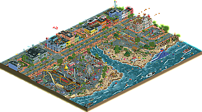
"Get your swim trunks and your cigar box, were going to the beach! On recreational grounds, Carnaval De Maravillas made its way to the shores of San Arnaldo Beach just in time for the last week of July, and Cuba's National Revolution Day. This year, the summer festivity sees a grand attendance, with rides and attractions for everyone!
For just $65 peso, you can buy a wristband to join in on the local summer festivities here at San Arnaldo Beach! Experience a wide variety attractions, live music artists and theater shows, and delicious cuisines from award winning food stands. San Arnaldo Beach offers beautiful views for the most amazing firework shows you will ever see!
Ride the Looping Star, an imported roller coaster from Brazil, which is now the fastest rollercoaster in Cuba! For thrill seekers, experience the Torre de Caida! Young thrill seekers can ride Montana Rusa, a coaster completely built by one man! Enjoy views of the city from La Noria, or take a ride on a Hobiecat. For water fun, you can go for a swim and ride El Gran Dragon. Can you tame the giant water dragon?" -
3 fans
 Fans of this park
-
 Full-Size Map
-
 Download Park
668
-
 Objects
534
-
 Tags
Tags
Well let me explain. With Arevik I made the mistake to make it unclear if it was part of a theme park or set as a real village. I didn't want to make that mistake here, I wanted to build a real part of the city. Not a theme park. So no other rides.
I have to admit that the overall quality of the parks is ridiculously high. Sure there are a few 'starter' entries, but even those had some merit here and there.
Carnaval Cubano
A bit basic, but it does sell the Cuba atmosphere. Overall a solid composition.
Cuba Libre Gardens
Very solid high quality park. Lacked slightly on convincing me it was Cuban though and lacked a distinct custom attraction I think. What I liked most of the park was the awesome landscaping and how everything blended together, which is sometimes pretty hard as a duo (Levis knows what I mean ). I found it kinda funny that I predicted the name of the scenic railway before I even clicked on it
  . Also one minor nitpicking thing, why was the ghost train named Ghost train 1 (or was this delibarate?).
Cuba
Pretty much a starter park so I don't have too much to say other than keep practicing. I enjoyed the tower as I recognized it instantly.
Cube-A
Yeah... it is one of those things that shake you up, but in a good way. Funny ideas and a nice take on the challenge. I enjoyed it for what it is
Dreamland Havana
Good park, am a bit of a sucker for nostalgia. There one thing that nags me with this park though if I view it within the contest; what makes it Cuban?
Puorto Habana
Very clean and very to the point. Definately a high quality entry. Loved Che. The coaster sells the park wonderfully, but also how it is wrapped by the park itself.
Guantanamo Bay Bolero
Waterboarding Experience?! xD Well I guess it helps to highlight the slightly darker things on Cuba. Overall a solid park, though it lacks something defining to take it home. The architecture was spot on though.
Cuba Antiqua
I like this park a lot and it comes down to a few smart choices that were made. First of all the elongated shape of the map instantly gives it something different. Secondly you didn't go obvious style of the Cuban theme that pops in everybodies head when they first hear Cuba. Yes, there was slavery and yes there was piracy. I like it when people don't go out of their way of it. It's part of the history. The port and plantation buildings are spot on.
Carnaval de Maravilla's
A very lively park with definitely a Cuban spirit. This spirit is the the one defining feature of this park rather than a single major highlight. All the small part together make it great.
Parque de la Habana
A strong entry. Well composed and colored. Obvious highlight is the coaster and it pathways. For some reason I love the the rapids as well. It is so 'stock'y communistic and brilliantly named. Only thing I wonder if it would be even better if it had an even more concrete finish.
Parque Santiago
Good seller of the more 'run down' thematic. The slums by the water was very strong as was rollercoaster.
The 'stock' log flume completes the picture. Overall a strong park.
Puerta Vieja
The highlight is a pretty obvious one I guess. Only felt that the bow was a bit to thin, so it looks a bit odd from the front for me. For the rest of the park the 'shabby' theme works well as a contrast to a modern cruise liner.
What buildings in particular? Also it is a b&m so I don’t understand that criticism. What water ride would you have preferred?
We accomplished what we set out to do and our proud of our project. Obviously not the best of the round, but it's absolutely full of the texture and atmosphere we were aiming for.
Curious if your thoughts would be any different if it were two different builder names aside from shogo and I next to this submission lol
The tea
I agree with V1 on the ship to certain extent. It's no doubt super impressive, and I could never do anything like that myself, one for the length it takes to get there, and two because I simply don't want to. But a ship, no matter how intricate, difficult and amazing, could never hold my attention the same way a very beautiful foliage, landscaping, or a well designed and composed coaster theming can. And these might take even less effort to do. So I can understand why there might be a feeling of underappreciation.
I think the main thing here is the fact that it feels so much like the port Disney ship. Comparing the two they are very different though. I haven't looked at the Disney in some time so I can't say which is better but I think the two are different enough for it to not be an issue. but on the topic of under-appreciation, I don't get that, because I can dislike something that I don't care for if it's because the subject matter (not sure if that's the case or not posix), but I can also appreciate that same subject matter and know that it was done well for the people who do like the certain subject.
Truly not upset, just interesting how people have different viewpoints lol
Especially considering the “been there seen that” comment, it’s very flippant as if we can never make another cruise ship ever again without people skipping over it because it’s been done ONCE beforehand. Silly.
I think it has to do with the factor that not only have we already seen a cruise ship from the same high quality before, it was built by the exact same person. I know that in contests and such we're not supposed to look at the names to avoid any bias and favoratism, but here it plays a role in V1's feelings. If somebody else had tried it, it would certainly look different and be in a different style.
Before I go into a review park-by-park I just want to say I have a lot of respect for all the contestants. Congratulations to finishing your park and entering this contest. I started to build a park for this round, but didn’t even come near finishing it. So I think it’s amazing to see all you guys finish with this high quality in such a short time period. I didn’t read any of the other reviews before writing this, because I wanted to give you my own unbiased opinion. The reviews are in random order, but I’ll finish with the parks that are the winner and runner-up in my opinion.
Carnaval Cubano – Gustav Goblin
A nice park from one of the newer members. Your architecture is crude, but definitely not bad. A little inconsistent in quality though. I liked the blue/white building with the ‘window overlay’ objects and the Cuban flag entrance a lot. Other buildings had weird shapes though, like the diagonal blue and purple one. I was also wondering how all those tables got up on those roofs and who would use those without any doors leading to them. I liked the kiddie-coaster. Such a lovely neck-snapping-no-banking-turn you expect to find on a coaster like this. Also liked the supportwork on the coaster. I think the ocean would look a lot better if you would have changed the underground landscape a bit. All in all I think it’s a nice entry and it shows a lot of potential.
Parque Santiago – Mamarillas
I love the opening shot you chose for this park: the bridge over the little river with that tropical foliage, trams, church, smoking peep and the cars on the side. Man this just screams Cuba to me. I actually like the surroundings more than I like the park itself. Montana al Reves is a unique and quirky coaster. I really like it’s strange layout, but I doubt a small park in Cuba would choose to build such a technically difficult coaster. Or if they would choose a chairlift, especially given it’s so short. But man those surroundings look so good. The broken down wooden poles in the water are my favourite detail.
Guantanamo Bay Bolero - Liampie
Great foliage and a lot of atmosphere. I think Cabardi Run (awesome name) has one of the most stylish finishes I’ve seen. It reminds me a lot of your Seaquarium park, but I think it also has it’s own look and feel. I don’t like the waterboarding attraction though. Maybe I’m not getting it, but I think the park would actually look better without it.
Cuba – VegasCoaster
Good for you for stepping out of lurking and sharing some of your work. Obviously your work is still on a very different level than the other contestants. I think your work would improve a lot if you change the colours of the trees to more natural colours. Also try to play around with different heights and shapes in buildings. Long streaks of same-sized buildings tend to be boring to look at. I liked the coaster crashing through the American flag and that there are doors on your balconies. Keep playing and developing your skills.
Puerta Vieja – Shogo and In:Cities
I think this park is the hardest for me to judge. On the one hand the overview looks like a H2H park and I love the giant cruise ship which is a work of art in itself. The park and surroundings show so much ‘technical’ excellence and it is clear this park was made by some of the finest parkmakers on NE. On the other hand I really don’t like the colours and the clitchyness of it all. I can see you are going for a run-down look on the buildings, but it doesn’t work for me. There are a lot of small places that seem to be rushed or forgotten (like the roof of the carousel) and the general look and feel of the park itself and the fort don’t really appeal to me. Just to be clear; this doesn’t make it ‘bad’. It is on an incredible level of technical skill. Miles ahead of anything I’ve ever build myself (or probably ever going to be able to build), but it just doesn’t ‘work’ for me.
Cube-a – Jaguar
Would’ve been a fun take on the concept if you had taken a more serious approach on the attractions. Now it doesn’t really do much for me.
Puerto Habana – FredD
Another great entry in this round. I really like the coaster layout (though I’m definitely no expert on coaster layouts). The Stone path broken up by the flat roof pieces works really well as a solid base. I think the Liampie-stone path near the water is too busy though. I like that you’ve made all these custom boats. I don’t think they all work as well. The smaller ones look amazing, but the Santa Clara and the Fisher Ship just don’t seem to find the right shape. I really like the yellow/purple colour combo for the coaster and the colourful buildings around it (based on Old Havana). Gives the setting a lively vibe. I think that if you wouldn’t have coloured any of the buildings yellow, the coaster would’ve popped even more. I think the planters around the fountain/statue could use some more colourful flowers to brighten up that area.
Parque de la Habana - Camcorder22
I liked this park a lot but it felt kind of inconsistent in quality. Cabello Mecedor Historico immediately caught my eye. What a great historical ride to place in this kind of setting. Archy is really good in certain places and in others it just seems like the general shape of the building is just . . . too curvy, which makes it look illogical. I did really like the part with the Cuban Flag and the area adjacent to it. Foliage is also great in most areas (really like the Oceanside), but near the houses there are these strange area’s with green lawns combined with dried out grass which look illogical.
Cuba Libre Gardens – Coaster Geoff and Scoop
A really cool park that has great coasters and a unique take on the Cuban foliage on the Oceanside as well as at the mountains in the backside. I really like the entrance to the park. What’s holding back this park for me is the choice of palette. It looks ‘grey washed’ to me. Which I associate with places like Scandinavia; dark and gloomy. Especially with the grey station on Chango, the centre-piece coaster. I changed it to the Pacific Ocean Park LUT palette, just for fun and it, and the whole park just became so much more alive to me. Apart from the colour choice I think it’s a great park.
Dreamland Havana – Colby
I like the ‘clean’ style of this park. I thought the Cuban-flag pool and the trackitecture roofs where it’s strongpoints. Though I like the cleanliness (if that is a word) it also makes the park a bit dull in places. To me, it misses some of the kinetics a lot of the other parks have. It doesn’t feel exceptionally ‘cuban’ to me.
Cuba Antigua – MK98 and RWE (Runner up)
This is such an amazing entry with a lot of content. The boats look beautiful and the architecture is great. I think the plantation is especially well composed. This park has a lot of kinetics (flying birds, traffic in the street etc.) which makes it very lively. A fun take on the concept of ‘custom in-house build coaster’. Small nit-picks I could find: the landscape could be a little more organically shaped in some small places, the trackitecture-bridge could use a second layer and that Wildebeest object makes my eyes bleed and should be burned. I think you’ve really found your own style MK98, with a lot of hacks and special objects combined with great design.
Carnaval de Maravillas – Hydroportal and Henkert (Winner)
This is just . . . wow. Such a detailed and lively park, it’s so bustling with life. Details like the cracks in the pavement just make it look so authentic. The park itself and the surroundings both look so believable. I think this is the absolute and clear winner of this round.
I didn’t build in this round.
He who travels has stories to tell!
Round 1 - Cuba: Results
We were very happy to recieve twelve entries, and we're equally happy with fifty-four poll members taking the time to review the parks and vote in the polls! Happiest of all should be 6crazy6king6 and hydroportal, who came out on top in this massacre of a first round and are the first to qualify for the final. Congralutations to 6crazy6king6 and hydroportal, and thanks to all who participated in the first round!
Find a table with all entries and their respective ranking and scores below. The total score has been calculated using the following formula:
Total score = objectives score + quality score
Carnaval de Maravillas-Playa de San Arnaldo
by 6crazy6king6 and hydroportal
60
And now... onto Namibia!
Idk, I think that is always tricky since you already have a big ass coaster in there, so it clearly already isn't just a city.
The two buildings to the left of the entrance (gray and purple) aren't exactly my favorites. If the coaster is a B&M then let us flip that to "shame you didn't use the in house built ride on your main ride". In terms of water ride, you did better than most in the contest, but I would have preferred more creativity with the instruction all over the board.
Well, exactly. Everyone knows that I dislike ships in RCT. But at least the cruise ship in Port Disney (just as the military ships in Warbird Cove) had the "Wow, you can actually really pull this off in RCT" factor for me. This obviously doesn't have the effect. This time I already knew they could be done so there was nothing special about it that cause me to get over my ship hating mindset.
Why the Ad Hominem? It's also a pretty bafflingly bad argument and I don't even know what you are supposed to say with it. If I build another completely asian themed park, you are free to say it doesn't blow you away.
No they wouldn't. First of all, I actually like you. You seem to be the one having a problem with me. Secondly, I think everyone knows I have issues with Shogos character and I definitely thought about whether or not I judged her work more harshly just because of the name attached. The truth is though that I ranked her H2H parks way lower than most of you without even knowing who built them (since I am horrible when it comes to builders), so it's safe to say that it's just her style that just doesn't work for me.
I don't see why the "main" ride had to be the in house one especially when it's a park with multiple "main" rides.
Ahum ahum ahum... To Hydro and Henkert who have won this round, congratulations! To all other participants in this round who didn't win, also congratulations for building such quality submissions!
We are all winners here. But Hydro and Henkert the most. Much deserved win.
Unfortunate to see my submission placed last with no votes whatsoever, but I'm still proud of how I did. Hoping Carnaval Cubano is just going to be a stepping stone as I keep making better and better parks. Henkert and Hydro earned their win, definitely a Gold-worthy submission.
Version1 the type of person to refuse to see his favorite movie again because he's "seen it all before"
honestly the best boats of this round goes to MK. those ships were fantastic
<3