Park / LAPUTA, Castle in the Sky
-
 29-August 20
- Views 3,046
- Downloads 535
- Fans 0
- Comments 7

-
 64.00%(required: 60%)
 Silver

saxman1089 75% In:Cities 70% Jappy 70% chorkiel 65% CoasterCreator9 65% geewhzz 65% Scoop 65% Liampie 60% nin 60% posix 60% RWE 60% Xtreme97 60% 64.00% -
 Description
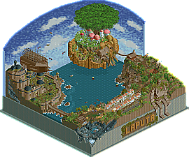
My first full park with rides and decos.
Ghibli Studio movie about an adventure of boy and girl, searching for LAPUTA, a lost kingdom in the sky with a mysterious power of the levitation stone.
Made by Miyazaki Hayao, Ghibli studio, 1986.
There's a custom music. put it in Data folder.
https://drive.google.com/file/d/1G06Qo9voUUJoHlNljTaucbQX-UXDUZZN/view?usp=sharing -
 No fans of this park
-
 Download Park
535
-
 Objects
379
-
 Tags
Tags

As a concept creation, this is excellent. Starting to bring in custom objects and shape things out a bit more, the atmosphere and dedication to capturing imagery from the movie make this so compelling.
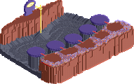
That being said, this really isn't a 'full park' for me because of the diorama-component. Don't get me wrong, the sky is beautiful and adds SO much to the theme and atmosphere of the project overall. But, some parts of the park just can't be seen because you really only get 1 full view, then two partial. The mine train, for example, is hard to follow without cutaway or making scenery invisible. But it appears you themed that part of it, so it seems like something you intended to be seen but then covered up.
I'm honestly very torn about it. On one hand, I think the diorama is such a unique way to frame the park and build something that looks incredible. But, it makes a very 2D experience that is less immersive as a result. I guess this just becomes a question of where you want to take your rct, between building these smaller vignettes that are gorgeous but quick to look at or sacrificing some of the benefits of a diorama element in favor of something more immersive for the viewer and more 3D in character. Or both. Or if you can get someone to make you pieces that are only visible from one direction, then you could do the diorama while still letting people see all sides.
That all being said, i'd say a high bronze/low silver seems appropriate: beautiful and creative, execution is getting there, but not quiet as engaging due to the sky diorama.
Impressive as always. Definitely more immersive than previous projects from you. The use of rides for movement and allowing peeps to interact with the park were nice additions.
I agree with FK about the framing.. I wanted to explore the mine train more and the maze from other angles, but I was limited. Is that a bad thing? Not necessarily. Just left me wanting more as a viewer!!
Curious and excited to see whats next from you.
Thank you for feedback. I agree on some of your suggestions.
I already had 1-side view objects for building sky wall before starting this park.
I also thought about limitation of view, as well. I could use those objects, but I think it's matter of where we put priorities of each of us.
I wanted this diorama to be more looking like a diorama, more looking like a figure, more looking like a miniature.
Then the sky which is only seen in one quarter view doesn't make sense in terms of reality. This is the difference of this park from other custom scenarios I used 1-side view sky objects, The Starry Night, for example. The sky of LAPUTA shouldn't be a real sky, but it must be a 'sky shaped wall'.
And honestly, that sky island with giant tree in the middle is not fully organized. It looks like perfectly circle in the front view, but is quite out of shape in other view.
We looks down objects in RCT, which makes the objects under the other hid and only partially seen. The case of maze garden and the big tree is like that. So I distorted the shape of the structure on purpose for it to be more looking like eye-level.
Then, covering and hiding the other side's distorted shape was inevitable. It's a matter of choice - sacrificing the aesthetic level of completion of the landmark, or sacrificing view of other side except the front, as you said. I've been usually prioritized former.
I don't know where I want to take my RCT. I just use the techniques I know of in every situations as much as possible, and deliver the best result that my aesthetic senses judge. That could be a vignette sometimes, or more 3D park other.
Very cool little vignette, loved all the action which made this feel a lot more alive and interesting than your scenarios. I'm also glad that you're moving more towards custom scenery as I think it has allowed you to add a lot of wonderful detail and play with shapes that wouldn't have been possible before. The obvious highlight is the main event, the castle in the sky. It's a really beautiful centerpiece, though the mangrove tree object seems a bit out of place aesthetically. I do agree that the 'diorama' model here limits the immersiveness of the whole thing but it's a unique way of building and you've clearly taken some time to consider the best way of presenting your vision.
Took me a while to figure out how to score this park. After spending some time in it, I ended up scoring it higher than originally planned. It's so great to see an actual park by you that isn't just left open to be a scenario. You've done an exceptional job with all of the details and ride interactions. So many cool things to find as you explore the map. I like to base my vote on a few factors - concept, composition, and execution. i think you've nailed all three. You picked a concept and absolutely executed it. Your composition suffered a bit from the diorama as mentioned above, but the park elements themselves are constructed nicely. I love the repeating shapes and pleasant colors you chose - specifically in the wall/structure for the base of the floating island.
Great work and congrats on the release my friend - always happy to see parks by you.
Josh
Cool to see this win. Congrats secondrun!
easily the best from you yet. its great to see you doing more detailed construction with smaller scenery- i think it shows a lot of skill and atmosphere, and recreates the movie nicely. in fact, i'd like to see a whole lot more! bigger map next time?