Park / Disney's Animal Kingdom Spain
-
 22-July 20
- Views 5,947
- Downloads 681
- Fans 8
- Comments 22
-
-
 78.50%(required: 70%)
 Gold
Gold

bigshootergill 85% Jaguar 85% RWE 85% CedarPoint6 80% chorkiel 80% Cocoa 80% Liampie 80% csw 75% Faas 75% G Force 75% geewhzz 70% Scoop 70% 78.50% -
 Description
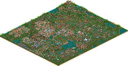
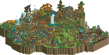
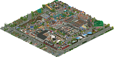
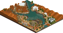
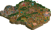
Disney’s Animal Kingdom Spain is a large, standalone park located in Southern Spain. This is Disney’s second animal based park, but has more thrill rides and wildlife encounters to make the park an immersive, multiple day experience. Guests can continue their Disney experience by staying at the nearby Animal Kingdom Lodge.
-
8 fans
 Fans of this park
-
 Full-Size Map
-
 Download Park
681
-
 Objects
631
-
 Tags
Tags
Glad to see this finally released, colby. Bittersweet to see because I wanted to be the first DAK on the site, but this is much more deserving.
I'll leave my final thoughts when I have a minute to take a better look, but you already know most of mine anyway.
I'm also one of the people who's already had some time to digest this, although it's exciting to see many new improvements made. I'm very happy that you finished another park, and I'm also happy that it's your best yet. There's a lot of really really good stuff on this map. Also some stuff that isn't quite as great, but because of the sheer quantity here it doesn't bother me much. It's just lovely to explore this map and discover new things all the time.
This is one of the best looking areas we've had in a while - even though the object selection is very archaic at this point. Good parkmaking transcends object selection.
Good work. It's pretty retro in the object selection so I assume that you've been working on it for a long time. I like that Arabic section mostly for the architecture and the others more for the rides. I really like the Safari amongst the elephants, zebras, and lions. The coasters are fun too. Good idea to combine rides with animal attractions. Very good work and hope to see more of your RCT work in the future.
This is a big surprise! Looks genuinely great from my first 10 minute look through, and I also love the DisneySea Arabic area, definitely my favourite along with the Indiana Jones area.
My one gripe is the coasters. I'm a diehard Disney fan, so seeing a B&M wing coaster along with an Intamin mega and a few of the others kills me a little. But when I get off my high horse, this is easily 80%+ quality work to me.
This is so good, so big, so old school. I can see me voting this quite high. Only thing i maybe didn't like was the foliage, felt a bit weird sometimes, maybe also to save object slots, but i also sometimes wasn't a fan of the colors. The darker green tons scream more conifer than spanish palm trees to me.
I wanted to write a long review about this. But going through all the areas i would just say that i like stuff and how good it is. Rides were all so much fun, disney classics mixed with more unique stuff like the wing coaster.
Congrats to you on finishing this. Looking at what Liam told us this seemed to be quite a journey for you. One of the parks of the year for me so far, and that with such strong competition.
Congrats on the release... I remember saying about a month ago on Discord that it would be cool to see another Colby park.. and here it is! Such a huge park with a lot of Disney character.. really wonderful stuff throughout.
The coaster lineup at times seemed not super Disney to me, but I liked some out of the norm rides like the B&M and Stallion. Some highlights for me was Drachen Tower, the lift and drop around the tower was great. Donald's Mine Train was a great family coaster, and definitely gave off the Seven Dwarves Mine Train vibe. Also a huge fan of Expedition Everest.. such an awesome area around that ride as well. The one coaster/ride that didn't meet the same quality of your other rides was the Ariel coaster.. having a lift on top of a hill to prevent rollback was rough!
I think you nailed a lot of the themes and ideas you see the real Animal Kingdom park. Only area that struggled for me was the Countdown to Extinction area.. seemed a bit dead and the coaster was mostly underground. The walking exhibits and the rapids ride were immense. The amount of theming for these areas were some of the best in the park.
Lastly again, great work.. can definitely tell a lot of care and passion went in to making this.
In between the game crashing on the multiple times I've tried to view this, I can say first of all congratulations, the scale of this park is huge, and completing this map I'm sure has taken a long time.
I really enjoyed the park as a whole, the architecture is pretty strong, the ideas are there and the aesthetic for the most part was clean and easy to follow.
The jewels of this park have for me have to be the animal exhibits and the surrounding buildings. I paticularly liked the simplicity but realism of the Kilimanjaro safari entrance, and I enjoyed the ride even more, clearly very inspired by the real thing and probably the best RCT safari ride we've had so far? Very well done on this part. Also on turning the rapids into a tour, they looked phenomenal as well, and certainly make for a different way of viewing animals. The ride is massive so I can only imagine theming it all took a while.
As others have said some of the coasters are probably better suited to a Cedar fair or a Six Flags park but you themed them pretty well and even if it's not real life Disney I think you made them plausible. I wouldn't mind if they were there in real life.
I enjoyed some of the extra steps you took for realism in back of house areas and applaud you for doing so on such a massive scale.
Most of the areas were distinctively different from one another but merged very well, the use of water and bridges to seperate areas is very Disney esque and again I enjoyed this, my favourite was the green girder bridge but can't remember where in the park it was.
Admittedly, I don't think it feels as Disney as say Glacier Cove but given that this map is at least twice the size I'm sure you probably faced object limits and other challenges. It still has notions of Disney scattered throughout and again I reference your building style for the animal exhibits as testament to this.
I gave you a 75% overall, because this is easily a high level accolade park, I might be being 5% too harsh but I'm not a panelist so I don't have to make that difficult judgement call. Again, well done on completing such a large scale project, and I look forward to seeing what accolade you earn.
Here's a video review of the park. Really nice work!
https://youtu.be/BFpgOFZPT3k
First off congratulations on finishing this massive park. I really enjoyed viewing it. I visited the real-life equivalent last year and it's definetely one of my favorites. It was fun to see how you brought a lot of parts from the origanal park to life. The Harambe village square, Kali River Rapids and Expedition Everest especially stood out for me in capturing the right atmosphere. I also liked the parts that you added yourself. Mixing in parts from DisneySea and California Adventure as well as your own ideas. Dividing the park up in large sections and dividing those in sets of three worked really well and made it feel like a logical whole even though it's such a massive layout. I loved the large entrance area with the two major attractions on both sides. How exciting would that be in real life. I also wanted to mention the great read-me you added.
Like others have said the object selection was a little dated here and there, but it didn't bother me that much. So much great content to see. I think the addition of several high excitement coasters made it feel a little less typical Disney, but I wouldn't mind some more coasters in the real Disneyparks personally. The way you integrated them into the park felt plausable to me.
I think it's a great achievement to create such a diverse and massive park with this amount of detail and atmosphere within the current object limitations.
A visitor stands next to the "Rafiki Rumble" carousel and asks a question to the other:
- Hi? Do you know how to get to "Sebastian's Calypso Kitchen" restaurant? The application: "Sightseeing - Disney's Animal Kingdom Espana" does not work on my smartphone.
Stranger to it:
Ha, ha, ha, ha, ha! I don't know, I'm sorry!
Everything is "Mega" as usual. It is a great pleasure to see how you can still create something new using old classic elements. For example: "Scar's Revenge", and the neighborhood. Everything is done with reverence.
What a cool Nessie's monster ?!
"Drachen Tower" is cosmic.
I like regions with a play of colors. And the more uniform ones are also great, because they are very architecturally refined.
The modernist style of technically advanced attractions - electrifying.
"Kilimanjaro Safari" is also a leap forward.
Everything is really, really nice. I promise to visit your park longer than now. Probably, there will also be inspiration in times of need. Best regards.
Congrats on such a great park and an astounding feat, building a park of this size and quality. More than anything, this park felt like it was fun to make and that made it fun to explore. Even when something may not have made sense, it felt fun in a way that made me less concerned about the logistics. Questions like "Would Disney build that ride?" or "Would Disney theme a ride to these characters in this park" are less a concern for me to begin with, but the sense of fun and excitement in building and exploring the potential of a park like this is great and what makes this such as compelling release for me.
Also, having visited EuroDisney, I can say that mixing the themes and characters around in weird ways seems like something Disney might do in Spain. I understand and accept that the inconsistent "Disney" brand is a drawback for some. Personally, I enjoy the creativity and I like the nostalgia of an era of rct that was about exploring what a theme park could look like.
At the same time, my only main criticism of this park is that some of those older nostalgic styles felt inconsistent with areas i'm guessing you've updated more recently. In a weird way, the park almost felt out of focus. Some areas were beautifully detailed and atmospheric, like the area around Expedition Everest, but then others felt under-detailed and more rough, like areas outside the park that were fully bare or the rapids in particular stood out as not having the same quality. I'm guessing this is due to the object limit, which is a shame. I honestly think that, while admirable that you stuck with the project for so long, it stretched the styles out so much that it's hard to produce an end result that is consistent throughout.
I don't think this detracts too much from the overall quality and fun of the park, but when asking if I would vote yes or no on spotlight, this is probably my biggest reason for saying no. For me, this is definitely gold, but not the 'near perfect park' that I generally consider spotlight to identify. Regardless, it should definitely earn you parkmaker, because I think the strong majority of the work is excellent.
Again, congrats on such an amazing feat and a great park!
A massive accomplishment, this map. I really enjoyed going through this, tons of content.
Entrance: Turned out to be one of my favorite areas, the Tree of Life path was great, and captured the feel of the real Animal Kingdom very well. Obviously it was based heavily on it, but you also captured the atmosphere with textures, colors, etc. The Outpost was nice, maybe could've used some park maps and such showing. The brown birch trunks were egregious, though; but this overall is minor. The flamingos
Fantasia(?) Area: Heading left off the entrance, this small area felt a little directionless to me. Colors weren't quite fully cohesive to me and went a little generic in style here. I did like the bridge and castle, started to build up some charm here. Drachen Tower had a great first drop and setting there, but then felt like it was just meandering quite a bit. I did like the small pond behind the castle, with the roll into the tower on the bank - great positioning there.
Jurassic Area: Overall, I agree with CP6's thought that the area was a bit rectangular - a more circular crater would've sold it much better. Inside I enjoyed most the architecture here, and was one of the more well-spaced areas in the park. Countdown to Extinction seemed like it could use some more fully-fledged theming; but the part running through the volcano was fantastic. The ribcage entrance was also a highlight of the park here.
Little Mermaid Area: I thought this was a cute little area - this had great composition especially with the drop and turn out of Ariel's Undersea Adventure. Some of the arch-work was awesome. Overall this area felt more Disney to me, given the adventure-style ride, but I felt some of the flats were a little undercooked for what Disney would do.
Aladdin's/Arabian Area: Headed back through the circle of the park, I think it's a good time to mention some strangeness in the park layout - the similarity between this and the above area is uncanny; why not combine them? Instead the Jurassic Section is plopped in the middle. Probably my favorite architecture work is here and the palace square felt very atmospheric - the peach section looks like it was built more recently as the architecture and detailing was much stronger. Stallion was a fairly good layout, but was probably the least Disney-ish in the park, and maybe I'm forgetting something in Disney movies, but I have no idea what this is based on. The station was great however. The scorpion tail was a clever touch, but again didn't feel as immersive as I'd expect in a Disney park.
Mining Section: I wasn't sure if this belonged to another area or was a small stand-alone, but the theming was nice and it actually developed a good atmosphere in a small plot. Kishi was a cool and fresh layout and I really enjoyed the cork placement. A little intense for Disney, but it did feel tucked into the theming enough for me to overlook it.
Africa: Sort of the area I think of when I think of Animal Kingdom and I think this one turned out well and served this purpose. Kilimanjaro Safaris was the natural highlight here and was massive. The station was very awesome, well done there. The sections in the center of the ride were excellent and really felt like the area, but the safari never really went through there, and went through a huge cave to start. I also enjoyed the village areas, and liked the pops of white in the architecture. Tasteful coloring here as well, but I think there might have been some room to make it feel more like Africa in its colors rather than just including the full range of options.
Nepal: I thought that, overall, this was the most "Disney" areas of the park, but that might have been skewed by the rides essentially being their real-life counterparts, which I'm fine with. The Jungle River Rapids was my favorite ride in the park, and the theming was at the level I wish everything was at. Expedition Everest had the atmosphere you're after in this sort of park, I did think the landscaping left a lot on the table and was a big block when you view it from the back side. Architecture, boats on the water, panda exhibit, all of that was great and I loved that there was more water features here.
Mayan/Indiana Jones Area: The wing coaster, to me, make no sense for Indiana Jones. Just not seeing the connection there when you have the option for anything more rustic - I would've went for using the mine train for this and rethinking Donald Duck Mine Train. The temples here looked really nice, and the work along the waterfront was very good. Canoes were very fitting and I liked the transition into the rusty modern buildings.
Western Area: Coming back towards the entrance, I think the composition here was a bit strange but the individual elements were enjoyable and fun. The wolf mountain was sick, but was faced in probably the worst possible direction. The mine train was nice and you needed it somewhere, but here it felt like maybe half a Disney-length mine train; and, I really wanted it over as Indiana Jones. Grizzly Creek Logging was much more immersive and was a great inclusion and substitute for Splash Mountain.
Tree of Life/Discovery Island: The tree was solid, not overdone and not intrusive, just nice and appropriate for what RCT can do. I didn't care for the architecture here much at all, but I liked the additional flamingos and the stage. The Rivers of Light system was awesome.
Overall, such a massive park that I'm impressed. It was definitely one I enjoyed to look at just because it's fun and has tons of stuff to look at. The downside was that I couldn't really look at each thing for too long, it felt a little bit surface level throughout which isn't exactly what I would expect in a Disney, let alone any park of this style. The coasters were a little bit either overly intense or they didn't really match the theme much at all - when you think Indian Jones ride you think mine train, when you're thinking Aladdin, I'm imagining magic carpets rather than a giant woodie, etc. There was portions that I felt were clearly older (which is unavoidable for a 10 year old park), which isn't ideal, but I can accept that. There were several composition/layout considerations I would've looked to change, but alas, I still could enjoy watching this park go.
this is just excellent. I'm so impressed by it, and surprised too- really out of nowhere. I'm not in a long review mood atm so I'll go quick on just some highlights. i'd say it has two main flaws, which don't really act much against my enjoyment of it. one, is the slightly inconsistent use of objects and detailing and construction. in some places its very good and in some places it feels a bit old-fashioned, clashing, inconsistent, etc. but easy to look past IMO. the other is the park composition- generally its fine, but some portions of it are just a bit square/cramped/ hard to follow, which is a shame because they're really very good otherwise. understandable with an long-in-construction-park thats been clobbered together however.
onto the highlights tho.
-entrance- vibey and mysterious.
-i like the addition of a the children's fantasy area. feels a bit clashing but the little mermaid ride really sells it
-the creater/volcano based jurassic area is an incredible idea. so good. just wish it wasn't a square!!
-expedition everest- maybe the best version of this area I've seen. you really nailed the buildings and feeling here.
-loved the mix of BG inspiration and larger rides. I thought most of the layouts were pretty good and did interesting things with their environment, maybe except indiana jones. I didn't hate it, but it felt a bit clunky.
-i love how you added more narrative and structure to some of the rides, especially the train, safaris, and rapids. very cool integration into the environment and animals.
-the piece of lost river delta which is copying disneysea's wooden buildings and boat station is phenomenal and so accurate. really strikes a chord with me.
-moroccan area and the animal exhibit behind it are fantastic. very good mix of BG and disneysea.
overall, just such an enjoyable park and it really goes to show how you can get away with less-than-stellar execution and still pull an amazing piece of rct out of your pocket. things like "disney wouldn't do that" are very fair criticisms but also didn't remove my enjoyment of the smorgasbord of inspiration. i can see why it might be considered 'not quite there' for a spotlight, but for me, i enjoyed it enough, and thats all there really is at the end of the day. 80% yes.
Hi all,
Thanks for all the thoughtful comments and feedback on the park. This has been a 10-year labor of love (well minus the 7 years that I stopped playing RCT). I tried to put some of the explanation of how this park evolved into the readme document, but I will try to elaborate below.
In 2010 when I started building this park, I had never seen an animal-based park attempted in RCT2. I thought DAK was the best real-world example, so I used it as the model. I thought a lot about what I liked and what I thought could be improve about DAK with the ultimate goal of making a more fun park. So I started pulling elements from other Disney parks that I thought would complement the general theme. I also knew I wanted to expand to other regions beyond Africa and Asia, and the Americas and Arabia were the most interesting to me. Originally, I also wanted to include an Australia/Pacific themed waterpark, but quickly realized that wasn’t feasible on one map – but maybe in the future.
IMHO what DAK was missing were major thrill rides. When I think of thrill rides and wild animals in one place, Busch Gardens was the first place to come to mind. So I thought, let’s use Spain as a location to test a park with Disney themes and animal exhibits and Busch Gardens thrill rides. To balance the larger coasters that wouldn’t be accessible to kids, I developed Disney character-based themed areas exclusively for kids in each of the five themed lands.
As far as the controversy of naming this park Disney, I think it’s very clear that Disney was the inspiration for the park and the name makes sense based on the general park layout, the replica of existing Disney themed lands, and the Disney characters. If the park doesn’t feel Disney enough for some, that’s a fair criticism, but my intention was to explore what I thought a fun, thrilling version of DAK could be.
I also don’t think it’s possible to build a full, large-scale park in the current NE-style within the limitations of the current RCT platform. That object limit struggle is real! Some of the best NE Disney parks in the past few years have only been one or two “lands”. So this park is a throwback to when parks were much larger, with somewhat less detail than the ones today, but more than parks in early 2010s.
The comments about the various styles are legitimate. Liampie and nin can probably vouch for this, but I completely rebuilt large sections of the park over the last few months to make them more modern. Ultimately, completely rebuilding the entire park was not feasible, but some of the older sections have their own nostalgic purpose.
Other comments:
- Dinoland is definitely too square, because up until a month ago it was a replica of Mysterious Island at DisneySea, which felt off-theme.
- The safari was inspired by nin and was a continuous struggle because of the foliage, which is not my strongest skill
- The enhanced rapids is based one of Disney’s original Tiger River Rapids concepts
- Similar to the real DAK, all rides are not named after Disney characters, some are based on animals and regions, ie. Stallion – the readme lays out the areas and their themes
First off, congratulations on finishing such a huge map! It's really fun to check out a park of this size with so much varied content. I think my opinions on it are in line with most of the previous comments, so roughly:
- you get the impression you had great fun building this, as it is really fun to explore.
- There are many really great details and ideas throughout the park
- There is a slight old-school feeling to it, with a more classic object selection and usage (not to an excessive degree, and I personally like it)
- The macro aspect maybe suffers a bit from a high number of different areas which are not always laid out in the most logical manner (such as putting areas with similar styles, e.g. Aladdin and The Little Mermaid together which was mentioned in other comments). But considering the enormous scale, I still think the macro is quite impressive and well done.
Some details/parts that stood out to me:
Loved this aviary structure:
Very pretty looking pattern at the bottom of the lake:
Nice bear sculpture!
This area probably felt the most atmospheric and had the best composition IMO (sorry for a bit of a weird crop):
There were many good ride elements and interactions throughout the park, but this was my favourite:
On the whole, super enjoyable release, and I hope you get a really good score with this!
Wow, this park is massive. Highlights for me are the safari ride and the Arabian area - the latter being spotlight-quality easily. I appreciate your willingness to go all-out with some of the attractions, namely the rapids ride that easily takes up an H2H-park-sized chunk of land. I think the facelift you've given the park with some newer objects and added detailing went a long way to improve the all-around quality. On the other side of the coin, unfortunately, I think the park really shows its age style-wise and object-wise - examples I think of here are the hotel and how many of the areas are sort of blocked off from each other and compartmentalized (the area surrounded by Countdown to Extinction and the area by Khan are the worst offenders here). Still, there are some great moments throughout - the plaza in front of Khan, the bazaar around Rafiki Rumble, and Kasbah Canyon Nature Walk, to name a few. Great park, thank you for submitting it.
I voted yes on this being a spotlight; even though it looks relatively under-detailed by today's standards, it would've certainly been one 10 years ago. I think the park is very technically well-done, especially for something that's mostly pre-OpenRCT2.
For starters, it's almost at the maximum size and managed to just hit the object limit while looking evenly composed throughout. There are a few areas that are open, but they don't look empty and barren. Everything seems to have just the right amount of scenery and nothing feels stylistically anachronistic.
As for critique, if there's anything I don't like about the park in certain parts, it's the terrain. It's very triangular and jagged at times, and is awkward, especially around the rapids ride. Most of it is really good though, like the crater around countdown to extinction.
I can see why some people don't agree the coaster lineup here as well... Intamin Megalites and B&M wing coasters aren't common sights at Disney parks. But to me, they enhance the park even if it's not particularly realistic...
As for highlights: the Aladdin section of the park is awesome... the palace is great, and I like the nature walk, particularly the aviary at the end. Also, the hotel may be my favorite section of the park, it's a cool style and it's really neat imagining all the wildlife wandering around and occasionally having the giraffes peeking their heads into the balconies.
The Little Mermaid area was also great... this ride is simply beautiful, very well done.
Congratulations! I think gold is the right accolade for this, and I don't disagree with the 78%, but it would've been nice if you hit 80 so that you would earn NE Parkmaker status. After 20 years of producing full scale solo parks, that wouldn't be undeserved.
Colby for Parkmaker 2030!