Park / Rob's Rusty Railyard
-
 22-July 20
- Views 3,005
- Downloads 595
- Fans 0
- Comments 12
-
 56.00%(required: 50%)
 Bronze

CedarPoint6 60% CoasterCreator9 60% Dr_Dude 60% Jaguar 60% bigshootergill 55% Cocoa 55% csw 55% geewhzz 55% saxman1089 55% Scoop 55% RWE 50% Liampie 45% 56.00% -
 Description
This park is 100% ncso with the exception of custom trains and blacktiles. The original version of this park was uploaded to DKMP back in April, and the expanded version was uploaded to RC&F last week. I hope you enjoy.
-
 No fans of this park
-
 Full-Size Map
-
 Download Park
595
-
 Objects
200
-
 Tags
Tags

![park_3143 [MM2014 R1] Parkouroaster](https://www.nedesigns.com/uploads/parks/3143/aerialt2757.png)


![park_4117 [H2H8 R4] Grand Central](https://www.nedesigns.com/uploads/parks/4117/aerialt3899.png)


Cool stuff.. really thought the shipping/industry details were nice. The custom flat was really well done too. The coaster had some odd colors.. was it supposed to be rusty? Either way the layout for the RMC looked fun to ride. Great to see one of your parks released here.
Solid work. The RMC's layout was excellent, but the pacing could've been improved just a little by slowing down the train. Little touches around the park, like the railroad track and shipping crates, really helped create a good atmosphere. And the custom color palette worked great here.
The rapids ride could've used some attention, especially with a boring layout like that. Have it interact with the coaster or something! It was like on its own little island. Likewise, the foliage was more filler than adding anything.
Overall, pretty good job.
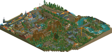
Overall, I think the theme, atmosphere, and little details were great and really made this a fun park to look at. I think this park is best where you capture that rusty industrial yard look embedded with the ride. The shipping containers, the cranes, even the overhead utilities were really atmospheric.
I'm not sure if this was submitted as a design but I don't think it was? Personally, i think this would have been better as a RMC design because the second coaster and the rapids felt a bit unnecessary. Taking those out might have given space to expand the RMC a bit and better immerse it with the theme, rather than it feeling like the theme was laid around the outside of the rides.
Also, the layout of the park felt a bit tacked together in a way, like the really long path from the RMC to the other side of the park. This reminded me of a more organic way of developing and building a park. Not a glaring issue, but something that I think hinders the park.
Overall, a fun entry and very much deserving of an accolade IMO. I would recommend considering the layout and relation of your different areas in your next park. Congrats!
Love seeing more NCSO stuff like this, this one does a really good job at selling a rugged industrial theme. All the vehicles like the forklift, digger, and cranes are really creative and a good fit for the theme.
An RMC is a perfect ride for this setting and the layout was good... I agree with rct2day though that the pacing of it felt too fast. The other rides did seem kind of filler but I did like the gerstlauer... you did a good job on the flat ride too.
i can always get around 'rusty shit' as a theme. theres some compelling stuff here, especially all the cranes and shipping container infrastructure. a good vibe throughout. i particularly liked the train on the woodie sign.
Pretty nice, I agree with RCT2day about the pacing on the RMC, it was very quick. I really enjoyed the rapids ride and the train yard
I'm confused why this is a spotlight submission and not a design submission. It's two pieces of park cut out of the surroundings connected by a single wide path. That's not a complete map in my opinion.
Coaster looked nice, sadly the layout was too fast and it was missing interesting set pieces after the first turnaround. Theming had some high points for sure, but then again it was very undercooked around the rapids.
As a design submission, this may have been 55%. As a park submission, I'm going with 45% for being incomplete. Good work though, talent is evident!
@Liampie
I'm new here, so I did not know what would be the best way to submit this park. I thought spotlight would be best since there are four rides in the park. Oh well. I'll run it by you next time! Look out for more stuff from me in the future. Also, thanks to everyone who left a comment! It is much appreciated.
There's a lot to like here. I love all the decrepit railyard stuff, although I think the conexes could've been executed a little better. Some other details I liked: the Rust Rusher sign, the water pump for the rapids, and the theming for Sequoia. The park does suffer from over-hacked-ness though. I could've done without the plain path queues and trackitecture station roofs. I also think the RMC supports are overdone - it looks too much like a jumbled pile of lumber. I think this is also the strangest path layout I've ever seen, almost as if the paths were an afterthought.
Good first submission though, I'd give it a solid bronze.
Congrats on the bronze!
Thanks for scoring this park bronze! I didn't expect to score this high! This park was fun to build.