Park / De Bedriegertjes
-
 02-August 20
-
 De Bedriegertjes
- Views 9,451
- Downloads 0
- Fans 0
- Comments 14
-

-
 73.00%(required: 70%)
 Gold
Gold

Scoop 80% bigshootergill 75% CedarPoint6 75% CoasterCreator9 75% Cocoa 75% G Force 75% Jaguar 75% RWE 75% csw 70% saxman1089 70% posix 65% chorkiel 60% 73.00% -
 Description
A timeline park started in 2014, in the style of 2005-era Dutch parkmaking, built around a castle. De Bedriegertjes is based on the actual castle Kasteel Rosendael near Arnhem in The Netherlands. The estate features an infamous 18th century fountain that has hidden sprinklers. The sprinklers will switch on and surprise visitors at random moments, resulting in the fountain getting the name 'the deceivers', which translates to De Bedriegertjes. In this universe, the regional tourist attraction has been expanded into a modern theme park while respecting its historic roots.
https://nl.wikipedia.org/wiki/Kasteel_Rosendael -
 No fans of this park
-
 Full-Size Map 1
-
 Tags
Tags
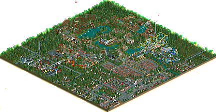
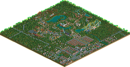
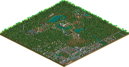
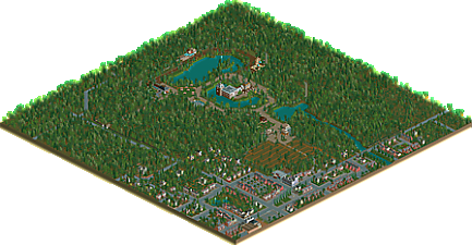

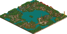
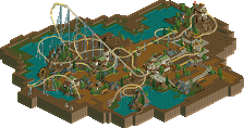
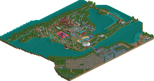
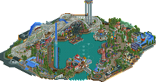
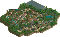
The two theme parks featured in this download are separately eligible for an accolade! Score the individual parks here:
Slow Swaffelhoeve by Faas
De Bedriegertjes by Liampie
Download page
I think this is my favourite work from you Liam, at least on a similar level to Corsair Veridian.
It may not be the most detailed thing you've ever made, and it may not be the prettiest thing you've ever made, but it is a masterclass in everything you try to teach to other people in playing this game.
While everyone fawns over the macro-level on Ancient Worlds, this to me is the pinnacle of macro. Every single large coaster looks like it's been carefully made with paths, view points and peeps in mind, whilst still looking realistic, immersive and pretty good in the flow department. Every building looks like it has a purpose. Every area has it's own identity, but they come together in a seamless way.
Here's a few of my favourite bits:
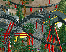
I love how this coaster is the first thing you see when you enter the park, the way it's framed with the park entrance sign to the right of the plaza, then the loop and the spires to the left, beautiful. Also, the way it's kind of below path level here is just incredible, it gives it a sense of depth where it almost feels like parts of the coaster would be hidden beneath the trees, so the only parts you see are the loop/spires mentioned before.
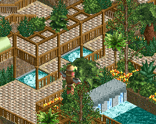
Such a simple bridge but really shows how well you integrate queuelines into the ride area and the interaction between the two. Not just for the bridge, but the way that your view of the ride is basically blocked from the queueline, until you get to the bridge, and then all of the walls are open from there on so you always see it. I can imagine how anticipation would build being in this queueline.
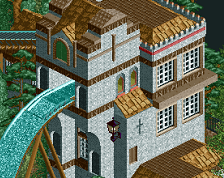
Not too much in terms of interaction here, but instead this shows how a building doesn't need to be super detailed to be interesting. All the details here are at the peep level and it still holds my attention as any larger building would. Everything above peep level is superficial and is just 'filler' in a sense, but still looks classy enough to pull it off.
I'll leave it there with the pictures to not spoil too much, but I think my favourite ride is Prototype. It feels huge compared to the area around it, yet it flows so well, and again feels super realistic. The motion simulator in this area is probably my favourite architecture on the map also, which definitely helps.
I do feel like the back area of the park, with the wooden coaster and the intamin family launch coaster, was a little bit weaker and definitely felt a little more rushed, but it's still solid overall.
I think I'd probably rate this somewhere between 80% - 85%. I'd be on the line with spotlight, but would probably go Gold just because I do feel that back area takes it down a notch.
EDIT - I posted this on Liam's park page specifically, but it posted on the overall project page. Faas, I'll review your park fully soon, but a quick summary is that I thought it was great and it makes me more excited for your Tivoli style park.
I agree with Trav on how this is an interesting execution on the macro scale... I'll review the parks later.
Very nice!
I've had a look at all of the maps and firstly it's super cool how they've come together for the great overview shot. Especially with the river flowing through the middle, that looks like a difficult concept to make work of multiple maps so well done both.
My favourite non-park map was centre parks, I enjoyed the fairly good replica of the main swimming pool area and thought the smaller buildings attached to the dome were a nice touch.
I won't review Liampie's park rn, but I enjoyed it a good deal, with my favourite ride being Aeronaut.
I think it's clear to see both parks follow a certain park-building style? A Dutch based design? It's pretty retro to see but a nice way of touching upon an older style of parkmaking.
Faas - I found your park to be very charming. It feels like a park that was built 15 years ago. Unfortunately I couldn't really see the castle that I believe was the stand-out building as my game crashed everytime I tried to look at it. The small village-esque area next to the castle was well done, and I found my eye attracted to many details.
Within the park my favourite section was definitely the area surrounding the water coaster and the blue (giga?) coaster. The area felt busy without feeling too compact. The coasters themselves were all good, with realistic layouts. I guess for a park like this there weren't any clever tricks with the layouts or modern techniques, but again I don't think that would have fit your goal.
I loved some of the little barns and huts placed around the park, very European, they worked really well again to make the park feel lived in.
I also greatly enjoyed your indoor water ride, at least the bits you did theme that could be seen without the cut-away view.
I'm sure there's more to add that I have forgotten but in summary I would say the park was pleasant, it feels like it could be family-run. Although I don't think it is quite as detailed as many other recently released parks there's definitely a charm to how this park was done. I think I would be giving your park a silver if it were released individually, and I think that's a fair assessment of what this park represents.
For the entire 9 maps, I think I need to reserve judgement without spending more time, my initial impressions are that the project is not quite a spotlight - I'm not sure whether this project has been the main RCT work of either of you two over the past few years? - however without spending more time I couldn't yet say exactly what I think it deserves.
Great fun to look at though, and again, a super cool overview!
A whole bunch of thoughts so here we go!
First, congrats to both on finishing a really cool and engaging project. I think NE has always produced a lot of its best work through collab, often forced inside H2H, so to see something more sprawling and collaborative outside is really nice. Overall, I wasn't amazed by the supporting maps but I love the impact. They provide a context and sense of place that really highlights and compliments the work put into the timeline parks themselves. There was definitely some interesting and unique things, but I won't lie that I found myself scanning through some. At points the maps were so much tree there wasn't a lot to look at, and they lacked the polish of the main parks (unnamed rides or signs). But I say that fully understanding that it's the nature and in some ways part of the intent of this kind of project.
Slot Swaffelhoeve - The sense of good parkmaking and a very classic style really carries this. A lot of the areas managed to feel really atmospheric without being overly detailed. I like seeing the original versus modern build out, thought the lack of a middle timeline makes it feel a bit abrupt. The dueling woodies were my favorite part of the park. Also, for an older bench, the forms help provide a lot of interest where some of the textures and pieces could otherwise feel a bit blocky. Overall, I'd put this in the Silver range. Fun, engaging, good parkmaking, but not offering that wow factor I'd expect with a gold.
De Bedriegertjes - Having the 4 different timelines really helped with this park because you had more timepoints to check in and see where things had changed or evolved. That and the large size provided a bit more of an immersive experience for the viewer. I've often felt that using simple pieces in unique and creative ways is a defining Liam skill, and it's very on display here. The line between this bench and more modern benches is blurred a bit better too, primarily standing out to me because I remember having to use certain techniques back in the day, heh. Just like Faas' park, the atmosphere and sense of good classic parkmaking are what make it, but in some ways that combined with the bench hold it back from really amazing me.
Overall, a big congrats to the quality and particularly the macro parkmaking on display with these parks. I'm torn on the old-school bench. I love the sense of nostalgia and see myself adoring these parks maybe 5-7 years ago. At the same time, they just are missing that wow factor I look for in the best modern releases.
I've been waiting for the release of these two parks for a long time now and I must say it tidn't disappoint at all. I knew there was a Center Parks being built as well but to see a nine map release went beyond my expectations. So congratulations for spoiling us so much!
The non parks were a great example of macro parkmaking, relying on old school objects and large scenery to create the atmosphere and feel of a real location. A location you truely nailed. It really looks like a typical Dutch town with the recognisable architecture and town planning you see in the Netherlands. Also big fan of the new houses using the textures from the built in ones.
Slot Swaffelhoeve is still the weirdest name for a theme park ever but a great Faas park. Love the different themes although the Roman theme does take up a hell of a lot of space. Your creativity really is in a place of its own. The prehistoric area is such a nice place to be. The dark rides especially are favorites of mine. For such a big map, some areas feel a little...cramped? Or at least have a lot of textures and things going on, like the pirate area. It's a real shame you also didn't include some intermediate maps to show the progression through the years of the park.
De Bedriegertjes feels the most like an old school RCT-Guide park though IMO, and captures that era of park making the best. The entrance area in it's beginning years looks like comes straight out of a Paul park. I admire you for also choosing a not very conventional park shape, making you work with the restrictions and boundaries you set out for yourself. Here as well the creative themes are an absolute highlight. The ballon themed flyer is an absolute favorite of mine. Things I liked less are the new area across the road. While it might be realistic, I don't really like the connection between the different park parts and think it's too jarring. Also not a fan of the reversing train.
All in all a very nice release from the both of you. I thoroughly enjoyed looking through all the maps and let's hope we see a new Concurrenten park in the future...
Alright, onto the first park:
Swaffelhoeve: This is definitely a pretty and well-planned park for the most part. I enjoyed the layouts, specifically Royal Battle and Baron 98 have excellent interactions with the paths. There were also lots of cool little scenes, like the playgrounds, or the campground (although the signs could've been named). Also, much of the park, admittedly does feel kind of filler with the foliage, but that was probably intentional for the style.
Highlights:
The architecture while a bit simplistic at times, is definitely beautiful... I like how the building bridges over the path. This section as a whole is a strong point. I also love the slide with the mountaintop and waterfall.
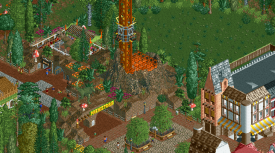
The prehistoric section is also a strong part, and maybe my favorite part of the park... I think this entrance is worth pointing out because of how seamless the base blocks blend with the volcano objects. This section has some really nice landscaping and I enjoy the blending of browns and greens.
This (commenting specifically on De Bedreigertjes here) was very pleasant and fun to view. The timeline aspect was well done, cool to see how the park evolved and expanded over the years. Only thing is that I'd expect the city to change a bit more over such a long time period, but it's of course not the main focus, and still perhaps pretty realistic after all.
I don't have much else to add - I think Trav's and Jag's screens overlap pretty well with my standout parts of the park. Especially Aeronaut - the way that it dives under the path in several diagonal swoops made for a really unique, interesting and pretty framing of the area. A little more out there than the rest of the park, which usually works well for me. The other ride that was memorable to me was Comet, simple idea but looks really cool and fun, and executed in a great way. The one thing I don't really agree on though is the usage of deco blocks as landscaping - they give too much of a weird Escher effect for me, and I don't really see any advantage over using regular rock or 1k ruin blocks.
A really nice release all in all - the generally high quality of the content combined with the convincingly executed timeline aspect and the fact that it is fleshed out further with several huge maps of the surroundings definitely makes this a solid gold in my eyes.
Cool I'm going to take a look at it. Funny enough I build yesterday for the first time in 3 three years in my timeline park. Maybe it will get finished...
Will update my post when I'm done watching the parks.
Amazing how far you 2 went, not only creating 2 fun timeline parks but a complete region in multiple maps. Hats off! It takes me back to the good old times of SaveRCT and RCTGuide, a memory trip to the high days of Paulism...
Bedriegertjes
I still don't get the Bedriegertjes name, but it's not like Faas had a much more "normal" name for his park lol. I'm a bit torn on het Kanon tbh, on one hand glad you kept an old Schwarzkopf alive but on the other hand it doesn't really fit on that place anymore. You have a nice entrance area there with a great theater and I'd love if you would have pulled that through a bit further to the place where Kanon stands today. Kanon could've been replaced.
Kasbah is one of my fav rides here, small but greatly themed and very charming. The area around Landhuis Griezelstein had so much Efteling vibe imo. Not a fan of Marooned, the coaster itself is hidden away from the peeps viewing point and the lay-out is pretty weird too. Don't know why you went with the sitting cars, motorbike cars would've fit way better.
Keelhauled is Liam at his best. Great little tower with just enough details, good ship and the ride composed around it. Great! Easily the most atmospheric area of the park. Orion is a big ass coaster, would easily be one of the better in Holland and attracts people to visit the park. I also love how the Prototype is placed on the other side of a road and people have to use a bridge to get there. The coaster itself looks awesome but again, why the sitting giga trains on it while those can't even take inversions?!
Swaffelhoeve
For the English speaking... 'hoeve' means farm, 'swaffel' means to tap your dick against someone/something (multiple times). He's not aiming at being a family park I suppose...
When it comes to coasters, you win. Swaffelhoeve has the better coaster line-up with a Beemer diver, Intamin hyper, a fun spinning coaster, dueling GCI's. A bit of a shame only 2 coasters in your park ride with block brakes, come on Faas, safety?! When it comes to water rides, I miss a good old flume! But you do have a classic big dark ride that Liams park doesn't have.
Swaffelhoeve has that cute Faas trademark and feels a bit more modern. Very cool park.
Thanks you both for finishing your timeline parks. I hope for another timeline 'contest' in the future
ok so i'm gonna use this thread to comment on all the maps that aren't the two theme parks I guess
a1- simple but vibey. love the campground and those custom object houses work perfectly for rct2
a2- love the train station and soccer stadium/s. the old district almost works well, but its a funny mix of old and new detailing. still i appreciate the commitment to new objects
b1- cute mansion!
b2- this is great, really feels like dutch building. cool structure.
b3- similar again but I do love the commitment to setting up this massive environment. its fun since i'm saving the parks for last to build up to them
c2- horse thing
c3- baggersloot indeed
can't wait now to see the parks! see you in those threads...
no wait, don't mind me, i realize this is also one big thread. ok then
slat swaffelhoeve- really lovely park. it really grew a lot over two sv6s! layouts are great and very reminiscent of their real life inspirations. i especially like the dueling woodie layout. the whole park reminds me favorably of efteling quite strongly. My favorite bit is probably the big schloss nobelfest building with the dark ride and the slides attached to it. I also love the train going over the entrance and looping around- very fun. great park, gold from me for sure.
de bedriegertjes - i think as a timeline park this works wonderfully. the park starts humble and grows in natural and interesting ways, filling up space and expanding creatively. its very entertaining to poke through and gives the park a lot of life and character. i really love (almost) all the coasters- great layouts and environments. especially the flyer, schwarzkopf shuttle and the new age vekoma. I don't like the intamin multilooper as much but they're ugly IRL so whatever. the park draws very tellingly on both dutch/european parks and dutch parkmaking, which is great to see. themeing is some quality old-school with touches of newer park design. I especially like the rapids ride and the area around the woodie in the final version. the park has a lot of atmosphere and vibe though, just an excellent example of this style of parkmaking.
Slot Swaffelhoeve: Dark ride building for Schloss Nobelfest was a highlight for me. As Fred pointed out, this is a solid coaster lineup. The spinner and the dueler were my favorites in that regard. The theming throughout was well executed.. loved the rapids especially. Having green spaces and gardens throughout were pleasant and helped prevent too much clutter.
De Bedriegertjes: Damn.. great park sir. Solid touches of theming throughout.. obviously Aeronaut was the best example of that. Loved the interaction Cannon had, but the path seemed a tad narrow? The family flyer was also a great ride in terms of interaction. Very old school park vibes.. and super atmospheric.. guessing thats part of the Dutch parkmaking. Areas like the maze, the swan boats, and the fountains/statue near the center of the park are things I wish American parks irl had.
Other maps: Really ambitious and adds so much context. As Cocoa said, great commitment to selling the environment these parks exist in. Multimap projects seem to take so much planning that I'm envious of that sort of dedication to the game.
Time to review my rival, at last. It's a shame the story wasn't included because I remember it was great. At least the park does show that it has grown organically, with the quirks and awkwardness of a proper timeline park. I'll go around the map, clockwise, starting at the entrance.
I think the parking lot area is very good, with the coaster and the train as in park teasers. The big train helix with huge flowerbed is an eyecatcher that I can belief would be one of those iconic landmaks of the park, like how the Pagode rising above the trees is a symbol for the Efteling. Of course, the castle itself would be a landmark too. It's good. One thing I'm not sure of is the squareness of the plaza in front. The far corner feels very sharp. Inside the park, the archy is a bit all over the place, but it's very atmospheric. The woodie lifthills represent the third major eyecatcher in a row. From the peep perspective, this park would be good looking for sure. Especially when you consider that when peeps look to the left, they see the lifthill for the vekoma, and when they look to the right, they have a diagonal view towards the drop tower. The sightlines aren't as consistently good in the rest of the park but so far, good job.
De Eenhoorn is a simple, average coaster, but elevated a bit by the pretty lakeside setting and the muted colour scheme. Royal Battle doesn't duel or race very well, but it looks pretty. Before moving onto the Pirate area, I'd like to mention that what I call the 'connective tissue', the low density spaces between the rides and buildings has been done very well here. It's not easy to create low density areas that don't feel empty or featureless. Before De Eenhoorn, you've got a nice variety of seating areas and small rides embedded in the greenery. De Moppenboom is also a great feature that blends in while still being a feature. Behind De Eenhoorn, you have this large garden-like area. Playground is good, and I love the picnic bench area with the tan low deco block walls. One of the most succesful bits of the park in my opinion. Great out of the box colour choices here too.
When it comes to theming, the pirate area is the best. The colour and texture palette here is tighter, which pays off. Two coasters here, and I really like both. The track layering on Zilvervloot is very unlike you, but it works. Again, nice variety in the connective tissue here. There are three paths leading out of the area, and every path offers something different. One thing I don't like here is the path texture mix, a bit messy.
The Roman area is almost great, but a bit too scattered to give it the same syngery as the pirate area. I like the realistic path layout here. Not the most efficient with the two dead ends, but perfectly believable. I'd say the dead end into the river rapids island is good parkmaking. The rapids is one of the best rides in the park, aside from the aforementioned aspect, the ride itself has a good layout too, with plenty of variety in the water features, and that bridge as a nice eye catcher. I really like the station, one of my favourite buildings in the park. Dark ride is neat too. Not great, but it works. To take it to the next level I would've liked better designed interiors, but I know it's not that kind of park to go all out with interiors. We're lucky you cut away the roof at all.
Random windmill. Shoutout to the camping with the soggy fries. Baron 98 is another good coaster. Good theming. The gold accents in combination with the browns give it a distinct look. Dinosaur area is lovely, although a bit small. I like the coaster but it doesn't look like a Maurer. Big Bang doesn't make sense, thematically.
The final area is one of the best when it comes to theming again, but it doesn't offer as much in the way of rides. From the angle where you enter the area most of the archy is obscured and it doesn't look too attractive, but the upside here is that you've got something new to look at every time you rotate the view. The best features here are the mat slides, and the way you themed the rear of the big castle. Just the corner turrets - that's the way a real theme park that cares would do it. Cool arrangement of bridges in front of the castle. One thing I'm not sure of is having another big castle in a park built around a castle - especially since this one seems bigger. That's kind of cheapening your own unique selling point.
Generally, it's a good park with some very mature parkmaking bits obscured by outdated object selection, I can understand that not everyone can see past the archaic style. Since I have a nostalgia boner for the style, I'm a big fan of this park regardless. When it comes to archy and rides, the park is merely good, not great.
Lastly, shoutout to the naming. Swaffelhoeve, Bibberrilling, de Beukende Boekanier, and Villa Verbolgen are excellent in their shittiness.