Park / Universal Studios
-
 18-July 20
- Views 3,080
- Downloads 573
- Fans 2
- Comments 12
-
-
 Description
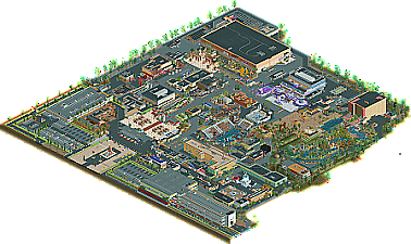
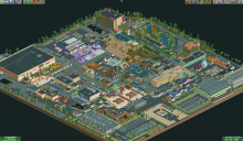
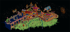
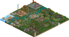
Welcome your peeps to Universal Studios! This theme park takes pride in immersing your guests at a backstage look at movie magic and celebrates some of Universal's biggest blockbusters! Set in the mid 2000s, your peeps can enjoy shows such as Waterworld Shrek 4D, and be thrilled on such attractions as Revenge of the Mummy the Ride and the Jurassic Park River Adventure! City Walk also offers great shopping and dining experiences!
-
2 fans
 Fans of this park
-
 Download Park
573
-
 Objects
503
-
 Tags
Tags
![park_3325 [H2H7 R1] Tenochtitlan](https://www.nedesigns.com/uploads/parks/3325/aerialt2925.png)
I wish we got more submission like these! Large scale parks from new members that show a lot of promise. Your execution is holding you back a bit, as the architecture, pathwork and foliage are quite disharmonic, but the overall package shows that you're thinking about what you're doing a lot, and that you know a lot of stuff, and that you have a good eye for detail. A dinosaur prop being spray painted in a backlot is a great example of this, I'm actually going to nominate it for an award for next year because I think it's such a neat detail.
Lastly, I'm also going to nominate your for best logo 2020.
Excited to see you develop with another park!
This was pretty cool! Love the creativity and fresh style you used here, a nice break from the usual NE meta styles. Hope to see more in the future and for you to refine your style and building a bit.
I really enjoyed this, this is a hell of a debut park. Part of it does feel kind of unrefined, but it's really a convincing universal studios park.
It's great seeing more realistic parks that don't really use coasters and are more focused on the theme... first a waterpark and now something for dark rides. I like the small details and motion put into this, that makes a ton of difference: the falling jeep, boat with seals, stunt show, etc. are all nice. I agree with Liam that the dinosaur prop is a very creative detail... really the whole JP section is strong.
The park is a bit hard to take in at times and I'm not a fan of the foliage. The architecture though is actually pretty good for what are essentially warehouses in a park that doesn't use a lot of quarter tiles.
Overall this is some really good realism, and it definitely shows a lot of promise.
Waffles Offline
Also thank you all for noticing and spending time to look for small details!
Looking at the score, my expectations were quite low on this park, but I was really suprised when I opened the save. The whole park has unique ideas and details that make it really fun to look at.
The indoor skydive, Jurassic Park, the queue for Water World, they all have a unique signature. I really hope you can develop your style into something great. I think you have a lot of potential.
Be carefull about using too much of the same color in one area. Especially the grey/black tints everywhere. Take the entrance as an example: grey path, grey umbrella's, black/grey fences and the roof and signs of the entrance are also grey. That makes it really hard to read and it could be so much more interesting. Even just some trims could do a lot.
I really enjoyed it after all. I'm not a panelist, but it really deserves an accolade imo. It's a 55% for me.
In regards to composition and ideas I think this is a 90% in all honesty.
It's clear you have some great knowledge of project planning and a real sense for adding details and life to your rct.
On the other hand as a newer member your object usage and general refinement within constructing rct scenery pieces obviously won't instantly fit right into the NE meta. Basically you're using rct building techniques and objects which were fashionable at the early stages of the rct2 communities which is probably the main reason why you're not reaching a higher score with this. I think if you stick around for a bit longer and if you look at some other releases on here, you will quickly find alternative methods for creating rct scenery pieces that allow for more freedom and more refinement in relation to geometries and scaling). Once you have that down, I'm really sure you will hit high percentages and get raving reviews every time. You're very talented and your project planning and eye for details are just too good to be overlooked.
For now I will give you a 70% just because I value composition and liveliness more than refinement. But if you want to know where to improve, then definitely improve the technical refinement of your structures.
Great job, congrats on finishing such an ambitious project and I can't wait to see your next release!
oh man, i love this. echoing what everyone's said about it needing refinement; i had readability issues because of some of the same-y texture and color choices, but it's still so fresh and exciting. particularly digging the storefronts and facades. you have a very expressive way of building, everything in this park has a load of personality.
I'm glad I looked at the new parks section today. This is a very good first park to upload to NE. I particularly liked the Jurassic park section, it felt very dense and reminds me a lot of the real one (I've only been to Universal in Singapore mind). I enjoyed the overall look of the buildings and the little touches like stage numbers and the slightly odd looking universal globe effect you tried. I do think there's a lot of refinement you could make but I noticed most of what you were using was the base scenery and so I applaud you for what you've made with it. I think there's a lot of grey footpath, car park and backstage areas, probably more than I'd like but it didn't ruin the park for me.
Overall, very impressive, I think you've started really strong and can improve even more with a bit more time with OpenRCT, welcome to NE and well done on a strong park!
I agree with the sense of potential from this park, there were a lot of good parkmaking choices going on, just at more of a bare bones level. I won't lie, the legibility was difficult in areas, and some of the architectural choices almost seemed at a mid point, where you hadn't learned how to construct a full building yet and were already trying to de-construct it for the viewer to see inside. So, I'd agree with others. This isn't excellent parkmaking, but you have a lot of potential that I can see, with some time you could build some really magical parks.
The details in here were great though, to have thought through some of those smaller bits this early in your parkmaking is a great thing to have. I'd push you to keep those ideas in mind even as you learn some of the finer points of executing things. The mechanical bull, for example, was a cool idea that would really shine in a more technically executed park.
Overall, a great and promising debut, so congrats.
I like the freshness of this. Very unique off-meta style, but it works, although the scaling was a bit off here and there for my taste. Also i was very surprised how good the ww/tt objects were embedded in this. Took me some time to figure out which one are it, which normally doesn't happen. There also have been object choices in this, i can't really agree on tho, for example the paths, which could have flowed a bit more and felt a little bit carelessly placed. Also the foliage could have been more: Keep in mind, bushes exist
Back to the awesome parts - and i'm really writing down right now what i'm literally seeing which might make this review a bit unstructured - that parking lot is damn hot. Cool use of the hedge object, which i really liked all around the map. Revenge of the Mummy as the main ride on this map had a really nice entrance, i really wished this would have had an indoor part. Also the building over here is a bit blocky sadly, which is something you avoided quite well elsewhere on this.
For example with the Pirates of the Carribean ride and its building. That ride also probably was my favorite part on this map. Although i hate the LOTR rocks here, the foliage felt much more careful here than on the rest on the map. Like the Mummy ride, this also had a good queue, entrance and station area. This really seems to be something you're really good at
All in all a cool refreshing map with some promising material! Definitely an amazing first submission. I think you have a great building career in front of you, if you keep on it. Good job!
i have a soft spot for parks with great overviews that don't quite mesh well on the smaller-scale. I think a bit more care with object choice/colors/textures would go a long way to making a more readable park. the scale is quite small, but I suppose in some ways its more accurate for peeps. I wish the park was a bit bigger! theres only a few rides here, and many of them are in big studio boxes. jurassic park was probably my favorite of the bunch.
There's a ton of creativity here, a real gem. The "little things" factor is off the charts despite being closer to NCSO level of detail than NE hyperrealism. Super fun stuff like the ET on the mummy show building roof, the "jeep gag" on jurassic park, what is probably the most true-to-life backstage we've seen in a while. Good park to look through live.
I think the shortfall is definitely architecture; most of it is chunky and sort of plain in a way that distracts from how impressively close to the universal pattern the park overall is.