Park / The Patriot
-
 14-April 07
- Views 2,007
- Downloads 384
- Fans 0
- Comments 8
-
 No fans of this park
-
 Download Park
384
-
 Objects
108
-
 Tags
Tags

![park_4701 [NEDC5 - 09/10] Paradise Palms](https://www.nedesigns.com/uploads/parks/4701/aerialt4572.png)
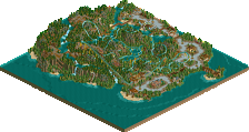
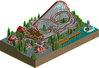
The Patriot is a wooden coaster inspired by the late Harry Traver's wooden masterpieces such as The Cycloneat Crystal Beach. With a compact, twisted layout andintense elements throughout, The Patriot is sure to thrill just as the Traver coasters of old did. The ride is built in a classicaly themed area with a wooden station and classic old-school tudor architecture abound. The Patriot also posseses an excellent location, built next to a somewhat inland section of the Atlantic Ocean complete with a scenic pier and lighthouse.
Hope you all enjoy this!
Download
or
MegaShare DL
Edited by eman, 14 April 2007 - 04:10 PM.
-JDP
-JDP
Anyway, it looks great, nice cyclone you have going on (great for following the other Traver designs) with the coaster, and the red white and blue looks nice with the rest of the archy. Good job.
Anyone else wanna give me some feedback/criticism etc. Id really appreciate some more input.
Just a couple of minor things I personally would have changed. Instead of that dark red you used on the coaster's colour scheme, I would have used the slightly lighter, toned down red you've used on the building rooves. I didn't really like the queue-line - I would've just stuck to proper paths, since you didn't really make the queueline go 1/4 tile. On the coaster itself, the layout was pretty much perfect, though I'm not too sure about the little bend straight after the lift hill -- it just seems wrong. Maybe a dip into it or something. I may have also added 2 trains to it, but that's not a biggie. I think you'll find with all of my gripes though, it's my personal preference... there wasn't anything majorly 'wrong' with the design - overall it's really good, you should be proud of it.