Park / Valkyries Ride
-
 23-September 06
- Views 4,994
- Downloads 752
- Fans 1
- Comments 22

-

-
 67.00%(required: 65%)
 Design

bigshootergill 75% CoasterCreator9 75% chorkiel 70% geewhzz 70% Liampie 70% RWE 70% Jaguar 65% Jappy 65% Xtreme97 65% Scoop 60% ][ntamin22 60% posix 55% 67.00% -
1 fan
 Fans of this park
-
 Download Park
752
-
 Objects
200
-
 Tags
Tags


![park_2390 [H2H6] R2 - The Replacements - Tivoli Gardens](https://www.nedesigns.com/uploads/parks/2390/aerialt2133.png)


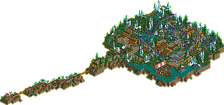
It's themed to the ancient vikings, with longhouses, dragonboat and an old norwegian church.
I'ts embedded in a sub-polar tundra forest with waterfalls (leading to the Ginnungagap, which is the cradle of all life in nordic mythology) - please do not throw any coins in it
First you walk through the battlefields and nomadsland, when you finally reach Valhalla, the place where all the brave soldiers meet each other in death. The Valkyries where female deities who served Odin. They have chosen all the warriors who died bravely in war, to follow them to Valhalla.
They all meet again in the halls of Valhalla, where they prepare for Ragnarök. The battle at end of the world.
In the Queueline, all sons of Odin are honored with a statue.
Balder - the god of beauty
Vidar - god of revenge
Thor - master of thunder
And in the harbour, Odin itself awaits the arriving longships of the warriors.
The coaster itself starts in the biggest longhouse, the halls of Valhalla. Then you ride on the Valkyrie's back through Valhalla!
The coaster interacts with it's surroundings (waterfalls, mountains, tunnels, the paths and the buildings.
Have fun!
"MFG"
Just download JKay's Blue Thunder and modify it, that's the best way to make your bench!
"MFG"
Rhynos Offline
Anyway, the main idea and theme was pretty nice, so well done.
RMM Offline
RMM, on Sep 23 2006, 06:23 PM, said:
Although a little painful...
Wicksteed Offline
Blue Thunder is probably better. Although this park is good, the architecture doesn't stand out and IMO, it doesn't interact with the buildings enough, therefore putting Blue Thunder above Valkyries Ride.
Don't get me wrong, I love them both.
Think im gonna have to check this one out
But if you're referring to the Classical song by Wagner, it's Ride of the Valkeries. Trranslation error maybe? But that shit irks me, dude.
-JDP
Gwazi, on Sep 24 2006, 09:06 AM, said:
HAHAHAHASorry, but this fucking made my day.
It's a DESIGN. The focus is on the ride, not the architecture. And, frankly, Blue Thunder sucked. (No offense, JKay... but it did.)
I second RMM - that layout is fucking amazing.
-ACE
-edit- post 666... lol.
Edited by ACEfanatic02, 30 September 2006 - 10:42 AM.