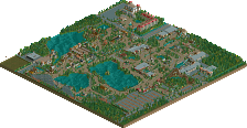
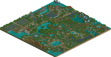
Park / Zwarte Zwaluw
-
 07-June 07
- Views 1,615
- Downloads 0
- Fans 0
- Comments 16

Similar Parks
-
Attractiepark de Vriese Plassen
-
Heart of Coal
-
Vista Parque
-
Attractiepark Breukelerhout
-
Naturepark The Golden Lion
-
Attractiepark Kirkland


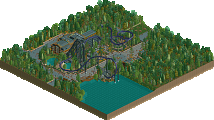
http://cco.foxpics.n...ategoliath1.png
overvieuw
Download
Edited by bobo1981, 06 June 2007 - 05:12 PM.
hpg Offline
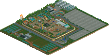
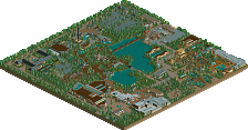
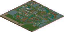
All the rest look rather good. Nice simplicity IMO although I'm sure a lot of people here will criticize this for it.
Also, while the simplicity can be good, you still could use a bit more detail ...especially in the landscaping.
hpg, on Jun 7 2007, 04:28 AM, said:
He always ignores that. Stupid gay fucker
I like the screens though! But listen to hpg!
The park looks generally over-treed to me
The kiddie rides buildings are very awkward
Not sure about the point of Goliath jr.
And I generally agree with Tracid on your colouring.
But it shows potential, a few neat sections/ideas and a basic ground on which to expand. Keep it up
PS. Moved to place to release your parks, as this has a download link!
Zwarte Zwaluw = Black ____?
inVersed Offline
Otherwise you had some pretty neat stuff going on here. I liked some of the coaster layouts
oh and try to put names on your rides.
but keep it there for future reference.
Metropole, on Jun 7 2007, 09:55 PM, said:
^TracidGwazi, on Jun 8 2007, 01:44 AM, said:
Swallow. I think
JJ, on Jun 8 2007, 04:24 PM, said:
^Yep, Swallow is the translation.
Emergo
Metropole, on Jun 8 2007, 06:24 AM, said:
good call.