Park / Soul Calibur
-
 15-April 07
- Views 6,701
- Downloads 2,402
- Fans 2
- Comments 31
-

-
 71.88%(required: none)
 Gold
Gold

5dave 75% Liampie 75% Poke 75% Sulakke 75% Cocoa 70% Fisch 70% geewhzz 70% inthemanual 70% MCI 70% Stoksy 70% 71.88% -
2 fans
 Fans of this park
-
 Download Park
2,402
-
 Tags
Tags
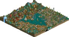
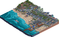
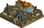
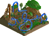
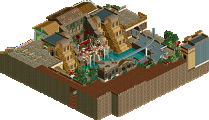

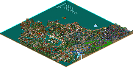
For years Metropole has been one of the best RCT2 parkmakers in the game, but always seemed to be behind the bigger guns. Well now I think Metro is starting to push his way towards the front and become elite. Once again we have a park that was started years ago, seemingly forgotten and now, maybe thanks to the contest gap, finished and released here at NE, Metro's long awaited video game epic park, Soul Calibur!
-JDP
The park was pretty nice. I especially liked the Inverted and the Rapids. The dueling 4th Dimension-coaster was a nice touch, even though there weren't that many near misses.
Congrats!
-JDP
I'm about to check it out now, but looks good from the screens. Nice to know you finally got it done.
Congrats on the SRU!
-X-
so unorganised and random everywhere.
i don't see enough direction and intention with this.
it's too loose and play-around. not serious enough.
A few points
1. Cork, that is an awesome logo, thanks a lot man
2. Yeah, those 2 guest spots definately stole the show. Janus' rapids still remain to be one of the best water rides ever made, awesome. And Phil's 4D's, I basically asked him to build some dueling 4D's with an underground flyby and a bit where 1 train goes over the track, underneath the inverted other train. He pulled these bad boys off amazingly, so thanks man. They were a blast to theme with the supports and weird ass theming to suit quite possibly the weirdest character in any video game ever.
3. Yeah, the park was really rushed in the end with mainly the Palgaea Shrine and the Waterfront areas suffering, but you don't understand how hard this was to finish with the ridiculously outdated scenery and horrible earlier work (see Orichalcum, lol)
4. Keep in mind the vast majority of this was done 3 1/2 - 4 years ago and then dribs and drabs since then (explaining the lack "direction" Posix mentions, though not entirely sure what the serious comment means, I though RCT was supposed to be fun and play-aroud
5. With that said, there are some bits I am really proud of, mainly the orange/white/aqua arena in the centre of the park, the Money Pit (4d) area, the mine train (Kumba, Link from Zelda features in the Gamecube version of Soul Calibur, Heihachi from Tekken in the Playstation 2 version and Spawn in the Xbox version), the layout of Nightmare and the double boomerangs.
Thanks a lot for the release and overblown title of SRU, and all the comments!
I love how you put in arenas from some of the levels in addition to rides for each character. Every time I saw a spot like that, I remembered it from when I used to play the game. You executed those arenas well.
White Storm was really cool in particular, although some of the rapids I've seen in some older LL parks prolly beat it imo. Finally, the duelers were a little off timing-wise on the parts of the coasters that actually dueled. The coasters were really good individually though.
Overall I quite enjoyed it, and although I don't think it should have gotten Spotlight, I'm happy for you, Metro. Congrats!
first i didnt like all the coasters. the inverted and dueling coasters were awesome but the others were not so much. the floorless felt like it was floating and the woodie was all up down. i didnt like the water coaster at all and the mine train was just sooo slow. some of the water rides and flat rides had soem great themeing though
one other thing i really didnt like was how undirected the park was. i just didnt feel like all the differnt games and their rides fit together in any order. they just looked very blobbed and lost IMO.
the acrhy was great and detailed in some parts but others were really not finished or left very bare. i loved the idea for the fireworks though!!
great park overall but i think SRU is defintly where it belongs based on the time and the style!!
FK+Coastermind
Edited by FK+Coastermind, 15 April 2007 - 07:36 PM.
Now let's sit back for a year or three for Safety in Alarms or whatever it is you officially named it.
I think as this parks such a contrast to todays parks, people are finding this a bit here nor there. I think if this was released three years ago it would of gotten a Sru atleast. I loved the rapids ride and i also like Nightmare alot for some reason. Sophitia was also a really nice ride. I liked the whole atmosphere it gave off and i also liked the water coaster area, So simple yet effective.
I think your prkmaking has moved on so much from this to an even better standard but this was such a nice park. Congrats on the SRU. I know for a fact your'll be getting higher with your other solo. I can't wait for that.
I personally like the White Storm meandering through the small town and Kris Naga: Daring color combination but worked out very well.
Also the station building of Ayus and Manus. I like the layout and the colors.
I agree there maybe is a bit too much water and it does look rushed in some places but considering the size of this park I feel that can be overlooked.
Congratulations,
Mama Bear