Park / WonderLandia
-
 06-July 20
- Views 2,020
- Downloads 406
- Fans 0
- Comments 10
-
 52.50%(required: 65%)
 Design Submission

CoasterCreator9 60% In:Cities 60% Scoop 60% Cocoa 55% saxman1089 55% Xtreme97 55% Camcorder22 50% geewhzz 50% Jappy 50% posix 45% RWE 45% csw 40% 52.50% -
 Description
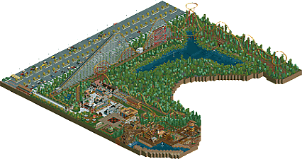
Welcome to WonderLandia, which has been put on the map a few years ago due to the opening of the largest rollercoaster in the continent!
Come in and witness the thrilling heights and speeds of Hyperion which takes riders up to more then 50m and a dazzling 120km/h!
With a ride-time of nearly 3 and a half minutes it’s still one of the longest lasting rides out there!
This breathtaking thrill ride will surely give the bravest adrenaline junkies a heart pounding experience they will never forget!
Make sure to take a ride on the park’s newest ride, Powder Keg!
Which takes their riders trough a series of hills and turns, just to do everything over again, BACKWARDS! -
 No fans of this park
-
 Download Park
406
-
 Objects
308
-
 Tags
Tags
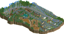
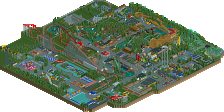
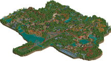

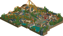
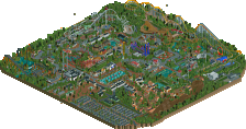
I was pretty stoked about looking at the entries of this contest, getting some 20+ hypercoasters. This was one of the stronger parks imo... layout was good and definitely had more than enough airtime hills. Coaster was well-supported too, good idea using a flume as a catwalk.
Archy in this was solid as well; the station almost feels too stately and formal for a roller coaster, but it looks nice. The entrance area and diagonal shops leading up to the coaster is definitely the strongest part of the park. There's also some great use of some awful scenery, like the route 66 sign or the gear on the carousel.
Landscaping was nice in certain parts, especially around the pond but I wasn't too fond of the foliage, it all looked randomly placed and kind of rushed. Also, the wild west/pirates(?) area is nicely done, I enjoyed the waterwheel tower and usage of trees as terrain covering. All in all, a nice, well-executed release.
Overall pretty solid. The first turn/helix after the lift is kinda uninspired.. would've rather seen a steep 90 turn ala Magnum at Cedar Point. As Jag pointed out there's a ton of air time hills, but not much variety in height and shape. I think this is a step up in building from your wave swinger entry. Curious to see a full sized park from you!
Pretty fun map! It has some cool ideas, like the transport belts or the cathwalks. The junior boomerang is pretty nice, and the architecture is your best point at this moment.
I think the white path is too bright. I would defenitely prefer one with a little more texture. Just crazy or tarmac path would do.
The foliage is also something you could work on. Try finding some pacing when adding trees. Some rows of trees or making the trees more clumped together rather than all over the place works much better. The bushes around the lake however are pretty neat.
I think you have a decent amount of potential and I can see you grow when you work on the feedback. You're a great member of the RCT community and fun to talk to. I would defenitely love to see more
Thanks for the feedback, I appreciate it.
I absolutely agree with the comments and they're also things I would approach differently now. The white path just looked like the right choice at the moment..
My foliage work could idd be better, so I will work on that for sure!
I really want to step up my pace for my full size park but contests are so much fun to do and ask such dedication, I usually don't get around building anything else... Soon!
not bad! the old school hyper is monstrous, would probably be very fun. I think the object use/ themeing is a bit chaotic and hard to read, but also energylandia does feel sort of confusing and plastic IRL so I can't fault you for that inspiration. i liked the pond and the foliage around it, but the park area ended up feeling a bit cramped and small on the park edge.
The ideas in here are very nice, but sadly, it's the execution that pulls it down imo. And I don't mean bad parkmaking or any of that. More like bad objects and bad foliage selection. I'd stay away from the expansion objects in the future. Because you don't need them. Proof is that little western area on the side which, despite looking a tad on the brown side, looks great!
Thanks for the feeds, you two! I'll keep it in mind next project!
i agree a lot with cocoas review. The object choices in this are very incoherent and incohesive. The foliage feels rushed and while some of the individual architecture looks good here and there, it just doesn't works together. The coaster layout is solid tho. I would recommend you for a future project to focus on less objects in your architecture and less styles you wanna use and look at some good foliage on the site for inspiration.
A bit late with this but I quite liked it, the coaster layout was fairly solid and I really love the gold/silver/red colour scheme you used. Great support work too. I think it could have done with a bit more path interaction to bump up the excitement, especially toward the end with the bunny hills. The station is some of the better usage of that WW/TT scenery I've encountered. You've certainly improved a deal since this was released judging by your cuba work.
Excellent park! Glad I finally got the chance to view this in game. I love the layout - it feels massive and well thought out. I do wish that it had more interaction with the rest of the park though. I'd love to see this map as a timeline park of sorts - where it expands closer to the pond over time.
There are definitely some inconsistencies here and there - but overall you've created a unique and special project. I sincerely hope to continue seeing more work from you soon!
Josh