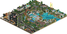
Park / Disney's Glacier Cove Water Park
-
 01-July 20
- Views 11,842
- Downloads 903
- Fans 21
- Comments 47
-
-
 84.50%(required: 70%)
 Gold
Gold

geewhzz 100% yes Camcorder22 90% yes CedarPoint6 90% yes bigshootergill 85% no CoasterCreator9 85% yes G Force 85% no robbie92 85% no WhosLeon 85% yes csw 80% no RWE 80% no saxman1089 80% yes Scoop 80% yes 84.50% 58.33% -
21 fans
 Fans of this park
-
 Full-Size Map
-
 Download Park
903
-
 Objects
1
-
 Tags
Tags
![park_3339 [H2H7 R2] Battle for New Elementia](https://www.nedesigns.com/uploads/parks/3339/aerialt2941.png)
![park_2849 [PT4 R5] Fox Glacier National Park](https://www.nedesigns.com/uploads/parks/2849/aerialt2502.png)
This is awesome. Theming a waterpark to a snowy mountain fits really well with the idea that waterparks are for cooling down. And I love how you've made use of ski-resort things the half pipes, slalom and ski-jump. This scene is really cool:
Great job!
wow, this is exceptional work. I really buy it as a realistic venture and the readme really adds to that. the park layout is brilliant and the details around it frame it so nicely. On top of that, just loads of great detailing, really flowing forms, and solid atmosphere. foliage is pretty fantastic, colors work everywhere, etc. I really ove the halfpipe slide and the slalom slides- really clever. I also liked that mickey with the raft on the top of the mountain. overall- really excellent work and a real good surprise.
From the moment of opening this park, I was very much able to insert myself into the map as one of the peeps. The attention to detail seriously took me by surprise, and I would love for this park to be regarded among the most well-respected ones. Very atmospheric and had a similar - but still distinct - vibe to in:Cities' stuff. This is awesome!
The readme file was really awesome too, loved the way the map was inserted into the real life satellite image. The kind of presentation that convinces you to open up the park immediately.
It's nice, but I wish there was more. I'm only seeing a few waterslides and I wish I could see more. Parks need more than a couple attractions in order to keep guests satisfied. I would recommend adding a few more slides in order to occupy your guests.
It would have been great if you had made some facilities or what we call "back-stage areas". That would help with the realism of the park. Right now I'm not believing this is a real park. I want to believe.
I also think this park would benefit from more placemaking. Is this actually near a ski resort? Is it in Hawaii? Where are we supposed to be? Essentially I'm asking where the park is located. Creations that are specific about that are better and I think you have room to improve. Once you decide where this water park is you can begin to develop a theme for it.
People who go to parks (also sometimes called park-goers, though that is more of an industry term) will need to use the restroom or else they might pee in the pool and cause a give attraction to close down for a while. Here is some reading on that: https://www.allenpoo...ool-urine-tips/
Essentially I think you need to add bathrooms for guest satisfaction.
So all in all I think this park is a good start but I would like to see some more thought put into your design work. Once we begin to see that I think you will begin to get more positive feedback. You won't be able to get better over night, this takes a lot of time. Just keep at it. That said, high pass. Sincerely, Milo
Hey Milo, not sure if you looked at the readme or not, but its really worth a look. One of the most entertaining readme's Ive seen. In there it shows the exact plot of land that the park sits on down in California on the old Downtown Disney parking lot.
I can't say enough good about this park, its my favorite release in a long time. Its maybe a bit small for a spotlight but I really think it deserves it. Might look at making one of those video reviews just so I can gush over this in much greater detail. Congratulations on becoming a permanent fixture in my Inspiration folder.
Edit: I missed the joke but I'll leave my obliviousness
Airtime Fan Offline
I think the best thing I love about this is the placement you have for it in the real world. It’s very viable. Disney should build this. The readme adds so much depth.
The water slides are very well done. The slide with the half pipes is so beautiful. Odd choice of ending for the big slide, it’s awkward and seems like a design flaw? Maybe you have a reason for it? The toboggan run slide seems a little random as well, felt like it deserves more.
Spotlight? You deserve it. A high score at the very least.
You’ve got such a refreshing park style that always inspires me.
This is a park I’ll be constantly coming back too and I think that’s a hallmark of a landmark park.
Can’t wait to see what you’ve got planned after this.
Comments on the park at a later point, but I'd like to mention the excellent readme. Presenation is a skill that people have been caring about less and less I feel. Unnamed staff, unnamed or generically named stalls, dead flowers, peep jams, rain, horrible glitches, no logo, poorly named files... This park got none of that and it went the extra mile with this excellent readme. Such a polished release, I think the good presentation will be reflected in the score.
This is awesome. The composition in this is superb. I really enjoyed all the diagonality and the way how all of the roundness was done. Makes other stuff done in these aspects these days look like a gimmick.Only thing throwing off here have been the SF lamps, bins and benches here for me, which looked a bit weird for me.
I also agree with Liam about the presentation of this. It shows you really haven't rushed with anything on this and cared about every little corner. This is also shown in the little details in this: Although there are not many of them in this, those that are there are very well done: The photo spot at the entrance and the skiing theming at the half pipe ride have been my favorites.
I think from a technical standpoint, one can't really say anything against this. One also definitely can see a lot of love in this. I would have loved seeing you play around with the Disney brand a bit more here and there. It might be not a real problem, but from my not so Disney-used point of view i would have expected a bit more of that in here and was surprised when opening the park.
I also think that this park shows off some really good foliage and landscaping skills. I liked the little snow patches here and there on the buildings, not a new technique, but something that shows some dedication and thought. Only thing i not really like here is the repetitive foliage in the outskirts. It made me not being sure if i think if the streets outside, although also technically really well done, were really adding anything to this or not. Not talking about the backstage facilities here, those were quite cool.
All in all a nice surprise release of someone i wanna see grabbing a colored name. Good job!
Amazing park. Absolutely fantastic.
SRF- have you ever worked with Disney? It feels like some of the details could come only from someone who spent time as a CM.
Here's my video review of the park.
https://youtu.be/n_NUdyeYp5M
Haven't opened the park yet but watched the full 30mins on CedarPoint6's channel earlier.
By far the most pleasing thing about this park to me is the fact that I don't think I could recreate it in OpenRCT2 even if I had the park open next to my attempt. Your ability to break the standard grid of RCT2 with this park is phenomenal, but doesn't feel forced. I love the wizardry that's going on with some of the rides such as the half pipe where you've essentially created a ride that doesn't exist in-game.
Outside of the theming, the extra details like the mechanics walking around the back of house are what really sealed this park for me as a believable and fun NE entry. I'm sure you'll be receiving one of the highest levels of accolade on this park, and it's well deserved.
Great Job SRF.
Such a prolific release!
Man this park is a blast. Love it! It's very believable and clearly well thought-out. You've incorporated a lot of cool concepts from Blizzard Beach and combined them with some very cool ideas of your own. It's definetely going to be one of those parks I'll just love to reopen time after time.
Love the Blizzard Beach inspiration here. And the overall presentation, like Liam said, is superb. I really wish more parks put that extra effort in to increase immersion.
Congrats on an amazing park
cp6 great job on the video, was great fun watching it, and SRF terrific job on this park! I didn't expect this from you, coming out of no-where and creating this awesome waterpark atmosphere and realistic setting. I must say I always have a soft spot for waterparks and this one makes me wanna go to one right away!
Great job and looking forward to more work from you!
This is a masterclass in proper use of diagonals. Great job, this is a really awesome release.
This was absolutely amazing man, normally I'm not big into waterparks but this is probably the best one we've ever seen. Love the curves, diagonals, theming, details, everything... Hope we see more work like this from you going forward, because this is top tier stuff.
Shitposting aside: this was fantastic and welcome to the leafy green crew!
I also have a soft spot for waterparks and it is exciting to see one fully fleshed out and not just part of a larger map. I had high expectations based on your previous screens plus taking a glance at the readme and I'd say you even surpassed them. As others have said, the attention to detail and presentation are impeccable. The hacking is impressively clean. The density is also impressive with guest behavior forming queues, photo spots, the lazy river, swimmers and even the traffic. It is hard to think of another piece of rct that looks so lived in since gee was active. The fact that you made everything functional (or at least simulated) even down to the hotel pool and slide really elevated the map as a whole. I also really enjoyed the winter theme as opposed to a generic tropical/tiki look. It gave you a lot of fun opportunities for coming up with custom slides and little details along with them. I'm not an expert on Disney but some of the ways you used foliage to hide sound barriers and restrict sight lines on the backstage areas was impressive and felt very appropriate.
My one gripe, and it will sound worse than it is, is that I feel it could have used one more major set piece within the park itself. It wouldn't have to be something intense or off-brand but some sort of tracked ride: maybe a MasterBlaster, Roller Soaker, flume or shoot the chutes type. Either that or one additional waterpark cliche such as a giant water jungle gym/playground would have pushed into Spotlight territory imo. Really, I'm just being greedy and I want to see how you would have pulled those off in as clean a way as you did everything else. As it is this is an easy Gold and I was possibly expecting 90+ as well. Well done! I hope you continue building as this sets a high bar for realistic detail, macro and functional peepability.
Edit - I could probably reverse engineer the custom slides but the Toboggan and half pipe were fun to watch and I'm not 100% on how exactly they function which I always love to see. Some of the best custom slides since Kumba's Brainwash.