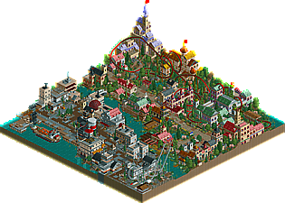
This is my entry for the March Road Rally contest at rct2.com, in which you had to make a 50x50 park on a pre-made workbench, themed to East Europe. I entered, mostly out of boredom and to get a break from my usual projects and try new (to me) things. And, to my surprise, I won. I tried to build in a more realistic style... I probably won't do it again.
This is really great darkjanus! I've liked everything you've released here, but this is something different. You've taken the detail to the next level. The architecture throughout is varied and interesting. It takes a lot of creativity to build realistic architecture like this with scenery pieces. Very impressive stuff. The station building to the beemer is nice too and the castle in the corner by the lifthill. Yeah and everything in the harbor area is impressive too. Thebeemer could have used some more speed on the cobra roll, but other than that this is all high quality stuff. Congrats on the win. I think you should keep working on this realistic style because you've nailed it. Take this level of detail to other projects. Or maybe not, whatever you want to do. You've got good judgement I think to see what you're best at.
PS - See Kumba, aren't you glad we snatched him up when we had the chance?
I liked it, good architecture, similar to ride6's but more diverse and organised. Nice enough rides, although I really didn't like the cobra roll and especially the turn that followed it. Nice mini, dj
Wow, thanks! I didn't expect such great feedback, really . I agree the beemer is too slow in the cobra roll, but I rushed it a bit, plus my computer sucks so I can't see exactly how fast it goes.
The level of detail is both inspired by and almost copied from your stuff Ed, lol.
The reason I said I probably won't do something like this again is that I don't consider it "new" enough. It's one of those stupid ideas I have.
I can't see how my architecture looks even remotely like ride6's...
Even if it was inspired by my stuff, you didn't just copy it. You translated it to RCT2 which is something I haven't even been able to do yet. The details are really great too. The crates on the dock, the drainage pipe, all the little pipes coming out of the silos, the dumpster, the glass atrium roofs. Those are the details that make something look real to me. Realism through clutter and an excess of detail. And I also love how you put rides inside the buildings and gave them names. Those little things really make a difference.
And the coaster actually has a nice layout. It has speed issues and that's something I've struggled with too especially in my earlier designs. So it looks like you really are following in my footsteps in more ways than one. For speed issues, pay attention to the speed when you test it. If the coaster is dipping belowe 20 mph in inversions that's borderline too slow. Some people prefer faster coasters and some slower. There's room to find your own preference in there somewhere. For coaster design, take a look at some of the more "unrealistic" parkmakers out there. Guys like Mala, roomraider, Blitz-Sama -- they really know how to make coasters. I always get a sense of total freedom from seeing what they do with coaster designs. Take some of that energy and use it in your own designs. The secret to a great coaster isn't just making it look good or flow well. The secret is doing things that are unconventional, new, and exciting. Challenge yourself to try something crazy and make it work.
Every park or coaster or minipark you make is just another step along the way. Even if you think it isn't totally original, you've learned something from it and that's something you'll always have. You never know what you can do until you try something. And hey, you never know what people will like. Sometimes what you think is subpar work is really exciting to someone for different reasons. What some of the other guys have been saying lately about just working on parks and not worrying about comments, that's really the bottom line. Build whatever is exciting to you. You never know what other people will think, maybe they'll love it too.
I know what you mean about fantasy coasters, and my intention for this park was actually to experiement more with coasters, but then I limited myself, as I have a bad habit of doing, and it ended up like this. Thanks for the advice, I am planning to be a lot more daring in my new project.
As for the detail, I also think that clutter can make it very realistic, but my main priority right now in theming is trying to do "effective" details. Details that mean something, sort of. Of course, the more "effective" details the better. I don't like parks with just lots of random detail to give it a overall look rather than an in-depth look where almost every thing adds to the park.
That's why I didn't post my runner-up mini here... it just makes no sense if people don't reply to your finished parks
I liked your park though DJ... the funny thing is, that I did study some topo for school, and the eastern europe stuff reminded me of your park (I also encountered Tallinn..)
8 Comments
Janus Offline
I tried to build in a more realistic style... I probably won't do it again.
Anyway, the download:
http://www.rct2.com/...download&id=110
I don't have any screens to show as I'm not on my usual computer, sorry.
Coaster Ed Offline
PS - See Kumba, aren't you glad we snatched him up when we had the chance?
deanosrs Offline
super rich Offline
Janus Offline
The level of detail is both inspired by and almost copied from your stuff Ed, lol.
The reason I said I probably won't do something like this again is that I don't consider it "new" enough. It's one of those stupid ideas I have.
I can't see how my architecture looks even remotely like ride6's...
Coaster Ed Offline
And the coaster actually has a nice layout. It has speed issues and that's something I've struggled with too especially in my earlier designs. So it looks like you really are following in my footsteps in more ways than one. For speed issues, pay attention to the speed when you test it. If the coaster is dipping belowe 20 mph in inversions that's borderline too slow. Some people prefer faster coasters and some slower. There's room to find your own preference in there somewhere. For coaster design, take a look at some of the more "unrealistic" parkmakers out there. Guys like Mala, roomraider, Blitz-Sama -- they really know how to make coasters. I always get a sense of total freedom from seeing what they do with coaster designs. Take some of that energy and use it in your own designs. The secret to a great coaster isn't just making it look good or flow well. The secret is doing things that are unconventional, new, and exciting. Challenge yourself to try something crazy and make it work.
Every park or coaster or minipark you make is just another step along the way. Even if you think it isn't totally original, you've learned something from it and that's something you'll always have. You never know what you can do until you try something. And hey, you never know what people will like. Sometimes what you think is subpar work is really exciting to someone for different reasons. What some of the other guys have been saying lately about just working on parks and not worrying about comments, that's really the bottom line. Build whatever is exciting to you. You never know what other people will think, maybe they'll love it too.
Janus Offline
As for the detail, I also think that clutter can make it very realistic, but my main priority right now in theming is trying to do "effective" details. Details that mean something, sort of. Of course, the more "effective" details the better. I don't like parks with just lots of random detail to give it a overall look rather than an in-depth look where almost every thing adds to the park.
Anyway, anymore comments? Would a screen help?
Jacko Shanty Offline
Six Frags Offline
I liked your park though DJ... the funny thing is, that I did study some topo for school, and the eastern europe stuff reminded me of your park (I also encountered Tallinn..)
SF