Park / Dueling Spirits
-
 22-June 20
- Views 1,973
- Downloads 393
- Fans 0
- Comments 11
-
 55.50%(required: 65%)
 Design Submission

CoasterCreator9 60% G Force 60% geewhzz 60% saxman1089 60% CedarPoint6 55% Cocoa 55% csw 55% Liampie 55% RWE 55% robbie92 50% Scoop 50% ][ntamin22 50% 55.50% -
 Description
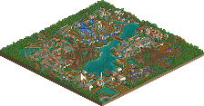
Oh yes, another wooden coaster nobody asked for!
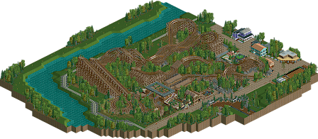
During this lockdown I discovered OpenRCT2 after 5 years without playing the game. I wanted to do something just for fun and this came out. It is a dueling wooden coaster inspired by Lightning Racer at Hersheypark. It features Phantom and Spectre.
Hope you enjoy!
IF -
 No fans of this park
-
 Download Park
393
-
 Objects
137
-
 Tags
Tags
I really love that finale. I wish maybe it dove underneath the path somehow, or interacted more directly. Overall the design is solid and the atmosphere is lovely, but I think it's a bit lacking in content for Design.
not bad stuff. I think the layout isn't super graceful but it also has some really fun elements that would be sick IRL, like the out and back racing segment and the dueling finale. Clever interaction. The scenery is a bit sparse and the overall composure is a bit square perhaps. I like the beginnings of a shadowlands theme but it doesn't seem like it was really carried through the whole park. I do like the station though, always cool to see a perpendicularly oriented shape.
Cocoa takes the words right of my mouth, but he puts it more elegantly than I would. Good to see you around again, I remember you were quite promising back in the day!
Thanks for your feedback guys. I'll take it as a compliment coming from you three. I'll try to do more and better content. The cult is alive.
Good job with this In Flames! I immediate recognized the Lightning Racers inspiration upon opening. I thought the layouts were pretty good. The archy is a bit bland, but still somewhat interesting. I think this is just below design-level. A bit of polishing in the archy and composition department, and you'd be up above 65%.
Really love the layout here, probably one of the cleaner dueling GCIs done in quite a while. Maybe could have used one more helix but that is quite a nitpick.
Submission had a pretty good vibe to it, especially around the enterprise, the purple building definitely felt familiar to me haha.
Only thing I wasn't a fan of was the station, sort of just felt a little lazy and un-inspired. Keep working on and experimenting with your architecture and you'll be winning high tier accolades in no time.
Thanks man, I always struggle with the architecture.
Are you saying I maybe copied a building from your recreation of Vortex because I lack of creativity with architecture? Because yes, you're right. Thanks for the comments, I didn't feel proud of the station and the surroundings as the architecture is my weakest point I think and thats why I always look for inspiration in other parks.
Fun duelers, definitely some clear Lightning Racer inspiration.
The swirly pre-lift and the final head-to-head interaction are highlights for me. One thing I do miss is that Lightning Racer tries to make the most out of it's dueling/racing experience with an extending "finishing straight," thunder vs lightning, etc. I feel like the Dueling Spirits here are missing that extra bit of juicy theme and engagement storytelling you can get with duelers - think Ye Olde Dueling Dragons, or George vs. the Dragon; the park isn't hinting at who the spirits are, why they're dueling, if one of them is good and one evil, that kind of thing. The station and queue structure could be played up significantly to be a cooler ride experience there, even if you're aiming for a typical American amusement park level of theming.
Not a bad release. I think the layouts were good until the end - they slowed down a lot and the layout just sort of ended abruptly. The surroundings are all nice, but nothing spectacular. You've got the basics down pretty well, now I'd like to see something more adventurous and bold.
I really liked the landscaping here, and the layouts were great too. The archy was a tad simple though. But I commend you for not going overboard with the trackitecture which is a current NCSO trend.