Park / Azrael
-
 22-June 20
-
 Azrael: The Angel of Death
- Views 2,806
- Downloads 578
- Fans 0
- Comments 12
-
 66.25%(required: 65%)
 Design

chorkiel 75% bigshootergill 70% CoasterCreator9 70% Scoop 70% Cocoa 65% G Force 65% Liampie 65% Milo 65% geewhzz 60% ][ntamin22 55% 66.25% -
 Description
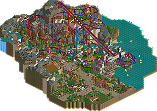
The tenth and final plague has descended on Egypt: the angel of death will take every firstborn in the land unless lamb's blood marks the door. It is Passover.
Small design created shortly after completing the Good Earth. The main goals are to create a design with a nonstandard layout and to demonstrate the impact peeps have on LL parks. -
 No fans of this park
-
 Full-Size Map
-
 Download Park
578
-
 Tags
Tags


I love everything you touch, csw.
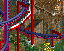
It's a little more simplistic than I think we've come to expect from our LL designs... I would describe it as "classic" maybe. I think having some custom supports that fit the aesthetic of the architecture on the mountain would have gone a long way for the macro here. The blood red steel supports everywhere take away a bit for me. I love a good terrain Arrow suspended of course, but the layout lacks any real big setpieces (other than the waterfall, which is kinda off to the side and the coaster doesn't interact with it much). The little helix nestled into the back side of the cliff with structures all around and a small grove underneath is probably my favorite part.
Since this was an exercise in peeps getting lost, I think it might have been a fun idea to make the mountain and all those structures at least partially peepable. Would have gone a long way to making it feel more lived in, rather than just a big decorative structure made for the ride.
The station area is wonderful. The arch with the queue and ride passing underneath is just lovely, and it makes solid use of a simple single-wide station. I think it's easy to fall into the trap of needlessly overcomplicating your station, especially in LL.
This is just verging on Design for me. There are a lot of missed opportunities and the layout is just okay IMO. The colors are punchy and the atmosphere is pretty unique. A lot of the nuts and bolts parkmaking here is great but I think it's lacking some finishing details and ideas.
csw touches his wiener
This was a fun. You make a strong case for peepable LL being a worthwhile endeavor and it elevates it above "meh" for me.
The coaster layout is fine, but is a little too dense imo and sort of sits perched on top of the landscape in an unappealing way. You already outdid yourself with Pirana, which wove in and out of a much more dramatic and impressive landscape.
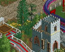
The structures away from the main area plus the large amount of rusty rooves/grey wall combo didn't work well enough to enhance the coaster. You flirted with stacked fences, objects and such to jazz them up but it falls into a middle ground between a classic throwback look and "stacking and hacking" without really committing to either well enough to be particularly interesting other than as a backdrop for the coaster.
For the main area with the station and other rides, I liked the temple and the textures used for the most part. The farms are nice and there is a lot of subtle and effective object placement and "little things" like the mini golf path and little doorways in the maze walls. You're getting good with the single wide station with a building section on either end and the arch over the queue was a highlight. I think it's a classy look and fits in with peeps. The peeps and pathing is handled about as well as one could hope. I think some more well established "seating areas" or a 2 story peepable building would have been nice.
I think this was a worthwhile endeavor with the peeps and another suspended. It just has a lot to live up to following The Good Earth and the suspended in it.
theres a lot to like here. the park has great composition and the suspended is overwhelming, but in a good way. I love the marble rocks (?) dotted around, even though I don't understand them on a physical level- the aesthetic is cool. The station is pretty solid and I like the little mini buildings around.
I think you still struggle texturally- you could benefit from being a little bit more restrained in your use of textures. There's just so much everywhere, every building is unique, that it blends into a bit of a themeless mess. Its a bit better here than your previous stuff but still I think I find it a bit hard to read.
I agree with Cocoa on the texture mess - relatively speaking of course. The more cohesive your work, the more it makes all the good bits stand out more. The highlight of this map is absolutely the station; great pre-lift section going under the bridge. I also like how the coaster returns to the area - over the walls, into the courtyard. Great exit path area there! One of those park bits that I wish was real. The sparse foliage around the queue and top spin is also stellar. That temple thing I would've left out. Adds zero to the map and texturally it's very dissonant. Should've been another cluster of grey structures to mirror the station area, tying the map together more.
The area around the coaster left something to be desired. Landscaping was a bit undercooked, and the coaster has too much filler sections (endless helices) without a lot of synergy with the landscape. It's just spaghetti. I love spaghetti in general, but this spaghetti needs some more sauce. On the bright side, I thought some of the more dramatic sections of the coaster were dope.
I think a 65% would be right here, with the station area being 80%+. Inconsistent theming and coaster, but all very servicable. All in all an enjoyable map, nice work. Makes me want to play LL again, I have a design sitting at 50% so who knows!
Thanks for the comments so far! Wasn't really looking to blow anyone away with this release, which was really just an excuse to build a crazy suspended layout.
Cool stuff, very atmospheric. I especially liked the rockwork and the massive lift hill.
Definitely felt that vibe.
I scored it 55%, which feels unusually low for your stuff - so let me lay out my logic.
There's some really enjoyable things to appreciate here, mostly conceptual - bold moves to take on a peepable LL project, centerpiece being an unusual huge single-lift suspended, religious theme and setting, and following up a (imo) spotlight contender solo project with a much less ambitious project. There's some really fun experimentation with the foliage and the land use, and I'm an absolute sucker for a massive terrain variance and a good wall-hugging coaster. The brick maze texture is worked in very subtlely to good effect, and personally I don't feel that the houses dotted around are over-codexed - just a nice use of available objects to add some detailing. Absolutely classic use of the waterfall and the semi-open station, just peak golden-age NE LL stuff there. The presence of the peeps makes me more mindful of what their sightlines would be, and staring down the absolute spaghetti-pile of suspended track on the mountain would be amazing.
Yet - I feel like the park falls a touch short in most of those key areas, and that's why I can't really rate it design-worthy.
The coaster itself is impressively big and the track looks great - flowy, an impressive tangle, nice setpiece moments like the big diagonal drop and the long lift to the mountaintop. (symbolism?) The actual ride experience could be better; the speed isn't managed as well as it could be, with some sections too slow and others too fast. With such a strong mythology-driven setting I was hoping for maybe a storytelling link in the ride design beyond just the name, maybe some logic to where the ride is intense vs smooth and twisty. As is, it's a nice concept but with some pacing issues and not so strong it can carry an entire map, which is sort of what you want in a design.
Thematically - I have to admit I'm a little confused and underwhelmed, maybe missing the proper background knowledge. As far as I'm aware Azrael as a mythological/religious figure is more of the "rest easy now buddy it's all ok now", welcome-wagon type of death angel than the "void of death claims all, kneel before my blade" type. There's a 10 plagues bible story reference and a Pharaoh entertainer but those both take place in Egypt, and this doesn't look or feel like Egypt. There's a temple, but it's clearly not the old testament tabernacle structure ... altogether I'm a little lost as to how or if it all ties together. While it's not necessarily a strong negative, it's a missed opportunity. Same thing for the visuals - we're clearly not in Egypt, and it's hard to say when or where we are at all; the reuse of objects does make everything relatively cohesive, but without a lot of personality. I can't latch onto a sense of place the way I could with areas in Good Earth because I don't really grasp a thematic concept.
So - there you go. Technically proficient LL and altogether a cool experiment in peepability, a nice aesthetic experience, but probably a Silver-tier park area and with a centerpiece coaster I don't love enough to push it to Design.
Thanks for the feedback ][22. I think you are exactly right about the weaknesses in this release, mainly with the theme. I decided to kind of shoehorn the theme onto the coaster when I was about halfway done and had already made my color and landscaping choices, so a lot of things don't fit - namely, the mountains and water surroundings. As far as the name, I was sort of hoping no one would realize that Azrael isn't the angel of death mentioned in the Pentateuch. So yes, there are plot holes a plenty.
I have a new, similar design in the works right now that plays more on the strengths of this map, so hopefully that one will be more appealing.
Airtime Offline
Short on content but quality of what is there.
Strange to have catwalk on the first turn out the station.
Great vibes, good solid park making.
Congrats on design, no idea why i forgot to vote on this. Probably wouldn't have changed anything anyway. This is a great little simplistic submission and i'm glad to see some LL here. I think Cocoa and Liam made some good points, why this isn't scored any higher.