Park / Italy\Rome Mini Park 1
-
 09-June 20
- Views 1,184
- Downloads 377
- Fans 0
- Comments 6
-
 43.50%(required: 50%)
 Spotlight Submission

Jaguar 55% wheres_walto 55% Xtreme97 50% Cocoa 45% In:Cities 45% Liampie 45% chorkiel 40% CoasterCreator9 40% Scoop 40% Terry Inferno 40% posix 35% RWE 35% 43.50% -
 Description
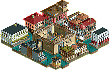
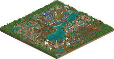
My first in a series of Roman\Italy based parks:
What I've learnt
-Color could be better
-Architecture could be more cohesive
-Next one will have peeps and rides
-ProTip- never build buildings at edge of park or else they will look barren. -
 No fans of this park
-
 Download Park
377
-
 Objects
169
-
 Tags
Tags
![park_4114 [H2H8 R3] Forum Caeleste](https://www.nedesigns.com/uploads/parks/4114/aerialt3853.png)
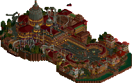
not bad, you probably got a lot of the good feedback on the screen you posted already. I like the idea of the central plaza building though.
I see the architectural queues that it takes from RWE's Parenzo and a tiny bit of Forum Caeleste. This was awesome, and I liked the Church a lot, even if it was too tiny compared to the other buildings. I think scale should be a priority going forward, other than of course the things you mention through better color, more cohesion, some peeps.
On the counter, it's perfectly fine to make buildings at the edge of parks in my opinion, as it can make imagination run wild rather than if the map extended further beyond. That may be just me though.
Also, street level details on the white corner building with green awning seem very needed to make it more inviting, and in general the whole thing feels quite dead outside the lively center that is decorated.

If you make more in the 'series', I look forward to it! There can never be enough Italian stuff on this site.
Hey I like it! It's not per se bad to build close to the map edge on such a small map. I think it's fine as long as the black void isn't too overwhelming.
My main advice would be to make the buildings more open on peep-level. Create some seating areas, or some souvenir stalls. That will be much more interesting to watch. Adding peeps to the park could bring some life to it as well.
I don't like the big square walls in the centre. It's lacking a lot of details and it kinda destroys the rest of the park. The marketplace inside is fun tho.
Great first park, the architecture is lovely and bright even if the map is a little small. Sadly this is really too static and lifeless, shame there's no peeps. Even some gondolas moving through the canals would be nice to see. You've had some good advice so far so I'm looking forward to your next work.
Nice. I can tell you were not randomly building stuff, but actively trying to capture the setting - quite succesfully. The colours are off though - I also legit wonder if you're colourblind? I changed the palette to black and white and I thought it looked better. Colours are less distracting and it lets your eye for detail shine. Keep doing what you're doing!
Not bad, you're definitely on a good way. My favorite building in this is the church. The castle in the middle definitely seems familiar to me haha. I agree with others that you could have done more on the street level and added more details. I would also recommend to you to experiment a bit with building shapes for your future projects. Looking forward to see how you'll improve.