Park / Cannonball Run
-
 09-June 20
- Views 3,433
- Downloads 689
- Fans 2
- Comments 13
-

-
 68.00%(required: 60%)
 Silver

G Force 75% Scoop 75% Camcorder22 70% Cocoa 70% geewhzz 70% posix 70% bigshootergill 65% CedarPoint6 65% CoasterCreator9 65% Ling 65% RWE 65% Faas 55% 68.00% -
 Description
Got inspired during a visit to Phantasialand by the Coaster Taron, So I decided to do a Pirate Themed one!
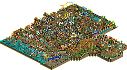
The Result is this Pirate themed area. There are two Main Coasters; Cannonball Run, a double launch coaster with inversions that runs through a pirate village. The second is Shiver me Timbers, an intense wooden coaster.
The area also has my take on pirates of the Carribean; Pirates of Tripoli, its got indoor and outdoor sections, a water coaster section and a final drop and airtime hill.
There are also plenty of boat rides, Restuarants and family rides. Everything except a Pirate ship ride, suppose thats been done! -
2 fans
 Fans of this park
-
 Full-Size Map
-
 Download Park
689
-
 Objects
595
-
 Tags
Tags


I have always enjoyed the creativity of your style and the density with which you compose these parks. This project displays that same style.
Cannonball Run is a wacky coaster, an impressively compact 8,000 feet track length. Some quite memorable interactions, such as the launch-over-mountain turnaround. That brown jagged rock texture gets pretty repetitive elsewhere in the park (perhaps could have just been raised land tiles?), but worked great under those high turnarounds.
The fken massive woodie coaster is menacing, props for use of the splashdown element at the end. Interesting steep track piece before the lift hill -- it's a strange kink, and I like it.
I think some might have problems w/ the density of this park, as it is quite an eyeful, but to me that's just a difference of style that I ain't holding against ye.
Theming was fun and varied throughout, the aquatic creature sculptures especially are very fun. That said, the back corner with the Stormy Seas raft slide is hardly themed at all compared to the rest of the park. Would have liked to see another sea creature!
On a scale of 100, I vote this park
6.9 out of 10.
~B-]
Congrats on releasing this park!
I love the creative effort you put into this park! There's so much to see. Very dense indeed, but I like that. The darkride elements are great (especially Treasure and Monsters) and the boats are nice. I also really liked Rigging Run.
The Wooden Coaster is massive. Very imposant, but maybe a little over the top. I also wish the water slide wouldn't go so fast. I wish there was a little bit more focus on those kinds of small details that make it a bit more realistic.
The archy is good. Maybe some loud color choices, but I liked it overall. I think the park is put together very well.
Fun and full of ideas, but incredibly messy and almost impossible to look at aesthetically.
god this is so fukn weird, to be expected maybe! You build such incredible rct on a small-scale level but it combines into these weird, dense, half-parks. Not that weird is bad, but I just have no clue how to interpret it. I think you could maybe do with cutting down the in-game music. You seem to have every tune in the game blaring and it blends into this nightmare of chaotic rct. I feel like I've finally lost the plot viewing this park
the coasters are good, maybe? I think I'm voting on cannonball run for design? I have no clue. the woodies steep lift intro is also fukn weird. I like the giant dirt mounds around, thats a cool aesthetic, and particularly the climbing structure. The rapids and other tracked rides are integrated pretty neatly too. I just wish you fleshed this out as like a whole park with an entrance and some space to breath and it would just be so good. Put some trees/mountains/grass/water in between your shit! have some buildings just for buildings sake, or something. And maybe a few less path/railing types to keep the chaos slightly at bay. Or not, its still pretty fun this way
So cool to see this released, this is directly on the edge between completely weird and completely awesome and i really like that! The thing that bothered me about this the most was the landscaping and foliage which just didn't work in my eyes. The architecture was really great tho. I also really enjoyed the black coaster launch area and how the different height levels work together in that part of the park.
I agree with MK, that the wooden coaster is a little bit over the top. I think it's a nice and cool ride but i don't see the sense of it being there.
All in all a fun release, i'm really glad i took a longer look into. Not sure what to vote yet.
Cool park mate, feels very unique and has a ton of your personal stylistic choices present throughout. It can be hard to differentiate ones style so strongly but you definitely do it quite well I think. The park is very eclectic and object dense, which works nicely in some areas but hinders the experience with others. This is also reflected in the busy music, as cocoa mentioned.
The main coaster Cannonball Run is clearly heavily influenced by Taron and has some really strong moments in its layout making it great fun to follow along with a specific train. The overall look however is a bit of a jumbled mess of track unfortunately which makes it difficult to read from a macro standpoint and obscures some of the wonderful smaller details and interaction points. The station was quite nicely designed though, and despite being hard to find the entrance to the ride was rather neat too.
The wooden coaster is a lot cleaner to read and has a cool layout. My favourite section of this park without a doubt is the waterfront, the seating and games stall with the ship masts is excellent and this area being less dense and having a more laid back atmosphere really helped in my opinion. The scenes inside the moutain are lovely as well, really excellent theming there, though I can't say I like the mountain object - it feels out of place with the game aesthetics and the texture becomes repetitive in places.
There are tons of other great ride and theming ideas present throughout the park, and I particularly enjoyed the underground treasure maze as well as the rowing boat/disk-o interaction. On the whole this was a nice piece of work and it's great to see another release from you.
This was extremely dense and full, very fleshed-out, and loud. I really struggled to take this in. I think the lack of more coherent composition really hurts this. You have many interesting bits that are great in isolation, but they are arrayed next to one another in a never-ending kind of fashion, making me struggle to appreciate this as much as I'd like to. I also think that mountain object didn't do you a great favour there. It just doesn't look so nice to me.
The main centrepiece ride was amazing though. Unbelievable that train kept running and running over all that course. Think you captured that aspect of Taron very well, and I don't think it's very easy to do.
This is a lot to take in, indeed. The same criticism as usual applies: your stuff is great and the weird choices you make (such as the bent woodie lifthill) somehow work. But it needs space to breath and more cohesions/composition. Burying a pirate ship and a skull below a wooden coaster (invisible for everyone!) is so unnecessary for example.
Some highlights for me:
- Cannonball Run is amazingly dense
- Loving the monsters and rafts in the sea area
- Great Rowing Boat racers/disk-o interaction. But both rides are poking outside, so you dont need that weird and huge cover structure.
- Ropes course! Love that the poles look like masts.
- Some great theming moments around Cannonball Run in general, like the single wide path running through the area and the waterfall before the second launch. I think the white 3x3 building also looks great. Your parks could do with more clean architecture like that.
Not voting yet, letting it sink in.
I love this. It's dense, but clean. Compact, but readable.
Pirates of Tripoli ride was fantastic. Love the queue.
Absolutely brilliant park. Wish that it was just a little more spaced out though!
Josh
I think a lot of my thoughts have been summed up pretty well above. There are a lot of great features across the board, but it's hard to appreciate them at times due to the composition of the map itself. With a bit more room to breathe between attractions, the density can be maintained but it would be more polished.
Your style is so unique, I hope we see more of it soon.
Thanks for your Comments, guys. To be fair this park was a bit of a pain and I was glad when it was finished! granted I like a lot of it, but definately was missing flow, space and a plan! I'm taking that on to my next project, conway castle. check it out!
This park has an unfortunately low number of comments for what is actually a really exciting release. Like all your releases, it has this really cool, maximalist, and almost saturated-looking style if that makes sense. It almost feels disaster-bench-y but in a good way. There's a lot to take in here, especially around Cannonball Run's coaster spaghetti which would probably look fascinating in real life.
All the interactions, not just between rides but with the terrain is nice to see... Pirates of Tripoli is just nuts; very well executed adventure ride. The underground buried treasure maze is also a good idea with nice landscaping to boot.
There are, however, a few fatal flaws, like the repeating rock textures that just bring the area down and look rushed. I'm also not entirely sure about the bent lift hill but it sort of works here. Either way, it's a beautiful piece of RCT with top-notch pirate themeing and the kind of density one only sees in contests... definitely the kind of park I would want to visit.
Congrats on another accolade. Really enjoyed this quite a bit. The density was overwhelming at times, but I agree that the Pirates ride was top notch. So much theming a detail here that it was hard to find every little story element you added.
The terrain choice of using objects for the dirt was a bit unfortunate. Would've liked the standard dirt ground texture throughout instead since it's less straining to look at and would've provided more negative space for the viewer to relax before looking at more detail and exciting bits around the park.
Looking forward to your next project!