- Views 5,750
- Downloads 717
- Fans 3
- Comments 25
-

-
 73.50%(required: 65%)
 Design

][ntamin22 85% CoasterCreator9 80% saxman1089 80% CedarPoint6 75% Cocoa 75% robbie92 75% WhosLeon 75% bigshootergill 70% G Force 70% Scoop 70% pierrot 65% RWE 65% 73.50% -
 Description
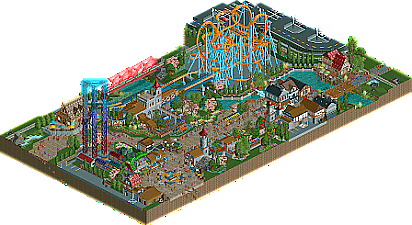
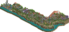
A Premier Rides LIM bowl added to the park in 1998, Warlock anchors the medieval area of Cascadia Park. Further improvements to the area were added in 2001 and 2008, featuring a S&S tower complex and a Zamperla Disk-o Coaster respectively. Cascadia hopes that the immersive themes and intricate gardens will whet your creative appetite and that the rides offer you unmatched thrills.
-
3 fans
 Fans of this park
-
 Full-Size Map
-
 Download Park
717
-
 Objects
415
-
 Tags
Tags
![park_3130 [MM2014 R1] The Janitor's Jinx](https://www.nedesigns.com/uploads/parks/3130/aerialt2776.png)
![park_3800 [NEDC4 1/15] - The Junkyard](https://www.nedesigns.com/uploads/parks/3800/aerialt3456.png)
Yeah, it's definitely a happy-go-lucky ren faire sort of thing, good catch.
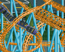
I really enjoyed this. Definitely a solid release and glad to see you're rct'ing. The coaster is - as others pointed out - well done. I also really do like the station and the queue. I also do think that this has great 'little' things to explore otherwise like the dragon or the pathwork. My favorite part in this probably is the ride sign at the entrance.
The architecture is also individually well done. But that brings me to my negative points, that you - looking at the voting - probably wanna hear. I think that this is really lacking connectivity. Not in terms of the general architectural styles not fitting to each other, but because of some choices i sadly personally can't understand. For example the colors: It felt like when you were building a new part of the park, you threw a dice what you colored it. That might sound harsh, but i definitely would have appreciated some consistency in your color and object choices.
Also i think that with a design of this size composition is a very important part of the critique. And in my opinion this sadly isn't doing everything right in terms of that. With a bit more room to breath for everything, it would have been way better. As pointed out by others to look at the composition of a spaghetti bowl design like this, one needs to really look at the interaction of the coaster with the park and peeps. And here i don't see much doing the trick for me, except for the 5 benches next to the framework architecture that i really appreciated. Otherwise the launch of the coaster is either behind trees or behind a totally random stand on the path. For the bowl itself the 3 framework buildings on the path are blocking everything for me. Imagine having a bit more space here, with removing these completely for a big plaza or even have them there, but the narrow street between them and the river being a bit bigger.
All in all don't get me wrong: i think this is a good design and a park in this quality would definitely get a high score. But on a small map like this it really comes down to little decisions that could sway things into certain directions. I think that is what this has suffered a bit from. But i definitely am looking forward to see your next stuff!
> I want to build a spaghetti bowl because I love them and I've never tried.
> I wonder if I can make a design out of this
> I wonder if I can hit 80% with it
> I wonder how quickly I can finish this at a design quality
> oops I forgot about it for a year
Going into building this, I knew that a spaghetti bowl is a challenge for a good design, because it lacks the ability to be well-interacted with. Instead, I intentionally composed the area so that every entrance to the map would have a fantastically framed sightline to the bowl itself, which would be exciting and cool from a guest's perspective, and would really draw people into the area.
I included the parking lot wrapping the bowl to both provide some park-like context and to convey a bit of language about how the park sees this coaster: It's a show piece that both looks really interesting and is a great tool to draw people into the park itself.
I don't really understand any of the arguments about colors, since parks almost always make coasters in a bold, stand-out color to draw attention to them, and everything else (except for canvas awnings and umbrellas, which i probably should have been more aware of) is consistently or sensibly colored. Perhaps the magnolia trees were more of a distraction than a boon as well, but I built this in the springtime and was enamored at the colorful blooms on trees around me and wanted to include something similar.
Thanks for the accolade. I do wish it would have scored at least over 75, but I understand how some of the unusual choices with regards to a design could have kept it from that, even with what I see as quality of work at a higher level throughout the map.
Here's my full review as promised.
As I mentioned, really lovely work. I think you did a great job with the layout and setting. The themes are very charming and feel very fitting for a park setting.
Great details here with the retaining wall and the gardens. I really like the entire waterfront area as a whole.
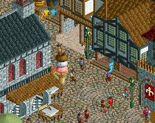
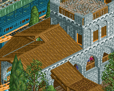
The architecture is nice - the forms are a little blocky, but I think the detailing really took it that extra mile. I like that you've managed to give each some purpose and personality.
Love this path feature. I think the palette did a lot for this park to give it some pop and brightness.
I really like this station, and across the whole park I think your use of foliage patches is quite tasteful.
I also really got a kick out of this, feels like something a park would do for a logo without a doubt.
All in all, I think this is a very solid Design. I almost wish that you went for a full park with this, because I think the style shown here would really suit a full size project. Hoping to see more soon.
Great design, Tim. I believe everyone's covered just about everything there is to say about it, but it's just a great piece of RCT. Really loved the attention to detail on the coaster itself, the thing was very impressive.
Excited to see what you're working on next!
Bump. Just a note to say I really enjoyed this design. Detailing, coaster and such are all awesome. I really love your style. Great job.