- Views 5,499
- Downloads 683
- Fans 3
- Comments 25
-
-
 73.50%(required: 65%)
 Design

][ntamin22 85% CoasterCreator9 80% saxman1089 80% CedarPoint6 75% Cocoa 75% robbie92 75% WhosLeon 75% bigshootergill 70% G Force 70% Scoop 70% pierrot 65% RWE 65% 73.50% -
 Description
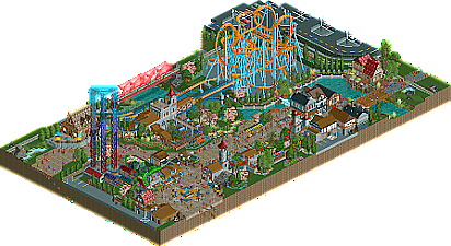
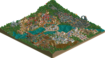
A Premier Rides LIM bowl added to the park in 1998, Warlock anchors the medieval area of Cascadia Park. Further improvements to the area were added in 2001 and 2008, featuring a S&S tower complex and a Zamperla Disk-o Coaster respectively. Cascadia hopes that the immersive themes and intricate gardens will whet your creative appetite and that the rides offer you unmatched thrills.
-
3 fans
 Fans of this park
-
 Full-Size Map
-
 Download Park
683
-
 Objects
415
-
 Tags
Tags
![park_3130 [MM2014 R1] The Janitor's Jinx](https://www.nedesigns.com/uploads/parks/3130/aerialt2776.png)
![park_3800 [NEDC4 1/15] - The Junkyard](https://www.nedesigns.com/uploads/parks/3800/aerialt3456.png)
Positives:
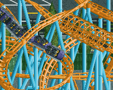
+ Great LIM Bowl in terms of layout and supports.
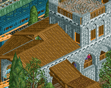
+ Architecture very nice
+ Strong atmosphere
+ Good path level
+ Coaster station layout is particularly strong
+ Very good disc-o
+ Dragon
Negatives:
- Maybe a bit too small
- LIM Bowls are just not a great option for a design. Not that much interaction.
Overall: Pretty strong submission. I think it's on a 75% level, but since it's a design and the main coaster just wasn't that interesting/interactive I'll round down to 70%.
Wew, I've seen the overview once, but I'm still suprised by the details in the park! Great combination between dirty realism and medieval architecture. The archy is actually top notch! It's so inspiring for me.
I bet the supports were a hell of a job, but the layout is nice. I don't like the diagonal transfer track though. It's so thin from two angles.
The foliage is good and all the flowers are very pleasant to watch. They really add a lot to the atmosphere.
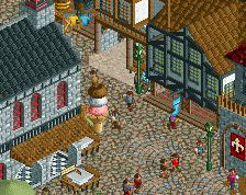
All the details everywhere such as the dragon and the ice cone make me stick to this park a little longer. Great job with this! I really enjoyed it.
75%
Awesome LIM bowl recreation, and I really enjoy all the little details you've put in like the Warlock sign out front, the path line designs, and the dragon sculpture.
I'll give you a more in depth review later, but I just find this super charming and satisfying.
What an awesome piece of work, probably my favorite release from the last days. 2020 is gonna be the best year in rct history.
The archy is really awesome, so great. Everything is super detailed and also very clean. A lot cool little stuff that elevate the whole map. The dragon is cool.
I like the coaster. Very nice coaster colors too and lovely bridges for the launch and brakes. Seems like a very cool coaster to ride. Man, props for the supports! Not only do they look good but it must've been a pain in the ass to do them
With a LIM spaghetti bowl coaster there's no opportunity to really include much interaction but I think the level of details and the super archy really make up for that. Congrats with what will no doubt get design
I liked supports blue roller coasters and the bridges were great.
Lovely design here. Managed to make a LIM bowl a centerpiece. Loved the architecture throughout. The disk-o queue and theming was a stand out to me. So simple, yet added quite a lot for me. The various midway games were brilliant. The potions stand was a standout.
The support work on the coaster itself looks incredibly tedious and is why I'd personally shy away from such sort of layout. I saw your comment on discord about interaction and I hope to transfer that to here because while the spaghetti bowl isn't providing much interaction to guests via criss-crossing the map, there is continual sight lines:
- people standing in the queue
- the parking lot
- people eating their ice cream
- guests riding the launched freefall towers
- the park train
- pedestrian bridge over the water
Lot of moments to take in the giant ball of steel.
dang this is pretty awesome. small but sweet.
You have a clearly distinctive style, which is somewhere in limbo between realism and a more aloof earlier-rct2-semifantasy. I like it. There's some great details here, like the train infrastructure, and of course the layout is well constructed. I particularly like the potion stall and that cramped row of buildings. It reminds me a lot in both style and feeling of zippo's, which I fall on the 'love' part of the spectrum towards
Pretty nice overall. Coaster supports and coaster station were definitely highlights for me. Rest of the architecture was okay, felt a little outdated though. Have we really not found a better way of doing framework buildings in 10+ years? We gotta find something.
But yeah, definitely design worthy, a lot of cute details around, like the ice cream cone (Which I've definitely seen in another of your parks before) and the games stall. I'd probably vote 70%.
nice release! I like what you've fit into the small area. Cool to see the contrast between the theming - which looked appropriately retro - and the car park, coaster area and some hints of backstage. It's a very tasteful level of context. I think all the path details were probably the standout here for me, especially the dragon and the floor motif.
Is there a need to find a better way to do framework architecture? I mean, it’s framework architecture. It is what it is...?
I don't think there's anything here to dislike, and the more I poke around the more little touches of extra care I find.
The custom signs for warlock and Dragon's Fire are lovely. I appreciate the "vanilla RCT but better" elements - the castle tower objects enhanced for jester, ye olde rafts & monorail cars as stalls dressed up a little, even the concept of a premier spaghetti bowl dressed up and really executed as best it can be in 2020 ORCT2 realism. (I see you, Quantum Thruster.)
The heartline coaster on the MCBR is a great little touch. I remember first seeing that on Joker's Jinx on RCDB waaaay back after looking up FoF @ PKI and just being completely boggled. The layout is about as good as it can be on Warlock I think, but the supports are what's boggling to me nowadays. That's an insane pileup of tubes.
Super-love the shops and stalls having so much life. There's a couple that aren't quite to the "overflowing with creativity" level of enthusiasm the Potions or Armor stalls reach, but everything being thematic and having names, clear purposes, and a little visual identity unique to it sells the area and the atmosphere so much more than empty shell buildings. Maybe it's just the peep activity, but this is a great lively little slice of park to watch in a way that can get lost sometimes in contemporary realism parks.
Ace, really. It does achieve everything it sets out to capably (plonk an as-realistic-as-possible LIMbowl in realistic park context) and continues to be enjoyable and novel beyond that due to all the little fun discoveries, so uh - 85? That feels a little high, but I can't find enough wrong here to justify lower and aside from being well-executed and just kind of fun to watch go, I don't think it's overwhelmingly impressive enough to go higher.
Great job with this, ITM. All the people saying "the coaster doesn't interact" are overlooking the composition imo. The bowl located near the parking lot definitely says "front gate coaster to me", not to mention the perfect sight line towards the bowl after you walk past the fountain and between the tower ride and the hat shop. Archy is perfectly themed to the area, and everything is cohesive yet still distinctive. I also loved the color choices, especially for the coaster and supports. Nothing says "look at me" more than neon blue and orange.
I can't really state much I didn't like about this, so I'll stop trying to look for criticism. Good job, 80% from me.
Some bits were super nice here but it all felt a bit fragmented, obviously you have the medievalish tudor archy but the other bits were a little lost on me. Maybe its just the difficulty of this sort of layout in a design, just not a whole lot you can do with it. Great micro as usual with you, and some creativity, but it didn't quite push the boundary enough for me to really get into it.
Anyways 70 for me, maybe that's harsh but its a tough park to score as a design. Glad you attempted it though, always good too see these sorta coasters, suddenly become very popular.
congratulations on design!
Also just wanted to clarify where I said "appropriately retro" I don't mean the RCT building style, I meant the theming to me seems to have a more cartoony approach that feels appropriate if it was made in the 90s rather than today where a theme park might go with something more gritty and GoT esq.
Here's a video review of the design. Congratulations on the win! This one turned out very nicely and makes me excited to see more from you.
https://www.youtube....h?v=92TtqYUBrr0
grats!
Old man timmy's still got it! Good work on design. I still need to look at it in-game but from the overview, my favorite part is the colors - you used virtually every color and made them all look good.
I enjoyed this design. It's a real kind of coaster but one we don't see much in RCT. I went on Joker's Jinx at Six Flags America and it reminded me a bit of that. The Medieval Theme around it makes it more interesting than the typical amusement park boardwalk would.