Park / Geauga Ocean City
-
 25-April 20
- Views 7,461
- Downloads 889
- Fans 6
- Comments 25
-
-
 82.00%(required: 70%)
 Gold
Gold

CedarPoint6 85% yes Cocoa 85% yes Jaguar 85% yes posix 85% no robbie92 85% no Camcorder22 80% no G Force 80% yes RWE 80% no saxman1089 80% no Scoop 80% no WhosLeon 80% yes Faas 70% no 82.00% 41.67% -
 Description
An Amusement Park
-
6 fans
 Fans of this park
-
 Full-Size Map
-
 Download Park
889
-
 Objects
629
-
 Tags
Tags
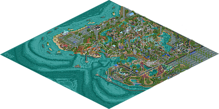
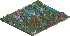
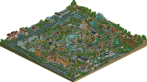
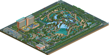
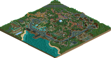
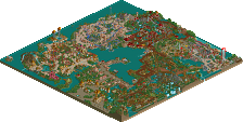
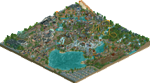
Kind of sad to see a few screenshots from the last week get more comments than this entire park. Same goes for the last couple large park releases. I get that it takes time to do a proper review, but don't we all hope for the same when it comes to our own finished parks?
Have to say although there were some quality screens from this park, I wasn't quite expecting this caliber of a release. It simultaneously came together better as a whole, but as others have mentioned suffered from some coherency issues in some parts.
Starting with the park layout, I actually saw this as one of the strengths. I don't mind a quirky layout and it often is more memorable to me than a by the book layout. I like finding random outskirts to explore and imagining areas you wouldn't typically see in real life.
The rides here were also a standout. I liked how you had the oldest rides towards the front or in the main pathways of the park (side friction, wooden, corkscrew) so its obvious how the park expanded over time, and the newer rides along the periphery, like the RMC in the back or the giga along the side across the road. The RMC was probably my favorite layout-wise, one of the better looking ones I've seen in game with some great interaction and I enjoyed the fake out track too. The invert and giga were solid, though maybe didn't do anything to set themselves apart into "ride of the year" territory. The diagonal station on the corkscrew was a cool bit, and the looper was another favorite, heavy Revolution vibes there.
While the individual buildings were a strength and were well-structured and coherent, as a whole there was way too many textures per section. This was evident in every section of the park (except maybe the outskirts), but especially in the western section. You have a log cabin looking building, a wooden saloon, a kind of bayou-looking brick building, and an adobe-ish mission looking building. All lovely structures on their own and I don't necessarily dislike how it looks, but I fail to conclude what this section of the park is about, in terms of aesthetic and atmosphere. Having some unity between your buildings would do a lot to make each section of your park more immersive.
Spotlight yes/no is usually a fairly intuitive answer for me, but to be fair to the park I'm voting on I try to justify that vote logically. While a high quality park that's definitely deserving of its score, Spotlights to me have a much more deliberate and identifiable aesthetic. This was partly the huge variations of architecture and part overall framing. I assume the park's set in Ocean City Maryland? While the architecture did feel very mid-Atlantic, the foliage and landscaping (and to a degree the pallette) felt a little too tropical which made the location a bit confusing. Overall, still among the best releases we've seen in what will be an historic year. I think with some slightly tweaks to your building you'll easily win spotlight with your next park.
Congrats on the gold and also on getting Parkmaker, roy! It's well-deserved for this park in my opinion. I enjoyed how different this park was compared to a lot of other realism parks. The aesthetic choices you made are distinctly you and unlike any other realism builder, and I really liked seeing that here. Architecture was solid, if a bit lacking in cohesion as others have stated before. Coaster layouts were also great, my favorite was definitely the invert.
My main issue with this park is the layout, as well as some of the composition choices. I do realize that imperfect park layouts should be a consideration of true realism building (as no park in real life is perfect), but I think it just went a bit too far here. It took me a few viewings to really understand what I was looking at as far as where the park was, where it stopped, what was outskirts, etc, and in some places it just made the park feel a bit messy imo. I also thought there were a few places that were a little too cramped for my taste (around the RMC for example), and some breathing room for those areas could've helped alleviate some of the awkwardness with the park layout.
It took me a pretty long time and a few viewings to decide on yes/no for spotlight, and I ultimately chose no for the reasons above. I think you'll positively nail it next time.
Hey thanks for viewing, ill post some WIP screens below and talk about the building process, maybe address some general complaints. I started this 2.5 years ago (around oct 2017) by now but most of the building was done in short inspirations if i wasn't just blankly looking at it. As for planning, yeah I didn't really plan any of the park I just kind of went with what I thought looked good or not. I know the plan ( or lack of ) hurt it for some but I really enjoy how organic parks look like this. Glad everyone enjoyed the invert so much, it was the last layout i did in the park almost around a year ago by now. The RMC i did before the current one i totally scrapped that area for whats there now. The schwarzkopf and invert were the first ones in and I would go back and make little edits to them over time. I know the city area was confusing and I might have went for more of a city park feel when i started the thing to end up as an amusement park later. I thought it was too nice to scrap for consistency so I tried shoehorning that area in like the park purchased the suburb later, lol. I also lost a lot of consistency in the architecture ( get better, scrap old work, endless cycle) due to working on this so long but its probably my fault for being too ambitious. Thanks ziscor and josh for their contributions, really helped me finish when i was pretty much done mentally with this park. The logo is neat too!
As for questions like "why do you do this" It's either object limit ( i did a lot to save on this ) or I just thought it looked good (personal preference). The park is definitely built in a maximalism style. Maybe I could have more path or plaza areas, just too many strips of path connecting everything together, but I really enjoyed the awkwardness of the overall product of how this came out in the end. Im not a very consistent person, lol. The park was its own amusement park chain. Just had Geauga in name really. For setting and location I never really placed or put it anywhere.
As for a next park or in the future, you all seem more optimistic than myself lol.
Wonderful work, roygbiv! This is a great piece of parkmaking and I'm a little bummed it didn't get spotlight.
There's some really nicely composed moments here, especially on a micro level, and the park is so full of life, love, and energy that it's becoming a favorite of mine.
Areas like these are just so exciting and cool to look at:
The park did feel like it had a story to it too, like it evolved over time and became this exciting wonderful place to have fun. The older coasters are to the front of the park, and you can tell how things grew outward from there.
I don't think this is without fault however. It doesn't feel like it was especially well-planned--areas tend to blend into each other--it's hard to make out clear themes to rides or areas, and there's a pretty consistent density to most everything. I also wish you'd had the object space to put a little more attention towards the beaches and ocean to bring that to life a little more. The last bit of critique is that almost every coaster in the park feels like an impressive headlining coaster, which leaves a gap where you'd want some moderately intense middle-ground coasters, which I feel is only really covered by the corkscrew right now.
Overall, I love the park. I'd have voted between 85 and 90/yes. It's believable, exciting, fairly unique, and shows impressive skill as a parkmaker. Congrats!
Airtime Offline
The park is a monumental achievement. The size is phenomenal and really adds to the context.
There’s some amazing points that are revolutionary and easy spotlight quality. Some really ground breaking ideas in there as well.
I do think there’s a few weaker areas, nothing major that detracts from the overall though.
The Intamin and the invert are so good. Not a fan of the RMC though.
I love the setting of the park and reminds me of Cedar Point.
Not sure the shadow idea works? I can’t remember how much you used it in the map but I think while the idea is great, on a large scale I’m not sure it works. Did you only use it for the Intamin?
Anyway, cannot wait to see your next stuff because this was huge. Can only get better.
EDIT: forgot to mention my favourite thing about the map, the underwater landscaping. This adds so much and people don’t do it enough!