Park / Geauga Ocean City
-
 25-April 20
- Views 7,562
- Downloads 899
- Fans 6
- Comments 25
-
-
 82.00%(required: 70%)
 Gold
Gold

CedarPoint6 85% yes Cocoa 85% yes Jaguar 85% yes posix 85% no robbie92 85% no Camcorder22 80% no G Force 80% yes RWE 80% no saxman1089 80% no Scoop 80% no WhosLeon 80% yes Faas 70% no 82.00% 41.67% -
 Description
An Amusement Park
-
6 fans
 Fans of this park
-
 Full-Size Map
-
 Download Park
899
-
 Objects
629
-
 Tags
Tags
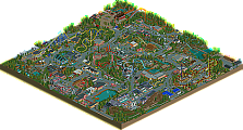
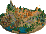
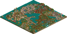
![park_4120 [H2H8 R4] Ruigrijk](https://www.nedesigns.com/uploads/parks/4120/aerialt3860.png)
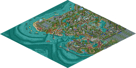
That ocean terrain work looks just stunning from the overview. Eager to check it out in game, will return with some more in-depth comments!
Very glad I'm not on the panel anymore, this is gonna be a tough vote.
Overall it's a great park with some fun surroundings. I do wish there was a bit more park and a bit less surroundings, especially as the type of surroundings that are there...we've seen before quite a few times by this point, and the atmosphere in the park is something we definitely don't see enough of.
The coaster layouts for the most part were great. I loved the invert, that's definitely one of the best big inverts I've seen in a long time, and the Schwarzkopf was very nice too. The RMC was one of the least offensive ones I've seen so far too, I'm generally not a fan of how they look in Rct, but this being close to the ground definitely helped it a lot.
I think the Intamin needed some work. The diagonals on it looked far too forced and I ended up feeling like the layout was weirdly blocky. I also thing the wooden coaster was kinda ruined by the custom supports, I really don't think it needed them and made the whole structure just look kinda weak and feeble when a wooden coaster, even a small one, normally feels big and imposing purely because of the support structure.
The weakest point for me is the architecture. It's nice, but it's not amazing. Some of it feels underdetailed, some of it feels blocky, but not to the point I can't enjoy it. For example, the Intamin station is just a big green and grey block made of glass that has a queueline in it...but that's it. There's no real interesting feature to keep me looking at the building or coming back to it. The area by the lighthouse was also a big offender for this. Again, the architecture isn't bad enough to ruin the area or anything, but it's definitely not the highlight of this area, instead I found myself more interested in looking at the walkways and roads throughout the area.
There were some good spots of architecture as well, like around the RMC and the Schwarzkopf. These areas were a lot higher in quality, and I'd be pretty confident in saying these were probably added much later in the build process because of how much higher the quality of the architecture is around here.
The strongest point by far is just the general atmosphere and vibe. It has a fun, carnival-y, small park feel, but on a grander scale with some big rides. It almost has a similar vibe to Luna Park in areas, which is definitely a good thing. I think your general parkmaking, infrastructure, path details and all that kinda stuff are top tier with this park. Everything looks like it is where it should be, everything looks clean, and for the amount of path types you used, that's a real skill.
The underwater stuff is fabulous as well.
A few of my favourite things:
Thought this ticket booth was very tastefully done, peeps queuing up adds a lot of atmosphere to the area.
This midway section was great and instantly shows where your skills as a parkmaker lie.
Turntable and spare train coach, very nicely done.
The first time I realised that there's a shadow thing going on through the park. I think for the most part, it's a little hard to read on the paths, but here it works really well.
Tina's Diner overlooking the immelman is great. Can definitely imagine eating there.
This little corner was probably my favourite in the park. Very tastefully done.
Love this little margarita bar with lights and all.
As I mentioned before, pathing/infrastructure details throughout were top notch.
I think if I were on the panel, I'd probably go 85% Yes, as I think there have definitely been weaker spotlights in the past few years, but at the same time, I feel like there have been stronger golds as well, so I really do think this could go either way. I'll cross my fingers for you that we see a gold star rather than a gold circle up there.
Congrats Roy on your first big solo park! It's a nice release for sure and something to be proud of. While this is American realism, it looks and feels completely different than the American realism we've become used to seeing.
I love the entrance, great use of steeplechase track to define the shapes there. Overall pretty cosy and warm entrance to enter the park. But first... where and what is the park?! First I thought the city part where the lighthouse is and the cable car ends, was an actual city part... Then I assumed the park was a city park where you didn't need entrance tickets but just payed per ride and thus you could enter the park freely. Only after watching the giga for a while I noticed the road to the town was blocked and so it belonged to the park. So I assumed it's kinda Disney Village, an entertainment zone. Cool, but as it is implemented it wasn't really clear.
That also points out the biggest downside to this park: the placement of the giga. Well now I know it is in the park, it looks like it's outside the park. It was a bit hard to read. The giga itself looks very good, would definitely want to ride irl. The other great coasters were the RMC and the invert. Both had killer lay-outs. Love the batwing on the invert and the RMC close to the ground was amazing. Great interaction with the flume too. I do wish you gave the RMC a bigger and nicer station though.
Overall really good park. It was a bit hard to read and a bit too busy on some parts, but the strong points definitely make up for that. I think the panel will have a though vote in front for them... I really don't know what score this park should get. On the one hand I do understand the call for spotlight a bit since it's refreshing and it contains much cool stuff. On the other hand, there were parks in the past who were better on technical level and were more consistent (thinking SFWoD) who didn't make the golden star... Nonetheless, congrats again on finishing this and I'm looking forward to see more Roy rct works in the future.
It's a spotlight in my book. Incredible job, with some brilliant and fresh ideas throughout! Stunning and unconventional in a way.
Positives:
+ It's a big park
+ The sea landscaping is great
+ Some awesome layouts
+ Good realism
+ Good area layout
+ Very good outskirts
+ Strong path details
+ Very good use of diagonals for the most part
+ Good boats
Mixed:
+/- while I thought the areas were layed out well I wasn't a big fan of the park layout
+/- Foliage is mostly good, it only bothers me that you used the very square grass object without smoothing the edges.
+/- While the diagonals are mostly used well, the Arrow looks pretty bad from 2 angles because of it
+/- While a lot of the architecture is good, a lot of it is also really awkward. Worst case for me is the station of Fuchsia which looks great on one side and really awkward from another
Negatives:
- Paths are often too thin. Most of the park feels cramped and disorganized due to that.
- You sometimes have areas with a consistent style for buildings and then have one or two buildings which don't seem to fit there at all.
- Don't like the grey Kryptonian rocks, they pull the eye in the worst way.
- Log Flume having track in the water makes no sense (potentially this is based on a real ride that isn't a standard Log Flume, in which case this point is moot)
- Severe lack of breathing room across the entire park
Overall:
This is one of the parks that I probably wouldn't vote on if I was on the panel, since I think it's clear that personal preferences give me a more negative view on the park than it probably deserves. I'd give it a 75%. It's a good park with a lot of skill involved, I just don't think it comes together as well as it could have.
Great park Roy and congrats on finishing this. It is absolutely monstrous.
I think this park is really a strange park, not necessarily in a bad way though. The park feels very unique and the style is different from other large parks we have seen on this scale.
Positives:
+ The area with the wooden coaster and the tram station looks fantastic. I like the archy of the wooden station and the wooden coaster had a fun layout imo. I disagree with Trav on the supports for the woody, I think the custom supports look great.
+ I like the way you did the Disk-O, it looks really great with the reverse free fall coaster track.
+ Next to the Disk-O we have the custom ferris wheel, and this is one of the better custom ferris wheels I have seen. It doesn't look blocky like many other large custom ferris wheels and the cars are pretty cool.
+ The swarzkopf looping coaster is fantastic. I love the layout, I love the way you supported it and put the stand-up coaster track underneath. I like how it interacts with the path and its surroundings. It's just a great ride in general.
+ I liked the diagonal station on the arrow looper. It seriously looks very cool to me. I know you wanted to have my diagonal loop object on there but unfortunately I couldn't really find time/motivation to finish that.
+ The RMC. Generally I am not really a big fan of RMC's in RCT. I think they always look kind of bad because the amount of track pieces are so limited. This layout is however acceptable. I think keeping it low to the ground helps it look good and RMC like. It does absolutely race through the course though, in some cases maybe a little bit too fast. I also love the interaction with the log flume. The log flume itself was also very well done.
+ I love the diagonal chairlift near the intamin giga/hyper. Looks very cool and I like the station building that is not on the giga/hyper side.
+ I like the lighthouse.
+ The diagonal boat sailing out of the harbour is so good.
Mixed:
I couldn’t have said it any better myself, this was exactly my train of thoughts as well. I will say I do really like the area near the giga and I love the interaction of the giga with the road. But I had no idea what I was looking at.
Negatives:
- My biggest gripe with this park is that the quality feels very inconsistent, especially when it comes to architecture. You have the Woodie station and the entrance area which has fantastic architecture, and then you have the intimin giga station building which is just a big blob of glass. There are some other examples of this throughout the park.
- Some areas felt a little bit cramped to me, like the area near the margarita bar, but I don’t think this is a very big deal.
- The landscaping was a bit inconsistent with it being very detailed in some places and not very detailed in other places. Within the park there is a lot of detail and also near the lighthouse you have a lot of detail with those 1k rocks. But then the rest of the sea wall is really under detailed. I feel like it is somewhat excusable because I’m like 99% sure you did this because you hit the object limit (looking at the available slots left). However there are some things which still bother me a little bit about the landscaping, for example on the side of the park where you have the beach you have these small sand islands with just one or two trees on them and no other foliage. To me that just looks incredibly strange. I think it would look better if you would have just kept these islands completely empty and just had them as sand banks.
- I actually was also not a huge fan of the underwater landscaping. While in general it looked good, in some places it looked odd. I don’t understand for example why you put that bright triangular spot in the “middle” of the ocean near the map edge. To me it seems like the water would be deeper here. If I make this patch dark it instantly looks a lot better to me personally.
Overall thoughts:
I am very torn on this park. I really like it a lot and I think it is a great park, but I also feel like it is very inconsistent quality-wise in some places. It's imense scale definitely makes it a spotlight contender in my eyes but I also agree with what others have said: there have been better golds. I also think the very unique style of this park would be a good potential argument for giving this park a spotlight. To me however this park would be a perfect candidate for a hypothetical "platinum" accolade category. Definitely a step above gold but not quite a spotlight yet. Since we don't have such a category (yet ), I am very glad I am not on the accolade panel. Overall you can be incredibly proud of this park though, it is such a massive park and the dedication to finish this is something which I admire.
First off, congrats on getting this done! It was a lot of fun to see your progress on this. The amount of rebuilding and re-arraigning was impressive and shows me how much effort you put in to this. Second, I do agree with some of the park layout criticisms, and I think the layout is a byproduct of moving from your original idea to the final park. Case in point, the area the chairlift leads to, it's a village inside of an amusement park? Huh?
Other than that though, this park has some areas that were stellar. The RMC was nuts. All the points of interaction were great. I can envision riding the flume and watching the RMC travel its elements and thinking "I can't wait to ride that next". And the number of drops on the flume look fun as hell too.
I think the architecture criticisms are a bit unwarranted. For example the station for Thunder Cyclone was excellent.
And I really enjoyed buildings like this one:
I think a lot of the architecture is similar to what we see from G Force and other realism builders in that the structures are very basic in shape, but are well detailed because of their real-life counterparts.. and in this case I'm assuming drawing inspiration from structures at Geauga Lake and Cedar Fair parks.
Lastly what this park really did well was interaction in most every ride. I've already mentioned the RMC/flume.. but I wanted to show one more moment that was really cool to me.. I can easily see myself standing on the path and being awed by the coaster zooming around and over where I'm standing.
Man this is a tough one.
It's a unique and charming park in its own way, that's for sure. I enjoyed looking through it a lot. It's somehow nothing like we have seen before and I can tell a lot of love and effort was put into creating this park, well done!
However, it was definitely not easy on the eyes. I had some issues with the consistency of the park as a whole. Flowy natural landscaping and foliage was intertwined with blocky and unnatural foliage and landscaping. Small cute architecture was mixed with bigger-scaled buildings, etc. This made it feel more like a collection of seperate areas. Somehow it felt like this park had every roof type, wall type and tree type that the game currently offers. In my opinion you should tone down on this a bit more the next time.
Keep it short: Great work... The current vote is way to low for my taste:D
Must give 100%!
Ps.: Love the ventilation stuff. I'm gonna use them for now on
Lovely stuff, this is definitely a breakthrough. I really like how unique your style is and the coasters in this are amazing. I especially liked Anubis and Vendetta, both one of the best coasters we have seen this year so far in my opinion. The overall style is reminding me a bit of the stuff Royr is doing, but there are a few flaws in this that makes this a little bit less good.
I also really like how the city is integrated into the park, cause when doing city parks we normally see them pretty separated over here. I just really liked not knowing where i am in parts when watching this.
My main critique point - and there i agree with faas - on this is consistency, especially in terms of architecture. The biggest example for this is the area where ziscor's stuff is in my opinion: There are like 5 architectural styles clumped into one part of the park and then there is an american flag thrown onto it. That didn't really worked for me.
Also i'm not a huge fan of how the landscaping is changing throughout the park. There is nothing that connects the different parts of the park in this. For your next project i would recommend have at least have a rockwork style and foliage idea that is the same on all of the map.
All in all an awesome park tho and definitely something you can be proud of. I'm sure with a few tweaks your next one will even strike more. I'm looking forward to it.
Really love watching this park's progress, and loved how it was a secret to a lot of people. Great to see a massive park like this - definitely your best work yet!
Favorite area is the invert and the waterfront with the Bahama Breeze. Glad you built that instead of what I had there initially - wasn't feeling inspired that day haha. I can definitely see some of the criticisms about the architecture inconsistency, but I don't think it's too big of an issue. The only thing I would love to see you improve on in the future is how things are composed in terms of sightlines and space. There's some awesome sections of this park that could be improved by making them slightly more readable. No need to go overboard with path, but I think some parts could have benefitted from having more open pathing to give the eye a place to rest and focus on the important parts.
Congrats again on this immense park - glad to have contributed, even though it was minimal!
Josh
Love those supports ♥
Awesome park, terrific work ! It's so full of life. You can be proud of that one.
Love all the roller coasters, they are all unique in their own ways !
The overall composition and choice of colours is great.
My only concern would be the archy, kind of weak in some parts of the park but it doesn't ruin the global experience.
Without being an expert, I would rate this around 80%.
dang, I really thought this was easily spotlight material. I have this feeling that since orct2 made large solos accessible again, we all have this lingering feeling that there should only be 2 or 3 spotlights a year at most, so we have to reserve our votes or something. anyway...
I thought this park was really awesome. So fucking weird and almost surreal, but I love that about it. I mean what sort of park just annexes a chunk of town to construct an absurd hypercoaster on, and then a diagonal chairlift, and then just nothing else. so strange but so awesome. that intamin is epic though, easily one of the best of the year for me.
so much of the parks infrastructure doesn't mesh together, and every building is just so different, but it almost all works that way- sort of like an out-of-control coney island build whatever you want feeling. In that sense it actually feels really true to that old school american park, and you've included some legacy attractions which really sell that. even within the themed lands, each building is quite separate from every other one, but it still works in a crazy way, sort of like a fever dream of a realistic rct park. actually, it really reminds me of the imaginearium parks, which are these sprawling, atmospheric themed chunks surrounded by an intimidatingly ever present ocean. I always had a soft spot for them. anyway, i really like the western area, even with the ugly cvs sightlines. the rmc is epic and well-integrated (with a cool trick jump section) and the archy is great, especially the way that single tile boardwalk path cuts off those natural bays over the water- i love that a lot. theres a lot of that sort of unusual but complicated and ultimately interesting composition throughout the park, and I think it does show off some really cool ideas for how a park can be structured and still work. even if i'm totally confused half the time. ziscor's little town is neat too- pretty but small, and I like the queue for the schwarzkopf. the entrance area may be my favorite part- just great, art deco american vibes and the whole composition is just at once so interesting and unusual, but also felt quite natural. really good work.
for me, it was a no-hesitation spotlight. but its a tough crowd these days.
it's so great man, and it's fun to see now all of the screens from the past months pieced together and in context, such awesome stuff
Here's a review of the park. Really nice work. Spotlight for me, but you should be proud of this park.
https://youtu.be/0HWAFe2PlHY
Congratulations on finishing such a huge park Roy! I really loved all the ride layouts, but in particular the schwartzkopf and the RMC. Just a great combination of coaster layout, track layering, colour scheming and supports on both. And with the RMC it's impressive that you managed to make a layout without any swooping turns so that you could use the side friction layer.
My preference is generally for parks with more cohesion in how the buildings look, but that didn't stop me enjoying the crazy and colourful eclectic style of this. Well done!