Park / Deurklink Megapark
-
 25-April 20
- Views 5,414
- Downloads 763
- Fans 4
- Comments 13
-
 58.50%(required: 50%)
 Bronze

Jaguar 70% CedarPoint6 65% CoasterCreator9 60% csw 60% posix 60% RWE 60% Scoop 60% bigshootergill 55% Liampie 55% Ling 55% saxman1089 55% geewhzz 50% 58.50% -
 Description
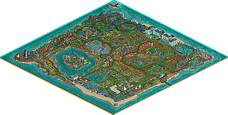
This park started as a challenge to myself to fill a map of the maximum size. It ended up as a 70+ episode series of Youtube that ate up most my free time.
I hope you enjoy it! And if not, have fun pointing out all the flaws ;-) -
4 fans
 Fans of this park
-
 Download Park
763
-
 Objects
444
-
 Tags
Tags
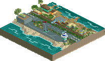
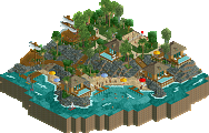
![park_4709 [NEDC5 - 08/10] Isla Mechanica](https://www.nedesigns.com/uploads/parks/4709/aerialt4586.png)
Congratulations on the release. It's an impressively sized park, and definitely has a lot of variety.
There's a good bit of quite cool stuff. I'll highlight a few of the things I liked most.
I really like the circular bumper boats pool.
Lovely and colorful play area.
The hanging dragon is really cool, though the architecture in this area and most of the park as a whole is quite blocky and not the most appealing to me.
Nice use of expansion objects as footers for the woodie.
Really atmospheric area. I wish more of the park looked like this! The small ponds, the stone pillars. Only complaint in this screen is the lack of path features (we'll get to that) and the lack of a different land color under the path making it feel a little flat.
The coasters as a whole were fairly strong, with a few exceptions. The one on top of the hotel, and the haunted forest wooden coaster. Just flat out was not a fan of the one on the building. It's quite awkward.
This is an odd one. The right side is actually really lovely, the left is quite awkward.
Egypt is quite nice, it's just very small and seems more theme-park-ified than the rest of the park somehow.
I think it's a byproduct of this being a YouTube series, but it's a bit of a shame that smaller features such as this didn't get the same treatment as the big attractions.
Something that tends to bug me in NCSO/Expansion parks is the utilization of a "cool gimmick" [rapids "stairs"] without committing to the use of it. This is often seen with trackitecture rooves (though you did a very good job with those here), but I noticed it a lot with the rapids track. Here you used it a lot, even underground! But oddly not on the exit path. This happens in a few other places too.
One of the biggest negatives for me is that this park suffers from the "islands of park syndrome" in which the themed areas are almost walled off by these large expanses of big, usually unthemed, and mostly straight path. Instead of guests walking through themed areas, it's almost like they're walking around them - even here where it's all part of one area. It unnaturally breaks up the park into chunks. I'm sure this is partly due to your method of building it in series.
The architecture is a bit basic and plain too. It really feels like the entire focus of the park was put onto the roller coasters and a few other major rides and the rest is just filler.
When you give me this, you leave me wanting more like it.
Not stuff like this.
tl;dr - Congratulations on finishing a large park - that's a great accomplishment. While I think this park suffers a bit from being the subject of a YouTube series with a specific target audience, I think you did some cool things with it. You have an eye for NCSO techniques, I'd be interested to see you tackle something more immersive - that horse ride might genuinely be one of the cooler things this year so far. As for a score... I'm still thinking about it.
I watched every episode of this and I was immortalised in one of the later episodes when you followed my suggestion to give a catwalk to the hotel coaster
It was amazing, the roller coasters are great
I loved your work
Congratulations
sweet park, pretty interesting back story involved
By the way, here's a little backstory for the area with the rocket. You might enjoy it: https://www.youtube....h?v=aBjuXPMZfwI
This park really reminds me of this old park on RCTgrotto called Palm Tropics Resort, so thanks for the nostalgia. It's really nice seeing a max size megapark in a time where custom scenery and detailing make this unviable; this really has an old school feel to it.
As for the positives, you have this unique and strange foliage style that actually works really well at a dark tropical atmosphere, despite being so dense.
This section for instance is great... it's very immersive and ominous... the color scheme is perfect.
This is possibly the strongest part of the park... the golden trees and blue flowers work very well together and the car ride has a good interaction with the paths. Definitely very bold and quite immersive. Your scenery use is also extremely clean and there's a good amount of technical ability here as well given the minimal glitching.
For the negatives... I understand that you did this to maximize space, but the entire island is a massive square, so it feels unnatural. It also makes this park feel rather flat, even though there's a lot of terrain variation. The cloning lab section breaks apart from this though and as such it's a pleasing section to view. I also agree with CC9 on the 'islands of park' critique... the park could be more immersive.
I also had mixed feelings about this section... I do like the custom palm trees... feel very LL like. i don't like the foliage and landscaping... it looks like you were going for a shrubland feel and while it looks great around the gentle rides nearby (smoothie cycles is really nice), it's rough and repetitive here.
Overall though, the layouts were mostly strong. There also was a lot of cool details like the helicopter tours, the launchpad in a crater, and the wildlife... the kind of stuff that makes me think "I want to visit this park in real life." Really an extremely fun map.
I think he was actually inspired by this when I brought it up on Discord.
Correct
Hey, this is pretty cool. Lots of stuff to like here. I always have a lot of respect for anyone who can finish a full-size RCT2 map, and you've done it to a pretty good quality as well. Thanks for submitting this.
Really fun to watch this get built in your videos. I agree with csw that being able to finish a park of this size with this much content is impressive. Figured I'd point out a few bits I enjoyed:
The speedboat ride was really cool with the wake zones.. such a silly little detail that added a lot.
The steeplechase ride with the monster truck log track to make the horses trot was a nice touch too. Really pleasant area that I think also highlights your foliage work too.
Lastly, the rocket launch area was something I enjoyed as well.
well, it certainly is massive. i kept getting lost when i'd zoom out and change angles.
theres a lot of good stuff, a lot of medium stuff, and a lot of filler stuff, as is to be expected. I wish it wasn't all just single rides/layouts in their own "islands" surrounded by flat path, but I do understand the creation process that went into the park. I quite liked the mine train actually, and the black woodie with the boat. I wish it had a more prominent and epic entrance though, its a bit anticlimatic given the scale of the park
@Cocoa You can get a free park map at the park info building right after the entrance. That should help your pathfinding algorithm