Park / Blitz Park
-
 22-April 20
- Views 1,749
- Downloads 493
- Fans 1
- Comments 7
-
 54.00%(required: 50%)
 Bronze

CedarPoint6 60% Cocoa 60% posix 60% bigshootergill 55% Jaguar 55% RWE 55% saxman1089 55% Scoop 55% CoasterCreator9 50% G Force 50% csw 45% Liampie 40% 54.00% -
 Description
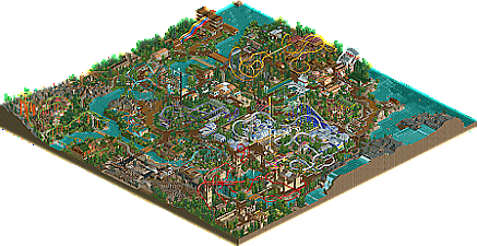
So... I started this park in quarantine and just kept building nonstop. I wasn't really expecting it to be this big at first, I was just using it as a sandbox to try out some tricks and things, but I'm happy with how it turned out. I do wish i had more room to make a parking lot and a more open entrance area, but I think in this park, the focus is really the coasters. I think this is at least a real step up from my last park, so I'm proud :)
-
1 fan
 Fans of this park
-
 Download Park
493
-
 Objects
351
-
 Tags
Tags
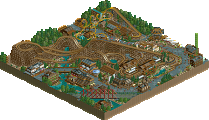
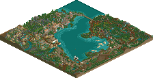
I think this is a dramatic improvement over the other parks. I think what was initially holding your old parks back was your landscaping, which is quite a bit better here and it feels much less sparse. The trees definitely could use some underbrush though. The architecture is also a bit more refined.
The layouts are a bit awkward tbh... goldrush having a corkscrew before the brake run, or the underground portions of volcano blaster, an otherwise good looking coaster, for instance. With that said, Electric Blue has a decent, if short layout and that entire section of the map is by far the best part of the park. I also like the area around Jolly Rancher.
This is overall a very aesthetically pleasing park that shows a lot of improvement and potential... there's certainly good macro skill involved in the park layout and as a whole, it's well put together. However, individually while some parts are neat and refined, others feel rushed and rough admittedly.
Definitely a step up. Really packed a lot of rides into this park! As a result I think it's a bit busy at times, but areas like Volcano Blaster kinda lighten it up a bit.
I agree with Jag that the layouts were a bit awkward. You tend to have a lot of coasters that either go underground, or dip below things. I would maybe work on continuing interaction above ground. Jolly Rancher and Electric Blue were also my favorites too.
Definitely an improvement! Layouts definitely are probably what's holding this back, I'm also not totally into the density of everything but that's more preference.
Just got to keep working at it and experimenting!
I like this. some decent layouts, although a few are a bit cramped. But theres a good atmosphere here which is a bit different from other ncso parks, which is nice to see- i think its perhaps the big stony rockwork throughout. its a bit 'islandy' at the moment- paths surrounding attractions. would be cool to see a tad more dynamism in the park layout.
This is definitely not bad. I really enjoyed the atmosphere in this. In terms of architecture we also definitely have seen worse NCSO archy here. Coasters have been very weird though. Same goes for the foliage and landscaping, i felt it was a bit random and careless here and there. Also i second cocoa about your composition.
All in all a nice release though. Thank you for sharing this. I think this should be awarded with a bronze.
Pretty nice park here, it has some really lovely and unique moments and shows a good improvement in skill over your last park. It definitely feels like you're placing more thought into overall park design and better scenery use, and making the park denser helps with this too.
The layouts all had decent flow, if a bit awkward in places, and I especially enjoyed Gold Rush and Ghostrider which had some great elements. The scenery around Volcano Blaster was really lovely as well with some nice foliage work. I think the entrance could definitely stand to be more grand and prominent, and overall the buildings throughout could be a bit more refined but there's a solid progression here and you're improving quite quickly. Looking forward to your next park.
Congrats on the Bronze!