Park / [NEFC] Celladoria
-
 14-April 20
- Views 1,889
- Downloads 459
- Fans 3
- Comments 12
-
 66.00%(required: 60%)
 Silver

Camcorder22 70% Cocoa 70% Jaguar 70% Scoop 70% bigshootergill 65% CedarPoint6 65% CoasterCreator9 65% posix 65% robbie92 65% RWE 65% csw 60% Liampie 60% 66.00% -
3 fans
 Fans of this park
-
 Full-Size Map
-
 Download Park
459
-
 Objects
151
-
 Tags
Tags
![Park_4820 [NEFC] Celladoria](https://www.nedesigns.com/uploads/parks/4820/aerialm5000.png)

![park_4811 [NEFC] Rainbow Valley](https://www.nedesigns.com/uploads/parks/4811/aerialt5005.png)
![park_4800 [NEFC] Ghost TowNE](https://www.nedesigns.com/uploads/parks/4800/aerialt5001.png)

![park_4808 [NEFC] Down the River Ganges](https://www.nedesigns.com/uploads/parks/4808/aerialt5009.png)

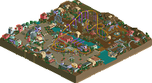
It's a shame that you couldn't make the deadline as this is really awesome. Love the atmosphere and colours. The hedge fences are a great touch I think they look like vineyards and add a ton to the atmosphere. Favorite part is the Woodie station and layout, wow. Definitely the centerpiece here. Seems the theme was a afterthought though as the pedestrian bridge is as close as I see to Connectivity unless I'm missing something.
Overall 8/10
Theme 2/10
Holy crap this is great. I agree with Mattk.. this would've been a contender for sure! The wooden coaster was definitely a highlight. Great flow, great interaction. The landscape surrounding was great as well.
FIgured I'd highlight this area.. cool waterfall and unique lift hill:
Loved this. Would be my #1 if not disqualified. Loved the colours, landscaping, architecture, foliage. Only bit I wasn't a massive fan of was the Heartline coaster.
No NCSO contest without the good old hedges. Not a fan of the heartline coaster and the surrounding area, didn't really fit for me, i really enjoyed the woodie tho. Great execution and interaction.
The use you made with the Hedge object was excellent, good imagination.
I loved your work.
The park entry has a pretty neat LL feel to it, which I found interesting in contrast with other parts of the park. I liked this overall but I want to highlight one or two things that I noticed.
This is an example of some of the really nice atmosphere and macro. Love the raised overlook! The elevation changes were also a nice feature. I'm a sucker for good landscapes.
I found this whole station rather unappealing; the architecture doesn't feel the same as the rest of the area to me, and I don't think those lower walls fit at all. Not sure how necessary the track feature is but that's a bit hit or miss. This building kinda stuck out - which is interesting because I really love the rest of the structures.
Keyword discussion; The more I looked at it, the more I felt some sort of essence of connectivity, but I don't think it was particularly fleshed out in this case.
I did like this overall, and I'm leaning toward the 65-70% range, not 100% decided yet.
Very pretty and atmospheric!
Yeah this was rad. One of the better maps for sure - shame you couldn't get it in in time. I really love the orange color on the woodie. Definitely getting LL vibes.
Really enjoyed this one, had a cool Red River Delta vibe from a few H2H's ago.
https://youtu.be/UvuseG4ZGdk
A review at 12:18. Great work-- really enjoyed this one.
Just barely enough for Silver for me, especially since this was unfinished and very rough around some of the edges. Some very good content though, and a praiseworthy unique look to it. This was a great moment especially:
Didn't expect that when I rotated the view.
I wanted to do something simple and LL-esque just for fun for this contest. I took inspiration from Shnupz’s work and Garden of Light and just kinda freeform built without much planning. Was quite a fun time and I’m glad people enjoyed it!