Park / [NEFC] What I Know
-
 14-April 20
- Views 1,411
- Downloads 447
- Fans 0
- Comments 9
-
 58.50%(required: 50%)
 Bronze

RWE 70% CoasterCreator9 65% Cocoa 65% bigshootergill 60% Camcorder22 60% Jaguar 60% Scoop 60% CedarPoint6 55% Liampie 55% posix 55% csw 50% saxman1089 50% 58.50% -
 No fans of this park
-
 Full-Size Map
-
 Download Park
447
-
 Objects
265
-
 Tags
Tags
![Park_4819 [NEFC] What I Know](https://www.nedesigns.com/uploads/parks/4819/aerialm4752.png)
![park_4799 [NEFC] New Element Kingdom](https://www.nedesigns.com/uploads/parks/4799/aerialt5004.png)
![park_4822 [NEFC] Great Mesa Gateway](https://www.nedesigns.com/uploads/parks/4822/aerialt4720.png)
![park_4818 [NEFC] Payload](https://www.nedesigns.com/uploads/parks/4818/aerialt4753.png)

![park_4097 [H2H8 R2] Mzima Springs](https://www.nedesigns.com/uploads/parks/4097/aerialt3837.png)

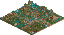
The mountain side of the map had some really cool architecture. Really nice how you did the sloped roof.
The coasters on the coastal side of the map was better in terms of layouts though.. the family flyer being intertwined with Neptune's Wrath was a ton of clutter but I liked it!
This was lovely. A lot of content, but a lot of room to allow it all to breathe. All the layouts were decent, the scenery was well done. I liked it a lot. Great stuff.
I like how you made this suitably personal. Coaster layouts were fun, architecture on the Mountaineer side was of a high standard, and there were a few little details as I went round.
+ As others have said, the mountain architecture is great.
+ There are some nice, compact layouts... the wooden looks very nice despite touching the border of the map and I like those flags.
+ I like the foliage placement and landscaping, especially around the waterpark.
+ Mad miner is a really cool looking ride.
- With that said, the waterpark feels shoehorned in imo, would've probably been a bit better with more conventional themepark stuff.
I can appreciate that this is a personal-themed park and the readme provides a lot of clarification and sentimental value to this. This was a very well-executed and enjoyable release.
Some rather nice layouts, but I don't know that focusing most of the content around the edges with a completely empty beach in the middle works that well compositionally. The architecture is a mixed bag and I'm worried you went overboard with the amount of different types and textures. I think your foliage and landscaping in the mountains is quite good, though. I don't know about the choice of using mints as both rocks and smoke at the same time! 65%
It's hard for this to identify as connectivity to me, as I don't share your personal experiences that shape this park. I think you made a better effort than most, though.
I didn't read the readme so I didn't understand it but there was still much to appreciate: great architecture, rides, waterfall and a cool bridge.
The readme explains a lot, especially why each half is so contrasted. I appreciate the kind words everyone! Don't have a lot of free time nowadays but I quite enjoyed the small form factor competition, and would love to see it return in the future.
https://youtu.be/8AZQIWboNUw
Here's a video review at 53:50. Really pleasant park even with the emptyness in the middle and the waterpark. Good work!