Park / [NEFC] NE Central Servers
-
 14-April 20
- Views 1,853
- Downloads 522
- Fans 0
- Comments 8
-
 54.00%(required: 50%)
 Bronze

Cocoa 65% Jaguar 60% RWE 60% saxman1089 60% Camcorder22 55% CedarPoint6 55% robbie92 55% bigshootergill 50% posix 50% Scoop 50% csw 45% Liampie 45% 54.00% -
 No fans of this park
-
 Full-Size Map
-
 Download Park
522
-
 Objects
193
-
 Tags
Tags
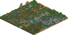
![Park_4812 [NEFC] NE Central Servers](https://www.nedesigns.com/uploads/parks/4812/aerialm5003.png)


![park_4806 [NEFC] We Overcome](https://www.nedesigns.com/uploads/parks/4806/aerialt4750.png)

![park_4808 [NEFC] Down the River Ganges](https://www.nedesigns.com/uploads/parks/4808/aerialt5009.png)

Fucking nailed the theme of connectivity.. way to go!
Thought this layout was compact but well done. Everything being separated by this internet/computer vibe makes me think this is in the same universe as Wreck it Ralph.
Great idea, but hard to pull off in NCSO. The computer servers dotted around weren't amazing, but got the idea across. I'm assuming each area is based off someone's work, but it's far too much effort for me to find out what each area is. But yeah, neat idea, execution would have been better if you had more parts to play with.
I was expecting someone to do something like this. I'm very glad you did it. Enjoyed this quite a lot, just wished you would have expanded on the theme a bit. The 'server parts' of this were awesome, but the actual park felt a bit out of place and random. Would have been awesome to see for example to see more notable members, parks or designs from the history of the site included into this. The individual themes also suffered a bit from the map size.
Probably the most clearly executed version of the keyword, along with Liam's. The use of the suspended monorail between areas and around the edges of the park was cool. Like RWE said wish the areas related to the theme a bit more. Maybe they were just supposed to be archetypical NE themes? Nice effort nonetheless but would've wanted to see some more clear NE-related details in the actual areas.
Very difficult theme to tie the situation of the current planet.
I understood the idea and I liked what you did.
If you want to try building something like Salga or BGA in a fraction of a 60x60, be my guest.
You pretty much nailed it. Had I had more time (and objects) I think it would have come across better. Given more time, I would have tried to apply more detail to the realism area, fleshed out the Design section, and tried to apply more uniqueness to the semi-realism and fantasy sections. I wanted to "chibi-fy" the different styles, but I think I underestimated how much space I'd need to actually do that. I had to pick committing to the computer connectivity theme, larger park snippets, or both. I went with both leaning theme commitment and that really restricted how much space I had. Lessons learned for the future! I was initially just planning on two sections but I'm glad I went for more. Pac had a similar (not identical) concept, and I think he did what I wanted to do a little better.
I think like trav said, I had the ideas to do this as a theme more than how I thought over how to translate it into NCSO. If it were full hacks CSO to the theme of connectivity with the same space, I think I would have been able to make things a little more convincing. It was fun though, and I want to give NCSO another shot. I always found my NCSO style too plain, but I think I can develop some new skills using tile inspector more often these days.
Cool idea and the execution is very readable. If the park areas themselves were supposed to represent NE related things, I didn't pick up on that so much, but I just read them as common themes/styles so that worked. The building style was maybe a bit too simplistic in the park areas.
https://youtu.be/WvsvMJEVRjk
Great park and good comments above to help clear up some concepts.
Review at 45:32