Park / [NEFC] We Overcome
-
 14-April 20
- Views 1,624
- Downloads 429
- Fans 0
- Comments 14
-
 65.00%(required: 60%)
 Silver

Camcorder22 70% Cocoa 70% Jaguar 70% RWE 70% bigshootergill 65% CedarPoint6 65% CoasterCreator9 65% Scoop 65% csw 60% Liampie 60% posix 60% saxman1089 60% 65.00% -
 Description
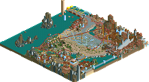
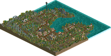
This NEFC entry is made-up of five areas connected by the effect of a pandemic or disease. In all cases, humans have fought back and shown an ability to overcome.
-
 No fans of this park
-
 Full-Size Map
-
 Download Park
429
-
 Objects
363
-
 Tags
Tags
![Park_4806 [NEFC] We Overcome](https://www.nedesigns.com/uploads/parks/4806/aerialm4750.png)
![park_4819 [NEFC] What I Know](https://www.nedesigns.com/uploads/parks/4819/aerialt4752.png)
I really like the concept. Considering your frozen staff history this was surprisingly tasteful, at least relatively speaking.
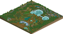
Fever Dream looks amazing and I appreciate the wacky little ideas here. The snail race is a nice little touch for example.
Good Kumba!
Jam packed full of content, with such really great innovative uses of objects throughout. The cutback on Ebola in front of the waterfall is clutch!
The theme is on point as well, next time just remember to use spellcheck
Wow. Really topical and creative! Loved it.
This area around Scourge I liked quite a bit. Wouldn't know this area was no hacks. Just really clean.. and thats true for mostly everything in this entry. Glad to see you building again Kumba!
"In all cases, humans have fought back and shown an ability to overcome."
"Fever Dream looks amazing and I appreciate the wacky little ideas here. The snail race is a nice little touch for example."
Yes
Such a Kumba entry and vibe even in NCSO. Really jam packed full of content, although that leads to not allowing anything to breathe - maybe that is the virus though.
Probably the most 'full' park out of all of these, and I think this 100% gets the 'connectivity' vote, really well done with that. Really enjoyed all the little details, coaster layouts were pretty strong and the overall vibe was great. Definitely a top contender for me.
Great stuff, Kumba. So happy to see you entering the contest.
There's something nostalgic in seeing a Kumba park in this style as DRC was the first spotlight that came out when I joined the site. Great to see you still keeping your style alive, and it translated to the format pretty well. Theme was pretty on the nose but one of the better executions of connectivity, and was a good justification for building a -land style park from a bunch of different time periods. As is usual with your style, its absolutely packed full of details and ideas but they individually struggle a bit to compete for attention. However, despite the many ideas and textures the composition still holds together fairly well.
The New York section had a tiny bit of Art of War syndrome in that it was certainly...a move to build a mass death event happening in real time in RCT, but it was treated with the appropriate seriousness. Except maybe Subway eat frash lmao. I'm not usually a fan of urban NCSO themes as the textures are ugly to me, but I really liked the hospital building and Javits center, which had one of the better uses of that Six Flags object.
Favorite section by far was the fever dream section, it felt the most well-composed and inspired. Glad you managed to include a Kumba maze in it as well. The other two sections probably fell in between in terms of quality but as a whole this kept my attention for a long time. Possibly in the top tier of entries for me, could potentially win one of my votes.
So I was struggling a little bit to be disciplined and finish my entry. Just feeling in such a different place compared to myself years ago playing to win accolades. Then I saw your message on discord saying how you can't wait to go back to retirement, and thought to myself how I can relate. Next thing I know as I open your entry is that boom it has like 3-4 times as much content as mine. I was pretty flabbergasted by how much stuff you condensed onto the map, and I loved to perceive some oldschool Kumba vibes. I never appreciated this enough back in the day, but you have such a great ability to do good micro. Usually this density looks overdone and chaotic. With your parks there seem to be endless things to exlore, and more and more stuff is just dished out like it's nothing. It's very hard to contain so much content in one mini map. At the same time, the intense amount of content also meant that there wasn't really room for composition, but I also had the feeling you were okay with that. So congratulations for finishing something to this calibre, and real nice to see RCT from you again.
We Oevrcome is so very Kumba, can definetly tell who made it. Super packed with content, and some really cool ideas in the fever dream section.
Here's where my inner healthcare professional comes out - I don't get the themes. I think you were maybe trying to capture the eras around when these were prevalent? Maybe? But to me the only one that makes the most sense is Ebola. New York is a fine take on COVID given the current situation, but the others feel like...Fantasy/fever dream for Spanish Flu and... Pirate for Cholera? Black Plague being a castle is forgivable. I think there are just a few thematic elements that don't make sense to me given my own personal background. Love the wooden coaster though. 65%
I'm not really sure I get connectivity from this, but there are some serious hints of it scattered around. So maybe I do.
Interesting - I think this is the best connectivity theme of them all. Nothing proves that the world is tightly connected like a pandemic that spreads globally within a few weeks.
+ That surreal Alice in wonderland-esque section with fever dream is amazing. One of my favorite things in this contest. The card fences, the giant grass, and that cuckoo clock are all great. Also that Illusioner shed made of junk.
+ Well executed themes... it's easy to tell which section is the black plague one, or the spanish flu one, although there's this weird sense of dissonance between the quirky NCSO aesthetic and the theme of pandemics
+ I thought the layouts were strong.
- Not a fan of some structures and aesthetic choices... that hospital building and parts of New York for instance
~ While it's cluttered and hard to read in certain spots, there's also a lot of interesting stuff to look at as a result. It feels like a highly hacked park but it isn't.
Definitely really happy to see another Kumba release, and it's very clearly in your style. Overall a very strong and enjoyable entry and one of my favorite for the contest.
https://youtu.be/8AZQIWboNUw
Here's a review of the park at 44:49. Fun park-- so incredibly Kumba. Has all the tropes I'd expect.
Thanks everyone. Like many people, the pandemic has left me stuck at home all day. I knew id try something for this contest and was just having fun with some basic themes at first. More than halfway through I had the theme idea, which never came together and yeah it was very crowded. Was fun building again, so I started on DR3...