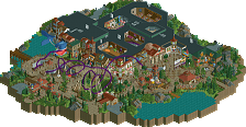
Park / [NEFC] Carnevale delle Riomaggiore
-
 14-April 20
- Views 1,231
- Downloads 385
- Fans 0
- Comments 9
-
![Park_4797_[NEFC] Carnevale delle Riomaggiore](https://www.nedesigns.com/uploads/parks/4797/logot.png)
-
 54.00%(required: 50%)
 Bronze

saxman1089 65% Camcorder22 60% CoasterCreator9 60% Cocoa 60% Jaguar 60% bigshootergill 55% RWE 55% csw 50% Liampie 50% CedarPoint6 45% posix 45% Scoop 40% 54.00% -
 Description
Welcome to Carnevale delle Riomaggiore, my 60x60 entry for NE's Flash Challenge 1. Themed to be a blend of carnival and cliffside, the park features 3 coasters, a water ride, numerous flat rides, shops, food stalls and beer garden!
Thanks and enjoy! -
 No fans of this park
-
 Full-Size Map
-
 Download Park
385
-
 Objects
283
-
 Tags
Tags
![Park_4797 [NEFC] Carnevale delle Riomaggiore](https://www.nedesigns.com/uploads/parks/4797/aerialm5002.png)
![park_4820 [NEFC] Celladoria](https://www.nedesigns.com/uploads/parks/4820/aerialt5000.png)
![park_4799 [NEFC] New Element Kingdom](https://www.nedesigns.com/uploads/parks/4799/aerialt5004.png)
![park_4818 [NEFC] Payload](https://www.nedesigns.com/uploads/parks/4818/aerialt4753.png)
![park_4806 [NEFC] We Overcome](https://www.nedesigns.com/uploads/parks/4806/aerialt4750.png)
![park_4800 [NEFC] Ghost TowNE](https://www.nedesigns.com/uploads/parks/4800/aerialt5001.png)

This may be one of the best looking entries in my opinion. This:
A bit of x-sector and a bit of John, and a bit of Kai. Beautiful!
I agree with Liampie. Very clean looking along the cliffs there. The theme was also very apparent.. Carnivale/Italy/Riomaggiore.. but while it was a real place, it was sort of a fantastical spin on it. Case in point.. Carnivale was very funky. Overall a nice step up over your recent stuff.
I loved
Nice work
Attached Thumbnails
So the entrance and its area are sooooo Bueno
What happened then? Almost like someone else built it. Still a sweet park Kai, and a certain departure into new stylistic territories for you which is exciting to see.
Very colourful. As pointed out above, the area on the cliff was pretty nice. The opposite side was a little too crazy for my tastes, it became a little unreadable. Solid work overall though.
This is so much fun. Nice execution of the old school crazy style we used to see from you next to some new twists coming into your style. This looks like you really enjoyed building it and that made me really enjoy watching it. Good job!
I actually kinda like the contrast between the two sides. Maybe unintentionally reinforced an otherwise weaker connectivity theme. I don't normally like excessive abstraction, but this appealed to me in a certain way. Lots of neat objects choices, and I especially liked the roman blocks under the paths. 60%
https://youtu.be/UvuseG4ZGdk
Here's a review at 5:00. This one was fun to look through!
+ The entrance area, despite its craziness (or because of it), is honestly my favorite part of this park, and has some of my favorite aesthetics of this contest. I love the pastel colors, the random scenery objects ranging from gears to giant candy, and that grid land texture. It feels vaguely like abstract art, but also like that 90s 'vaporwave' aesthetic you'd see in an old isometric game.
+ The village on the cliffside is also quite strong... the dive coaster especially has some excellent interactions.
- The terrain of the alpine coaster, however, is rather lackluster with patchy landscaping and randomly placed trees.
All-in-all, this was a nice and very old-school feeling park that's kind of nostalgic. While parts of it were unrefined, it was still quite beautiful.