Park / Flags Fiesta
-
 12-April 20
- Views 4,504
- Downloads 664
- Fans 3
- Comments 16
-
 67.00%(required: 65%)
 Design

Scoop 80% bigshootergill 70% Camcorder22 70% CoasterCreator9 70% G Force 70% Jaguar 70% WhosLeon 70% RWE 65% saxman1089 65% Cocoa 60% csw 60% posix 55% 67.00% -
 Description
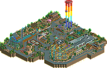
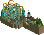
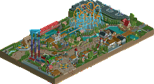
This was my latest entry for the Deurklink Monthly Contest. It is a remake of Poltergeist from Six Flags Fiesta Texas and the rest of the park has a few other flavors from Fiesta Texas.
-
3 fans
 Fans of this park
-
 Full-Size Map
-
 Download Park
664
-
 Objects
249
-
 Tags
Tags
![park_3130 [MM2014 R1] The Janitor's Jinx](https://www.nedesigns.com/uploads/parks/3130/aerialt2776.png)
So impressive, loved every bit of this.
Wow. So awesome. Really love your style.. everything about this just looked right.
This is nice. Lots of tile inspector tricks to appreciate. I think this stands out a little bit from what's becoming a common theme of small monthly NCSO parks, but only a little. As with other parks of this type, I really miss more park context to make each stand out more from the others. It's blending together a little these days. This is very nice and lovely, but coming back to look at it a second time makes me wish there was just...more.
That said, there are a few things that I really thought worthy of note:
These supports look great. Splash boats too, but these in particular are probably some of the best NCSO supports I've seen. Clean yet functional.
I really like what you did with the queue here. The queue work is a highlight throughout.
Subtle swampy theming and the station, nice work here.
If you were to manage a full scale park at this level of work, I'm sure it would score well.
Wow. This park fantastic. So much creative object use, and the atmosphere is top notch. I wish there was more to explore! I think a full sized park on this level would be a spotlight contender.
Excellent work
Thank you all for the comments. I was very proud of this park. Mad props to Terry Inferno and Mekkit for inspiring a lot of these techniques.
I see you've submitted this for Design! I'm actually quite pleased to see this, as I think it is much more competitive as a Design submission for the respective accolade.
The first thing I want to mention is that I wish the map centered on the coaster itself a little more. It's a little pushed off to one side. I can understand why you did it the way you did; but it's just something in the back of my mind. It almost comes off as a small park than a Design, but I don't have any issues with larger Design submissions within reason. I think this is within reason, if not a borderline case.
I'm not super familiar with Fiesta Texas (I want to get there at some point); but I get the sense that this is largely more of an "inspired by" than a strict recreation. A quick peek on RCDB and Google Maps suggests that's definitely the case. You really did an amazing job at recreating the queue and exit pathway, and the station captures the feel of the real life ride for sure. I do also appreciate your deviations from real life. The seating area along the launch is more appealing than some backlot stuff that would otherwise be there.
From a layout perspective, it seems fairly accurate, but I think you missed out on a few quirks that a cheeky merge or two could provide. Additionally, the pacing is a little slow in places - and if I'm seeing this right, you hid a trim brake that probably didn't really need to be there.
As stated above, I like a lot of the NCSO tricks you've used, but the ones that work the best are the supports for Perilous Plunge, Poltergeist's supports, and the umbrellas. A lot of the NCSO roofing is the typical hit or miss (though I admit I do like the restroom under Perilous Plunge), and I kinda wish you kept with a common layering of two tracks instead of varying between mine train and car ride over wooden coaster. It would have felt a lot more cohesive that way. Really though, the architectural forms are appealing, and your buildings seem to have some identity to them - so all in all it cancels out a bit there!
Overall. Nice work. With respect to Design scoring, I'm quite confident with a 70% score. I think this is deserving of design but a few points kept me from going any higher; none major individually, but they added up a little bit.
Thanks for your in depth review. I didn't submit this for anything in particular, the mods must've chosen for me. Because this was a contest entry for Deurklink's monthly contest, you see the restrictions of map size and so on.
I tried to use variety in the buildings and stations designs because on such a small entry if you go with one roof design or set color palette it looks very monotone, whereas in a large park, the "area" would be one theme and look like a smaller part of a larger "whole" if I was to go with one roof design instead of the many I used.
pretty awesome work- great (if common nowadays) ncso realism stuff. I particularly liked the foliage, especially how you used that japanese tree as scruffy underbrush- a clever ww/tt trick (took me ages to figure out where that tree was from!)
obviously the support structure is incredible too. felt like a solid silver but a bit small, so i gave it a 60- not indicative of the quality so much, as the small amount of substance. what there was, was very good!
Congrats on the design!
I wonder where these ideas came from...
You may want to be careful in the future with making rides look too similar to those from existing parks. Perilous Plunge, its supports, and the restroom underneath it are basically Rio Grande Falls with a few very minor adjustments. I appreciate it when other builders take influence from my work, but what really bothers me is that nobody else on NE actually recognized the ride as a Raspberry Acres clone. At least it hasn't faded out of memory in Deurklink's server! xD
Anyway, I did thoroughly enjoy this submission, particularly the umbrellas and Poltergeist's clever supports. The diagonal fence illusion is another cool trick that I imagine we'll be seeing more of over the next year. This is definitely the kind of NCSO I like (none of that tan walls/tan roofs everywhere stuff that the rest of NE is raving about), so I hope to see more like it from you in the future! You're definitely among my favorite up-and-coming builders.
Welcome to New Element Terry haha, welcome.
@Terry
I look at your parks for inspiration and I won't lie, I was very much creating a clone of your design. I love your work and it was good practice to see how yours was built and executed.
I am always looking at alternative ways to build and taking hints and clues from the legends are always appreciated.
Being able to take and re-skin buildings like the restroom are little challenges for me to utilize different colors and textures. I hope you take it as compliment that I enjoy your style.
Personally, I don't mind at all that you cloned the ride...really, it's one of the greatest tributes a builder can ask for! I only brought it up because there are some people who have a tendency to call out builders who build too closely to what others have already built, and I don't want you to be subject to that when you mean it as a form of tribute.
As I said, the problem I have is that nobody else recognized that it was a clone, so I wasn't calling you out; I was calling out the people who have seen and reviewed Raspberry Acres for not remembering where the ride came from. Come on, you guys. It's not that forgettable. :-D
@Terry: I've looked at Raspberry Acres a few times in the past couple months for inspiration.. Just that splash boat rides aren't memorable for me!
@Swag: congrats on the design!
nice job on this one...