Park / Everland Discovery Kingdom: Nightmare Nocturnes
-
 12-April 20
-
 Everland Discovery Kingdom
- Views 7,525
- Downloads 976
- Fans 6
- Comments 21
-
-
 79.50%(required: 70%)
 Gold
Gold

bigshootergill 85% posix 85% Camcorder22 80% CoasterCreator9 80% Cocoa 80% Liampie 80% robbie92 80% RWE 80% saxman1089 80% Scoop 75% WhosLeon 75% pierrot 70% 79.50% -
 Description
The well-known theme park Everland Discovery Kingdom's season is coming to a close. But first, Halloween has crept within the borders of the park...
-
6 fans
 Fans of this park
-
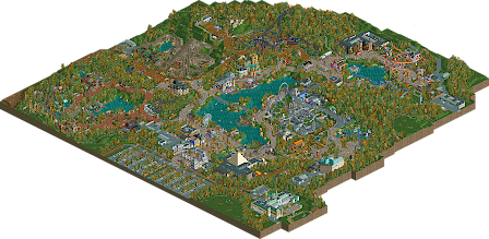
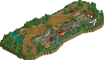
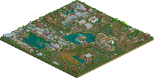
 Full-Size Map
-
 Download Park
976
-
 Objects
615
-
 Tags
Tags
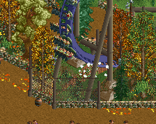
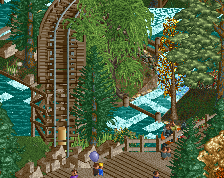
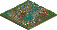
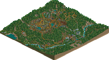
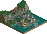
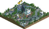
Hooray! Excited to see this released. Great park.. really enjoyed seeing it's progress. Look forward to seeing what people think. The Halloween theme of the entire park was well done. Very temporary feeling and reminded me heavily of Halloweekends at Cedar Point.
I figured I'd post a few screens of parts that I really enjoyed:
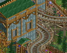
This area was really nice. The hangar and the flying themed area was really cool. The centerpiece BOOM Machine was great, I just really liked this row of buildings.
Coaster interaction was great. Forgot that it dueled a little bit during the layout.. really cool. I just wish it was timed a tiny bit better to have the trains be side by side.. so people in opposite trains would be facing each other. Still really cool.
Lastly, this was my favorite ride. Dynamite Runner looked like such a cool layout to ride. Really atmospheric too with the rapids ride interaction.
Congratulations on the release; I've been able to see bits and pieces as you've worked through this. It's exciting to see it done. It's also really cool to see a full scale semi-realism release of a park during the Halloween season. I think it's fun unexplored territory that we got a tiny glimpse of in Emerald Pointe.
I'm still digesting the park and I think I will be for a bit yet. There are some fun highlights though.
Favorites first; this is a lovely little feature. I'm glad you integrated the ruins the way you did. The whole park has an interesting Alton Towers/Walibi vibe.
Spectre as a whole is really fantastic. Love the way it's sunken in and interacts with everything. Killer layout too (G).
The whole harvest festival area is quite nice, and I really appreciate the macro element of Incantation/Spellbound being in a valley of sorts. One critique is that I got more of an eastern/northern European manor theme out of it than harvest fest. Maybe that's intentional, I don't know.
This area is particularly atmospheric. Lovely music choice too.
EXCEPTIONAL Vekoma mine train, especially the track layering and supports.
Other highlights:
- Haunted mansion.
- The lake bridge
- Main street architecture; love those curved fronts.
There are a few negatives to me, as well.
- Fireworks Express. Great theme, and the layout is largely a strong one, but I felt the second half was lacking in pacing and form. I appreciate the switchback element and it's well done but it felt like it was forced into the layout a little. I know it really wasn't, and I know this ride took a lot of reworking - but I don't think it quite made it in the end.
- The fire/explosion effects might be a little overboard here and there; minor.
- While the individual architecture is very nice, in an overall sense it feels as though it's patch of buildings along the path with another patch somewhere else. By the time you get to the next patch, you're often in another themed area. This seems a little off to me from an overall cohesive element - great individual buildings that perhaps don't always come together quite right.
Overall, this is a strong modern European-style realistic park, and it's very nice. I don't really know where I stand yet, and I'm taking my time with this one, as I think everyone should!
It's a great park, Jappy.
Very believable BeNeLux style park imo, with some great and unorthodox design choices, that scream Jappy to all of us. That's definitely a positive, as your work is always recognizable.
Some brilliant and innovative ideas, and the entire Halloween thing was also very interesting. One thing that I didn't quite understand though is that the park in general already seems to feature lots of mysterious/haunted-esque rides/themeing elements. I found it hard to distinguish between what was just seasonal decoration, and what is actually always supposed to be there. Some of the main rides, Halloween or not, already felt a bit spooky in the first place, and would've still felt that way without the seasonal event. I think in order to make the event stand out more, you should've perhaps gone even crazier with event specific decoration.
I love the overall layout of the park and some of the calmer areas. The ride lineup is also very cool, but at the same time there were some bits and pieces where I didn't quite understand your choices from a realism standpoint. The park is clearly going the realism route, yet some of the details around the coaster layouts/coaster trains/transfer tracks/etc. felt like they didn't receive as much careful thought as most of the other content on the map.
My favorite layout was the inverted coaster, which was beautifully embedded into its surroundings. The mine train was obviously also brilliant.
I think as always your level of ingenuity is top drawer. Now what I'd like to see from you for your next project is that you improve those aspects, that don't seem very important to you. It feels like everything is awesome, but then some tiny aspects you just weren't really interested in, which are now lacking a bit in thought when compared to the other stuff on the map. That's where I see room for improvement.
Positives:
+ Cozy entrance
+ The Egyptian museum is a great idea and very well pulled of.
+ The stage in front of the museum is great, as are all the other little show areas
+ All the halloween mazes are great
+ Circus building is strong
+ Laundry themes are always great
+ Very nice log flume
+ Generally solid layouts
+ Firweork Express theming is excellent
+ Wonka's is great
+ Ruins
+ Nice waterfront with well integrated attractions
+ Great interactions in the "western area"
+ Autumn vibes work really well
+ Restrooms in front of the entrance have path
Negatives:
- Park layout feels a bit awkward in places
Overall:
Great park. You've managed to elevate your game without losing the "Jappy-Factor". I don't think it's quite on the spotlight level and I think improving your park planning skills would get you over that threshhold. For now I'd give this park a 85%
Congratulations on a stellar release Jappy. The concept of a park in halloween season is fantastic, it's very original and really adds something extra that allowed a lot of great little concepts and ideas to elevate the park. I think you did a good job with the foliage as well to really sell the concept, along with all the temporary attractions etc. The entrance is nice, very your style and I love the blue and purple accents. I wish the road leading into the parking area wasn't a dirt track though. The entrance plaza has some lovely moments and I enjoyed Mr Bones welcoming the guests haha. The ferris wheel and swans were nicely placed on the lake there too.
 )
)
I like to move clockwise so the first area to visit is the wild west. I think this held some of my favourite parts on the map, and I particularly liked the western style architecture at the front. I love the choice of path here and the open space works really well to allow the atmosphere to shine. I also think the pumpkin use here was the best in the park, they popped nicely against the path colour. Dynamite Runner is a great coaster and the track layering is a subtle detail but a solid one. There were some bits where support pieces were sticking out through the track that would have been easily fixable however. I think this part of the park also sold the halloween concept the best with the use of entertainers like the grave digger and butcher scenes which felt quite organically integrated.
The phantom manor is a really great attraction, excellent theming and the little cutaway was perfect. The placement is a bit peculiar though because it feels like it should belong in a specific themed area and would probably be better facing the lake rather than not. Either way it's not a big issue. Next up, the Harvest Fest area which feels a bit small but you've done a lot with the space and I love the inclusion of the red apples. The duelling/racing coasters have a great pair of layouts, though the Incantation side lags a bit through the second half. The corn maze is another nice detail. I can't quite figure out if it's meant to be a temporary halloween installation or a permanent thing, since it would fit in well with the general theme of the area. I also love the idea of the monster trail.
Next up is the area containing Spectre. I'm not sure if this is meant to connect to the harvest fest area since they share the path type but it feels distinct and has a sort of dark forest vibe, plus I love the little scenes with the witches. Anyway, the coaster is excellent; a perfect layout with great theming to match. My only complaint would be the way you've done the landscaping here which feels a bit lazy. The queue seems quite difficult to find but I love the way it tunnels around and interacts with the coaster. The derelict abbey might be my favourite part of the area, it's a really great addition and adds a lot of character and history.
Moving on, I'll make a quick note that the hotel ride is really nice, bit of a fun riff on tower of terror. The island in the middle of the lake is also a great peaceful spot. The next place to hit is this sort of zone between areas. Flashback is strangely placed but feels somewhat realistic as perhaps a relic of an older part of the park. The main entrance building is great and I love the lift over the path, feels like it would be an iconic bit of imagery for the park. (Side note, I wouldn't have the fireworks display on the lake so readily accessible from the main path without any gate or anything
The Chocolate Factory is really gorgeous, takes clear inspiration from Universal's but still has a unique charm to it. Fireworks Express is a great family coaster with a couple of cool self-duelling moments and the surrounding area is filled with lovely firework details, the sort of barnyard aesthetic is lovely. I wasn't quite feeling the scrapyard part next to it however, but I loved the blue and white building there. I think ultimately this back half of the park felt a bit directionless and lacks an identity of sorts. I'm also left wondering if the rat race maze is permanent of temporary, because without it the scrapyard doesn't really have a signature ride to anchor it unless you incorporate the firework part into the theme.
Moving around the lake and I reach a wonderful little aviation themed zone. The BOOM coaster has a great layout and I think you've framed it quite well next to the lakeside path. You've got a lot of great little details in here and though the halloween theming is a bit minimal it still fits with the theme. The boathouse restaurant nearby is a fab bit of architecture and carried the entrance style through with the blue touches which is a nice link.
Coming out of this area and there's a sort of unthemed plaza with some gentler rides and I think here it works quite well as less of a connecting area and more of a place to have a stop. The 'Laundry Day' ride is ingenious, absolutely loved all the details like the wringer and the washboards. Brilliant little idea that I could totally see in this sort of European style of park that you're going for. I also loved the Everland Theatre building, great architecture there.
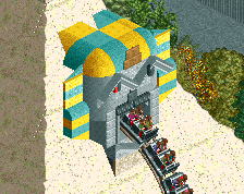
Lastly looping back around to the entrance and the final main attraction with the Curse of Nefer-rha. The coaster popping out of the pyramid is a great moment, but that hill right afterwards would be awful to experience. I appreciated the indoor scenes you did as well.
Overall I did have a really enjoyable experience viewing this and it's got a lot of charm and character. The layer of halloween theming adds something extra and makes this a rather unique release. In future I think you could pay a bit more attention to filling in and adding that layer of finish if you're going for a more complete product and aiming for spotlight, because as it stands the park feels like it's lacking some polish - things like the supports poking through the mine train, seeing unfinished insides on station buildings or bits of foliage looking incomplete etc. I think you're almost breaking through into that spotlight level of work but not quite reaching it. Nevertheless this is something to be real proud of. All the best with your next project, I'm sure you've learned a lot from this one that you can apply.
Some of my favourite scenes:
I just found these two points interesting. The first seems to describe Alton Towers very well. The second I don't think there's anything particularly wrong with this, it all feels like a very "Jappy-style" of park design.
After sleeping on it, I think I'm in the low 80% range.
I've looked at this park a few times now and every time I go back into it, I like it more. I missed so many small details my first time of looking, even now I'm still finding new little things.
I think the park as a whole can be summed up by saying that the architecture and general park layout, etc is 75% - 80% work, but the small things and details added around the park are 90%+.
Everything feels very open. I think I can understand what you were going for with that, but I'd still like a little more density overall - even Alton Towers is very dense when you get into the actual areas. The coasters are great, I especially liked the duelers, and the supporting rides are also very nice. As I mentioned before, the architecture throughout the park is nice, but underdetailed for the size/scale of it. The Western architecture was probably the best in the park, it felt more detailed and the scale because of that worked well.
The main thing this park really does do better than any other park recently released is the small things. This is what I can tell you enjoy about parkmaking, because you pack them in throughout the whole park. I'm still finding new ones, but a selection of my favourites:
The fall theming around the park was great, with the fallen leaves being a particular highlight for me.
I loved all the vehicles dotted around, and again, the forklift trucks stood out to me.
I completely missed the indoor section of the Haunted Mansion ride the first time I looked over the park, but saw it when wondering why the ride was tracked and not just a haunted house or motion simulator. I always love stuff like this, but you've done it particularly well with the armchair and piano.
These ruins were really good, a definite highlight for this area.
Loved this BBQ, although at first I did think it was a perilous pit of fire that people had to walk over or something.
My favourite of all the mazes, but I really enjoyed going through them all. I remember working at a theme park at Halloween and the way you've tucked them all out of the way apart from this one was really reminiscent of that time for me. The little details on all of them are great, and I like that they're actually usable.
Best ride in the park. The amount of little details here is fantastic, and it truly feels like something a wacky European park would make.
Overall, I'd probably vote this somewhere between 80% - 85%. I don't think it's quite spotlight level, because I think the architecture and general parkmaking needs a little bit of work, but the small details will keep me coming back to this park for longer than a lot of other spotlights.
My favorite part of the park is the invert, hands down. Fantasic. I think this is a solid 80% but I'm undecided on spotlight.
this actually really exceeded my expectations significantly- enough to change how I thought I was going to score beforehand. I guess you were only showing us your rusty stuff in the discord anyway!
You did a great job- full review another time. atmosphere was the real winner here though.
Jappy,
I think this park is pretty awesome. As others above have said, the little details sprinkled throughout the park make it really fun to explore and try to find all of them. I'm absolutely sure I missed some things even after my second viewing, which will make coming back in the future all that much more enjoyable.
Architecture is great in most places, and distinctively Jappy to me. I'm not sure whether I enjoyed the entrance or the station for the wooden duelers more in this regard, but they're probably my favorites on the map.
You excel at creating atmosphere in all of your work, and this work is no exception. I don't think anyone has mentioned the custom music at all, but I think you've used it really effectively (especially near the entrance) to set the scene. I love opening the park and getting punched in the face with Halloween/autumn right away.
One thing I'd love to see you focus on in your next endeavor is park layout and planning. While what's on the map is by no means bad, I think there were a lot of missed opportunities for making your ride placements more impactful. The path layout also didn't seem to do much to direct the peeps or viewer towards your best attractions. For example, the peeps come in the entrance, get to a junction and can choose to go left or right through the park. There's nothing drawing the peeps to the left, as the path leads into another intersection and there's no major ride in the sight line down the path. If you had moved the haunted mansion over a bit, with it on top of its hill right at the end of the path (right above where the giant nocturnes sign is now), the peeps would look and say "whoa, what's that building, let's go check it out!" As a viewer, I chose to go right because I can see the Egyptian-themed ride, but the peeps only get to see the side of the building through some trees from the entrance plaza. I would've considered rotating the ride and the building 90 degrees, so when you got to that intersection right after the entrance, the peeps would look directly down the path and be drawn to the ride. This is especially true if it was also hidden from the entrance and the first time they saw it was when they got to the intersection.
Still really struggling on a vote here, but I'm thinking an 80 or 85 for the great detail, atmosphere, and micro elements, but probably a no on the spotlight question due to some of the park layout choices.
All in all, a great park from you Jappy, and one that I greatly enjoyed.
I'd rather leave a short comment now than hoping to write a full review and never being able to.
Wonderfull park, that really shines in the atmosphere and the details. Spectre is fantastic, and that corner of the map is my favourite in general. What held this back is how, like barnNID among other people, you maybe struggle to differentiate each area. It all blends together in a soup of a detached, mansion-like buildings. Looking at the path layout and the landscape this park is super smooth and organic, looking at the architecture and theming it's very jagged. I like how spaced out the park it is but instead of having dense clusters and more quiet spaces inbetween it looks like you spread everything out evenly. The Spectre area is the best area because it's the exception to this rule.
To end on a positive note: I love the entrance, really fantastic looking. Even the parking looks great there.
I agree with the no spotlight decision but I think a parkmaker spot wouldn't be undeserved at this point. Too bad you didn't crack 80 by such a small margin, but you'll get it next time. You've never stopped outdoing yourself, so why would you stop now?
Okay, not that short of a comment.
80% - Yes
The decision to make a full scale park at a high calibre and add an extra layer of thought and creativity by integrating a seasonal themed event is something I think is creative, novel, and thoughtful enough to deserve a spotlight nod. The park is sprinkled with good ideas and most are fairly well executed, before and after the halloween layer is added.
That being said, I know you're looking to break 80%, I know you're looking to earn parkmaker and/or spotlight, and I think there's a few things you can improve to try and get there.
The foliage is too dense especially around the exterior of the park. I also don't understand the park boundaries, what's with all the weird fence horsehoes? Break up the dense trees with open meadows, streaks of grass, etc. When you're using foliage as a feature, like you're doing here by making it autumnal, you need to make sure it's interesting and enjoyable rather than distracting.
The test lab area was well done, and was a very nice area with a collection of well done buildings, rides, and ideas, but it didn't feel like it belonged with the park. Some effort in cohesively blending that theme with the rest of the park would have gone a long way, I feel.
The mechanical area's best feature was Firework Express, the only part of it that felt uniquely yours to me. Some of the other ideas in the area felt like they derived from other recent successes a bit too much, but you did a good job at tying them together into a believable, cohesive theme.
The first half of Spectre is way too short, but i really enjoyed the second half. The ruins and hidden train station were a nice quiet reprieve from the rest of an otherwise busy park, but I didn't understand what was supposed to draw guests that direction. The contrast in energy was nice, but the dead-ending of it didn't strike me as thoughtful.
The dueling woodies are one of the most impressive things in the park and I'm wishing they had a more central presence. They were one of the last things I looked at as I explored, and I don't feel like they're particularly visible from anywhere else in the park.
Really a well done park, an obvious improvement in both skill and effort over previous work I've seen from you, and something I'd have given a spotlight vote for. Keep up the progress and you'll definitely earn a place among the parkmakers.
Congratulations on the new release Jappy! I enjoyed it a lot.
Here's my review, I hope there is some useful feedback for your next project:
This has always been your strong suite, all the small sculptures and storytelling elements which you place are so rich and lively. And it really comes into its own with the halloween overlay. These are the highlights:
So I waited to post a review until after the scoring, as I felt it may get in the way of other's enjoyment of the park, and I'd hoped to see you get park maker here..
I think, overall, you took one step forward in technical skill, but two steps back in terms of aesthetics and charm. I looked back at JWAK, immediately after viewing this, and found that I enjoyed that park much more. It had beauty, simplicity, and (generally) strong composition. It was charming and heartfelt. Somehow I was missing that in this one. Now, this is by far your best technical execution in any of your parks - but is that your greatest strength in the game? I always loved your work for the way it is warm and wholehearted - it's easily digestible and I can immediately tell it was built with love for the game. Go with your strengths. Not that this was completely devoid of what I enjoy in your parks, but it felt like the focus was upping technicality here and not highlighting what you're best at.
Easily better in terms of architecture, ride design, detailing, and all the little minutiae of RCT, than your previous parks (still not your best IMO - between H2H and MM). I'm happy to see these get honed in. But I don't think these were put together into a cohesive whole. There's a lot of tendency towards standalone buildings along the path, that never really become integrated fully into the whole (examples being the Spookworx theatre, the strange medical tent, Wonka's factory, Horridson Hotel, and many others). There's some unorthodox arrangements that I didn't find ideal - such as the Ferris wheel orientation, forcing the path under Fireworks Express, the log flume not having any natural landscape interaction, Wonka's factory facade being visible from one angle, and the dueling woodies in an open grass pit. The path is always hugged to the ground, and even though you do have a lot of elevation changes, it feels flat due to this. I think there's only two small seating areas and a little corner where the path is actually on the waterfront.
The left half of the park was easily, easily superior. The red path of the frontier area was beautiful - absolutely gorgeous choice. Same with the dirt path in combination with the purple invert - so pretty and atmospheric. The invert was excellent, and the theming and composition was on a level I wished the whole park was on - set into its environment effortlessly. The duelers were great too, and the grey/green combination was spot on. Other than the back side being an open grass pit, these also felt appropriate in their environment - touches of queue and path interaction. Dynamite Runner and the rapids had excellent interaction with each other and the path - the landscaping here felt natural. Only thing I didn't care for was Dynamite Runner's lift and drop feeling so separate when everything else was integrated. The forts were straightforwardly executed and atmospheric - exactly what I wanted to see.
The right half of the park, fell victim to the composition issues I mentioned. Ride design was still solid (other than the ejector hill of Curse of Nefer-Ra). One big issue on that whole half was the cobblestone path for basically everything. It looks like old city cobblestone - not something appropriate for Willy Wonka, Egyptian antiquities, modern aircrafts, etc. The backstage areas - I think dark tarmac would've been the way to go here. The cutaway bits were a bit rough, the one large one looked like a mural, some were just deleted roof, and others were deleted roof with some trims. I would've much preferred glass or just doing away with them.
Overall, I obviously enjoyed the park, otherwise I wouldn't have thought about it so much. I wanted this to nab parkmaker for you, given the body of works you've produced, but as a standalone piece I can see why it didn't get there. Better execution is nice, but it's far from the end-all, be-all of RCT and I don't see that as your brand anyway. It'll be nice to see what you've developed on here in technical skills applied to a project that puts Jappy charm at the forefront. In my opinion, keep with your strengths and bring in the execution you're developing only when necessary, and we'll have a seriously excellent park.
Hello. Regards. I will start with information from me: I have been watching this work for three days. It's very pleasant.
A real festival with a thrill, a great package of attractions (and original ideas). Despite the theme, the climate is not overwhelming, it is rather fabulous. I think that in the real world it would be a great park for children. It's nice that so many characters (actors) are involved in creating the atmosphere of fear, magic and ghosts. They make good results. It is difficult to comment on the impressions of all "scenes" and décor. Just the atmosphere "finished with the last button".
The attraction "Curse of Nefer-Rha" sweeps. "Circus of Sombre" and "Everland theater ..." caught my attention. I think that for me salt in the park could be attraction a little too often in the parks.
It's "Runway Mine Train RCT"
That's it. A lot of smiles for you and everyone.
Here's a review of the park. Great work!
https://www.youtube....h?v=1uMQGFTRXts
OH MY GOD JAPPY !
This is awesome, but not the average awesome, I mean really AWESOME ! It felt like a real park to me, the kind of park I would love to visit in real life.
You have your own style and it makes everything look so vibrant. Maybe in some parts there's a bit of lacking and unrefinement in your archy but it doesn't really matter to be honest, the result is great. The ideas are here. It has a warm atmosphere. It rocks !
So much fun exploring this park, thank you !
Holy shit.
Easily your best work, one of my new favorites! You have a great eye for little details, every single corner is filled with something to look at, and there's so many tiny details like the pots as pumpkins and the fallen autumn leaves. Even though pretty much every idea has been done at this point, this park is full of originality! Some highlights are: Curse of Nefer-Rha, Fireworks Express, and of course the Halloween theme in general. I love the little haunted houses and scare zones everywhere, I really like how the sci-fi area is like a contaminated area.
Here's a tip for everyone looking at this park: Set your game to night time!