Park / Ancient Worlds
-
 05-April 20
- Views 12,585
- Downloads 1,212
- Fans 24
- Comments 28
-
-
 92.50%(required: 80%)
 Spotlight

CoasterCreator9 100% yes bigshootergill 95% yes Camcorder22 95% yes Cocoa 95% yes posix 95% yes robbie92 95% yes Jaguar 90% yes pierrot 90% yes RWE 90% yes Scoop 90% yes SSSammy 90% yes G Force 85% yes 92.50% 100.00% -
24 fans
 Fans of this park
-
 Full-Size Map
-
 Download Park
1,212
-
 Objects
320
-
 Tags
Tags
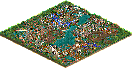
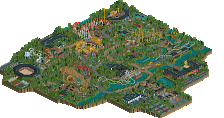
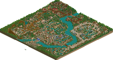
Obviously, a fantastic park, and the fact it's NCSO is even better. I'm gonna go through a few of my favourite things, but I first just wanna go through my two negatives for this park that really stop it from being a #1 contender for me personally;
First of all, I just don't like this reliance on red rock/sand in your landscaping. I know a lot of people will love it, and it's definitely just a stylistic choice for me, but it gives the whole park a kind of red hue while I'm viewing it and just makes it feel like a theme park on Mars. I actually had a go at changing the landscaping in a couple of areas to see if it fit with different land types, and, again in my opinion, it definitely gave the park a much more Earthy and 'realistic' feel.
Secondly, the filler foliage. The foliage that peeps will see in the areas and stuff is beautiful. The foliage in the corners of the map is not. I really wish you'd have toned down a bit in the corners, a bit more sporadic, some gaps in the foliage, etc. I'm trying to watch Shenlong and all I see this this giant green blob behind it.
The fact that those are the only two 'negative' things I can find though, speaks volumes about the park. Every area is crafted with so much focus on your goals that it comes together. It's basically a four corners park, but at no point does it feel like a four corners park because your work between the areas to bring them together is great. It's one theme park, rather than 4 separate lands.
A few of my favourite bits:
This entire entrance is a work of art. From the queueline to the left, to the drop perfectly centred, to the blue/gold/red trims to add a splash of colour to the otherwise monochrome buildings. Sightlines are incredible, and I can really picture myself walking up to this entrance.
An example of the area between areas, and as someone pointed out before, the fact that the waterfall from the Roman building is only viewable from the Egyptian area is a great example of how you mix it all together. Here, from Egypt you get a great view of the Roman coaster as well, while walking away from Rome, you'd get a fantastic panorama of the Ferris wheel with the giant pyramid directly behind it in sightlines.
I fucking love giant interactive queuelines and this is a great example. The first time I opened this, this is the part of the park that fascinated me the most. The style difference between the Roman city and this Roman camp kinda thing feels like something straight out of Assassin's Creed Odyssey. Love it and easily my favourite 'small' area/building in the park.
Beautiful rendition of the Ishtar Gate. The layering work at the top is great, and the animals added on through the sign are genius.
This whole coaster is beautiful, but this beginning building and waterfall is just on another level. We've seen many renditions of Journey To Atlantis, but looking at this makes me want to see you attempt it.
The China area is probably the weakest overall in my opinion, but it still does a few things beautifully, like this rapids ride that goes on a three part journey - first straddling the border of China and Babylon, then up into the hill and framework of the RMC, before finishing floating through the river in the middle of the village area.
I think the very nature of this park means that there are definitely less 'small details' - there's very little in terms of peep level details overall, but the park still feels busy and complete without them due to the focus on the areas you could fully develop. Sightlines, macro composition, colours, textures, foliage; all done perfectly and unlike anything since RoB (And maybe a couple more along the way).
I'm excited to see what you do next, but I'm hoping it's something with a bit more custom scenery. I'd love to see something on a Protour bench from you, just to give a few more textures and roof options mainly!
But very well done overall. I think I'd have voted somewhere 85%-90% if I was on the panel.
I'm glad to see it wouldn't have mattered had I gone with 95%.
I think this is a really wonderful release. I genuinely don't have much in the way of criticism because I truly wish that I had the ability and vision to build NCSO this way. It's such a nice style and it really maintains the RCT aesthetic. If I could comment on anything in particular it would be along the lines of what Trav noted about the filler foliage. Even that comes off as pretty minor in my eyes.
Amazing work for a first full scale RCT2 park. Your eye for composition and detail is incredible, and I can't wait to see more from you.
I want to say what kept me from voting 100% was that the Asian and Roman area lacked in aesthetic performance compared to the other two. Especially the Asian area to me was considerably weaker visually. While I can see why you chose certain textures and objects from a theme-must-make-sense point of view, I don't think they look nice enough together to justify a 100%.
Kind of funny, I felt the exact opposite.
To me the Chinese and Roman area's were far stronger than the Egyptian and Mesopotamian ones. Or atleast visually, the Roman and Chinese areas felt far more fresh to me, and did much more to elevate themselves past the sort of standard (good oldschool ncso) style of the other two sections.
The Egyptian area definitely was my least favorite, still very good obviously though. Maybe it was the metal roofs sort of breaking the immersion, or the simplistic color choices used in the detailing of the archy. The 1/2 pyramids were kind of awkward too I think, perhaps just a matter of preference. I think you could have added maybe a little more variety and subtle changes into the detailing to vary it up a little more (using the candy wall for color on every single building just go a bit repetitive). The lowness and simplicity of the entrance left a little to be desired too, just craved for something a bit more epic and grand feeling for a project like this one. Perhaps I'm just overly critical when it comes to these themes, lol. Ancient Egyptian art and culture is something near to my heart tough, so maybe that's the cause. I would also say Classical Roman is too, so who knows.
Overally, it these areas just felt a bit sterile I guess, sort of the same goes for Babylon but to a lesser extent.
The repetitive foliage in the Egyptian area left a little to be desired too, this sort of repetition works in the simplistic casual ncso parks we see more often. But for something like this it think it hurt you a little. It's something I feel like I'd see in a multiplayer server, not on a 90% New Element Spotlight.
Would have maybe liked to see some more unique architectural elements added in. The amphitheater and fort in the roman area and different pagodas in the Chinese area satisfied that enough for me, in those locations. Just felt like it was missing a little something to push those sections over the edge.
Don't want to make this all negative though. The duelers are probably my favorite wooden coaster(s) I've seen in a number of years. Just love the theming and execution of it, pretty much perfect.
The Intamin was also fantastic, loved the framing of hte drop and first turnaround, and the area in general. Felt epic and significant in a way few coasters do in rct. Obviously the RMC is one of, if now the best one we've seen yet, and again fantastic framing here.
This park is weird to me. Some of it is 100% material, other bits are like 60%. It can be a weird contrast, almost jarring in some places. I don't like saying that because it's sort of straight forward NCSO a lot of times it naturally feels a bit amateurish to me, but I think a few of the lesser sections do. Obviously most of the park reaches far above that level, but its not completely devoid of that.
I didn't intend to be the low vote. This park showcases immense skill and creativity obviously. You've quickly become an all time great coaster builder. Big congrats on the submission, 3 spotlights in 4 years is super impressive, across both games too. I do hope you do something a bit more detailed in the future, probably couldn't expect a modern cso park but maybe something in-between? Applying your ability to something a bit more micro would be a treat to see.
95% Yes
It's not the kind of hyperdetailed modern realism that pulls me in for hours to look at every little thing and ask "how did they do that?", but it is a fantastic collage of very immersive, engaging atmospheres. Alex, you have a talent for making cohesive, thematic, and interesting areas in your parks that I think is unmatched in modern RCT.
The few complaints I have are mostly nitpicks. The macro color composition is a bit washed out and samey. I think I might have liked china better with gray instead of beige roofs. The area themes weren't as distinct as they could be with a central theme of ancient empires. They're executed uniquely in game, but 3/4 are Mediterranean. Might have been nice to see India or Mesoamerica represented. Again, these are nitpicks and only marginally detract from what is an otherwise splendid work of art.
I think Egypt was my favorite area. It's so detail rich it's easy to forget it's NCSO. The other areas latch on to some noticeable NCSO/LL tropes, but apply them uniquely and creatively, and mix in some fresh interesting ideas as well.
Well done, and an obviously deserved spotlight.
First off, congrats on the Spotlight. I was trying to come up with some thoughts others havent said already but CC9 covered a lot of what I enjoyed about the park. As someone who loves Classical history, I enjoyed combing over every detail.
The Roman area was quite immersive.. I thought you knocked it outta the park. The dueler's layout was solid and the theming to it was well done too. The architecture was so detailed and quite the departure from traditional Roman ncso, and best example of that was the Senate building IMO. You captured the grandeur of Imperial Rome I think.
I think the only negative I have is the Hanging Gardens area.. just sort of a dead end I think. I would've rather seen the queue for Anu interact with the garden complex a bit. Still it's such a minor gripe.
Congratulations on the Spotlight Alex. I know I´m late to the party, but this park made such an impression on me that I can't resist to post. I love zooming in and out on the park, because it works so good on a macro and micro level. I'm normally not a fan of NCSO, but this park made me change my mind about it. It's impressive how you come up with all these tricks and combinations that make it look so great and I love trying to figure out how you did all that. Also really cool to find myself sweeping up dirt in this wonderful park. I can honestly not find anything I don't like or would want to change. I saw on Discord that you're experimenting with CSO. Can't wait to see what you're making next.
Made a video about the park: https://youtu.be/HFPAasBlbgk