Park / Ancient Worlds
-
 05-April 20
- Views 11,327
- Downloads 1,046
- Fans 23
- Comments 28
-

-
 92.50%(required: 80%)
 Spotlight

CoasterCreator9 100% yes bigshootergill 95% yes Camcorder22 95% yes Cocoa 95% yes posix 95% yes robbie92 95% yes Jaguar 90% yes pierrot 90% yes RWE 90% yes Scoop 90% yes SSSammy 90% yes G Force 85% yes 92.50% 100.00% -
23 fans
 Fans of this park
-
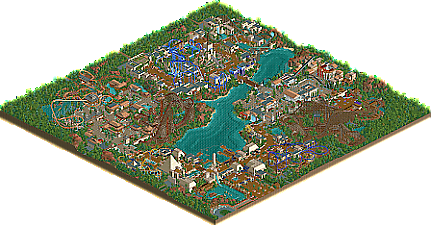
 Full-Size Map
-
 Download Park
1,046
-
 Objects
320
-
 Tags
Tags
Congratulations for making ncso not look like shit.
cool
Super clean. Cleanliness is next to managerliness.
Fantastic build!!!!
Unsurprisingly, this is a really great release, alex. Probably another spotlight. Highlights for me include the dueling woodies, the landscaping, and the rapids ride. Things I don't like so much are mainly color-related, namely the light blue in the Babylon area and purple/black awnings in the entrance (blech). That being said, the attention to detail and execution are fantastic. My NCSO standard is Blue Oak - this is on par with that, albeit in a vastly different style.
I need more time to decide my vote (thinking mid-80s, leaning towards spotlight), but there's no doubt you'll have your spotlight in a few hours. Congrats!
Forgot to mention: my absolute favorite part is the queue line hacks. Simply amazing.
this park is genius.
I will try and do an 'extremely tiny things' screen review later
but
wow
This park was so immaculately composed in such an unassuming way that I almost had trouble not taking for granted that everything looked so perfect. Everywhere I turned there was another picture perfect moment and so I actually felt compelled to do a screen review. Hopefully my crops did this justice.
One of the things I love about this park is it is framed so well for both the isometric view and for the guest. Imagine walking up to the entrance with the splash boats drop framed so perfectly on the left. And you managed to fit two picturesque drops on one ride...
Amazing entrance for a great ride. The coasters were super fun to watch. Also love how this scene squeezes in one of my favorite bits of the looping coaster, with the nice covered seating area there by the lake as well.
Transitions between themed areas can be one of the most difficult parts of a park and not only did you manage it, you made it a highlight. While the chairlift is part of the Egypt area, it is so perfectly framed against the waterfall in the Rome area. Great support idea for the chairlift also.
Can't believe you had the audacity to do an old school Babylon theme and have managed to do the original of Babylon-themed parks justice. The placement of the loop is great on its own. But the lift supported in the waterfall planters sells it even harder. Love all the hanging gardens, especially on the lift hill cage.
Somehow every element on this ride was worth a snapshot. The cobra roll against the water would've been a highlight in many other parks and it came in 3rd for this one. Great queue entrance, previewing a thrilling element of the ride without giving the whole thing away. Love the terraced water around the pretzel loop thing also.
Love this waterfall and entire structure. The stacked ruins work so well and don't get repetitive, and the swooping drop is a great element too. Apologies for what seems to be my game glitching with supports.
Another shot that needs to be appreciated from the guest's perspective. Imagining entering the park and seeing how imposing this ride is, reflected across the lake. From the Rome area there would be some nice framing with the waterfall as well.
While this wasn't admittedly my favorite asian area of all time because I don't really like the generic peach roof used in a lot of this, I loved this bit. Wide shot because all of it is brilliant. First, look at the dual pagodas that lead across a square to the entrance. Another great queue entrance. Very peaceful and creatively laid out queue line, and the station is some of the best archy in the park. Little garden towards the left was perfect too. I also love the gumdrop lamp idea. Wish the rest of the Chinese area had used more of these textures.
Another well done transition. Functionally, its just a straight section of path with no attractions or shops on it, but you still managed to make it interesting just by how you laid it out.
Circling back around to the entrance. Such a peaceful and quiet area to enjoy a meal, with views of the rest of the park across the lake. Almost makes me wish romance existed.
Had to point out the waterfall entrance on here too.
Overall, this park had one foot in the old school composition is everything spotlights such as RoB, and one foot in modern detail-oriented tile inspector NCSO. While it felt too natural to feel revolutionary, there were many clever and unique details, many of which I probably haven't even found yet. In terms of pure park building fundamentals, I think this park holds its own with the best of all time. Still deciding on score but its definitely a 90+ yes for me.
I've been lucky to have seen this park for a bit now, having worked on the aerial and release prep. I had a short look or two while working on it, and I was already impressed. After having another look (or 5), I was still pretty stunned. It's not often that a park comes around that makes me constantly think "man, I wish I could build like that" (Starpointe, BGA, Riverland, and RoB come to mind). This was one of those parks.
I'm going to do my best to not repeat any screens that have already been posted, but there's so much to love in this park and I don't think any screenshot can do any individual part of it justice.
Let's go.
The entrance. There's so much to digest here. One thing I saw mentioned is that this park feels so convincing from not only an isometric perspective, but feels believable and real from a "peep's eye view". The grand entrance, so many pops of color coming from the flowers and the wall selection. It elevates what would otherwise be a very brown screen and gives it so much life. The stacked lights making up the sign (?!?!), the clever but subtle use of multiple fountains and rapids tracks to make a wonderful centerpiece, the use of trash cans as turnstiles. There's just so much neat little stuff to find. Then on top of everything, you end up with a grand entrance with a beautiful view of the splash boats drop nearby. (Nice use of roman columns.)
Speaking of splash boats, I love how the ride winds along the scenery and rockwork. It's a nice touch.
One of my favorite parts of the park is how you find new ways to use objects that might never be used otherwise. Those creepy theme statues made great columns, and I love how this drop is framed. From the entrance of the ride itself flanked by waterfalls to the photo camera, there are again a bunch of lovely details. The vertical signs as doors is a brilliant idea and works so well.
Even the transfer sheds are remarkable pieces of theming. Just wonderful.
I always get caught up on the details, but something this park does so well is overall composition. The way the park has been constructed as a whole feels very natural and I can imagine myself enjoying a lunch or something in this garden near Shenlong.
Just love this towering coaster over the rapids and the buildings in the area.
This is so beautiful.
Yet another example of inventive object use. Domes and elongated archways with wagons? Very nice.
Another super cool transfer shed, and amazing interaction with the queue.
This is another really cool compositional moment here - a bunch of walkways and seating areas along the river with huge coasters looming across the water. Huge props for the glass covering the ice texture, really convincing marble texture.
Strong, strong contender for best wooden coaster of 2020? Gonna take a lot to top this, so massive and imposing yet duels very well. It feels so right.
Okay, one more screen. This park deserves to be enjoyed in game. I love this little section. From the eye motif on the Ferris Wheel to the lush seating area, it just all clicks so well.
There is so much more to be seen in this park, I just picked a few that stood out to me. I am in love with this building style and this park.
Ancient Worlds is a phenomenal release. It oozes that "RCT feel" that I wish I could pull off in the NCSO format. The composition is excellent, and alex has even managed to slip in little details that add some pop for those realism fans such as myself. It's amazing that we're here in 2020 and can still be so impressed by base game content - I really have no complaints. I feel this is a truly special release for these reasons, hence my score.
Just went trough the park and wow... you are blessed with immense RCT skills to make it look so atmospheric. So much to see and so much to love. I mean, if I wouldn't think about it... I'd forget this is completely NCSO.
It sounds like cursing in a church but I'm so curious how a full CSO Alex solo would look like. But please just do what you like, it's amazing. The entrance zone is so good, reminds me of Terra Mitica btw.
Also kudos for that corkroll in the RMC, I like that kind of inversions Congrats with a new spotlight to your resume. This park not getting spotlight would be the robbery of the century...
Man i absolutely love that central building in the babylon area. Great stuff all around!
This is a game changer, absolutly brilliant alex!
Also:
Clean environment, I loved it, good foliagen.
Deserved award.
So everyone else is obviously going on about the brilliant composition, atmosphere, etc. I thought I would make a tribute to the tiny details I found in this park, which is what makes alex so brilliant in my eyes- these tiny innovations which he always seems to make which seem so obvious in retrospect. They're always clean and easy to read and so missable unless you really know what you're looking for! (apologies if this ruins the magic for you!)
Ok, going line by line from left to right, we have some tiny things that I loved:
1. canon balls and either green pipe or gumdrop (cant remember) underneath the obelisk, straddled by the lamps. we also have the one tile of stripey fence detailling.
2. rounded/sloped crown-looking sign using the columns
3. sunken rapids below water. not original, but done throughout this park flawlessly. just clean and adds a bit of life
4. brilliant signs- cutoff wide ones, and double lamps
5. pink braces with orange rails
6. doors (!)
7. windows- wooden walls behind the castle window cropped by roman fences
8. arches
9. more layered window design
10. wagons. been experimenting with these myself but this is great execution
11. perfect marble
12. open windows- my favorite.
13. tall columns with the statue piece, and also perfectly spaced. feels like the best roman archy ive seen.
14. custom chairlift supports
15. totem pole columns and martian lamp lanterns
16. jungle fences as boardwalk supports. this is actually amazing.
17. double lamps again, back-to-back
18. (just below the lamps) flat roofs using the weird ass candy object
19. perfect coaster colors
20. scissor lifts
21. the way the ladder goes up to meet the mini golf railing. also- that grey path texture. took me ages to work out what it was!
22. mowed grass inside the structure as a garden
23. little pagoda roof
24. flat black path with no edges as roof continuation, and large red lantern. (flat wooden paths throughout are brilliant)
25. more roman texturing
26. slight changes in things like awning color are used throughout perfectly to keep areas lively but not overdone and too colorful. just a perfect balance. and of course, overgrown foliage is my fave
what a park! cant wait to steal so many things, like always.
Here is my review:
https://www.youtube....h?v=SG8u2sJ-DQA
Amazing park. Easily one of my favorites! Can't wait to see what you build next.
Alex. Do you want to marry me ?
Do you want to have children with me ?
Serious talk.
Love the TV monitor for the on ride photo on the queen of the nile splash
Thanks a lot for the kind comments and reviews so far!
Would be nice to see some more reviews if anyone has time - its cool knowing that people like it but would also be cool to read some analysis and critiques etc too